Showing posts with label Isabey. Show all posts

Sunday, 25 May 2014

Watercolour Brushes Pt 3 - Mops

Following up the previous brush posts, one on synthetics the other sables, comes the third instalment -  Mops. Although I have a number they are not my brush of choice. I've used them only sparingly so once again I have enlisted my good friend John Softly to do the honours. 

MOPS by John Softly

If you know your history you will be aware that Edward Wesson was the first artist to use - and popularise - a French Polishers mop for watercolour. I have no information as to when it was that Ted first started using the French Polishers mop but he purchased them initially from France. In an article in the May 1980 edition of Leisure Painter he wrote "Personally I have always used squirrel haired "polishers mops", and in the smaller sizes, a selection of Daylons (nylon) and oxhair". We can therefore  assume that he was using them prior to his stint in the army in WW2. According to Herrings of Dorchester, artists themselves, they first began getting requests for these brushes from Wesson some time after the Wars end and, after great difficulty,  found them in France. Later they got to know him personally as he held many workshops in Dorset, not far from the Herrings shop in Dorchester PW. 


French Polishers Mops  (Isabey)

I  purchased four French Polishers mops in 1973, for French Polishing, from an artists supply retailer but none came to a point and were, what we call today a wash brush. As far as I can recall none came to a point. Those Ted bought did come to a point and they were his main brush throughout his career.

Today there is more written, and questions asked on forums, about mops than any other brush type. Traditionally made of squirrel hair with a quill ferule, bound with wire, but nowadays more are metal ferruled and synthetic versions are coming onto the market as popularity grows.

Not only are there mops in rounds but we have the Petit Gris, cats tongue, or filberts which, thanks to artists like Gerald Green and John Hoar, are increasing in popularity. Flat squirrel hair, one stroke brushes, are also available but it is debatable whether these come under the `mop' banner.

Possibly the major drawback with mops is sizing as there is no standard between manufacturers (this also applies to rounds in both synthetic and sable. PW. John says in response to this as follows: "Your comment is certainly correct but in round sables and synthetics, a Number 10 say can differ in size by a few mm in hair length and diameter but usually smaller to make it an 9 or 8. With mops sizing means little. Alvaro's go from 00 to 10. Harmony from 1 to 10, Jacksons from 6 to 22, Isabey from 3/0 to 10, W & N from 000 to 12 and Da Vinci from 0 to 6. Unless you know exactly what you are getting it's best to ask the retailer actual size or buy from Jacksons - they list ferrule sizes in their catalogue!"). The rounds are the problem as Petit Gris and flats are usually sized in fractions so when you order - for example - a three quarter inch brush you know exactly what you will get. If you order a No 8 round mop you will have no idea what the size will actually be. Some online retailers list hair lengths and diameters, where the ferrule meets the hair, which takes the gamble out of purchases.


Alvaro Castagnet

Prices vary across the range  with the Isabey - made of Kazan squirrel hair supposedly the best - and the Neef Alvaro Castagnet series at the upper price level with others somewhat cheaper. As usual one gets what one pays for and the hair on some of the cheaper brushes would appear to have started life on the tail of a feline (see what is said on this issue of `authentic' hair in the article on sables. Why should mops be any different? PW). One of the better budget sets is the Harmony brand from  Jerrys Artarama, a large American online retailer. You don't expect Kazan squirrel hair from Siberia at this price but I found them to be good, a no frills mop, albeit the hair a little coarser than most.


Harmony


Cats Tongue


It is purely conjecture on my part but I believe the Isabey genuine mops as used by Wesson were, and are, considered the Rolls Royce of mops. While I am not swayed by artists endorsements, Escoda have most high profile artists tied up anyway, I have bought mops with an artists name on the handle. The full set of Neef brushes marketed under Alvaro Castagnets name, and the single, metal ferruled, Escoda mop that Steve Hall sells. The Neefs have a longer handle and hair than most and I purchased them because other Neefs in my collection have performed faultlessly for 20 years.

Neef also do a synthetic mop which has had good reviews but I went with the Neptune brand. They only offer 3 quill mops, 4, 6 and 8, but their synthetic hair is very close to squirrel and by far the most popular synthetic quill mop brush on the market. I've not come across either the Harmony or Neptune brands on sale in the UK. PW

I bought the Steve Hall brush on impulse when buying his book, and whilst I find it a nice, long-haired, brush, softer than most, it is inclined to be uncontrollable when fully loaded. Rosemary & Co make some generic brushes for the British online retailer Jacksons, but I am unaware if mops are amongst them. Jacksons mops however are an excellent product and like all Jacksons own label brushes, built to a quality. rather than price, which is why I suspect Rosemary & Co are involved.


Jacksons Mops


Steve Hall, Princeton Neptune's and Rekab No8.

Rosemary makes  a series 1 Kolinsky quill brush and Jacksons a  series 777 synthetic quill, see the article on synthetic brushes. Although Rosemary calls her Kolinsky quill a mop there is nothing mopish about her high end series 1. They may bear a resemblance to a mop but are round Kolinsky sables and priced and perform accordingly (here I disagree slightly from what John writes based on my own experience with one of these mops, although mine was bought under the old ABS label. PW).

Traditionally polishers mops have quill ferules tied on with wire, the quill coming from the feathers of ducks, geese or swans, depending on the size of the brush. These days manufacturers use firm plastic sheeting in lieu of natural feather quills, but even if plastic it's still called a quill.

There was a time when all round brushes had quill ferrules rather than metal. Sizes took the name from the bird which the feather came from - the smallest a lark, which was the equivalent to a number 2 or 3 modern brush through thrush, crow, duck, goose ans swan - the Americans even had eagle in the mix! The hair was glued into the small end of the quill and the handle, referred to as the "stick", in the larger end but no glue - just a friction fit.

Due to the amount of water mops hold it is important they are dried with the hair pointing down in order that moisture doesn't creep into the ferrule, expanding the wood thus causing hair to be shed. Perhaps I would have more hair than I have today had I been suspended upside down after every shower.

Almost every high profile artist has at least one mop in their arsenal and I'm sure Ted Wesson would be surprised to see just how his mop, which was considered something of an oddity in the 1950s and 60s, has become a standard watercolour brush.

I am aware I have too many mops but, there again, like Peter, when It comes to art materials I have too much of everything, but if I hadn't got them I couldn't review them.


Peter Wards Mops

The top three brushes are Isabey, the large 4th one is a Rosemary squirrel (ABS), the 5th the Da Vinci Artissimo 44 size 2, while the last one is the Kolinsky sable mop series 1 ABS (Now Rosemary) size 4. The Da Vinci 44 size 2 approximates to a size 14 round, although a different shape so you can judge roughly what the other brushes equate to.. Look at the splayed out Kolinsky series 1! Even when loaded with water it doesn't point terribly well and is only useful as a wash brush (in my experience) PW.

My experience with mops is very limited. Currently the only one I use is the Da Vinci Artissimo 44 size 2. Initially I liked this brush very much but have gone off it a little, mainly because the hair became detached from the ferrule, although it was easy to put back in. I am afraid I am not a fan of the Rosemary series 1. Actually it was purchased under the old ABS label but I believe the brushes are the same.

That's it then folks. Thanks John for taking the trouble to produce this and give us the benefit of your experience. 

Tuesday, 10 December 2013

The Puerto Rican Tody - Todus Mexicanum !

I've not kept up with the weekly subject on the `Paint Colorful Birds' Facebook page but completed this one yesterday. What a mouthful of a name.


The Puerto Rican Tody 16" x 12" not

This is painted on the back of a failed or discarded painting. I think it the Great Art Centenaire paper but not certain. 

I made an initial drawing using a Pentel mechanical pencil 07 2B. This was done the day previously and painted yesterday. It is quite an easy subject compared to some other birds but interesting in the contrast of green and orange. I recently sorted my paints out and found I had at least ten different tubes of greens (!). When I looked at the bird I thought I would have trouble as I didn't have an emerald green but found a forgotten tube of Maimeri Cobalt Green Light (PG50). Although fairly old the paint was fine and I used it with touches of Hansa Yellow Medium (Daniel Smith PY97). The lower rear area has some Indian Yellow (Rowney PY153). The orange-red is Schminke Translucent Orange (PO71), and the breast some Ultramarine Violet (Rowney PV15) together with touches of Cerulean greyed with Burnt Sienna. The eye is Maimeri Ivory Black. The white areas were brightened with Acrylic white. The branch has Raw Sienna, Indian Yellow, Cerulean and Quinacridone Rust (Graham PO48) and Raw Umber.

I used the Isabey Kolinsky sables series 6228 in mainly size 8 and the size 4 retractable. I like Isabey very much and while I think Escoda make excellent brushes the current spate of `big' name artists telling us Escoda are the `best in the world'  increases my cynicism about listening to such marketing hype.

Tuesday, 22 January 2013

Self-Portrait

This is another attempt at a self-portrait. My wife doesn't like it so I'm posting it with some trepidation. On the other hand I'm a believer in `warts and all' paintings. The fact that I rather look as if I've swallowed a lemon is irrelevant and the bloom of my youth is long departed. Well I don't feel that old so...!


`Self-Portrait' 16" x 12" Waterford 140lb (300gsm) not

I began with as careful a drawing as possible, although not over detailed, using a Pentel 05 mechanical pencil with a 2B lead. My skin mix was based on the Charles Reid one of Cadmium Red, in my case Rowney Cadmium Red Pale, together with smaller amounts of either Yellow Ochre (Graham PY42) or Raw Sienna. Yellow Ochre gives a slightly darker mix. They are mixed in the palette and I brush out some Cerulean and/or Cobalt Blue Deep (Rowney PB72) in a separate well'. Sometimes I add the colours together in the palette or mix on the paper. The blues are used to darken the mix for the shadow areas. I start with the features, eyes first, then down to the nose and lips. After that I extend the wash to the other areas and make sure I don't have a definite edge where the brow meets the cap under the brim. For the features I tend to use the Isabey Retractable Size 6 Series 6201 Kolinsky which is small for a size 6 but long and slim. For the remainder I use the Isabey 6228 Kolinsky sizes 4, 6 and 8 and also the Da Vinci Artissimo 44 Size 2 mop for  areas like the cap. When the initial washes are dry, and consequently much lighter, I go back in with the darker mix for the shadow areas with special emphasis around the eye sockets, making sure not to leave too many hard edges. I try not to mess around with it too much but often stray over the line. Although my system is based on the Charles Reid way I'm also impressed by several other superb artists whose portrait paintings I have come to know like Fealing Lin, Cao Bei An, Bev Jozwiak, Paul Lovering, Stan Miller and there are more. 

Tuesday, 18 December 2012

Just a Sketch

At a recent AVA meeting the subject was Xmas cards - possibly my least favourite topic. I must admit I stretched the subject as wide as possible by presenting my effort as representing a design for a card (!) It is a small sketch and I repeated the recent Robin painting, although slightly differently as the colours used were not identical, principally as I forgot to bring the Translucent Orange from Schminke, rapidly becoming a favourite colour. This was done on a small Fontenay block that I discovered amongst my paper stocks.


12" X 9" Fontenay

I first made a drawing of the robin and then painted it using Cadmium Orange and Cadmium Red Pale plus some Quinacridone Gold for the red breast. The blue is Cerulean and the other colours Raw Sienna and Raw Umber. The eyes and bill include Ivory Black.

When  all was dry I added impressions of holly leaves drawing with the brush. I mixed up the colours using Sap Green, Green Gold and Hookers for the greens, adding Cobalt Teal Blue and  Perylene Maroon, letting them mix on the paper.

Brushes were the Isabey and Escoda retractables, mostly in the 4 to 6 range of sizes. Just a sketch, nothing more which took about forty minutes excluding breaks.
 .


Tuesday, 11 December 2012

Robbie

This is my latest portrait. For some time I have been collecting interesting photographs , mostly from the weekend colour magazines. This is from one such photograph. 

 Initial stages


`Robbie' 16" x 12" Waterford 140lb (300gsm) Not

I first made a careful drawing using an 07 2B mechanical pencil.  I try and get the features in the right place and the right size, often using a mechanical aid like a steel ruler or my brass variscaler. I refuse to wear a hair shirt and try and do it without aids. There was a recent article in The Artist magazine describing the growth of Atelier-type drawing schools where the emphasis is on super realism. In it the use of plumb lines to ensure accuracy was described. My understanding is that the old masters used all sorts of drawing aids. Generally I don't get it right first time and have to make some changes. When I haven't got things quite right  out comes the eraser. I stress I don't aim for a super realistic image but it is nice if the subject is recognisable.

With that completed out comes the paint. I spray the paint with water from a small spray bottle about 20 to 30 minutes prior to painting, that is if I remember to do so - not always the case. As seen in the top image I used a combination of Cadmium Red Pale, Yellow Ochre or Raw Sienna, mostly the red with only small amounts of yellow. Cerulean is used for emphasis and to darken where necessary. Colours mostly mixed on the paper. I have been trying to be less precise and going for a`cruder' approach than in some of my earlier work. With this in mind I studied the portraits in Charles Reid's last book `Watercolour Solutions' and also viewed his painting of the man in his latest `Figurative Watercolour' DVD. Attempting to follow CR's teaching I did not leave an abrupt line between the face and hairline in the initial wash, but strayed beyond as this would be covered when the hair was painted. I realise by now I should know these things off by heart but unfortunately regression can set in all too easily.

The hair was painted using various dilutions of Ultramarine Blue and Burnt Sienna - lighter/darker as required. There is some Raw Umber in there and I added white gouache when fully dry, quite thickly in places. For the white I have been trying Galeria Titanium White and also Vallejo Acrylic Titanium White Gouache as an alternative to the standard white gouache.  This is something I've seen Yvonne Harry do but so far have not reached a final conclusion which is best for me.

I re wetted areas of the face and added both Cadmium Red and Cerulean to get stronger tones. The very last thing on the face was to add small white highlights on the pupils. His jacket and shirt are mixtures of Ultramarine, Cerulean and Ivory Black.

My usual brushes, the Da Vinci 44 No2 and Isabey Nos 4, 6 and 8, the small retractables used for detailing the eyes. If you wish to paint portraits in the general manner of Charles Reid then I recommend his last book `Watercolour Solutions' and the DVD `Figurative Watercolours'. You don't have to copy him exactly - very difficult in any event - and he himself says you shouldn't try.
 .

Saturday, 3 November 2012

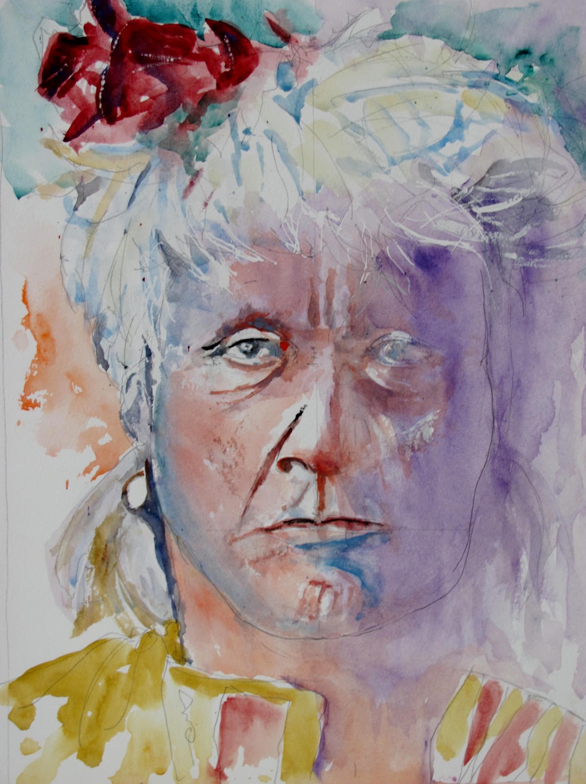
Red Whip

This is my latest attempt at an Amerindian based on old black and white photographs from Edward Curtis. I have adopted a different approach, specifically with regard to colour.

The Atsina, otherwise known as Gros Ventres or less flattering as `Snakes', were a branch of the algonquin-speaking tribes located in North Central Montana. At the turn of the 19th century numbers were reduced to a few hundred but have since increased substantially. Wikpedia has comprehensive information.


Atsina Brave Red Whip 1908. www.firstpeople.us/


Red Whip 16" x 12" Centenaire 140lb (300gm) not

Interpretation of the photograph was again difficult. Is his hair grey or what? It certainly looks peculiar. I decided not to get into a tangle over this and went for an impression rather than a very realistic approach. 

Colours used for the face were Cadmium Red Pale, Yellow Ochre, Cerulean. and Ultramarine Violet (Rowney PV15) for the shaded areas. There are touches of Cerulean and Raw Sienna in the hair with Perylene Maroon (Graham PR179) for the red top piece. Raw Sienna and Perylene Maroon for the shirt. Some Cadmium Orange (Maimeri PO20) and Viridian (Rowney PG18)  in the background. I tried to match complements, also alternating warm and cool..There are small amounts of white gouache in places.

Brushes used were the Da Vinci Artissimo 44 Size 2 Kolinsky and Isabey 6228's, 4, 6 and 8.


Friday, 14 September 2012

The Last Hostile Apaches

On 4 September 1886 Geronimo and his band of Chiricahua  Apaches finally surrendered to the US Army - mainly infantry - commanded by  Brigadier General Nelson  Miles. This is generally considered the end of the Indian wars, although further localised trouble took place with the Crows in 1887 and Sioux in 1890. A few recalcitrant Apaches never surrendered hiding away in the wild Sierra Madre mountains of Mexico. There were occasional reports, up to the early 1920s, of minor depredations, such as cattle stealing. Some may still be there. 

The Historic photograph of the hostile Apaches.

Geronimo left, mounted on the horse with Naiche (son of Cochise) mounted next to him. Geronimo's son is holding a baby. This was taken in March 1886 when Geronimo was in negotiation with General Crook before surrendering. Subsequently the US government, as frequently happened in it's dealing with the Indians, reneged on the deal and the Apaches fled. Crook was so disgusted he tendered his resignation, which was accepted, replaced by General Miles, a more ruthless and ambitious individual. Miles using 5000 troops and numerous `friendly' Apache scouts  finally cornered Geronimo and his band of less than thirty the following September.


 Geronimo (centre bottom), and the remnants of his band on the way to prison in Florida. a single woman is part of the group shown here. On the way to Florida one warrior somehow escaped and made his way back to Arizona or New Mexico, hundreds of miles, without being seen let alone captured. This episode was made into a film with Burt Lancaster as the warrior, but in usual Hollywood fashion bore  little relation to the facts.

The top photograph was my entry into the AVA subject of `Transport'. We are allowed considerable flexibility (!) and as the horse was the principal Indian mode of transport I  selected the first photograph. The second could well have been considered as it depicts the captives train but too complicated by far for me to attempt.


I began by making as accurate a drawing as possible given the difficulty of interpreting the photograph, then started painting Naiche, beginning at his hat and working downwards.


Further progression with three of the four figures and horses completed except for final touches.


Geronimo - "16" x 12" Centenaire 140lb (300gsm) Not

I had to use my imagination for the colours plus my knowledge of the Apaches dress sense. A useful reference was a small booklet in the Osprey Men-At-Arms Series `The Apaches' Paperback 48 pages 1989.

Although this painting is 16" x 12" the actual figures are quite small with a lot of detail, much of it impossible to see clearly if at all. I used only two brushes the Isabey 6201 retractable Kolinsky sables sizes 4 and 6. This is against the trend recently where I have been resisting small brushes, but using larger brushes would have stretched my capabilities too far. Despite using small brushes - and these Isabeys are small compared to most other makes - I resisted fussy detail and tried very hard to create an impressionistic result that did justice to the subject.

Colours were varied but Ultramarine Blue, Burnt Umber, Quinacridone Rust (Graham PO48) and Raw Sienna were the principle ones. The darks were mainly various mixes of Ultramarine Blue, Burnt Umber and Quinacridone Rust. I also used small amounts of Gold Ochre (W & N PY43) and Raw Umber. The headbands were Viridian and Quinacridone Rose. There is also some Cerulean and Cobalt Blue. I think that's it. The pencil drawing was completed using a Pentel mechanical pencil 07 2B. 

I finished rather pleased with the result because it brings together two of my main interests, watercolour painting and the history of the Indian wars.

Friday, 3 August 2012

Evie

I have made several attempts to produce good paintings of my grandchildren with so far mixed results. Several good artists say children are the most difficult to paint and they certainly aren't easy. I have already produced two paintings of Evie and she proudly displays them in her bedroom, but the deafening silence from both parents and grandmother makes me think they aren't that impressed. In mitigation I am trying to paint a `Charles Reid' type of interpretation where absolute realism is not the aim but this is what most people like to see. Another problem with painting children, at least to me, is making them look older than they actually are.


This was my guide photograph


Evie 16" x 12" Centenaire 140lb (300gm) not

I don't put this up as a definitive effort by any means. I think slow improvement is visible compared to the others. She thinks it great by the way but then she would! I followed CR's advice in stressing one eye over the other. I have messed around with the left side and could have done it better initially. 

I first made a careful pencil drawing using an 07 mechanical Pentel. For the skin tones I used Cadmium Red with a little Yellow Ochre. Where I wished to darken I added Cerulean or Cobalt Blue Deep. I concentrated on the eyes then the nose and mouth using slightly darker colour, where necessary stressing the inner eye. There is some Hookers Green (Graham) in the corners. When completely dry I added more colour - for instance on the right facing cheek. I also did this with the lips. I tried to do the eyes very carefully in order to maintain a good resemblance. Evie recognized herself immediately. 

 The colours in the eyes included very diluted Raw Umber. The hair is essentially Ultramarine Blue and some Burnt Sienna, stressing the blue. Evie has very dark - almost black - hair. I used Cadmium Orange for the clothing to compliment the blue.

Brushes used were the Rosemary series 33 Size 12 and also the Rosemary (ABS) Kolinsky mop Size1. The Isabey size 6 also featured.  

Wednesday, 25 July 2012

Bull_Goes_Hunting

This is my latest Indian portrait. It is of an old Indian photographed by Edward Curtis around 1900 (?).


Bull_Goes_Hunting Apsaroke Indian 
www.firstpeople/us

What a face! Obviously old (ancient?) with greying hair. The Apsaroke, better known as the Crows, a name given them rather contemptuously by the whites, were a warlike tribe although not especially numerous, who inhabited the Rocky Mountains. In the Indian wars of the mid to late 1800s they frequently served as scouts for the cavalry against their deadly enemies the Sioux and Cheyenne.


Bull_Goes_Hunting 16" x 12" Centenaire 140lb (300gm) Not 

I initially made a careful drawing, not over detailed, and used a limited palette with Cadmium Red, Quinacridone Rust (Graham PO48) , Raw Sienna and Cobalt Blue (Rowney PB72) plus some Cerulean for the skin tones. The hair was varied dilutions of Ultramarine Blue and Burnt Sienna. After the initial washes I let it become fully dry and then added the furrows and fissues in the face.  Finally, the following day I applied some white goache quite thickly in places shown as white in the photograph. 

Brushes were the Isabey Kolinsky sables Series 6228 sizes 4, 6 and 8.

Sunday, 6 May 2012

Elephants

As I've mentioned previously one of many artists I've become interested in is the Chinese artist Lian Qhan Zhen. Amongst his subject matter are animals and birds. I've just bought a DVD of his and also looked at some of the trailers on Youtube.  There are at least three on which he features. Last Thursday at my AVA group the subject was `animals or birds' so it gave me an opportunity to try a few things. I decided on a group of elephants. www.lianspainting.com/


My initial setup. The top left photograph is one of Lian's, which is illustrated on his website. 


Elephants - Lian Quan Zhen. (Fantastic - look at the colours!)


The initial drawing


So far so good (?)!


`Big Ears'- Fontenay 16" x 12" 140lb (300gm) Not

Not up to his standard or even approaching it but who is? I think there are things to be taken from his methods it's just a question of being able  - not easy - to do so. As you can see I went for colour using many that I've mentioned previously, Quin Gold, Cobalt Teal Blue, Quin Rust, Cerulean, Cobalt Violet etc. Lian  generally uses three or four! How about that.

Here are a few of the paintings from my fellow artists. I did not take so many on this occasion due to lack of time..

   Cath Wilkins - Watercolour Pencil


Jan Weeks


Helen Newman (actually pastel)

I've mentioned the DVD. I'll review it together with his Youtube videos in the near future.

As is usual at my AVA sessions I used a mixture of Escoda, Isabey and Rosemary retractables.  Escoda sizes 8, 10 and 12  Series 6212 Kolinsky, Isabey 4 & 6 Series 6201 and a Rosemary rigger. The Escoda and Isabey came from Jacksons and the Rosemary direct.


Tuesday, 10 April 2012

Something Different

Recently I have become very interested, and impressed, with the animal and bird drawings of a a number of artists who paint their subjects in a loose and colourful manner. Some seem to me to fall into the concept of realistic abstracts, while others are more realistic but use colour in a very imaginative way. Jean Haines www.jeanhaines.com/  , Gerard Hendriks www.gerardhendriks.net/ , Esther Hefferman, Bev Jozwiak www.bevjozwiak.com/  and  Lian Quan Zhen www.lianspainting.com/  are among those that have made an impression on me. Terrific artists one and all, although different from each other in various ways and they paint a variety of subjects not just wildlife.

 Snow Leopard

It may be that this photograph is subject to copyright and if I am so informed I'll delete it, but hopefully since this blog has no commercial aspirations this won't happen. This is the photograph I based the painting on.


Snow Leopard- Fontenay 16" x 12" 140lb (300gm) Not

I concentrated on the features and blurred the outer parts to partly blend with the background. Colours used were diluted Raw Umber, Raw Sienna, Cerulean Blue and very diluted Quinacridone Rose (Graham) mixed with Raw Umber or Raw Sienna. Indigo also featured quite a lot in various dilutions with some Burnt Sienna and Burnt Umber. The background is mainly Cerulean Blue, possibly a little Cobalt Blue in places. For the black marks on the face and just above I used Daler Rowney FW Black acrylic ink. The red of the mouth is a mixture of Cadmium Red and Quinadicrone Rose with some added Burnt Umber. I used masking fluid put on with a ruling pen for the whiskers, and added white for the teeth.

The only brushes used were the two Isabey 6201 retractables, the 4 and the 6. I recently added the 4 to my armoury. Both brushes are very small compared to normal 4's and 6's but are very slim and have excellent points. For the larger areas the Isabey 6228 Kolinsky Size 8. All were purchased from Jacksons www.jacksonsart.co.uk. Am I pleased with this one? Yes.


Wednesday, 7 March 2012

Bath College Portrait Course Week 8 - 6 March 2012

This week the subject was again Sarah wearing her hat.


This is the angle from where I sat, roughly ten feet away. This was the closest  practical distance, bearing in mind the need to avoid blocking out others. One problem arose, in the first hour session, in that the Sun shone through a window into my eyes.  This wasn't such a problem in the second session as it had moved. Nevertheless I ploughed on, first studying the subject in detail before committing pencil to paper. I tried to measure up accurately using a pencil with arm rigidly held straight out. This isn't easy and proved difficult partly due to the distance from the model. I have been consulting  Bert Dodson's book `Keys To Drawing' (North Light 1985, paperback edition 1990). Charles Reid considers this the best book on drawing, a large claim considering the dozens available.  Having a selection of these books, many of which are valuable, I am inclined to agree in that it is far, far easier to digest in practical terms. It has a very good section on taking proportions. It is still available at a reasonable price from online booksellers like Amazon.  

The Drawing with painting begun on the features.


 Sarah - Schut Noblesse 40 x 50cm (15.75" x 19.75")  300gsm (140lb) Not 

Faults notwithstanding this is a much better effort than my painting of a few weeks ago. I have altered the proportions of hat to face compared to the photo. My wife thinks I have made her look a little sad which is probably true looking at the photo. I am reasonably happy  while constantly striving to do better.

Colours for the face and features were Cadmium Red Light or Pale, Cadmium Yellow Light, plus Cerulean Blue to darken, Lamp Black for the upper eyelids and pupil, Cobalt Blue for the Iris. The hat is white overall but much darker in shadow under the brim where I used diluted Cerulean and very light greys by adding Burnt Sienna to the Cerulean. The hair is mainly Raw Umber with some Gold Ochre and Burnt Umber. The reds are Quinacridone Rose (Graham PV19) and Permanent Carmine (W & N PR N/A). The green is Viridian (Rowney). Ultramarine Violet (Rowney PV15) was added to the background colours of Raw Sienna/Raw Umber and Cerulean.

Brushes were the Isabey Size 6 Retractable for the features with the Da Vinci Maestro Size 6 and Artissimo 44 Size 2 for the rest.

I am now into the final two weeks when we are having a new model. Jackie says we can do whatever we wish, paint, draw, use whatever medium. I may do a large drawing next week then another watercolour in the final session. I have decided not to take the follow up five weeks. I am very happy with how the course has progressed but basically now need a break.

Friday, 2 March 2012

Avon Valley Artists Thursday 1 March 2012

This week the subject was `In the Garden'. to be interpreted as you will although keeping to the basic theme.


My source Photo


 In the Garden - Fabriano Artistico Extra White 14" x 20" Not

Although only small my garden swarms with birds. I have four feeding stations plus a bird bath and a small pond, a four star hotel for the birds! The most numerous visitors are goldfinches. In the painting I've added greenfinches, also regulars, and a long tailed tit, an occasional visitor usually in numbers. I could have put in many other species.

My basic painting was built around two bird feeders with the two goldfinches at the front left the  main focal points. I painted them and the bird feeder together with an impression of the surrounding foliage in one passage. I then moved to the right completing the second feeder and another goldfinch linking them together with the  greenfinches at the top right. The branches at the top of the painting were put in last as was the long tailed tit. I tried to link everything to avoid any one part looking isolated.

Colours used for the goldfinches were Indigo (Daniel Smith PB60/Pbk6) for the blacks , Hansa Yellow Medium (Daniel Smith PY97) and Indian Yellow (Rowney PY153) plus diluted Raw Umber. The Red is Quinacridone Rose (Graham PV19). Raw Sienna was used to simulate the seeds in the feeders. I used a lot of Hookers Green (Graham) in various dilutions and sometimes altered with yellow. Some Gold Ochre is in there somewhere (Winsor & Newton PY43). Burnt Sienna was added in various places to add warmth. The Greenfinches are a mixture of green and yellow in various dilutions. The greys are mainly Indigo with some Burnt Sienna.

Brushes were my Da Vinci Artissimo 44 Size 2 Kolinsky mop, a size 6 Da Vinci Maestro 10 and the Isabey retractable size 6. Comments welcome.

Monday, 20 February 2012

February Challenge

This months challenge was chosen by Mick www.thepaintingstruggle.blogspot.com/ and is a scene in Venice showing The Bridge of Sighs.


When Mick sent this photograph I was unable to save it and various e-mails went back and forth without a resolution, Finally I searched the web and came up with a free utility called Pixillion Image Converter. I downloaded and it worked first time! I was able to convert the photo file enabling me to save, crop, print etc.

Venice is one of the most painted cities in the World - actually many think over painted. I remember reading of a judge at an exhibition saying if any more Venice paintings appeared he would...!!! On my last visit - a cruise in the Venice lagoons - we explored beyond the normal tourist limits. I knew that the population has fallen dramatically in the last decade or more and this was evident in the empty buildings and semi-derelict shops as soon as you got beyond the centre and main tourist areas. A dying city?

The first two paintings attempts were unsatisfactory. Yesterday I had a final shot and first of all cropped the photograph.


The right hand (facing) side has been cropped. This is the view I decided upon. I completed the drawing trying not to be over fussy but getting everything in their right place. 


Bridge of Sighs- Fabriano Artistico Extra White 18" x 10" Not


Modified by lightening the small rear bridge using a damp sponge.

I used quite a few colours in this painting. Blues were Cerulean, Cobalt (Rowney PB72) and Cyan (Maimeri Green shade PB15-3). The Cerulean mainly on the bridge, Heavily diluted Cobalt for the water and sky, with Cyan for the darker areas of the water. Also some Ultramarine for the darks in the boats. The walls were  Raw Umber, Raw Sienna, Quinacridone Gold (Daniel Smith PO49) and Yellow Ochre (Graham) with Burnt Sienna , Ultramarine Violet Deep (Graham PV15) and Permanent Magenta (Rowney PV19). Some Viridian on the poles sticking out of the water and Burnt Umber and Indigo Daniel Smith) for the darks. I think that's it. Oh yes a touch of Permanent Carmine (W & N PR N/A) on the small boat.

Brushes by contrast were the Isabey Size 8 series 6228 and Da Vinci Maestro 10 Size 6, both Kolinsky sable plus a size 4 . 

One thing I'm frustrated with. I photographed the original using two cameras, a Nikon DSLR with 55mm lens and a Canon Powershot, different settings and under different light. Despite producing over 20 photographs not one conveys the actual painting in a satisfactory way. It is better than the reproduction on here - by a margin - but unfortunately you'll have to take my word for it. I'll have to consult Mick the camera expert. Comments welcome.


Monday, 13 February 2012

Another Try at Sarah

Readers will gather than I often make several attempts at the same subject until I get a satisfactory result. I have followed this with Sarah, the model at my Bath College Portrait course, and this is positively the last attempt until we resume in a weeks time. 


 First Stage - Drawing then features. The drawing was further altered when I realised the hair shape was incorrect.

Face and Hair completed.

Sarah - Fabriano Artistico 20" x 14" Extra White Not

I am reasonably happy with this while accepting it is still not perfect. The big problem all along has been getting the eyes right and I've only partially succeeded. However I think it much better than the previous attempts. Colours for the skin were Cadmium Red Light with either Raw Sienna or Cadmium Yellow Light. Cerulean was used to darken the skin colour, all mixed on the paper. Touches of slighter darker Ultramarine around the eyes with some Ivory Black added. The hair is a mixture of Gold Ochre (W & N), Raw Umber (Maimeri) and a little Burnt Umber (Rowney). A spot of red in the corner of the eyes plus just a touch of Hookers Green (Graham). The scarf is Cerulean Blue (Winsor & Newton) and Viridian (Rowney). The pink of the jumper is Quinacridone Rose(Graham PV19).

Brushes, my usual array with the Isabey 6201 Size 6 travel brush for the features and the Isabey 6228 Size 8 Kolinsky and Da Vinci Maestro 10 Kolinsky Size 6 for the rest. I think that is all. Comments welcome as always.


Friday, 3 February 2012

Bath Portrait Course Week 4 - 31 January 2012

This was my 4th week and the subject (as it will be next week) once again Sarah. We were allowed to draw or paint her using any medium. I chose watercolour and I'm sorry to say made a hash of it. We repeat this next week so I am thinking hard how to avoid a simlar result.

Sarah

Sarah - Fabriano Artistico Extra White Not 20" x 14"

Not very good is it. I have definitely overworked and am thoroughly dissatisfied with the above. In mitigation the photograph of Sarah shows her in close up whereas I was about 10 ft away and unable to get closer as I would have blocked out some of the others. She is much lighter in the photograph as I remember, both in features and hair. Still that's enough of the excuses. I used my normal colours of Cadmium Red Light and Yellow Light, darkened with Cerulean, for the features and added further dark washes, after the initial one dried, for the shadows. I overdid it and finished up with the face looking `dirty'. Sackcloth and Ashes this week. The hair was primarily Raw Umber, Burnt Umber and Gold Ochre in various combinations.

Brushes used were my Isabey and Escoda retractables, sizes 6, 8 and 10.  I may have another try before next tuesday using the photograph as a reference. I was in two minds about posting this but warts and all....!

Just to finish.


Yours truly with  tutor Jackie (I'm the one on the left). This is at the end of the session so I'm still smiling despite a near disaster. Actually it was a disaster, not a near one because I'm aiming much higher than that these days. Jackie's website is www.jackieharding.com

Friday, 20 January 2012

Bath Portrait Course - Week Two - Tuesday 17January

I attended my second session this week and this is a short description. The model, who I discovered is called Sarah, was the same one and once again displayed extreme professionalism. 

Sarah
On this occasion we were allowed to draw or paint, whichever we decided, and in whatever media. I chose watercolour and this is the result.

Sarah 16" x 12" Centenaire 140lb Not.

Sarah's face was mainly in shadow, due to where I was seated- far from ideal, so next week I'm aiming to move and had a word with the tutor about this. I used pan paints with Cadmium Red and Yellow Light plus Cerulean for the skin colours and features. The Scarf was a mixture of Viridian and Hookers Green, and the cardigan a mix of Orange and Red. Brushes were Escoda 1214 retractables, Sizes 8 and 10 plus my small Isabey 6201.

 Next week we have a male model and are to do drawing using cartridge paper and willow charcoal. We were also told to bring a putty rubber. Another enjoyable session.