Saturday 31 March 2018

Watercolour Paintings 41

With the beginning of Spring here is another batch of watercolours from around the World.


Robert Wade

The doyen of Australian watercolour artists Bob is also a very nice man. I had contact with him a few years ago via e mail. He well remembered Bristol as his son had been a medical student here.


Yuko Nagayama

This lady is an amazing artist. I don't think there is another like her. Her paintings have this wonderful ethereal quality. 
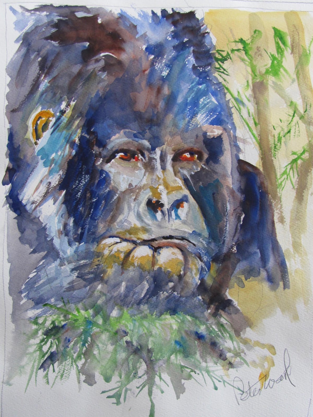


Bijay Biswaal

Wow!


Sarah Yeoman

Sarah has done several similar paintings. Catches the subject (and turmoil) of birds competing with one another very well. An unusual subject.


Stan Miller

This is a good example of Stans portraits. I think this was a demo.


Amit Kapoor

Fantastic detail. I imagine this is quite a large painting.


Aud Rye

This is so evocative! Mother (or is it father?) and children.


Vickie Nelson

Typical of Vickies work. Loose and colourful with just the right amount of detail, mainly the yellow and white Iris slightly left of centre. which attracts the eye.


Jonathan Kwegyir Aggrey

Different from much of Jonathans work which often entails large panoramas.


Nikhil Girl

A new one to me, almost abstract but set off by the two tiny figures in the centre.


Gerard Hendriks

The wonderfully colourful and prolific Gerard. Colour and movement. What more can I say!


Charles Reid

This is a typical pose and good example of Charles figure paintings. I've been trying to emulate him for years (with only moderate - if at all - success!) Small areas of detail - large areas of generality.


Cao bei An

This fine Chinese artist was featured in Kees van aalst's book 'Realistic Abstracts'. He also has some videos on Youtube, which is a rich source of inspiration and demonstrations for artists.


Trevor Lingard

One of the best British watercolour artists of the modern era.


Robert Brindley

This almost seems like a pastel but it is said to be watercolour  from this British artist.
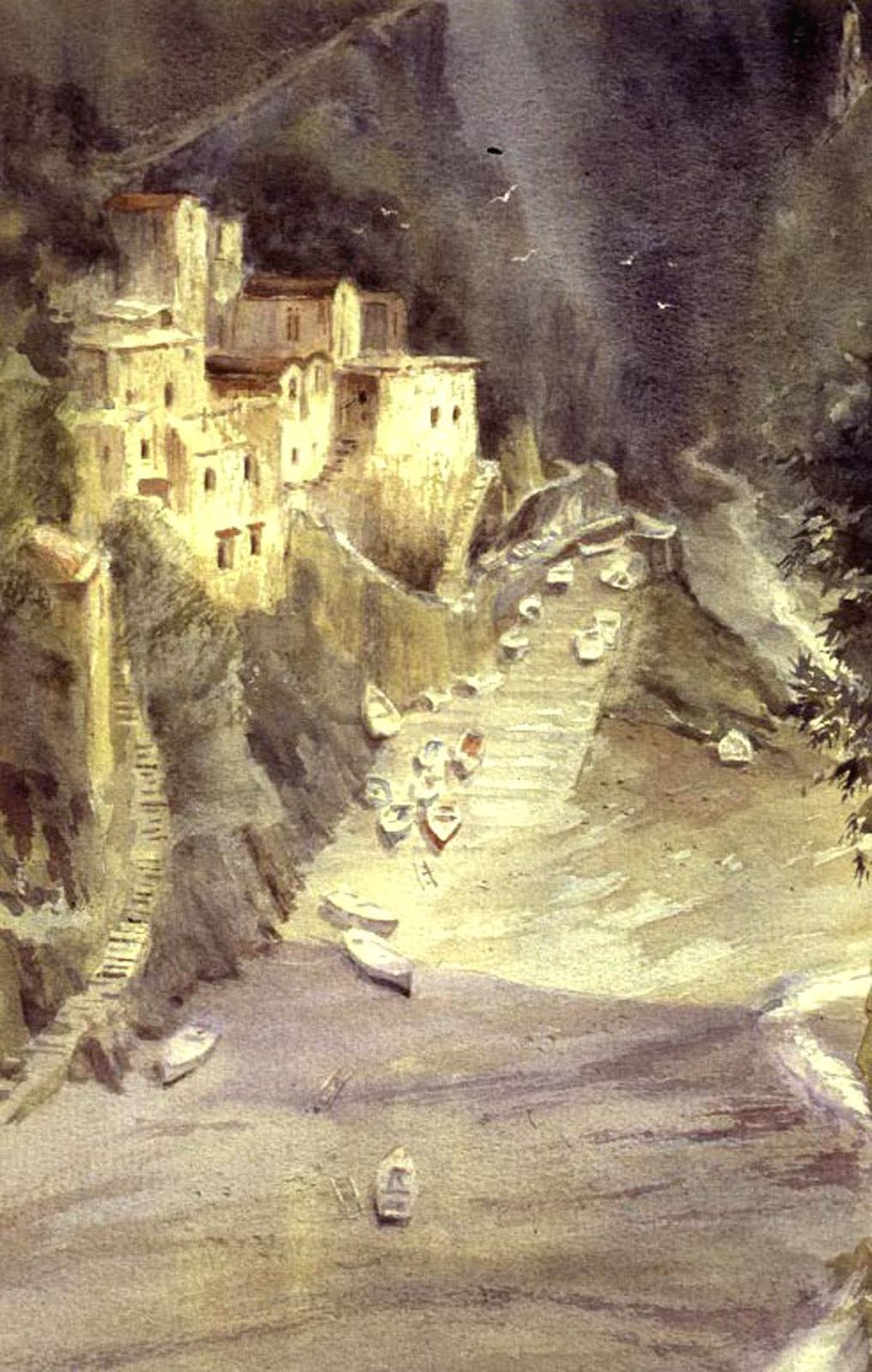


Roberto Zangarelli

I very much like the work of Roberto and this is a typical example. Three large shapes, the building to the left, the trees on the right and most important the tram at bottom front with it's yellow colour highlight. Look how he creates depth.


Diann Benoit

This is a typical Diann  painting from her Monday night class painted from a live model, bold and colourful.


That's it folks another batch of highly individual paintings which I hope has something for everyone, regardless of taste. My personal preferences  are towards  the looser end of the spectrum but I can - and do - admire other styles, even though I wouldn't want to emulate them even if i was capable of it. Each to h or her is own. What a wonderful and underrated medium watercolour is.


Monday 26 March 2018

My Paintings

Here are my most recent efforts.


30 x 40cm Cornwall 210lb/450gsm Rough -Spring Flowers

This was a recent subject at my AVA group. I used Cornwall rough paper which has a very pronounced pattern that not everyone will like. I don't normally use this paper but bought some a while back to try as Yvonne, the best artist in my group, had made complimentary remarks about it. It is slightly unusual as well in being a heavier weight than I normally use. I'm not sure what it is made of but isn't cotton, This is one of the large Hahnemuhle range. Colours used were Rowney Cobalt Magenta (PV14) for the flowers with some Perylene Maroon ( PR179 Rowney or Graham) for the darker areas, I masked the stamens with Pebeo Drawing Gum  using a ruling pen. The greens are Sap Green (Lukas PY153/PG7)), Green-Gold (Rowney PY129 ), Oxide of Chromium (Rowney PG17) and Perylene Green (Schmincke PBr31).  I also used some Lukas Cobalt Violet (PV14) but this is an extremely weak colour of a very pale greyish violet shade. Although I like Lukas generally I'm not impressed with this one. I like Lukas both for quality and price, but avoid this colour and earth shades, like Burnt Umber, where multi-pigment mixes are used.


Tropical Finch - 9 3/4 x 11 1/2. Not

This was a subject I did some while back at the AVA but after studying the colourful bird paintings of Gerard Hendriks I had a look at it and decided I would introduce more colour. Initially I Increased the darks on the head and under the beak and strengthened the red colour. I also added the blue, and a touch of Turquoise (Lukas PB16) plus Cerulean (Rownery PB35) on both sides of the bird. I then added more varied colour on the branch he was sitting on.

I've now collected some bird photographs and intend to paint some more. I need a break from my Indian portraits as I've torn up the last two.

Saturday 17 March 2018

Latest Efforts

These are my most recent paintings. I've also trashed a couple. My policy now is to destroy any that are going wrong and start again, not in every case as for example I started one of the Nez Perce chief Looking Glass. The drawing was fine but the painting turned out very dull so I trashed it. I may try again but not sure on this one as the guide photo is a very murky one with poor detail. Trying to interpret it proved beyond me.

I pick photos that appeal to me unless it is an AVA subject, in which case I (mostly) stick to the subject although we are allowed leeway in interpreting the subject. Some subjects are more specific, others less so.


Hipah - Mohave Woman c 1900.
 One of Edward Curtis photographs, all are black and white.


Feeding Time.

I found this one on Pinterest. I like drawing and painting birds and  this little bird had made this amazing nest in an old hanging lamp, with the original glass missing.


Mainly Red. 

This was an AVA subject so I looked at red flowers. The one I found was of Dahlias, although the colours were brighter than the above, but I couldn't match them even though I have a lot of reds.  Possibly Vermilion would be more accurate but I don't have that one. The foliage was a very black-brown which also appealed with some subtle green also in the background. I used Perylene Green (Schmincke) a very blackish green, Lunar Black from Daniel Smith. and another darkish green. I also sprayed the background with a very fine mist of water and let the colours mix. Some Molotow masking fluid was used on the flower centres which are Burnt  Umber. The one  I used was Lukas which is a three pigment mix. Why I bought this one I 'm not sure as Burnt Umber is usually a single pigment and this Lukas version is a very dull Brown. I do like Lukas overall and at current prices they are a 'best buy' - not Burnt Umber though!


King of the Jungle 

The guide photo really appealed to me and this is the third study of a great ape I've done recently. This guy had a very pensive expression - staring into space. After I finished I kept looking at it and  finally realised the eyes were too human-looking. I then added Transparent Orange (Schmincke PO71) and then a touch of Cadmium Red (PR108).


Young Amerindian Girl. 15" x 11"


Cree Chief Big Bear in captivity after the Riel rebellion in 1885 in Canada. The Metis people, mixed race French speaking, rebelled together with some Cree and Assiniboine indians. Louis Riel, the leader, was tried for treason and hanged, leading to deep resentment by the French-speaking population that continues to this day


All the above are approximately 16" x 12", except for Hipah and the young  girl who are  11" x 15" Khadi.

New Watercolour Papers from Jacksons

Some interesting new watercolour papers have recently been offered by Jacksons. Two of those below have been available for a while.  I've not tried them but my interest has recently been aroused.  As I paint mainly on blocks those below are in this category but you can get sheets or pads of some.

The above is a paper new to me called 'Stonehenge'. I first heard of it when reading that it was now Bev Jozwiaks favourite paper, the hot press. It is available in a variety of sizes and surfaces including cold pressed (not). In my favourite size of 12" x 16" the cost for 15 sheets is £25. Comprehensive information is on the Jacksons website.


This is the Strathmore 400 series . Strathmore is an American brand very popular over there. A variety of pads are offered, called "Field' spiral, "Softcover" art journal plus a glued pad. Sizes vary. They don't appear to do a 16" x 12" with an 18" x 12" the closest to this size. The blurb states 'wood free, acid free but nothing about it being 100% cotton so I assume it isn't. They do a series 500 in an imperial sheet which is described as 100% cotton for £7 - quite pricy.

This one - Yupo - has been available for a while and is a controversial paper as it is unlike any other. The surface is white, smooth like glass and hence doesn't absorb the paint which you can move around. Some artists appear sold on it and it would seem it is selling well judging by the range of weights and sizes being offered. The reason I say controversial is that a painting friend described it as an 'abomination'. However that fine artist Stan Miller recently tried it and was quite impressed as it enabled him to loosen up and get effects not available on normal papers. Funnily enough I was looking through some old 2014 copies of the American mag Watercolour Artist and lo and behold a small trial sheet of Yupo was included!  Jacksons offer an 11" x 14" gummed pad of 10 sheets at prices that range from £18.40p for the 200gsm to £33,.0p for the 390gsm. See details on the website. Interestingly enough the SAA (Society of All Artists) in their comprehensive 170 page materials catalogue (Society?) have an 85gsm version in loose sheets A2, A3 and A4 as well as 25  sheet pads in A3 and A4. With the lighter weight the prices are cheaper sheet for sheet. The 25 sheet A3 pad is £22.25p. You are supposed to be a member to get these prices and I can as my AVA group has an associated membership as well as public liability insurance with them. Some prices are listed as 'members only' but many others would seem to be on offer to non members.

This is a new range called 'Fluid Easy'. It is said to be manufactured in a European mill that dates from 1618 and blocks are glued on two edges. Cold pressed and hot pressed are available in my favourite size of 16" x 12,  15 sheets costing £19.00p. The smallest size is 6' x 8'. There seems to be quite a range offered by Jacksons of this new 'Fluid Easy'.

I have not tried any of the above yet. The ones that interest me most are Stonehenge and Fluid Easy but the proof of the pudding is in the eating. If you are interested look them up on Jacksons where there are many more details than I have given above.

Looking at prices  Stonehenge is more expensive (per sheet) than my current favourite Waterford High White, while Fluid Easy is slightly less. 

Sunday 11 March 2018

INDEX

I have just updated the Index. To access it you have to scroll down to JULY 2014. I know this is a bit of a bind but I'm not clever enough to make access any easier, although there have been attempts to help me. If there is an easy way to make it more accessible I'd be delighted to hear.

There is some good stuff in the back posts, including contributions from John Softly.

Saturday 10 March 2018

ShinHan Watercolours ?

The feature I did on Korean Watercolours,  although a while ago, still seems to be regularly scanned. Recently someone posted on it saying, in effect, that I was misleading people. This gentlemans argument -  with the moniker of pbasswil, at least it wasn't 'anonymous' -  seemed to be that ShinHan offered three ranges and only one was actually considered 'artists watercolours', even though all three are described as 'watercolors' by ShinHan. Who is misleading who?  The other two weren't even watercolours I was told.  His final bit was 'Don't muddy the assessment  by calling them ShinHan 'watercolours' , just call the pro line 'PWC', ignore the lesser ranges, and no one will get confused.' I must confess my hackles rise slightly when I get this sort of post as all the confusion is due to the way ShinHan have marketed them. Read the post on the piece as I don't want to quote it in full. He did say ShinHan were partly to blame in the way that they were marketing these products, but said the one I  reviewed was actually the wrong one even though called 'Professional' watercolours.


Premium - what does this mean?


Is this the same as the above?


What are these?


PWC Extra Fine Artists Water Color - this I believe is the top range although I can only count 70 colours here.

This is the range in order of priority from the ShinHan Website.

1. PWC Extra Fine Water Color. 84 colours. Jacksons Watercolour catalogue says 72 listing each one and including pigment information.

2. Professional Water Color. 30 colours.

3. Shami Water Color.  24 colours.

They use the American spelling of color by the way.

Being somewhat bemused by the critical post in effect saying I had reviewed one of the others. I contacted Jacksons sending them a copy and asking if they could clarify which ones they actually sold. A few days later this is the reply from Julie Caves at Jacksons:

I can confirm we previously stocked the ShinHan Special Watercolour SWC and a few years ago switched to the ShinHan Premium Extra Fine Watercolour PWC. A few colours that sell the most slowly are still in the SWC, as they sell out we are replacing them with the PWC and eventually all colours will be in the PWC. Our website says which is which. Because of your e mail we are adding the words Extra Fine to the product name to clarify it. If it has been a while since you tried the ShinHan you might want to try it again now that we are stocking the highest grade.

When first launched I did buy one colour and a painting friend another. I did say at the time that this was  a very small sample but they were awful. At least two painting friends from my art group subsequently bought the 32 piece box offered by Jacksons and are quite happy with them. Seeing the paintings produced they do seem rather opaque, to my eyes at least. They are  cheap compared to the leading makes. I think they have the PWC type.

Looking at the PWC as currently offered I make the following observations. There are a number of fugitive paints, PR83 Alazarin Crimson is used in four paints and I think at least two dyes, Bright Violet BV11, and Opera BR1. These are fugitive. White is added to 15 paints, something I'm not keen on at all as it makes the paint cloudy and opaque, while my experience with other paints with white in them is that they solidify in the tube after a while. I know people say cut the tubes open and treat them like pans. My answer is why should you have to do that? This can mess your brushes up.

Some of the pigments used are not featured or are uncommon in the top ranges of other makes for example PY1, PG8, PY183, PY83, PY81 and PY74 to name just six. They may be fine I just don't know. I looked some up on the Pigment database (The Color of Pigment Database) but while listed this resource does not rate the pigments.

In summary I think my original descriptions don't seem to differ much from the above. I'm still not inclined to buy them but, if you discount the fugitive and white-loaded paints, there are still quite a number with good single pigments. My advice, for what it is worth, is stick to single pigment paints avoiding the fugitive ones and in general multi-pigment mixes. They are  inexpensive compared to leading makes but do seem rather opaque so transparency may be an issue. You can only find out by trying them. 


Thursday 1 March 2018

Watercolour Paintings 40

Here are Februaries batch, another bumper one with a wide range of subjects and techniques. Like everyone else I prefer some more than others, but that reflects individual tastes and hopefully there is something for everyone. 


Ben Gassenbauer


Cemal Selimgil


Jansen Chow


Rukiye Garip


Yuko Nagayama

The fabulous Japanese artist. Her paintings are almost surreal.


Coral Colmenaras

Amazing detail for a watercolour


TC Orhan Guler


Jem Bowden
Very similar in style to Edward Wesson


Natasha Kolvalchuk


Charles Reid. A Typical figure painting


Nicki Keith Saunders


Trevor Waugh

I did three workshops with Trevor in my early watercolour years. A very professional teacher.


Rajeesh K Karimbanakal's


Gerard Hendriks
Gerard never ceases to surprise with his wide subject matter


Burhan Ozer -I think this is one of his. A fabulous artist.


Kees van Aalst

Author of 'Realistic Abstracts'.


Bev Jozwiak

Love her jackdaws of which there are many.  Her favourite colour is Winsor & Newtons Manganese Blue Hue which is one of the phalo PB15's. She says she tries to use in in every painting. You can see it above.


Stephie Butler

Great Portrait artist and much else


Robert Wade

The great Australian watercolour painter


Another from Stephie Butler


Another from Gerard Hendriks


Bev Jozwiak


Robert Zangarelli


Lorenzo Santini

I really like this one. It's quite different.


Thats it folks. I've indulged myself a little with several from my favourite artists - I have many more as there are so many wonderful artists out there. Having said that some  of the above - quite a few - are new to me.