Friday 29 April 2011

The April Challenge

This months competition between Mick Carney www.thepaintingstruggle.blogspot.com/ was my choice. Mick posted his painting yesterday.

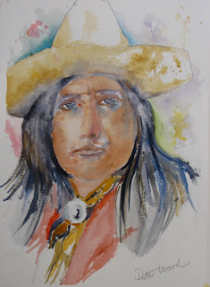
Ostoho Apache Cowboy Early 1900's

This is one of many striking photographs I have from (mainly) the first people site. They are the work of Edward Curtis a famous, and controversial photographer who recorded thousands of images of early ethnic aboriginal Americans. There is a possibility I got this one from another source I'm not quite certain so I thought I'd better say that. I know nothing more about this individual but it seems obvious he is from a later period when the Apache wars were becoming a distant memory.

Ostoho- Saunders Waterford A3 Rough

What were the problems with this one? To begin with, as always with these Indian subjects, the original is in black and white and very starkly contrasted. The features stand out but there are large dark areas, with no detail on both the left and right of the face and under the brim of the hat. What to do? I'm sure the lack of detail and very strong contrast is a feature of early photography so why follow this faultline and overemphasize the darks? The hat itself is obviously quite light which you can see quite clearly so by the same token the underside of the brim, although in shadow, must be similar.

My approach is based on the teachings of Charles Reid who I try to emulate. I first did a loose but reasonably accurate (hopefully) drawing then painted the features beginning, as always, with the eyes, nose and mouth. I don't aim for a superealistic result because I don't want to achieve that even if I were capable of doing so. Colours were my usual Cadmium Red Light, Yellow Ochre (for darker features) and various blues, Cerulean, Cobalt and even Ultramarine. I used Burnt Sienna instead of the Red to darken the features and remove any trace of pink (hi Hap). If you study photos of Apaches they do look to have quite dark features as do many other Amerindians. Brushes were my usual Isabey retractable No.6 for the eyes, nose and mouth, with Rosemary or Da Vinci Kolinsky No.6 and either da Vinci Artissimo 44 Size 2 or Rosemary Series 33 No 9 Kolinsky for the remainder. The hat was Raw Sienna and/or Yellow Ochre with mainly a mix of Ultramarine Blue and Burnt Sienna, mixed on the paper for the hair, and I think some Raw Umber in there somewhere. The colours in his shirt and ornament comprise Gold Ochre (W & N PY42), Cadmium Red Pale (Rowney PR108) with touches of Permanent Carmine (W & N PR N/A). I think thats pretty much it.

How do I view this painting? Overall I am quite pleased with it although I was concerned that in my efforts to get the correct skin colours, and handling the very dark areas, I was in danger of `dirtying'  the final result. I tried to correct this with some sponging off paint. My other concern is that I made the eyes slightly too large. This is always a problem with eyes. Are they too small or too large? Generally the tendency is to make them too large. What do you think? It's Micks turn for the May challenge. I wonder what he has in store this time?



Monday 25 April 2011

Latest Portrait

As a change from my Amerindians I was taken by an illustration in one of the weekend colour magazines.


This is the young lady concerned. Her name is Nadja Benaissa of the German pop group  No Angels. Judging by the story which the photograph illustrated she certainly isn't.I'll say no more about the content of the article.


I first did the drawing which was basically accurate but not overdrawn. Then the features followed by the hair.

 The completed painting. Fontenay 16" x 12" Not.


Slightly modified final version. Can you spot the differences?

I can see one or two mistakes in my painting but generally the likeness has been captured reasonably well. I rather like the earlier  stage before I put in the darker shading on the left hand side of the face. Face colours were my usual Cadmium Red Light, Cadmium Yellow Light and Cerulean to darken. The hair initially was a mix of Indigo (Maimeri PB27 and Pbk7) and Cyan Blue green shade (Maimeri PB15-3). A day later I added French Ultramarine using one of the (correction) tecniques Charles Reid taught me, which was to dampen the hair with clear water first and then paint into it with the Ultramarine. The dark of the dress is a mix of Burnt Sienna and French Ultramarine. It isn't great but certainly much better than I would have done a year or so ago.

I have actually completed another portrait of the Apache cowboy who is the subject of the April challenge with Mick Carney www.thepaintingstruggle.blogspot.com/  I may do a second one because one aspect of the painting - which I won't go into at this stage - causes me concern.


Wednesday 20 April 2011

More on Viktoria Prischedko

Viktoria demonstrating

The interest in this artist has been considerable, one of the most popular posts recently, and I determined to find out a little more about her tecnique.


I've confirmed she uses Hahnemuhle 600gsm (300lb) rough paper which she lies loose on a plywood board. After an initial sketch with a soft pencil both sides of the paper are wetted with a sponge. She immediately dabs with a paper towel the focal point, approximately one third to two thirds vertically and horizontally, and some other places that are important in it's composition. Once she starts painting she varies the tone between warm and cool to determine relationships. Mostly she paints wet in wet but keeps the paper towels handy to dry off where she wants to place details.


She uses a lot of pigment and a little water for the detail. Lemon Yellow is an important colour used to contrast with dark colours in the background. Apparently her people are always Lemon Yellow + Orange with some Ultramarine. Paints are `Russian' (St Petersburg?) and Scminke. This is logical as she is originally from the old Soviet Union (Moldavia) and currently lives in Germany. She uses 3 - 4 colours up to a  maximum of 5 for each watercolour. Colours are Orange (Scminke), Ultramarine, Violet, LemonYellow, Green Gold.  I'm amazed at this with the riot of colour she creates. Looking at her paintings it is difficult to reconcile some of the above, at least on some of them. This additional information was obtained from a piece  on his website by a Dutch artist Dominiek Reynt Jens, who attended a course in 2009.


Nothing much to add on brushes which are described as `Da Vinci-type filbert sable in thickness and type 30/20/15/10 (broad brushes with fine tip) and a fine tug for details'. Quite what a `tug' is I'm unaware - could it be a rigger? Note Added: 01/05/11 .I looked up `tug' and eventually found someone selling them. They appear to be riggers.


Although virtually unknown outside the continent of Europe she is a very highly regarded and popular artist. Although her approach couldn't be more different than the path I am currently (trying) following I think she is a fabulous artist and should be better known outside her home turf. Do look at her website which is also for her husband ( I presume) Slawa. I am on the track of more great European artists and hope to feature others in the coming months.

Once again I make the proviso that I don't actually have permission to show the above paintings but as I am promoting the artist and have no commercial gain in mind hope this is okay. I will remove the material if asked to do so. Her website gallery is: www.prischedko.de/

Wednesday 6 April 2011

Gerda Mertens - A Way with Trees

Some years ago I was very interested in the English landscape artist Edward Wesson. Wesson was something of a cult figure with an enormous following and several books have been written about him and his paintings. One of the best known was by Ron Ranson and I remember Ron writing that `Ted', as he was commonly known to friends, had `a way with trees'. This lady also has `a way with trees'.

Recently I became aware of the artist Viktoria Prischedko and that led me, quite by chance, to Gerda Mertens.


Gerda Mertens - the lady on the left.

I'm not absolutely certain I've identified Gerda correctly but I think so. This is taken I believe at the Dum Pingo Vivo group that she runs in Balen, Holland, although when I say run it does appear to be a very co-operative organisation involving much discussion as well as painting. She runs numerous weekly courses in Holland and at least one in France.

Gerda graduated in 1980 as a secondary school teacher of Plastic Arts (what is that?) at the Sint-Maria Institute in Antwerp. Her education appears to have been comprehensive involving a 35 hr week and several different teachers, each a specialist in their particular field.  Still more education took place, both domestically and abroad, including a spell at the China Academy of Fine Arts, studying Chinese painting. 


She likes  a variety of subjects, buildings and landscapes predominating. She also favours painting plein air. What struck me most were her tree studies.


What do you think of that lot? I love them and already I'm pondering how I can incorporate this free and colourful approach into my landscapes.

What is her approach? Her drawing style is described (in her words) as  `a mixture of intuitive and analytical'. I'm not quite sure how I interpret that, perhaps someone can enlighten me. 

Gerda's preferred palette comprises 10 colours. Two yellows, two reds and two blues with cold and warm versions of each, making four of each type. That makes twelve by my calculation not ten and her signature colour is Burnt Sienna which she describes as `a must'.

Paper is either hand-made or machine made, and brushes a natural hair/synthetic  mix, both flat and round. No indication of what makes she uses nor, in the case of paints the specific colours. 


These are other examples of her style as applied to buildings. You have this slightly distorted effect, more obvious on some paintings than others. On Wetcanvas I posed the question about this rather different approach and a Danish member replied that this was a currently popular vogue in watercolour and there were many  Continental artists doing it. He gave a link to another artist called Voka www.voka.at  (Please note:There appears to be a problem with this link. When you click on it an `Oops this link appears to be broken' appears. Follow the suggestion it then gives to click on www.voka.at  and you should get there.   As with Viktoria Prischedko the approach seems to apply various degrees of realism with abstraction and even distortion. I like some of it and some I'm not so sure about. 

I confess I don't have permission to show the above paintings but as I have no commercial objectives, and am  highlighting the artist, hope this is acceptable. If advised otherwise I will delete them (and the post!). Her website which enlarges on the above is : www.gerdaaquarel.be/