Wednesday 30 July 2014

Sitting Bull Again

Sitting Bull is one of the major figures in the history of the conflict between the American Indians and the settlers/ American cavalry. All the photos I've seen show a hostile implacable demeanor - he never smiles - but then many Indians didn't - particularly in the early years, because they had a superstitious dread of so losing their soul. In numerous instances they were physically restrained and held while being photographed.

Sitting Bull - Arches Hot Press 16" x 12"

This is only the second painting I've done using hot press paper -  Arches. A partially used block was given  me by Jan Weeks of Avon Valley Artists some time ago. The effect is different but I rather like it so will try some more, although I don't buy Arches as it has become so expensive. 

As for the painting the likeness is not 100%, mainly due to the eyes not being quite right. In the guide photo his stare is riveting! I'm also resisting becoming too tight and used the Da Vinci Artissimo 44 No 2, roughly similar in size to a 14 round, although a different shape, as much as possible. The features were completed with the Isabey Size 6 retractable.

I made an initial pencil drawing with an 07 2B mechanical pencil without using any mechanical aids to get the proportions right. I don't think there any major errors. The guide photo used was on the ipad. I don't want an exact result as I'm not keen on photorealistic paintings of any sort.

The colours were mainly Cadmium Red mixed with Ultramarine Blue, in different mixes, plus some Cobalt Violet. The hair is Ultramarine and (mainly) Burnt Sienna/Burnt Umber, again in various dilutions. 


Wednesday 23 July 2014

INDEX

For some considerable time I have been aware that the lack of an index is a problem, especially as the blog is now nearly five years old. One lady did give me instructions how to do one but I'm afraid things simply did not work out so, not being a technical `geek'. I was afraid to proceed further as I was likely to fall off a cliff so gave up - at least temporarily. This attempt is not ideal but will have to do and I can point readers towards it from time to time, while updating will also take place. I have not listed everything. My own work has been excluded and also stuff that has dated too much. Anyway here goes. I hope it helps.

ARTISTS.

Viktoria & Slawa Prischedko - FEB 2011
Gerda Mertens - APRIL 2011
More on Viktoria Prischedko - APRIL 2011
Piet Lap - AUGUST 2011
Charles Reid at Crantock (9 posts) OCTOBER 2011
Charles Reid at Stow - MAY 2013 (7 POSTS)
Charles Reid - Watercolour Supply Lists. - JUNE 2013
Charles Reid - JULY 2014
John Palmer - DECEMBER 2011
Ann Blockley - JANUARY 2012
Fealing Lin - JUNE 2012
More on the Prischedkos - JULY 2012
Gerard Hendriks - JULY 2012
Evie by Gerard Hendriks -July 2012
Bev Jozwiak - OCTOBER 2012
Paul Weaver at Avon Valley Artists - NOVEMBER 2012
Bei-An-CAO - FEBRUARY 2013
Stan Miller - MAY 2013
Catherine Beale - December 2018
John Yardley - February 2019
Trevor Chamberlain - MARCH 2019
Edward Wesson - MAY 2019
Rowland Hilder - JUNE 2019
Charles Reid - 1937 - 2019 - JUNE  2019
Winslow Homer - SEPTEMBER 2019
Shirley Trevenna - AUGUST 2020
Memories of Charles Reid - October 2020

ACCESSORIES & PRODUCTS

The Swedish Walkstool - JANUARY 2010
Palettes Pt 1 - AUGUST 2010
Palettes Pt 2 - AUGUST 2010
Palettes Pt 3 - MARCH 2011
Palette Update - MARCH 2013
The Craig Young Experience - MARCH 2011
Easels and Stools - FEBRUARY 2010
Pebeo Drawing Gum - JULY 2013
New Insert for my Craig Young Palette - AUGUST 2013
Easels by John Softly - JUNE 2015
Easels Pt 2 by John Softly - JUNE 2015
Easels Pt 3 by John Softly - JUNE 2015
Cornwall Watercolour Paper - APRIL 2016
Watercolour Papers - AUGUST 2016
Khadi Watercolour Paper - MAY 2017
Molotow Masking Fluid  Pens - JANUARY  2018
Pebeo Masking Fluid Pens - FEBRUARY 2018
New Product Nitram Liquid Charcoal - JUNE 2019
Product Test: Nitram Liquid Charcoal - APRIL 2020
My Favourite Watercolour papers - MARCH 2020
Jacksons Reven Brushes - Series 528 - September 2020


BOOK REVIEWS

Watercolour Solutions - Charles Reid - MARCH 2010
Portrait Painting  in Watercolour - Charles Reid - MARCH 2010
Realistic Abstracts - Kees Van Aalst - MAY 2011
Atmospheric Watercolours - Jean Haines - JULY 2012
Two Books on Watercolour Techniques - JULY 2012
Watercolour Secrets - Charles Reid -  SEPTEMBER 2012
Transparent Watercolours by William Condit - NOVEMBER 2012
Experimental Landscapes in Watercolour - Ann Blockley - JUNE 2014
Color Mixing Recipes - William F. Powell - NOVEMBER 2014
Sketchbook - Charles Reid - APRIL 2015
Be Invigorated (Charles Reid Sketchbook) - APRIL 2015
Painting in Venice - Judi Whitton -October 2015
Keys to Drawing - Bert Dodson - MAY 2016
Ann Blockleys Watercolour Workshop - APRIL 2018
Hawthorn on Painting  - AUGUST 2019


BRUSHES

Luxartis & Brush sizes - OCTOBER 2010
Watercolour Brushes Pt 1 - Synthetics - SEPTEMBER 2012
Watercolour Brushes Pt 2 - Sables - FEBRUARY 2014
Watercolour Brushes Pt 3 - Mops - MAY 2014
ROSEMARY & CO - April 2018

DVDs

Watercolour Landscape Masterclass - Charles Reid - JANUARY 2010
Charles Reid 10 Lesson Course - Charles Reid - SEPTEMBER 2010
Figurative Watercolours - Charles Reid - MARCH 2012
Animals in Watercolour - Gerard Hendriks - JUNE 2016

PAINT MANUFACTURERS

Graham Watercolours - DECEMBER 2009
Daniel Smith Watercolours - OCTOBER 2010
More on Daniel Smith Watercolours - OCTOBER 2010
Daniel Smith Pts 1/2/3 - MARCH 2012
Daniel Smith Lunar Colours - JUNE 2012
Daniel Smith `Special' Pigments - OCTOBER 2013
Lukas - JANUARY 2013
Korean watercolour Paints - JUNE 2013
Sennelier Watercolours - JULY 2013
Mijello Watercolours - AUGUST 2013
New Colours for Daniel Smith - OCTOBER 2013
Ken Bromley Watercolours - OCTOBER 2013
New Watercolours from Winsor & Newton - APRIL 2014
Daler Rowney - JUNE 2014
Schmincke Watercolour Paints - JULY 2013
Graham Watercolours - SEPTEMBER 2014
QoR Watercolours - OCTOBER 2014
Maimeri Watercolours - NOVEMBER 2014
Turner watercolours - NOVEMBER 2015
Another Limited Edition from Winsor & Newton - JANUARY 2016
Holbein Watercolours -AUGUST 2016
Blockx Watercolours - DECEMBER 2016
Rembrandt Watercolours - NOVEMBER 2016
New Scnmincke Watercolours - FEBRUARY 2017
New Watercolours from Daniel Smith - JANUARY 2017
A Brief look at Schminckes New Paints (Pigments) - MARCH 2017
Watercolour Dot Cards - Schmincke &  More - FEBRUARY 2018
ShinHan Watercolours? - MARCH 2018
New & Revised range Van Gogh Watercolours - DECEMBER 2018
More Information on New Van Gogh Watercolours - DECEMBER 2018
New Maimeri Watercolours - January 2019
W & N Cadmium 'Free' Watercolours - March 2019
New Rembrandt Watercolours - AUGUST 2019
Van Gogh Watercolours - JULY 2019
St Petersburg White Knights Watercolours - OCTOBER 2019
SAA Watercolours - OCTOBER 2019
Jacksons Watercolours - APRIL 2020
Roman Szmal Aquarius Watercolours - NOVEMBER 2019
Trying Van Gogh New Watercolours - OCTOBER 2019
Greenleaf & Blueberry - January 2021


PAINTS (PIGMENTS)

Quinacridone Gold (PO49) - APRIL 2010
Top Forty Yellows - FEBRUARY 2011
Alizarin Crimson (PR83) - MAY 2011
Permanent Alizarin Crimson - MAY 2011
Quinacridone Gold (PO49) (2) - JULY 2011
Quinacridone Rose (PV19) - SEPTEMBER 2011
Quinacridone Violet (PV19) - SEPTEMBER 2011
Mineral Violet (PV16) - SEPTEMBER 2011
Cadmium Orange (PO20) - DECEMBER 2011
Green-Gold (PY129) - DECEMBER 2012
Indanthrene Blue (PB60) - JANUARY 2012
Translucent Orange (PO71) - JULY 2012
Quinacridone Purple (PV55) - SEPTEMBER 2012
PO48 & PO49 Quinacridones - FEBRUARY 2013
Turquoise (PB16) - MARCH 2013
Cobalt Violet (PV14) - APRIL 2013
A replacement for PY153 - AUGUST 2013
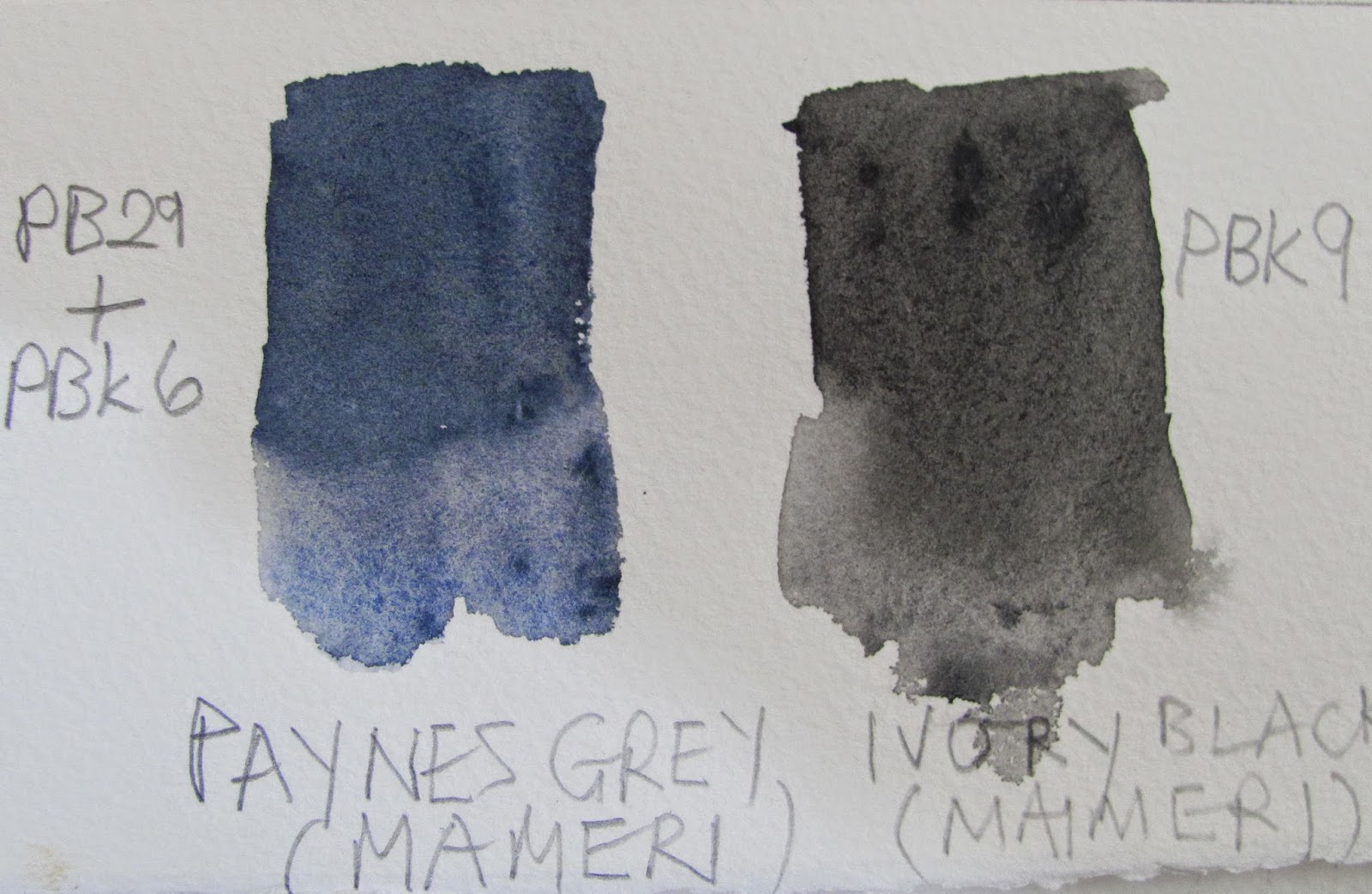
Paynes Grey - JULY 2014
Translucent Orange (PO71) & Translucent Brown (PBr41) -JANUARY 2013
Phalo Blue PB15:1 - 6 - AUGUST 2014
Quinacridone Maroon PR206 - AUGUST 2014
Watercolour Paints - MARCH 2010
Daniel Smith & Indian Yellow - FEBRUARY 2015
More on Pigments - FEBRUARY 2016
Ultramarine Blue - APRIL 2016
Schmincke's New Paints Pt 2. April 2017
Perylene Green and Perylene Violet Schmincke - July 2017
Mahogany Brown PBr33 Schmincke - September 2017
Beware the Hype! April - 2019
W & N Cadmium ''Free' Watercolours - March 2019
New Schminke Watercolours  - December 2020
Honeybee Pigments - December 2020
Pearlescent Watercolours - december 2020

FEATURED PAINTINGS

Paintings I like - JULY 2013
Complimentary Colours - SEPTEMBER 2012
Landscape Paintings I Like - SEPTEMBER 2013
Flower Paintings in Watercolour - SEPTEMBER 2013
Portraits in Watercolour - OCTOBER 2013
More Paintings (Mostly Buildings) - OCTOBER 2013
Animals in Watercolour - NOVEMBER 2013
Birds in Watercolour -DECEMBER 2013
More Paintings I like - MARCH 2013
Salon de Aquarelle de Belgique - FEBRUARY 2012
More Landscapes - AUGUST 2014
More Paintings - SEPTEMBER 2014
Birds in Watercolour (2) - SEPTEMBER 2014
More Paintings (2) - DECEMBER 2014
More Watercolour Paintings (3) - FEBRUARY 2015
Watercolour Paintings (4)
Twelve More - MAY 2015
Watercolour Paintings (5) - JUNE 2015
Watercolour Paintings (6|) - JULY 2015
Watercolour Paintings (7) - AUGUST 2015
Watercolour Paintings (8) - September 2015
Watercolour Paintings (9) - September 2015
Watercolour Paintings (10) - October 2015
Watercolour Paintings (11) - November 2015
Watercolour Paintings (12) - December 2015
Watercolour Paintings (14) - January 2016
Watercolour Paintings (15) -February 2016
Watercolour Paintings (16) - March 2016
Watercolour Paintings (17) - April 2016
Watercolour Paintings (18) -May 2016
Watercolour Paintings (19) - June 2016
Watercolour Paintings (20) - July 2016
Watercolour Paintings (21) - July 2016
Watercolour Paintings (22) - August 2016
Watercolour Paintings (23) - September 2016
Watercolour Paintings (24) -November 2016
Watercolour Paintings (25 - December 2016
Watercolour Paintings (26)- January 2017
Watercolour Paintings (27) - February 2017
Watercolour Paintings (28) - March 2017
Watercolour Paintings (29) - April 2017
Watercolour Paintings (30) - May 2017
Watercolour Paintings (31) - June 2017
Watercolour Paintings (32) - July 2017
Watercolour Paintings (33) - August 2017
Watercolour Paintings (34) - September 2017
Watercolour Paintings (35) - October 2017
Watercolour Paintings  (36) - November 2017
Watercolour Paintings (37) - December 2017
Watercolour Paintings (38) - January 2018
Watercolour Paintings (39) - February 2018
Watercolour Paintings (40) - March 2018
Watercolour Paintings (41) -April 2018
Watercolour Paintings (42) - May 2018
Watercolour Paintings (43) - June 2018
Watercolour Paintings (44) - July 2018
Watercolour Paintings(45) - August 2018
Watercolour Paintings, 46, 47, 48,49 September to December 2018

OTHER ASSOCIATED TOPICS

Reflections on Two Painting Courses - DECEMBER 2009
Moldau watercolour Paper - DECEMBER 2009
Artists or Student Quality? - JANUARY 2010
Drawing - JULY 2013
Jacksons Eco Handmade Paper - MAY 2010
On Watercolour Paper - JUNE 2010
Latest Acquisitions - JUNE 2010
Thoughts on Painting Courses- JANUARY 2011
Greens - AUGUST 2011
More on Greens - SEPTEMBER 2011
Fugitive Paints ? - NOVEMBER 2011
Texture & More - DECEMBER 2012
Ten Drawings by Leonardo da Vinci - JUNE 2012
Problem Colours or Pigments? - OCTOBER 2012
Watercolour Painting on a Budget Pt 1 Paints - APRIL 2013
New Palette - JANUARY 2014
Watercolour Painting on a Budget - JUNE 2011
This and That - NOVEMBER 2013
The Price of Watercolour Paints - JANUARY 2016
Watercolour Papers -AUGUST  2016
Watercolour Painting on a Budget Update Paints. - May 2017
Watercolour Dot Cards - OCTOBER 2018
Watercolour Painting on a Budget Pt 1  AUGUST 2018
Watercolour Painting on a Budget Pt 2 Brushes  SEPTEMBER 2018
New Products - AUGUST 2018
Watercolour Magazines - AUGUST 2018
Too Much Detail or Too Little? - JUNE 2018
Watercolour Artist - MAY 2018
Beware the Hype! - April 2019
The Mystery of Schut Watercolour Paper - JANUARY 2020
The Pure Watercolour Society Exhibition - NOVEMBER 2019

Tuesday 15 July 2014

Charles Reid

I'm not exactly certain when I first became aware of Charles Reid. I believe it may have been an article in `The Artist' magazine in association with his latest book. Initially I had mixed feelings about his style as it was so different to most others, and his methods and teachings went against much of the existing orthodoxy.  Despite these misgivings - I had in the meantime bought `Painting  Flowers in Watercolour ( First published 2001 with two DVD's) - I gradually became more and more intrigued and about this time came into contact with Craig Young, from whom I bought a palette. At that time Craig was organizing Charles UK workshops and he told me that all Charles various techniques were explained in the flower book. His approach to all subjects is the same.

One thing led to another - including the acquisition of more of his books and DVD's - and I started my Charles Reid journey. In 2006 I heard that his next UK workshop would be at Burford in Oxfordshire close to where my sister lives. Although the workshop was residential I asked if I could exclude the hotel costs as I could stay with my sister. Jane Duke, who by this time was organizing the workshops, agreed  but suggested that I would miss an important element by doing so. I was persuaded and she was absolutely right in that meeting and being with the other students outside the working part was very beneficial. These workshops are restricted to less than 20 and, while expensive, demand is very high. If you don't apply as soon as announced you may well miss out.

The hotel in Burford was very nice - it had originally been the Lord of the Manor's residence in distant times - situated just off the high street. Burford is a typically Cotswold village, quite small but a major tourist attraction. We arrived on the Sunday evening and met Charles and Judy at dinner. The students, who included some professional artists, came from far and wide, including France, America and New Zealand.

On Monday morning the workshop began. Charles basic approach when indoors is to do a demonstration utilising models if a portrait, and still lifes with flowers. Actually he painted the portrait in the garden of the hotel having persuaded a young member of staff to be the model. This was my first Charles Reid demonstration of the roughly 30 I have subsequently seen. 


First Burford Demo - this young man worked at the hotel.


This first workshop was a tough experience. Charles commented at one stage about the high quality of the students work, as good if not better than on any previous ones. I don't think he was just saying this as none of my subsequent workshops have been quite such high quality. Many painted quite large, the half sheet being the norm. Here I first met Gilles Durand a top French artist. Frankly I was out of my depth and struggled to hang on in there. I was certainly in the bottom two or three. Nevertheless I made it and came away determined to improve.


A typical Charles Reid figure painting.


At that time I had no plans to do more - very expensive as I've mentioned - but later learned he was going to Catalonia in 2008 for Angel Barbi's EPC Art Courses. I immediately suggested to my wife she go as a non painting partner and contacted Angela Barbi - a  delightful lady with perfect English - who was very helpful. We had to arrange our own flights which was our first and only experience of the controversial Ryanair. You have to obey their rules but punctuality of the flights was better than most other airlines.


This was the first demo at Roses.

On arriving at Verona we were picked up by a private hire minibus with one other student - if I remember correctly she came from Canada.  This transported us to our hotel in Roses, right on the beach, where accommodation and  facilities were good. In particular meals were a substantial and varied buffet.


Charles does quite a few boat paintings but usually adds figures.

To my surprise and pleasure I discovered Judi Whitton was at the workshop, accompanied by her husband Pete. As Judi doesn't like to fly they had travelled leisurely by car, with stops on the way. I had previously and subsequently been on several of Judi's workshops. Also met for the first time was Don Glynn, another British professional artist and great character, who had been involved in organizing Angela's workshops in previous years. EPC have since expanded and run annual courses with many high profile artists. There were several Spanish artists on the workshop, some whose English was not so good so we had one of the others interpreting all the time!


This is an unusual one depicting American troops in the Korean war.


This workshop was a 10 day experience, four days, then a day off then four more days. More or less two workshops in one. At the end I told both Charles and Angela how good this format was but I don't believe it has been repeated. 

On this occasion we began with an outside demo, a beach scene incorporating a man selling tickets for something or other. There was an indoor session for portraits and visits to various places where Charles demonstrated then we painted.

Overall I didn't think the demos were the best I have seen from Charles but it was an excellent experience in that it worked as a holiday as well as a painting workshop. Overall the standard  of students varied from very good - Judi did several superb paintings - to average and I considered I was somewhere in the middle this time.


My next workshop was at Urchfont in Wiltshire comparatively close to where I live but residential. I had heard about previous workshops Charles held at Urchfont and it is certainly a favourite of his. He had previously got to know several of the locals and is fascinated by the history and stories they tell. What to say? He was certainly on form that week with several excellent demos. The first one was superb and I said to him that he was on form repeating this to Judy Reid. His demos do vary as the mood takes him and he doesn't paint to a fixed pattern. Unfortunately I cannot find photos of the demos he did.


Urchfont itself? Here I met the irrepressible Mick Carney and once again Gilles Durand. There were others there like Genevieve Buchanan and a few more from Burford. It is amazing how many workshops some have attended. Frequently they go on to the second week. Urchfont itself was a mixed bag. The house and grounds are owned by the council - it is not a hotel. Accommodation was spartan to say the least but the food was good and plentiful and also the studio facilities. By the end of the week my painting was showing signs of improvement and the last still life painting, now hanging in my `studio', was reasonable. Gilles Durand commented on it.


Three years ahead and it was Crantock Bay in Cornwall. As it happened Crantock closed at the end of the year so we were probably the last workshop held there. Judi Whitton was there the previous week and had been going for twenty years. My wife, as non-painting partner, and I had been to five of Judi's Crantock workshops previously and thoroughly enjoyed the experience. When I heard Charles would be at Crantock that was it. Once again the wife accompanied me and it was somewhat poignant when we heard it was closing.  See report October 2011.


Another demo.

We had a good week at Crantock, Mick Carney and some others I knew were  there, but not everyone liked the location 'it was too quiet' and the hotel not grand enough. The location on top of the cliffs, overlooking the sea and large bay to the right, is fantastic. Mick absolutely loved it and said he would return. I  have reported in great detail on this workshop in October 2011 so won't say any more.


Joseph Wolfskin - painted several times by Charles on American workshops.

And so 2 years on in 2013 my last and possibly final Charles Reid workshop. He may well come in 2015 when he will by 78 - my Australian friend Ray Maclachlan thinks he might be cutting out overseas trips next year - as on the last three he has filmed a DVD immediately afterwards. I haven't ruled out going entirely (should he come) but I'm unsure. I think mentally I've probably absorbed as much as my capabilities allow and while the social side is good - meeting interesting people from previous workshops - this isn't the main purpose of attending. 

This last workshop was at Stow-on-the Wold in the Cotswolds, a renowned beauty spot and major tourist area. This one wasn't residential so you had to make your own arrangements for accommodation, a list of places being given to each participant. I don't know the full ins and outs of the situation but Jane Duke, who was again the organizer, did indicate  that she had suffered considerable problems with insurance and other matters causing her sleepless nights, and I wondered if she might well want to opt out of further involvement.


In many ways this was my most disappointing workshop. I stayed at my sisters home, only 20 miles away, so it was less expensive. Many of the previous regulars were missing and some of the newcomers were of a mixed standard, one lady never having before painted in watercolour. I had gone hoping to really show my progress but was in the middle of a planned house move, which showed every sign of going wrong, and what with this involving calls to the estate agent I was thoroughly off key.  The last day partly restored things but overall a mixed week. I have written a detailed report on this workshop in May 2013 so will say no more.

A few more paintings to finish things off.


Another demo


Famous artists that Charles admires.


Joseph Wolfskin again.


To sum up a great experience with one of my favourite artists, meeting numerous interesting and nice people and I think I learned a lot. Naturally I can't paint like Charles but then who can? The workshops I've reported on contain far more detailed information, plus much else so if you are interested look them up. Apart from the detailed workshop reports on Crantock and Stow there are various other pieces concerning Charles Reid, reviews of books and DVD's primarily. I plan an Index of sorts soon so it is easier to navigate and find older posts.


Thursday 10 July 2014

Paynes Gray - Hero or Villain?

The title may be melodramatic but this paint is one of the most controversial there is, damned by some and praised - or at least used - by other artists. Grey is even spelt differently,  `grey' or `gray'!


Maimeri : Paynes Grey on left, Ivory Black on right.

That doyen of Australian artists, Robert Wade, had this to say " My present palette does not include......Paynes Gray (and when you mention that colour, say it in a hushed whisper!)". He also calls it a `dead' colour  (in the same piece he also damns Burnt Umber and Yellow Ochre!) . One of his reasons is that the colour dries several values lighter BUT whose Paynes Gray does he refer to since this is a convenience colour? I suspect Winsor & Newton  as he was using W & N at the time he wrote the book  `Robert Wades Watercolor Workshop Handbook'  (International Artist Publishing 2002).

We then go to Ron Ranson who mentioned the controversy in at least one of his many books saying that combined with some yellows Paynes Gray made some interesting greens and concluded by saying it was " a tremendously useful colour". Charles Reid, while not having Paynes Gray in his normal palette certainly used it on occasion, mainly for skies.

What does Handprint say? This from Bruce McEvoy : " The watercolourists four traditional shadow colors were Neutral Tint, Payne's Gray, Indigo (See the Indigo convenience mixtures) and Sepia (see the convenience mixtures under Pbr7)"

Pigment information for Winsor & Newton is PB15 (Blue), PBk6 ( Black) and PV19 (Quinacridone Rose or Red), in other words a blue, black and red combination. Daniel Smith, the flavour of the moment combine PB29 Ultramarine Blue, PBk9 Black and PY42  a yellow often featured in Yellow Ochre or Raw Sienna paints. Maimeri on the other hand combine PB29 Ultramarine Blue with PBk9 black. Holbein have four pigments in their version PR83, PB27, PB29 and Pbr7 - note a red, two blues and a black. Schminke offer two versions, Paynes Grey (PR101, PB29, Pbr7) and Paynes Grey bluish (PBk6, PB15:6), which they say was produced `by demand', and finally Daler Rowney who use PBk7 and PB29 - a black and a blue. These are the ones I've looked at but I'm sure you get the picture. What to do and do you really need this colour?

The swatch is from an old tube of Maimeri Payne's Grey I've had for years. It is still viable although I haven't used this colour in recent years. I hesitate to differ from someone as exalted as Robert Wade, a charming man as well as a superb artist, but in my limited experience it was useful for dark storm clouds. As for making greens I wouldn't know.

Do you need this colour? I'm inclined to say no as it is easy to mix an approximate `Payne's Gray' from a combination of Ultramarine Blue, Burnt Umber or Burnt Sienna. You might have to play around with the  proportions but you get there in the end.

Tuesday 1 July 2014

Sitting Bull

My latest Amerindian is another attempt at Sitting Bull, the famous Sioux leader and implacable foe of the white man. His opposition eventually got him killed while in captivity. He obviously didn't appreciate his photograph being taken, many Amerindians felt the same, mostly on superstitious grounds which is why he usually scowls. 

This is the sequence the painting took, purely to show how I did it, not claiming in any way that this is good or the way to proceed.


I now mainly use the ipad for references due to the high cost of printings photographs on the inkjet.


I made the drawing by drawing visually without using any mechanical measuring aids. This involved a certain amount of erasing and redrawing but (for me) that's normal. A mechanical pencil the Pentel O7 3B.


I began with the eyes then nose and mouth.


The above three photographs show the approximate sequence I followed.


Sitting Bull - 16" x 12" Waterford High White 140lb. (300gsm) not

As I am constantly criticized by my friend Hap, who knows many native Amerindians, about my skin colours not being dark enough I have altered my skin mix, although I'm not confident the above will meet with his approval. Instead of Cerulean I used Ultramarine Blue and cut down slightly on Cadmium Red.I also used some Translucent Brown (Schminke Pbr41). I played around with the combinations and when dry added some pure Cadmium red in diluted form. The hair was a mix of Ultramarine and Burnt Umber, with Ultramarine predominant. Brushes used were my usual Isabey sables including retractables.  

I am reasonably happy with the above result. His face has a `craggy' look so I used a little dry brush and added acrylic white for highlights when fully dry. Texture is difficult in watercolour, although books have been and are being written using clingfilm, gesso, scraping, scratching and heaven knows what else to achieve this. I'm not against any sort of aids but it is easy to overdo it and lose the vibrancy and freshness that is the main charm of watercolour.