Showing posts with label Bath College. Show all posts

Sunday, 29 March 2015

Weeks 8 & 9 Bath College Portrait Course

The final two weeks of this 9 week course were again painting our model Linda. 


Linda


This was my first effort  Week7  


Second effort Week 8 - 50cm x 65cm Canson 140lb (300gsm) not . I think I like this best of the three.


Early stages of `3rd attempt at `Linda'


Third and final painting 50cm x 65cm Canson 140lb not . This was slightly rushed with less time spent on it compared to the previous two.

In the first two instances I painted her at more or less the same, although not identically so, whereas for the final one I was moved around to the left so had a more sideways angle. With all three paintings I experimented with the skin colour as this was new to me never having done a black person before. The colours were mainly Ultramarine Blue, Burnt Umber, Transparent brown (Schminke PBr41), a little Cadmium Red and Cerulean Blue. I think that's it but I've probably missed something out - possibly Ultramarine Violet. I used my Isabey and Escoda Kolinsky travel brushes with the larger sizes like 14 predominant. The final two are the largest paintings I've ever done.  The boards holding the paper, held by strips of masking tape, were absolutely vertical. While I do paint fairly upright, usually not quite so much as this. I've tried to follow Charles Reids advice to be a little `crude' and to some extent went for it with the possibility that a disaster would ensue. This didn't happen although you may disagree. Certainly the number of `likes' on the Facebook group `Portraits & Figures (People) in Watercolour', which I started - almost 13000 members so far - are not particularly flattering, very low compared to many other paintings posted. I've had a better response on my personal Facebook page.

As you may imagine this was quite an experience. I felt I coped with it quite well and came away thinking I'd definitely learned something - not bad at my age! Prior to the course I was beginning to think my learning capacity had hit a brick wall. I'm considering taking a Life Painting course with the same tutor although the timing of it is a slight problem, being in the evening rather than morning..

Saturday, 28 February 2015

Bath Portrait Course Week 5

Due to illness I missed week four and last week was half term so I resumed after a two week break. The model was the same one as the initial two weeks, and we were allowed to do `our own thing' in terms of medium and/or whether to do a full length figure or a portrait. I opted to paint in watercolour with all the others working in charcoal. I should also add this painting is on fairly thin cartridge 
 rather than watercolour paper.


In reality the eyes, and eye sockets, were rather darker than appear here so I (over) emphasized them.


Here the eyes have been toned down slightly from the previous example.


This was as far as I got by the end of the session. I don't intend to do any more although Jackie said it would be improved by darkening the clothing areas - just indicated.

Overall I was fairly pleased with the session. Next week is similar and I will probably bring watercolour paper and possibly experiment further. I have been reading the article by Aine Divine in the latest issue of `The Artist' (April 2015). She featured in Sky Arts Portrait Artist of the Year in 2014 and was a finalist, although she didn't win, not surprising as the standard was amazing and other mediums predominated. I like most - not all - of what she does but her technique is completely different to Charles Reid, who is my guru, and I'm not really prepared at this late stage to completely change the way I do things. For example she uses large flats, including cheap brushes and paints on 535gsm Bockingford Not. She uses many colours with Ultramarine Blue predominant with Alizarin Crimson, Cadmium Red, Cadmium Orange and two greens amongst others with lots of layering. 


Friday, 6 February 2015

Bath Portrait Course Week 3

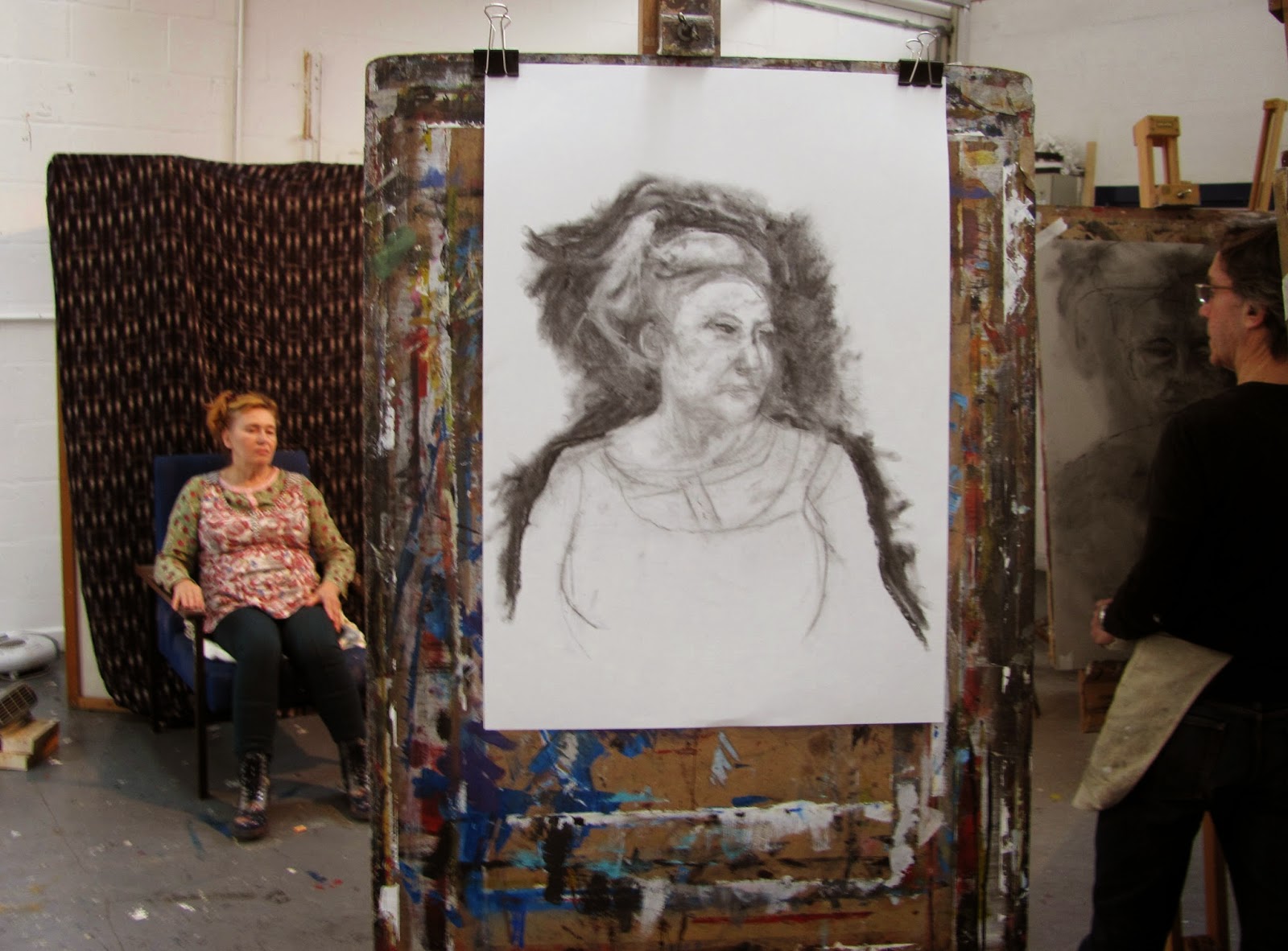
This week the medium was charcoal and we had a new model. The idea was you crushed a piece of charcoal into powder and initially worked the portrait with your fingers. Then add detail with small  pieces of charcoal of various shapes, sharp, blunt etc, depending on what was needed. The putty rubber also came into play erasing and creating whites.


 A2 Sketching paper

During the session Jackie quietly drifted around - you suddenly find her at your elbow - pointing out errors and suggesting ways of improving things. This is very effective and not at all negative. 

This was quite an enjoyable exercise, although I wouldn't do it by choice! Charcoal is very messy but also expressive. The idea once again is to avoid `tightness' and repetition in your drawing/painting with Jackie again stressing there is no one way of drawing. To illustrate this she had a book of Matisses drawings which clearly showed him drawing in many different ways, as well as examples of her own very good work.

Next week we are using pastels, something new to me.

Sunday, 1 February 2015

Bath Portrait Drawing/Painting - 2nd Week


 This was the second week of the course and was more demanding. Jackie spoke to us first regarding what she wanted us to do, the overall purpose being to  adopt a more relaxed, more impressionistic and less formulaic approach, something many artists slip into - their comfort zone. The session was broken into four distinct parts using different drawing mediums, fine liners, graphite sticks, charcoal and drawing ink. We were told we shouldn't take more than ten minutes or so for each study but invariably they took longer.


Fine liner sketch on A2


This drawing was with a graphite stick and one of the things we were required to do was move to another easel - two places - after each session so the angle of the model was different. From this you can see I got the front profile of the features wrong and had to the redo them but was unable to erase the earlier marks.


Ocado Drawing ink applied with a sharp stick, one end chisel edged the other pointed. I rather enjoyed this even though it created a `black' result.


UGHH!!!

Sight unseen drawings. I was reluctant to put the above two drawings on here but warts and all! This was actually the third task and we had to place our body and head slightly in front of the paper and easel. We weren't allowed to look at the paper and were asked to draw a continuous line!  In effect your head was slightly ahead of the easel with your drawing arm hooked round onto the paper, while all the time looking at the model.. Jackie showed us several examples of where she had made drawings using this method and they were universally excellent even if each somewhat different. I found this very difficult as the above examples show. I wouldn't say most of the other (9 this week) were a lot better, although some were. Where comments were made about mine Picasso was mentioned but I fail to see that connection - rather just a mess.

As mentioned earlier we were supposed to take not much more than ten minutes on each but they still filled a two and a half hour session, even with a thirty minute break!  I think it fair to say that everyone on the course is enjoying it. I did this course two or so years ago and it has moved on to some degree.

Wednesday, 7 March 2012

Bath College Portrait Course Week 8 - 6 March 2012

This week the subject was again Sarah wearing her hat.


This is the angle from where I sat, roughly ten feet away. This was the closest  practical distance, bearing in mind the need to avoid blocking out others. One problem arose, in the first hour session, in that the Sun shone through a window into my eyes.  This wasn't such a problem in the second session as it had moved. Nevertheless I ploughed on, first studying the subject in detail before committing pencil to paper. I tried to measure up accurately using a pencil with arm rigidly held straight out. This isn't easy and proved difficult partly due to the distance from the model. I have been consulting  Bert Dodson's book `Keys To Drawing' (North Light 1985, paperback edition 1990). Charles Reid considers this the best book on drawing, a large claim considering the dozens available.  Having a selection of these books, many of which are valuable, I am inclined to agree in that it is far, far easier to digest in practical terms. It has a very good section on taking proportions. It is still available at a reasonable price from online booksellers like Amazon.  

The Drawing with painting begun on the features.


 Sarah - Schut Noblesse 40 x 50cm (15.75" x 19.75")  300gsm (140lb) Not 

Faults notwithstanding this is a much better effort than my painting of a few weeks ago. I have altered the proportions of hat to face compared to the photo. My wife thinks I have made her look a little sad which is probably true looking at the photo. I am reasonably happy  while constantly striving to do better.

Colours for the face and features were Cadmium Red Light or Pale, Cadmium Yellow Light, plus Cerulean Blue to darken, Lamp Black for the upper eyelids and pupil, Cobalt Blue for the Iris. The hat is white overall but much darker in shadow under the brim where I used diluted Cerulean and very light greys by adding Burnt Sienna to the Cerulean. The hair is mainly Raw Umber with some Gold Ochre and Burnt Umber. The reds are Quinacridone Rose (Graham PV19) and Permanent Carmine (W & N PR N/A). The green is Viridian (Rowney). Ultramarine Violet (Rowney PV15) was added to the background colours of Raw Sienna/Raw Umber and Cerulean.

Brushes were the Isabey Size 6 Retractable for the features with the Da Vinci Maestro Size 6 and Artissimo 44 Size 2 for the rest.

I am now into the final two weeks when we are having a new model. Jackie says we can do whatever we wish, paint, draw, use whatever medium. I may do a large drawing next week then another watercolour in the final session. I have decided not to take the follow up five weeks. I am very happy with how the course has progressed but basically now need a break.

Wednesday, 29 February 2012

Bath Portrait Course Week 7 of 10 - 27 February 2011

This week was an eye opener. Jackie asked us to use ordinary brown paper, the sort parcels are wrapped in, so I bought a large sheet from the college shop for the princely sum of 20p. The model was again John. 

 John

Actually we were asked (told!) to do a full size drawing including legs and torso. Then the catch. We were asked (told!) to use a green stick about 20" long - slightly larger in diameter than a pencil - of the type sold at garden centres as small plant stakes. Attached to one end by masking tape was a piece of willow charcoal.  Apparently this is something the old masters did, use very long paint brushes for very large paintings and we were shown some photographs illustrating this tecnique. Some appeared to be wall paintings. You have to hold the stick at the very end, not being allowed to cheat, and having your arm outstretched. 


John - Brown Parcel Paper 29" x 44"

As you can see this is huge and it was a daunting experience, wondering where to start and how to proceed. I did not enjoy the first session much but by the second one was coming to terms with it and  was fairly satisfied - with reservations - about the result. I've made him rather fatter than he actually is and  as you can see couldn't get his legs in because I didn't initially set the midpoint correctly. Better to run off the sheet than try and cram him in which I noticed a couple of others did with the usual results. Apart from slight use of red and white crayons on his head I stuck with this long pole throughout. 

What is this to do with a watercolour blog? Drawing is the basis of all painting and I certainly wish I had given more attention to it when I first started. The apparent reason for the procedure just described is to encourage `looseness'. Next week we have Sarah back with the hat and I'm hoping to paint a `Charles Reid' type of watercolour of her.

I shall be returning to other subjects in the next few weeks, several are in draft form, so don't think I'm becoming too portrait oriented.

Wednesday, 22 February 2012

Bath Portrait Painting Course Week 6 of 10 - Tuesday 21 February

After a weeks break for half term we resumed yesterday. The subject was again Sarah, this time wearing a hat and different clothes. She was  in a slightly different position in that she was sitting on a chair rather than the raised platform - so actually a little lower - on the opposite side of the studio. Unfortunately I forgot my camera so was unable to take photographs but in two weeks time we will have a more or less identical pose.

Jackie our tutor suggested we concentrated on drawing  and do so fairly large. Those present (6) used either pastels, charcoal or in my case thick graphite leads. I opted to use a Koh-I-Noor Hardtmuth 5340 metal lead holder with 5.6mm Cretacolour lead. Ordinary graphite pencils of 0.5 to 0.9 are much too small for such a large drawing on A1 paper. Looking at both Great Art www.greatart.co.uk/ and Jacksons www.jacksonsart.co.uk/  I couldn't find any Koh-I-Noor holders on Great Art but they do offer a Cretacolour one at £5.75p. Jacksons have the Koor-I-Noor Versaille 5347, which also takes the same size leads BUT it isn't in the catalogue. Cost is £5.10p and additional leads (6) are £2.70p. This type of drawing tool is more suitable for  larger drawings and enables (in my opinion) one to draw freely yet still make a realistic image. Incidentally  more and more products are on the website but not in the catalogues.


Sarah 33" x 23" A1 220 gsm Cartridge Paper

The resemblance is quite good and overall I am pleased.  You may think the folds in her clothing are too dark, but my thinking was that having emphasized her dark hair and eyes I had to do this to link everything together and better to have greater contrast than be insipid. This course is certainly taking me into new areas which I hope will enable me to raise my game generally. It is exhilarating. Comments welcome.

Next week we have John back followed by Sarah. In the final two weeks we will have a new model so plenty of variation. I am thoroughly enjoying this course and seriously considering taking the follow up 5 week Summer term.


Wednesday, 8 February 2012

Bath Portrait Course Week 5 - 7th February 2012

Once again it was off to Bath college. How time races on! This week was a repeat of last in that the same model and pose was the task. I made a hash of last week and was determined to do better.


Sarah - Fabriano Artistico 20" x 14" 140lb Not.

This is better than last week but still looks on the severe side. I am having difficulty in getting things right. I've never painted live models previously and it is a steep learning curve. It is actually easier just to do a drawing. Hopefully I'll come out the other end with improved tecnique. One thing that  has become even clearer is the importance of careful study before putting pencil to paper, avoiding the error of using your imagination rather than seeing what is actually there. Note Added 9/02/12. Actually I have painted live models previously on my four Charles Reid courses. One session on each  was devoted to this with Charles first demonstrating then off we went. The difference was that the models were closer and were more or less at eye level. It was also less formal. At Bath the model is on a small raised platform and as I don't paint standing up I'm tending to be looking up slightly plus the distance problem. I shall ponder these two factors and see if I can come up with a solution. Any thoughts anyone?

You can see the original photograph of Sarah in the week four post. I've taken more photographs and will probably have another attempt this weekend. When I was drawing and then painting, Jackie kept a close eye on my progress and pointed out several things that were not quite right. I don't think she was entirely satisfied even then as she is  a hard taskmaster but she hasn't given up on me yet!

The features were a mixture of Cadmium Red Pale, CadmiumYellow Light and Cerulean (W & N PB35) to darken, the hair almost exclusively Gold Ochre(W & N PY42) and Raw Umber with very slight touches of Burnt Umber. I used a 2B pencil for the drawing.The only brushes were the Escoda Series 1214 retractable Size 10 Kolinsky and the Isabey 6201 Size 6 retractable. Cerulean and Cobalt Blue Deep (Rowney PB72)for the scarf and a mixture of Permanent Carmine (W & N) and Cadmium Orange (Maimeri PO20) for the jumper. I deliberately downplayed them rather than fill everything in.

We now have a weeks break for half term before resuming on the 21st.

Thursday, 26 January 2012

Bath Portrait Course - 3rd Session Tuesday 24 January

Tuesday was my third portrait session at Bath College, drawing using white cartridge paper and willow charcoal. The only other tool needed, or allowed, was a putty rubber which is used to lighten areas and/or take the paper back to as near white as possible.  At least I didn't have to carry much on the bus and bought the cartridge paper (very cheap) at the college shop plus a new putty rubber. On this occasion we had a different model.

 
John

Our starting point was to cover the paper with charcoal.


Not very promising is it! I did have a much better position this week. The model sits just to the back and  right of the easel

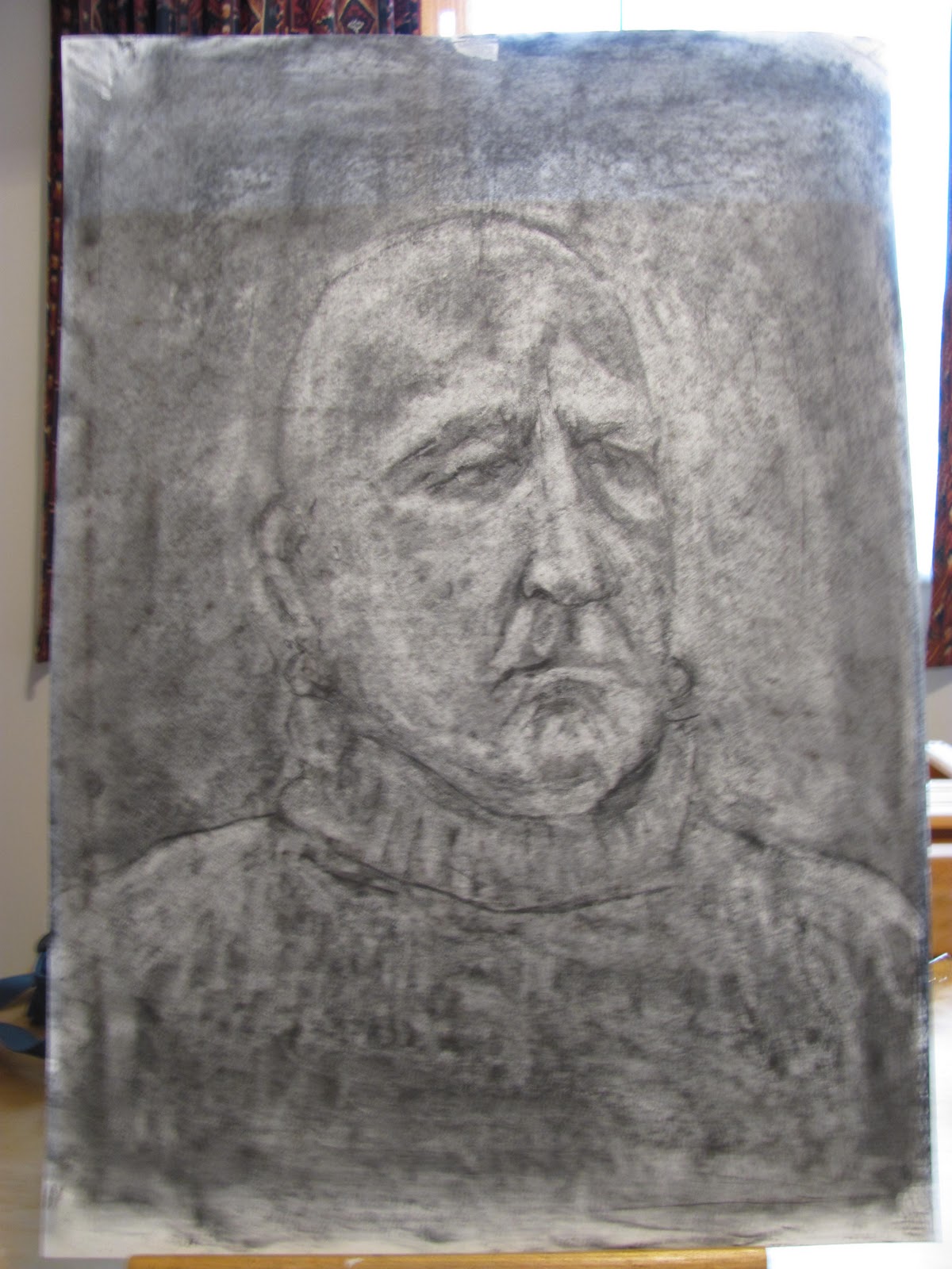
The instructions were to draw the model with the charcoal stick or - as some of the more experienced did - form the shape just using the putty robber. We were specifically told the previous week that it had to be willow charcoal not compressed. As I have never done anything approaching this the latter was a step too far, so I used a piece of willow charcoal for the general shape and the features, using my measuring stick to try and get the overall dimensions and the distances between the features accurate. This stick is a green garden stake, slightly less than half the diameter of a pencil, around 10" long and with notches cut into it every 1/2 inch. I held this at arms length - arm very stiff and straight - while measuring.  Prior to beginning Jackie laid out a series of reproductions of charcoal drawings, roughly A4 or smaller, both by famous past masters and some of her own. This was helpful to the newcomers, Pat and I, in establishing exactly what we were to try and emulate.  


Two views - A2 Cartridge paper Charcoal

I've shown two views because I've struggled to get a good photographic representation. The original looks better in the flesh but I think the above are reasonable. Even my wife thinks it good. Actually she said excellent!

This was a fascinating session because it is all about shadow and light shapes and all you have to define them is a putty rubber and a piece of charcoal. As you know I am a `pure' (well not that pure!) watercolourist and how will this help my watercolour painting? I'm sure it will help portraiture. Downsides? Charcoal is dirty (very!) but fortunately Pat bought an aerosol of fixative at the shop and allowed me to `fix' my  drawing so it arrived back home in more or less pristine condition.  

Next week and the following it is back to painting with Sarah, the same model from the first two weeks. Having had one shot at painting her in watercolour I am determined to do better this time. I hope to be in a similar position - facing her more or less frontally or slightly to her right, and have been thinking hard how to improve my approach and get a better result. 
Once again I found this a very stimulating session with Jackie quietly appearing at regular intervals to point out where things were not quite right or could be improved. Not a word of praise whatever. She is very unobtrusive but a hard taskmaster. When I was contemplating my original piece of putty rubber, black as the Ace of Spades, Jackie appeared and explained she had used the same one for years and showed how to knead it to a point to pick out whites.


Friday, 20 January 2012

Bath Portrait Course - Week Two - Tuesday 17January

I attended my second session this week and this is a short description. The model, who I discovered is called Sarah, was the same one and once again displayed extreme professionalism. 

Sarah
On this occasion we were allowed to draw or paint, whichever we decided, and in whatever media. I chose watercolour and this is the result.

Sarah 16" x 12" Centenaire 140lb Not.

Sarah's face was mainly in shadow, due to where I was seated- far from ideal, so next week I'm aiming to move and had a word with the tutor about this. I used pan paints with Cadmium Red and Yellow Light plus Cerulean for the skin colours and features. The Scarf was a mixture of Viridian and Hookers Green, and the cardigan a mix of Orange and Red. Brushes were Escoda 1214 retractables, Sizes 8 and 10 plus my small Isabey 6201.

 Next week we have a male model and are to do drawing using cartridge paper and willow charcoal. We were also told to bring a putty rubber. Another enjoyable session.

Wednesday, 11 January 2012

Portrait Painting at City of Bath College

Yesterday 10th January my long awaited portrait course commenced. This was from 10.00am to 12.30am and I travelled to Bath on the local X39 bus complete with backpack and assorted art materials. On arriving at the College, not far from the centre of Bath and conveniently close to the bus stop, I went into the Macauley building as previously instructed only to discover the reception desk was missing replaced with four chairs and a coffee table! There was no indication of what to do so after a bit of head scratching I asked an official looking lady, who happened to be passing - the place is  heaving - what had happened. She quickly explained that, as part of major restructuring and improvements currently taking place, the reception was now located in the Roker building and took me there. The Roker building is new and very impressive as was the new reception area complete with coffee bar. On enquiring and quoting my course number I was given a studio number and instructions how to get there. The place is like a maze and finding your way about is far from simple. By this time my fellow AVA artist Pat had arrived and we set off to find the room.  After travelling down various corridors we entered only to discover it was empty apart from a young man who was stacking easels. We were (as instructed) early but time progressed and when 10 o' clock arrived still nothing. To cut this short the young man went off to check, returned saying we were in the wrong place and took us there because it was another trek to find the studio. The staff at the college are all very pleasant and helpful but I'd been told it was pretty chaotic and so it proved.

After this unpromising start things took a turn for the better. The class were already at work, all present having done previous courses, and the tutor introduced herself. She is a mature lady and artist called Jackie Harding and couldn't have been more helpful. Already the previous bad vibes had been banished! She explained to Pat and I how things were done and we were provided with cartridge paper and various other bits and pieces to get us started. After selecting an easel and stool off we went.

There were eight on the course, as I've explained, the model was already in place (apologies to her I've forgotten her name already), and Jackie gave us a sheet of paper with a number of key points to consider when drawing portraits. I'll probably publish these in a future post.

The scene when we arrived.

 Another view, Pat in the striped top

 Ist Pose

My easel to the right of and slightly below the model

 My Drawing. Graphite on Cartridge Paper.

During the first hour, until just after 11am, we completed our drawing. The model took no breaks  and never moved, obviously very professional. At 11am Jackie called a halt for a break and most took off to the coffee bar near the reception, us newcomers noting the return route to the studio!  After about twenty minutes we returned to find the model assuming another pose at a  different angle.

 The Second Pose


My effort on the right. This is full length, as was the other, approximately 23" x 16", cartridge paper, graphite and willow charcoal. For the drawing I used a Koh-i-noor mechanical pencil with a 5.6mm lead.

My second effort

The Completed Studies - Remember they are just that! Graphite and Willow Charcoal on Cartridge Paper each approximately 23" x 16"

We finished at around 12.20 and I must say I thoroughly enjoyed the experience. I was pleased with my first efforts especially as it was all very new to me. As for me being the oldest student on the Campus, or in this class, I'm glad to say this was not so! I'm looking forward to future sessions which will vary with both drawing  and/or painting sessions. 

 A word about the tutor. I had never heard of Jackie Harding but  found her website www.jackieharding.com/Site/home.html  I thought she was excellent. She was quiet and unobtrusive but managed the class effortlessly and is obviously an experienced teacher as her CV indicates. After an initial  briefing for the two newcomers (Pat and I) we went straight into the drawing and she quietly moved around, occasionally suggesting improvements or corrections to individuals work. In this particular class 6 of the 8 members had been with her previously, some several times. There is a structured plan for the course and I'll return to it in future weeks.