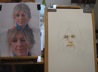
Readers will gather than I often make several attempts at the same subject until I get a satisfactory result. I have followed this with Sarah, the model at my Bath College Portrait course, and this is positively the last attempt until we resume in a weeks time.
First Stage - Drawing then features. The drawing was further altered when I realised the hair shape was incorrect.
Face and Hair completed.
Sarah - Fabriano Artistico 20" x 14" Extra White Not
I am reasonably happy with this while accepting it is still not perfect. The big problem all along has been getting the eyes right and I've only partially succeeded. However I think it much better than the previous attempts. Colours for the skin were Cadmium Red Light with either Raw Sienna or Cadmium Yellow Light. Cerulean was used to darken the skin colour, all mixed on the paper. Touches of slighter darker Ultramarine around the eyes with some Ivory Black added. The hair is a mixture of Gold Ochre (W & N), Raw Umber (Maimeri) and a little Burnt Umber (Rowney). A spot of red in the corner of the eyes plus just a touch of Hookers Green (Graham). The scarf is Cerulean Blue (Winsor & Newton) and Viridian (Rowney). The pink of the jumper is Quinacridone Rose(Graham PV19).
Brushes, my usual array with the Isabey 6201 Size 6 travel brush for the features and the Isabey 6228 Size 8 Kolinsky and Da Vinci Maestro 10 Kolinsky Size 6 for the rest. I think that is all. Comments welcome as always.


11 comments:
You have done well Peter. Don't forget - "A portrait is a painting with something wrong with the mouth". Leave it at that.
I haven't heard that one before Ray. Thanks for commenting.
Apparently it was said by John Singer Sargent. He should know about portraits.
Thanks Ray. JSS is one of my favourites.
I went back to your original photograph and had a quick run round with a ruler to map the relationships between various elements in the face. If you try it with the resulting portrait you find there are small but significant differences in the relationships, which is a long winded way of saying that measurement is crucial in making a portrait convincing.
Your portrait technique has become strong in the last couple of years and the way you begin the process is the key to that success, ensuring that central elements are secure at the start. With this one, the facial lines are just a touch strong in terms of value and the one to the left of the mouth gives a false impression of where that side of the mouth is placed.
Thanks Mick. I'll take account of your points although there is a difference in this last one. I didn't use the same photographs but ones taken at the final session, including a closeup.
I've checked the mouth against the photo - I've got the placement wrong!!! Go to the bottom of the class!
Ray is correct,that quote is from J.S.Sargent.Leave like that,is quite good and portraits should always have something of the vision of the artist,not a faithful reproduction,in my opinion,for reproduction are the cameras.
Mistakes are part of it is a comment of Charles Reid. I agree Robert.I'm not aiming at a faithful representation but the basics have to be correct. Thanks for commenting.
I think that your latest attempt is great. You have a likeness and that is the most important part of painting a portrait to me.
Thanks Artist. It does look more like her. The eyes aren't quite right and the mouth is slightly misplaced but I'm afraid perfection eludes me.
Post a Comment