Sunday, 6 October 2013

Another AVA Session - `Seed Heads'

Despite the hectic activity dealing with the many issues of moving to a new home I managed to get to the latest AVA session last Thursday. Apart from that painting is taking a very back seat at the moment and this is likely to last until Xmas at least. It will be weeks before my `studio' is fit for purpose. At the AVA the subject was `Seed Heads'.  Apart from lack of time I'm lacking inspiration and the gardens and park near me didn't produce anything very interesting. Knowing that there was some colourful foliage and blackberries outside the Hall I took my secateurs and cut some, putting them in a glass from the hall kitchen cupboard.


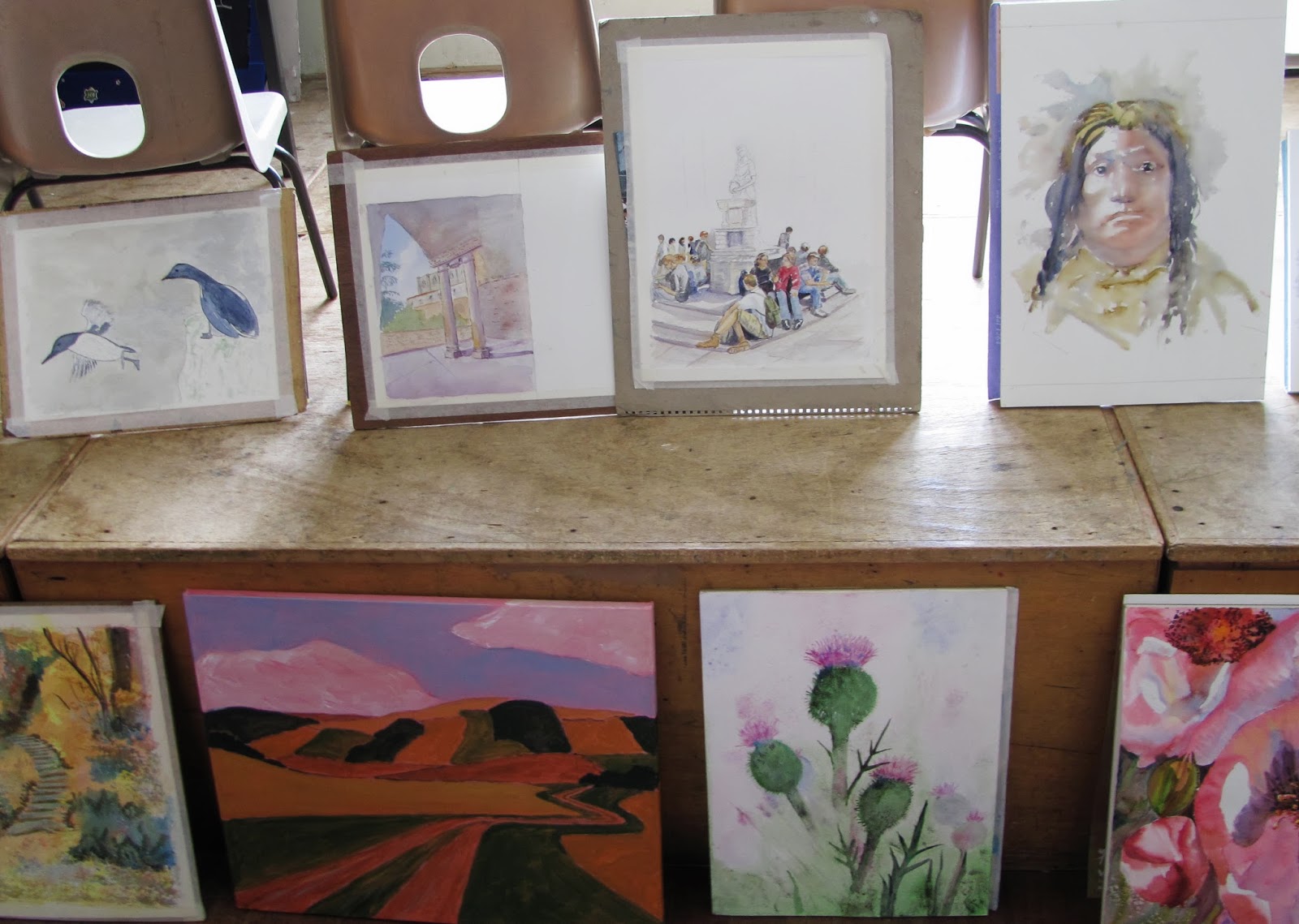
Once again we were rather thin on the ground with only eleven members present. My position is to the right of Pat Walker on the left. You may also note a more informal arrangement of tables. than previously.


Pauline Vowles
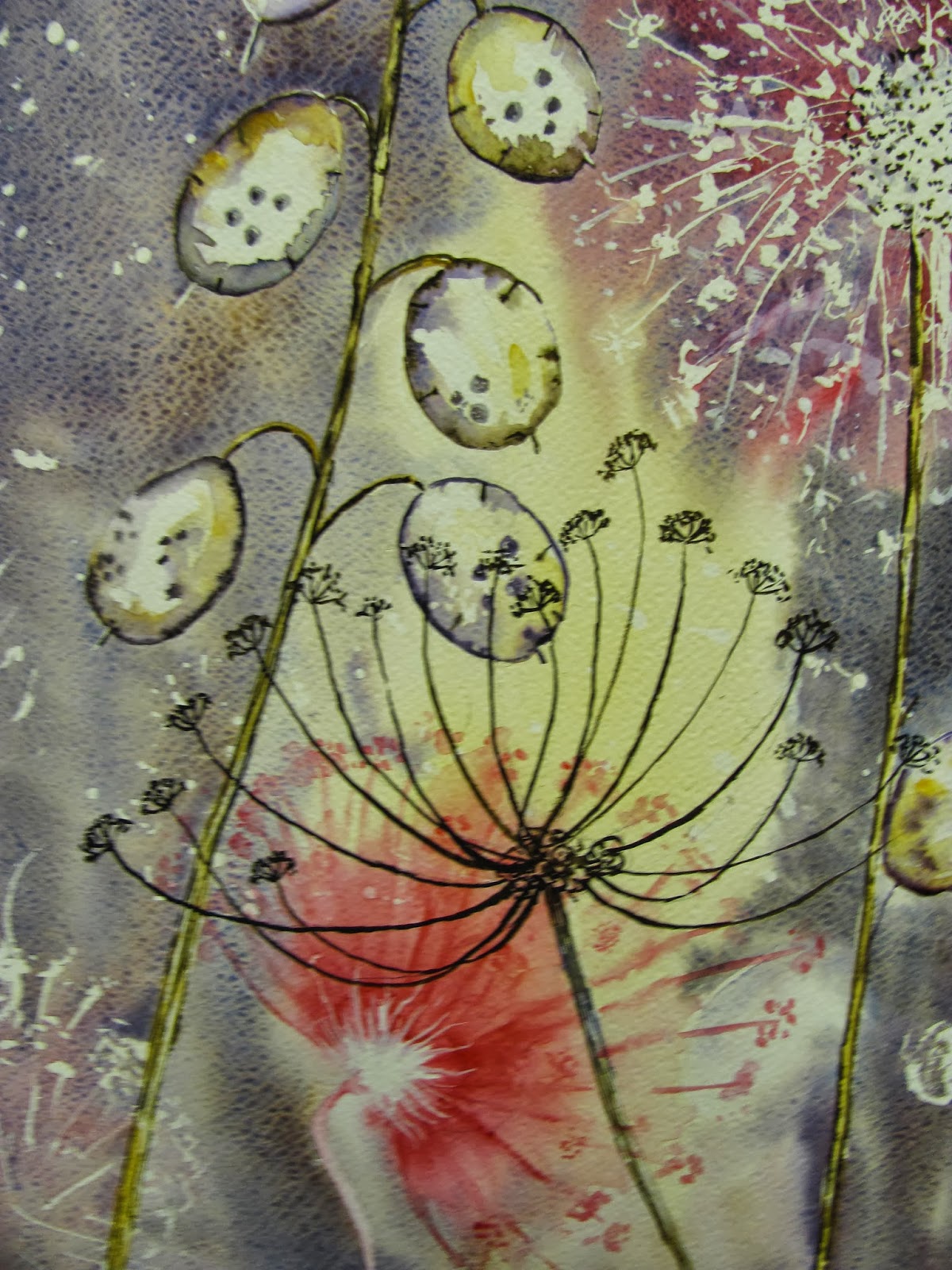

Jan Weeks


Yvonne Harry


Seeds (?) Waterford A3 Rough 140lb (300gsm)

I was a little flexible with the subject matter but the blackberry fruits do become the seeds - if not eaten - and the lovely autumn coloured foliage, amongst which they were growing invited a  combination of the two. I used Ivory Black and Moonglow (Daniel Smith) for the blackberries. Other colours included Perylene Maroon, Quinacridone Coral and the greens are Sap Green and Green-Gold. Some Prussian Blue was also added, most colours wet into wet. Touches of Orange and also Quinacridone Rose. Brushes were my usual Escodas and Isabey retractables. I first made a loose drawing using a No7 Pentel propelling pencil with 2B lead.

I'll get back to you soon John!


Wednesday, 2 October 2013

New Colours from Daniel Smith

Jacksons are now stocking three more Daniel Smith watercolours. They are Neutral Tint, Mayan Orange and Quinacridone Purple. I'd already obtained Quinacridone Purple from the SAA a few months ago. While Daniel Smith make excellent watercolours price is an issue. Apart from the unique ones they offer I would suggest that some of the standard colours, in quite acceptable quality, can be obtained from others at lower prices. I am referring specifically to the UK as DS seem to have regular special offers in America. Daniel Smith make superb watercolours but prices are of the eye watering variety. A friend of mine recently ordered four 15ml tubes and they were over £50!

Sunday, 29 September 2013

The Watercolourfanatic is back!

Well almost. The trauma of moving and the vast number of  issues to be dealt with, when moving into a new property, means I won't be back to normality for a while. One major problem is sorting out my `new' studio, formerly a bedroom and somewhat smaller than my previous abode. While it has some good cupboard space it also has a `plinth' which will have to be removed. You would have to see it to really understand what I am on about but essentially it is a wooden structure the size of a single bed, intended to have a mattress put on it. Weird. What has he moved into you might well be thinking. It is a three story town house, part of a development that originally won an award some thirty plus years ago.It will be a while before normality returns. The wife chose it as we are downsizing from out previous home.


Dismantling the plinth.

Enough of that!. Having painted very little in the last two months I determined to go to Avon Valley Artists last Thursday. I managed to find paints, paper and brushes amongst the heaps of art and associated materials and off I went. The subject this session was a `mysterious' animal. This turned out to be a Tiger with two different photographs provided by Yvonne. I chose the side view.


The Photograph is by Stefan Wisterand.


`Big Cat, A3 Waterford Rough 140gsm.

I first made an accurate but not over detailed drawing using a Pentel 07 2B mechanical pencil. Then started painting commencing with the eyes and the area around them. Colours included Cobalt Teal Blue (Daniel Smith PG50), Ivory Black (Maimeri), Quinacridone Burnt Orange (Daniel Smith), Gold Ochre (W & N) and a few others. Brushes were my usual Escoda and Isabey retractables. Initially the Isabey No 6 and there after mostly the Escoda No 10. I was quite pleased with this, my first effort for a while, but viewing it in the last few days I'm not so sure. Maybe I've overworked a little.


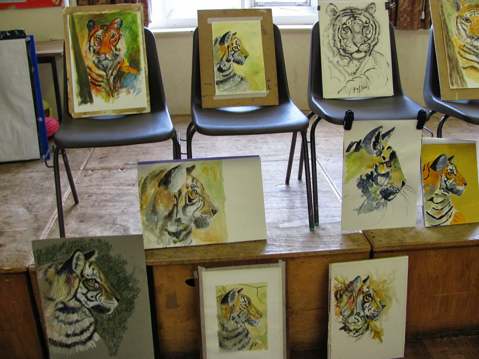
There were thirteen present and above are the paintings produced.


Monday, 9 September 2013

Flower Paintings in Watercolour

Here are a selection of flower paintings in no particular order. I think - but am not certain - that they are watercolour. There are just a few of the many I've downloaded that took my eye. This should please my friend Yvonne.


Rose Marie Dubrecqu - one of my absolutely favourite flower paintings. What beautiful colours.


The German artists Lars Kruse who has studied with Gerard Hendriks


Fabrio Cembranelli - a South American artist of great talent 


Cheng Zhenwen


Liu Yi


The excellent American artist Janet Rogers

 Olivia Quinton


Yuko Nagayama -one of the most talented Japanese artists


Nicole Zeimet


Mualla Ozdemir (Turkish?)

 Tueko Sato


 I may have some of the artists names spelt incorrectly in which case I apologize. I don't think anyone would disagree, even those who don't particularly like to paint flowers, that there are some stunning paintings amongst the above. I don't know much about several of the artists featured but more information may be forthcoming if you Google them. As will be noted my preference is for the more impressionistic styles rather than botanical or super realism.

With these paintings I'm signing off for the next two to three weeks. We are moving home on the 10th and having a weeks holiday starting on the 13th. Due to this I shall be offline until Virgin Media install cable broadband and the rest in my new home on the 23rd. I certainly won't be up and running until I also get my new `studio' - another bedroom but smaller - sorted out. In the meantime good painting and I hope you enjoy the above.


Friday, 6 September 2013

Landscape Paintings I LIke.

This is another set of paintings I like amongst a great mass of others I've downloaded.  Some of the styles I wouldn't necessarily want to adopt, or indeed be capable of, but all display, in my humble opinion, great artistic merit.


The great Alvaro Castagnet, a very popular workshop artist. This is Pin MIll in Norfolk, a famous painting location for many artists over the decades.


Genevieve Buchanan an enthusiastic artist, and lovely lady, who I met on a number of Charles Reid workshops.


Chen Hong, one of the large number of excellent Chinese watercolour artists.


Christiane Bonicell - see Facebook.


Helga Berger - prominent on Facebook.


He Jiangu - another from China.


Ian Potts - I know nothing more about this artist, certainly strikingly different.


David Taylor the brilliant Australian Watercolour artist.


Millind Mullick - a superb and prolific artist, also on Facebook


Oleg Kozak - a distinctive style, prominent on Facebook


Michal Jasiewicz - a Polish(?) artist


Orhan Gurel from Turkey - one of the best amongst a vibrant group of Turkish watercolour artists.


Ping Long - another from China or is it Taiwan.


Sterling Edwards - an American artist

The general theme here - not in every instance - leans towards impressionistic loose paintings and I make no apology for this. This is what I like but I can appreciate more detailed paintings. More to come.


Monday, 2 September 2013

Chief Washington - Second Try

Not being really satisfied with my first attempt at Chief Washington I thought I'd have another try. I decided not to be too hung up over how close the resemblance was and re-visited one of my favourite Charles Reid books `The Natural Way to Paint'. When I told Charles this was one of my favourites he seemed surprised but I can only say the chapter on features is one I've studied many times.


Chief Washington 16" x 12" Fabriano Extra White Artistico 140lb (300gsm) not

I approached the previous version in a different way to my normal practice and this is even more `way out' if that's the right word. Actually I'm somewhat apprehensive about possible reactions. These Indian portraits are tough using these old monochrome photographs, with so much detail obscured and I find it hard to know what to do with these `missing' areas. 

Skin colours were Burnt Sienna, Raw Umber and Cobalt Blue/ Cerulean. Also some Cadmium Red and Translucent Brown. The hair was a mixture of Ultramarine Blue, Raw Umber and Burnt Sienna. His clothes are Raw Umber and some Gold Ochre.

I only used three brushes, the Isabey No 6 retractable for the features and the Escoda Kolinsky retractables sizes 8 and 10.   

I don't suggest for one moment that this is good just an experimental painting trying different ways of tackling this subject. I won't be posting much this month as we're moving home on the 10th, and also going on holiday on the 13th for a week. I didn't anticipate that these things would be so close together but that's how it has worked out.  As a result I'll be offline until at least the 23rd when my cable company are scheduled to install broadband et al in my new home. 


Wednesday, 28 August 2013

New Insert for my Craig Young Palette - the Paintbox.

For some time I've felt that the 16 well insert for my Paintbox is not ideal for me. Recently I asked Craig to make me a 24 well insert to replace the current 16 wells. It arrived by post today. 


My well-used Paintbox with new 24 well insert.

I'm not a limited palette person. I like as many options as possible and paint a range of subjects that often require different colours. Not for me the half dozen or even dozen paints of the limited palette. Many will disagree with my approach but plenty will agree and I think in general there is a tendency to have more paints available rather than less.

I've had the above palette for some years now and seeing Charles Reid's paint box at Stow this year prompted me to do something. See the small amounts of paint in each well.  


Charles Reid's Palette at Stow

Charles recommends you squeeze out fresh paint each day you paint. The above is the normal 16 well palette and each well can hold a considerable amount of paint - far more than is needed for my` first try for a finish' Reid approach. I rarely achieve this `first try' thing but that's another matter! The new wells are smaller - obviously - but will still hold a lot of paint and unless you use wide flats or very large rounds are perfectly adequate. I've modified my current insert by sticking in some half pans and count 28 (!) but that can be cut down, and the next task is to carefully consider what paints to make up the palette. The first dozen or so are fairly obvious but it then gets trickier. I do hedge my bets in that I have a secondary small palette with 12 additional paints but I think that will also have to be pruned.

I'm not rushing things as I'm still stuck in the moving house problem but will report further when this is resolved and am settled in my new painting abode.


Thursday, 22 August 2013

Chief Washington

After the mixed - very mixed - response to my Beaver Tail portrait I thought I'd try another this week. The subject is Chief Washington of the Coquilles, who took part in the Rogue River War in the Pacific Northwest. The guide photo shows him with a very bitter expression. I suspect it was taken against his will while in captivity. When I `googled' him all I got was a reference to a `Chief Seattle', who was obviously a different person, but referring to a book called  `Indian Wars of the Pacific Northwest' by Ray Glassley, there were two short references. Before starting our AVA leader Yvonne suggested I try to impart more colour into my Indian portraits rather than copy the rather dull sepia monotones of these original photographs which she thought were inclining to look `dirty'. Yvonne suggested I find some colour photographs of Amerindians so I get a better idea of the skin colours. My friend Hap always says mine are not dark enough. In view of the comments I've had I thought it worthwhile to show the guide photo - very, very dark. 


Chief Washington 16" x 12" Fabriano Artistico Extra White  300gsm not

I think you can  easily see the colours I've introduced, if you compare it with the previous portrait, which include brighter yellows and Quinacridone Burnt Orange (Daniel Smith PO48). I also used more Cadmium Red mixed with a little Raw Umber for the skin tones, Cerulean or Cobalt Blue to darken , and Translucent Brown (Schminke PBr41). The hair is various mixes of Ultramarine Blue with either Translucent Brown or Burnt Sienna. It is on the rough side but I persist in my creed of `being cruder' espoused by Charles Reid. This will make the perfectionists blanch  but I will keep trying if still some way from producing work I am completely happy with. My wife took one look at it and said she preferred the previous one! This was very much experimental and I shall have to ponder how to approach the next one.

Brushes used were the Isabey retractable Size 6 for the facial detail and the Escoda sizes 8 and 10 Kolinsky retractables for the rest.


Monday, 19 August 2013

Beaver Tail before & after

When I posted Beaver Tail a comment by Ray was that the finished painting had lost something compared to the earlier stages. Yvonne agreed so I thought I'd play about with it and see if I could address that problem.


Beaver Tail - First version


Beaver Tail - Corrected Version.

My friend Hap from near Seattle in Oregon knows many Native Americans and always says my skin colour isn't dark enough. My `corrections' are on the crude side but that is deliberate.

The main colour loaded on was Schminke Translucent Brown (Pbr41) with some Cerulean and Ultramarine Violet PV15) either Graham or Rowney.. The Schminke is a great colour and could easily replace Burnt Sienna. What do you think? Is it better or worse. I'm not sure although I agree the first version is on the dull side.


Thursday, 15 August 2013

Avon Valley Artists and Beaver Tail.

I imagine many will wonder what this title means. In a nutshell it was the latest AVA session and I painted an Amerindian called Beaver Tail.


Fourteen present today, which is almost as many as we get with the official programme. We have two more weeks of `do it yourself' painting then the official programme starts.


Just to prove I was there!


Yvonne Harry


Jan Weeks unfinished.

Yvonne and Jan have just returned from their highly successful ten day exhibition  at Wells Cathedral, where combined sales of framed and unframed paintings exceeded 60.


Some of today's paintings.


And some more.

The last portrait I painted was at Stow with Charles Reid. That was in May. Problems and distractions since then reduced my painting time considerably but I did attempt one last week - unfortunately a disaster on hot press paper. My normal policy is, rather than brood about failures, to go straight back in and it usually works - at least I think so. This week I attempted to paint an Amerindian called Beaver Tail, an Assiniboine Indian as photographed by Edward Curtis in 1908.


Beaver Tail 16" x 12" Fabriano Artistico Extra White 300gsm Not

I began with a careful but not over detailed drawing, taking measurements to ensure things were in the right place. For this I used a mechanical 07 pencil with 2B lead. You can see the sequence of events so I won't elaborate. The actual painting is a little darker than it appears on here, especially the shadow areas where I added a second wash. I'm sure Hap will say I haven't got the skin colour right but on this occasion I just wanted to get the show on the road again.   I'll do better next time Hap.

Colours used were limited. Cadmium Red Light, Raw Umber and Cobalt Blue for the skin colours. The hair Ultramarine Blue, Burnt Sienna and Raw Umber. His clothing Raw Umber. The cap is Raw Umber and Raw Sienna. I used three brushes. Escoda 1212 retractables sizes 10 and 12 plus the Isabey retractable size 6.