Friday, 24 June 2016

Another Two

Here are another two portraits, drawn at home and painted at my AVA session on Thursday.


16" x 12" Centenaire 140lb (300gsm) not "Queen of the Desert"

Blog followers will know I am an  admirer of the photographer Edward Curtis who is famous for his portrayals of American indians, mostly taken in the late 1800s and early 1900s. In this instance I came across a photo entitled `Queen of the Desert'. Rather different to his other work, further searching produced the information it was taken in 1898 and was a posed photo of an African American model - no name attached. No indian maiden would have posed like this, although in some tribes partial nudity was not uncommon.

I found it hard to tackle and did it in two or three stages, with a few days between the first and second. Although stated to be an `African - American' her skin tones looked pretty light apart from the areas of deep shade on the left hand side (facing) of her face. Unfortunately these black and white photos tend to have very harsh dividing lines between tones and it is probably better not to follow them too closely. Colours were Gold Ochre plus a lighter yellow, Cadmium Red, Raw Sienna, Cerulean, Ultramarine and Translucent Brown in various combinations. I used three brushes, all Isabey nos 4 to 8


Buffalo Bill Cody Western Legend, 16" x12" not sure what the paper is other than it is  140lb not .

Exactly same brushes and colours mainly Cadmium Red with a little Raw Sienna for the skin areas. Ultramarine Blue with Transparent Brown plus Raw Umber, in various combinations for the rest. Possibly slight touches of one or two other colours. 


Wednesday, 22 June 2016

Two More

These are my latest efforts mostly done at AVA sessions but also partly at home. I make the usual proviso that these are just my paintings and I don't hold them up as particularly good.- just mine. I have started to do more work in my `studio' after reducing my activities in other areas. I'm always looking to improve even at this late stage of my life.


Wisham Woman from as Edward Curtis photograph c1900
 16" x 12" Waterford High White 140lb (300gsm) not

This portrait did involve a slight change of technique in that I dried the painting using a hair dryer, between each phase - a la Gerard Hendriks. My fellow painters said they liked it better than some of my looser and more contrasty efforts but I'm not sure I want to take that route. Actually I don't but I continue to experiment..

Colours used were various combinations of  Cadmium Red Light, Raw Sienna, Burnt Umber, Cerulean, Ultramarine blue and Transparent Orange. Usual brushes.  


Back to animals! "An Otter" 16" x 12" Centenaire 140lb (300gsm) not

My main interests are portraits, animals, birds and the occasional still life. I've gone right off landscapes and buildings. I do other subjects when they are in the programme of my AVA group. I aim for a Colourful result using arbitrary colours - those that aren't actually there - as do Charles Reid and Gerard Hendriks.


Sunday, 12 June 2016

Two More Chiefs

The following are the latest portraits I've attempted. They are again of Amerindians, in both cases very-well known ones. The guide photos were both black and white


Sitting Bull - 16" x 12" Waterford High White. 300gsm (140lb) not

The guide photograph was almost certainly taken during Sitting Bulls reservation period a few years after the defeat of Custer in 1876. He remained.a very influential figure - although with enemies amongst his own tribesmen - and was killed, some say murdered, when reservation indian police attempted to arrest him for fomenting trouble. He never accepted  subjugation to the white man and was a renowned `white hater'.

The colours are mostly a mixture of Cadmium Red Light and a little Raw Sienna, with copious amounts of Cerulean Blue and Ultramarine, Raw Umber and possibly Burnt Umber added for the dark areas. I mulled it over a few days after initial completion and deciding it was too dull, added diluted amounts of Translucent Brown (Schminke Pbr 41) to warm up the face.This is a great colour and Yvonne Harry of my painting group asked if she could try it and seemed suitably impressed. 


Quanah Parker 16" x 12" Centenaire 300gsm (140lb) not

Quanah Parker was the last war chief of the elusive Qwahadi Comanches. The interesting thing is his father was the war chief Peta Nocona and mother the captured white girl Cynthia Ann Parker. Cynthia was captured at between the ages of 8 and 11 - no one is sure exactly when she was born -and her capture became a cause celebre on the Texas frontier, indeed nationally. Recaptured by Texas Rangers at the age of 34 she never adjusted to white society and died of influenza in 1871. Her young daughter Prairie Flower preceded her. Quanah eventually became the leader of the Quahadis and was the last to surrender in 1874. He subsequently adapted to reservation life becoming quite wealthy. He dressed like a white man and adopted many white men ways, but not all. At one time he had 8 wives. Quanah visited his relatives amongst the Parker family and  became a well respected member of the community. Quanah kept a large framed photograph of his mother and sister in his house.  .. 

I wanted to paint him because of his history and also strong features. Prior to painting I reviewed some of Charles Reid's Indian portraits and also Gerd Hendriks DVD..The reasons are obvious in Charles case but in Gerards were to see whether I might incorporate some of his techniques - at least in a modest way initially. The resemblance to Quanah is quite good although not as good in Sitting Bulls case.

Using my normal portrait colours of Cadmium Red, Raw Sienna and Cerulean or Ultramarine I also heavily invested in Translucent Brown..I wanted to avoid the dullness of the first painting stages of Sitting Bull and be bolder. . Brushes used were my normal Isabey in sizes from 4 to 8. I'm pleased with the results, especially Quanah.


Saturday, 4 June 2016

New DVD from Gerard Hendriks

A few days ago arrived in the post a copy of this new DVD from Gerard Hendriks - I think it his first. This was most unexpected but not really a surprise as I've benefited from Gerards generosity previously, as readers of the blog will know.


Animals in Watercolour - DVD - In Dutch and English (English in subtitles) 1hr 12 minutes - 29.95 euros (may be extra postage (?) to countries outside Europe) e mail enquiries to info@ingridrovekamp.nl Her website is : www.ingridrovekamp.nl


The first demo two blue tits


Demo in progress


This was sent to me sometime ago, again out of the blue, by Gerard and I've had it framed.

The DVD has five sections. 1 to 3 are demos, blue tits, followed by a chimpanzee and finally a cockerell. In the 4th section Gerard explains his methods again, as he talks about them throughout the paintings. The final section is a gallery of his paintings.

I'm an admirer of Gerard both as an artist and a person. Although we haven't actually met, communicating through e mails and via Facebook, he comes across as such a nice man. His work has similarities to my American guru Charles Reid, but in other ways his working methods are very different.

Gerard starts with a pencil drawing, not over detailed and using a form of contour drawing. Gerard describes his preferences in paper, brushes and paints - much of this is also detailed on the inside front cover of the DVD. He paints in three or four phases, using a hair dryer after each phase, so the paint is thoroughly dry before commencing the second phase. This he says is essential. I'd wondered how he got some of the effects I see in his paintings and now I know. I intend to try and incorporate some of his techniques in my own paintings. As far as I can see Gerard holds nothing back. He is not at all dogmatic and uses tissues, fingers, the end of the brush and anything else  he feels  necessary to produce a good painting. What you see is what you get. 

In my opinion if you like his style of painting, and he has become extremely popular, this DVD is a must.

UPDATED INDEX  - JUNE 2014

Wednesday, 1 June 2016

Watercolour Paintings (19)

Here are the latest batch of paintings I have collected. Another very varied batch with (hopefully) something for everyone. Several of these artists are unknown to me but all are on Facebook so it should be possible to track them down if you are especially taken with any particular one or more.


NB Gurung


Yuko Nagayama


Milind Mulick


Charles Reid


Shahanoor Mamun


Carlos Santos Marques


Siriak Shepherdson


Another from Charles Reid


Morten E Solberg Snr


Pasqualino Fracasso


Gerda Mertens


Dusan Djukaric


Frank Eber


Constantin Sterkhov


Roland Palmaerts

It never ceases to amaze me how vibrant the watercolour scene is in many other countries outside Europe. It seems to me watercolour is considerably more popular and all sorts of events involving watercolour seem to be taking place. The standard is also very high.


Wednesday, 25 May 2016

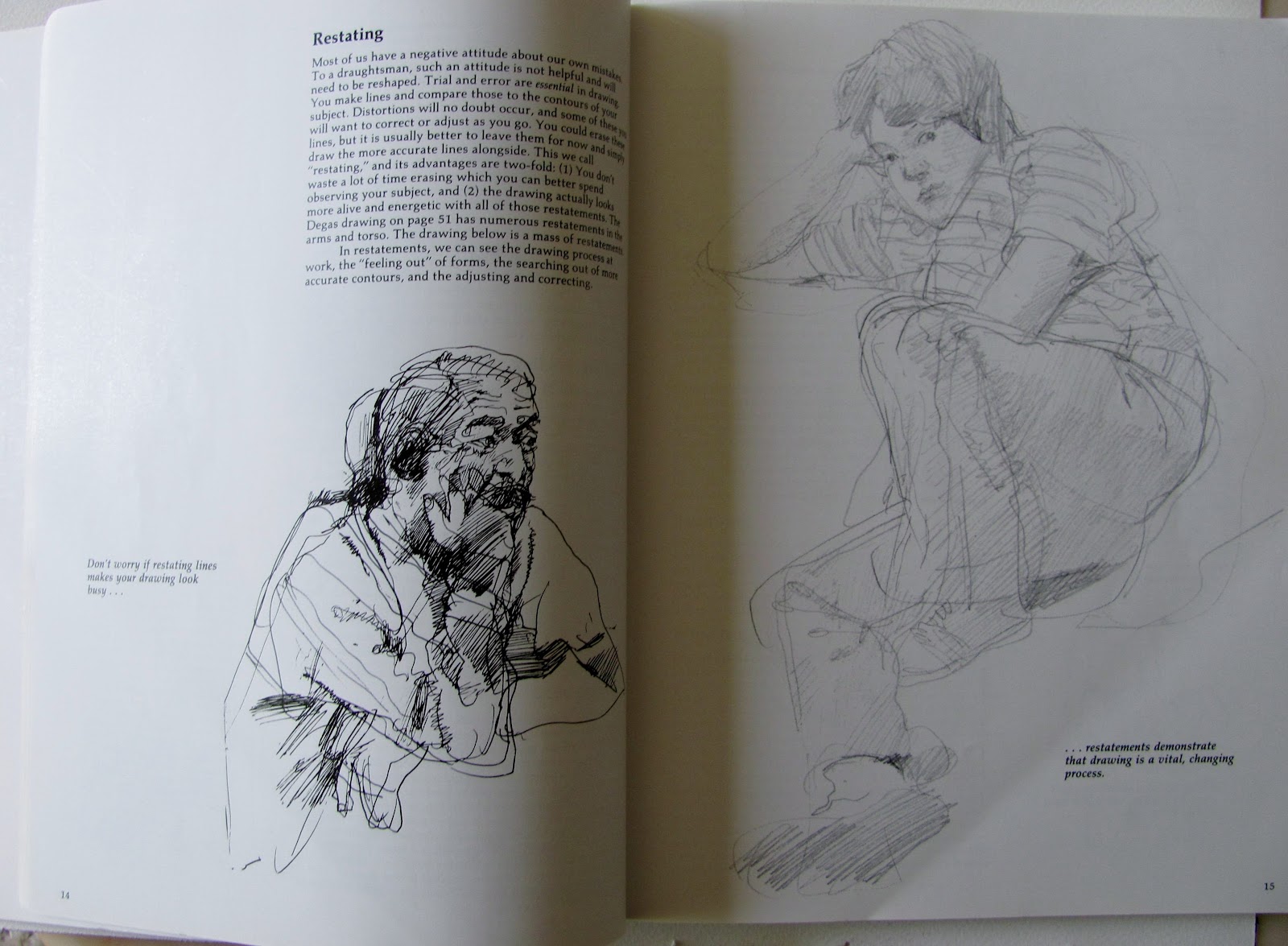
Book Review - Keys to Drawing by Bert Dodson

I may have mentioned this book before as Charles Reid told me, when on a workshop, that he considered it the best book on drawing. This is a bold statement as there are hundreds of books on drawing and Charles can't possibly have read all of them. They vary from the classical style `Atelier' type publications to every variation on the theme. Having bought it I certainly agree with him from my point of view. I have several others, including classics, but I prefer the `looser' style of Charles and Dodsons book, while covering all types, is more to my taste. 


Keys to Drawing - Bert Dodson. North Light Books this edition paperback 1990 224 pages approx. 81/2" x 103/4"
Current Amazon prices - Hardback £16.30p, Paperback £14.88p , From Amazon partners used and new from £6.64p Also Kindle edition.

Here are some examples from the book.


I realised after doing this that I had skimped it rather and can only apologize for my befuddled state. Following a weeks holiday in Malta I returned and immediately went down with a raging cold and cough. Here are some of the things the book teaches:

55 specific keys to improving your drawing.

48 mini lessons that help you master techniques

8 self evaluation checklists to help you gauge your progress

In addition it teaches you to restate, focus, map and intensify. Free your hand action, then learn to control it.
 Convey the illusions of light, depth, and texture etc Enough said to kindle your interest?

I imagine this book won't suit everybody, who might prefer a more orthodox approach although Dodson does cover all types of drawing and we get none of the `this is the only way to do it' approach.. I think it excellent and refer to it more than any other drawing book. He did publish a second book but it didn't seem to me as interesting as this one.

Monday, 9 May 2016

The Green Man

The subject at the latest AVA session was `Greens'. This isn't beloved by many but, as is my usual method, I entered the search on Google and came up with the Jack in the Green festival at Hastings. Previously my association with Jack in the Green.was in regard to the primrose flower of the same name, due to the green ruff _ leaf like - in which sits the flower. I used to  raise them when I was hybridizing primroses. The Festival is based on an old Pagan ritual, involving Morris Dancing and is held on May Day. It was revived at Hastings a few years ago. Look it up - quite amazing what the participants get up to in terms of dress, covered with leaves and much else to give an overall green impression..


The Green Man 16" x 12" Waterford High White

I completed the drawing two days before the AVA session so was ready to start immediately and perhaps take more time over the painting. I have a tendency to rush in where others fear to tread.

What to do about the greens. Well here I simply went into my box of greens and picked out several, Sap Green and Hookers Green (Graham), Cascade Green and Apatite Green (Daniel Smith), Sap Green (Lukas) and a couple of others. They weren't all used in the actual painting but most were. I also added Cobalt Teal Blue (Daniel Smith PG50), a lovely colour with a greenish tinge that is often difficult to fit into a painting. Here it featured quite strongly. Other colours were Translucent Brown (Schminke PBr41) and Cerulean for parts of the pipe. Some Burnt Umber in the pipe as well as the Translucent Brown.The eyes were Cadmium Red Light with a little Raw Sienna and Ultramarine added for the darker areas and the iris.

I started off with the eyes then the nose followed by the mouth. I didn't do these in isolation but ventured into the areas adjacent to them. Once I'd done that I completed the green leaves around the head and painted his beard with lots of Cobalt Teal Blue as well as some green.

Brushes used were the Isabey 6201 travel brush for the main detail plus Isabel Kolinsky sables 6228 sizes 4, 6 and 8.

Overall this went well and I am happy with it as it achieved my aim of a loose interpretation which I felt caught the subject quite well.. I had a slight problem with the eyes and am still less than 100% happy even after remedial action the day after the AVA session.


Tuesday, 3 May 2016

Watercolour Paintings (18)

Here is this months batch of watercolour paintings. Again a mix of well-known  and lesser known artists with a variety of styles. Naturally I include a few of my favourites.


Robert Wade - Doyen of Australian watercolour artists


Gerard Hendriks - A master of colouir and movement - and much else


 Nirupam Konwar - another new one to me


Ewa Ludwiczak - very Charles Reid.


Trevor Waugh - I've seen him paints flowers like this.years ago


Christian Couteau -Very much a colourist


Samiran Sarkar - Simple yet effective


Milind Mulick - colourful and profilic, great use of greens


Charles Reid


Oops! Wrong artist - this is Joseph Zbukvic


Javed Chowdhury - New to me


Another from Gerard Hendriks


Valentino Veriato - |Quite amazing


Jonathan Kwegyir Aggrey - Amazing young African artist with a growing reputation