As readers might have noted I have suffered something of a relapse in my landscape paintings, not helped by a very limited number of plein air outings this year. This has resulted in a reliance on photographs. Concentration on portraiture and still lifes has brought about improvement in those areas but one step (or more) backwards with landscapes. What actually defines a
definitive landscape? Is it just a rural scene depicting trees and fields, perhaps dotted with animals like sheep, cows or horses? How do you define a scene with buildings the main shapes? Does it all depend on the
variety or which are the major players?
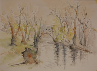
A few weeks ago I showed the painting below of a scene in Keynsham park, somewhere I know well and have painted several times in the past. I've lost count of the number of times I've walked around this relatively small area bisected by the River Chew.
Keynsham Park looking along the River Chew.
Painting No.1 Gerstaeker Acquarell 16" x 12" Not
This is the original painting which failed to get single vote at Bathampton and generally went down like a lead baloon with most others. I rather liked it (!)
When at first..... I then thought hard about this subject and consulted both Gerda Mertens (`A way with Trees' )
www.gerdaaquarel.be/ and John Palmer to see if their approach might help.
Keynsham Park Version No.2 Waterford (?) Not 16" x 12"
I rather liked this initially but the more I study it the more I can see it is overworked,and much too busy with too many trees crowded in, and a more simplified approach would have been better. Still progress of a sort or not? I frequently do more than one version until I arrive at a better result.
Keynsham Park Version Number 3. 16" x 12" Centenaire Not
This is my `definitive' version and I am quietly pleased with it. This has been simplified and the large tree stump at the front eliminated. Although essentially a `cool' painting I have added some warm colours. Brushes for all three paintings Isabey 6228 No.8, Da Vinci Artissimo 44 No.2 mop, Da Vinci Maestro Size 6 and Isabey 6201 retractable Size 6, together with a Pro-Arte Series 103 Size 4 rigger. The rigger is a synthetic, all the rest Kolinsky sable.
My usual palette featured with much reliance on the earth colours, Burnt Sienna, Raw Umber, Raw Sienna, Burnt Umber and Gold Ochre (W & N). I mixed the greens mainly with various blues and yellows, the yellow the Daniel Smith Hansa Yellow Medium (PY97). The blues primarily Cerulean (W & N) and Ultramarine with some Cobalt Bue (+ Phalo Blue?). I do like Grahams Prussian Blue and it is in there somewhere. I also incorporated some Graham Hookers Green, a colour I like a lot as it is, in my opinion, more natural looking than other Hooker Greens. For darks I seem to frequently use Ultramarine with Burnt Sienna, or less often Burnt Umber, not overmixed but the Charles Reid way in which you can still see the original colours and let them intermix on the paper. There are many other combinations that make good darks and I will probably do a post on this in the future. Not an expert view just mine as a hobby painter.
I'm not
absolutely certain what the paper is on number two (or is it three?), as it was painted on the back of a failure. I've gone off the Gerstaeker Acquarelle paper completely. I don't know if this latest block is somehow different but it doesn't take the paint terribly well. In future I'll just use it for drawings with perhaps a small amount of paint. I like Centenaire and both Yvonne and Jan from my AVA group have given it qualified approval, especially at the current price. This is exclusive to Great Art
www.greatart.co.uk
What do you think? Comments welcome.


3 comments:
Very pleasant final attempt, Peter. Great sky, and the simplification of the reflections cuts down on the number of verticals, allowing the horizontal and diagonal lines to form a pleasing composition.
Number 3 is very nice. The painting feels as if it were done with certainty in every stroke. Number 1 feels rather tentative in it's approach (at least to me). For me, a good landscape makes me want to be there and Number 3 certainly accomplishes that. Plus I like the way the colors dissolve into each other.
I feel rather odd offering my critique as I have not done much in the way of landscapes lately, so please take my observations in the spirit that it's intended, as one who loves painting.
Happy Holidays.
Oscar
Thanks Ray and Oscar. I appreciate comment although I know how difficult it can be so many thanks. I think Number 3 points the way, one problem I have is keeping to the straight and narrow, and straying off the right path is a continuing problem. I don't want to paint just one single subject but as we all know maintaining a consistent standard isn't easy, especially for the amateur who doesn't (usually) paint almost every day. Best wishes to you both and a prosperous New Year(and to all my readers).
Post a Comment