Thursday, 21 February 2019
INDEX
I know my Index system is a little clumsy but not being a technical 'geek' it's the best I can do. On the opening page see the list on the right hand side called 'blog archive' This is directly under the followers picture section. Scroll down to 2014 and then click on July. This will bring you to the index, recently updated.


Friday, 8 February 2019
John Yardley - A Watercolour Master

John Yardley has been one of the very best British watercolour artists for many years. He is now in his mid eighties, as is Trevor Chamberlain a contemporary. He also paints in oils but is best known for his watercolours. I don't know how active he currently is.

I met him once at the Alexander Gallery in Clifton, Bristol. He was one of the resident artists and they were holding his b-annual exhibition. Apart from the gallery owner the only people there at the time I visited were him and his wife, so I introduced myself and had a short conversation. He is a shy man but was very pleasant. The late Ron Ranson had previously told me that Yardley had become involved with the Alexander following the death of Edward Wesson, who was one of their major artists. They were looking to find someone similar and - at the time - according to Ron John painted in a very similar way, in fact Ron said you couldn't tell them apart. He did drastically change his style sometime after this which I will relate later.

APV films of Chipping Norton have produced at least two (at least four) videos of which I have one 'Sunlight in Watercolour'. They are all still available. He is also the subject of several books, by Ron Ranson, Susan Haines and more recently Steve Hall . They are all good but my pick is 'John Yardley A Personal View' in the Atelier series by David and Charles. This isn't' a 'How to' book but as the title implies - a personal view. I rate it highly as I do the similar book by Trevor Chamberlain in the same series. The Atelier series were discontinued after only a few titles were published but should be available second-hand if you search for them, possibly at a price!

Apart from the books and videos he has until recently tutored annually at Dedham Hall in East Anglia. He is not a natural teacher and obviously finds it difficult. Looking at his videos you can see this. I know or knew several of those who were regular attendees at Dedham and all became friends, some painting with him on other occasions. His approach was to do a wonderful demonstration, with those present desperately trying to see how he was doing it as he didn't say much if anything. He would then disappear for a cup of tea and a sticky bun with the baffled students scratching their heads. Ron Ranson attended one such course when he was writing his book on Yardley and after he disappeared several asked him to explain how he did it, leaving Ron somewhat embarrassed. The Susan Haines book touches on this. All I can say is he is held in very high regard by his students, some of whom are professional artists, many becoming firm friends.
Watching his videos I was struck by the fact the only real tip imprinted on my mind was his suggestion of keeping the water container full to the brim so you can measure the correct amount of water in the brush. I can't really think of much other advice. The brush he was using was the very expensive Winsor & Newton Series 7 size 10 at over £100. Ron Ranson said in his book that there were discarded brushes all over his studio which John said had lost their point (after about 6 months). When you see him paint on the video you can see why. He scrubs them into the palette when mixing paint and uses dry brush a lot. In more recent years he joined the Escoda band waggon with a three brush set being offered with his name on the handle. Mentioning his studio he had a purpose built one in his garden but preferred to paint in the kitchen!
In his Atelier book he relates how a visit to Venice brought about him becoming his own man in leaving Wesson behind. His palette choices are conventional although he cautions against the over use of Cadmiums. Paper is or was Arches, Lanaquarelle and Canson tinted. He originally painted on Bockingford like Wesson. Sizes are from 15' x 22' down to 10" x 14". His palette was originally a folding Roberson which he was able to replace by the similar hand made palette from Craig Young, another regular attendee at Dedham who became a close friend. On the video he is using one of these palettes, the one with the six wells, probably made specially for him.

Subject matter is quite extensive. While he paints a lot outdoors he also loves interiors. Horses and trains also feature with flowers another favourite. Figures in his paintings are prominent. On the video he actually demonstrates how to paint them. He is a very bold painter who doesn't waste a stroke. As is clearly shown painting the light is a priority.


He is a wonderful artist and with the books and videos available you can find out much more. There are lots more of his paintings to study if you 'google' his name. Without doubt he has few peers amongst watercolour artists, although I recognise the huge number of fabulous artists throughout the World.
Sunday, 3 February 2019
My Latest Paintings
These are my latest efforts for what they're worth. Two painted in my 'studio' and the third at my art group last week. I did all the drawings in my studio.

'Moose' - 16" x12" Waterford High White Cold Pressed 300gsm.

Victoria Beckham A3 Daler Watercolour Board
This is my second portrait on this board which has a faint tooth. Not entirely convinced by it yet. I saw the guide photograph in an article on her. I'm neither a fan nor a critic. Good luck to her I say.

'On the Beach' 16" x 12"
This was the subject at my art group this last week. All the drawings for the above were done in my home 'studio' . The portrait was painted at home also and most of the moose, which I finished off at my art group. The beach scene was roughly drawn at home and painted at the art group session. It was painted on the reverse side of a 'failed' older painting.
Friday, 1 February 2019
Watercolour Paintings 51
For this month I'm showing watercolours from a variety of artists who are new to me and I know little or nothing about. It never ceases to amaze me how many excellent artists - in the thousands - are out there.

Jaomine Huang

Emil Kerez Kerie

Direk Kingnok

Igor Mosiychuk

Steve Hanks

Kitipong Ti

Lin Shaoling

Yvonne Joiner

Z. L.Feng

Sarah Pye Green

Andrew Geeson

Bhira Phokthavi

Jasmine Hsiao - Hu Huang

Andy Evansen

Anna Razumovskaya

Henry Arafin

Vladislav Yeliseyev

Margaretha Cornelia Johanna Wilhemina Henrieta Roosenboom (!) 1843-1896

Ye Yint Mijint Nainy

Yong Hong Zhong

Yong Hong Zhong (again)
I think I've got the names right but if you know different please feel free to correct me. I also am fairly sure all are watercolour but it's possible one or two might not be.
Friday, 25 January 2019
North American Bison
The North American Bison once roamed the plains, and up into Canada, in the millions. They were nearly exterminated by the Buffalo hunters in the mid to late 1800s, and only a few survived. Fortunately conservation efforts mean there are a few moderate sized, protected herds. The plains Indians, the most numerous and warlike who were nomadic, in particular relied on the Buffalo for almost all their needs and this loss brought them to the edge of starvation, and was the key factor in their eventual subjugation. Not all Indians relied on the Buffalo to such an extent, such as the even more warlike Apaches, however other tribes would venture onto the plains to hunt them, although this was dangerous given the hostility of the plains tribes to intruders.

Male Bison - 16" x 12" Strathmore Aqua Cold Press 140lb.
As readers of this blog will know I like animal subjects and continue to look for interesting subjects. My approach here was to do the drawing first, as well as I'm able. This involves much rubbing out and study before I get it completed to my satisfaction. Not perfect but then I don''t aim for a very realistic to super-realistic image. Studying the subject the only areas of real detail were the eyes, mouth and horns so they were painted as carefully as I'm able. The rest was completed over two or three days after leaving time for reflection at each stage. The final few touches were done today trying to avoid over working. I'm quite happy with the result.
Colours used were Ultramarine Blue full strength or mixed with Translucent Brown in various combinations, more blue, more brown. Burnt Umber, Raw Sienna, Cerulean Blue, Turquoise (Lukas PB16), Quinacridone Gold (Daniel Smith PO49), Quinacridone Burnt Orange (Daniel Smith PO48) and a little Raw Umber and Gold Ochre (W & N PY43). Various brushes, all round sables, apart from a Rosemary comber, from size 14 to 4.
You may note the paper is the highly acclaimed Strathmore Aqua. Claims that this is the 'best' watercolour paper are a little over the top. I like it a lot but -in my opinion - Waterford High White is just as good. The prices per sheet are similar, at leat in the UK.
Monday, 21 January 2019
African Wild Dog
Finished this yesterday at stage three. First stage do the drawing, next day initial painting, mainly the face, then finished it yesterday. I watch a lot of wildlife programmes and have seen several on these wild dogs. Fascinating animals much misunderstood.

Afrikan Wild Dog - A3 Moldau 280gsm
I know my paintings are not to everyones taste - actually a small minority it seems judging by the way I get few likes on Watercolour Addicts, while others get hundreds. The only one that did get a lot was my painting of an eye. Still many artists were only recognised after death - only joking I'm well aware of my limitations.
As you can see there are lots of strong colour. Raw Sienna, Quinacridone Gold (PO49), Burnt Orange (Daniel Smith PO48), Cerulean Blue, Burnt Umber, with the darks various mixtures of Ultramarine Blue and Transparent Brown (Schmincke PBr41). Slight touches other yellows.
Friday, 18 January 2019
Latest Paintings
I keep going with the painting although the session at m AVA group this week was a disaster (for me) . Anyway I finished off the Hare painting after scrapping the effort for this weeks subject 'City Buildings' - just not my thing. I do try to tackle the subjects we are given even though some are very challenging but overall it is a good practice as you are pushed out of your comfort zone and the results are often better than expected., not this week though!

'Hare' - A3 Khadi Rough
I quite like painting Hares and they do seem to be a popular subject, not just in paintings but also figurines. I've seen several in galleries I've visited.

A6 Khadi Rough
Blue Tit Feeding
I like painting birds. This was a quick 15 minute sketch as I had a little spare time towards the end of the last AVA session.
Monday, 14 January 2019
New Maimeriblu Watercolours
After sticking with the existing range for over 20 years Maimeri have done a massive revamp of their popular Maimeriblu artist quality watercolours. Maimeri have always been highly rated with Handprint comparing them favourably with Daniel Smith and Winsor & Newton. I used them initially when I was able to buy them from a company at Swindon at very favourable prices. Unfortunately they were then discontinued for 'lack of demand'. They are available from several of the mail order specialists although never really pushed by them. The main criticism I had was that the pricing policy was skewed with series 1 and 2 very reasonable but series 3 and 4 less so. Some things were difficult to fathom. For example Permanent Magenta, the rose form of PV19 was in series 1, but Rose Lake, the red form of PV19, was in series 3. Golden Lake, supposedly Quinacridone Gold PO49, said PV49 on the tube, and was replaced with PY43 with the tube details unaltered.. The original paint was poor nothing like as good as the Winsor & Newton version. When I contacted them I received no reply.

The new 12ml Tubes
What has changed? First of all there are now 90 colours instead of 72. Oddly they have dropped the 15ml tube size and replaced it with a 12ml one. Half pans are also available as before. Also EVERY paint is now a single pigment. This is unique amongst current ranges. It's difficult to define exactly what is new as they seem to have changed (reformulated?) the names of some of the existing paints, and changed the pigments, so my interpretation may be incorrect in some cases. For example Dragons Blood is now PBr25, previously a two pigment mix. A few of the colours as now constituted. Cerulean Sky Blue (PB35), Green-Gold (PY129), Golden Yellow (PY183), Gamboge Hue (PY139), Potters Pink (PR233), Permanent Violet Blue (PV23), Naples Yellow Medium (PBr24), Sap Green (PG17), Cobalt Blue Green (PB36), Hookers Green (PG17), Paynes Grey (PrN/A?), Magenta Quinacridone (PR202), Quinacridone Lake (PV19), Yellow Vanadium (PY184) and so on. Many of these pigments were in the original range under different names! Some of the names of paints in the existing range are the same but the pigments have changed. Confusing isn't it. On the Maimeri site the colour chart gives pigment details so that's something as some makers seem to be backsliding in this respect or making it even harder to find them.
Have I any gripes? Yes indeed pricing. There are still four series and taking Jacksons discounted 12ml tube prices we get £8.00 Series 1, £9.20 Series 2 , £10.40 Series 3 and £12.80 Series 4. Bear in mind this is 20% less paint than in the previous 15ml tubes. If you ramp this up to what 15ml would be for Series 1 £10.00 and £11.50 for Series 2. This is a substantial price hike. I honestly don't know how much more us amateurs are expected to pay. I've no doubt these paints will be good because Maimeri are but .......
When on the Maimeri site I tried to look up Venezia, the budget make, to see if anything was happening there. I could find nothing referring to it despite them talking about two colour ranges. Venezia have 36 colours, many very good, in 15ml tubes. I wonder if anything is going to happen there.
Have I any gripes? Yes indeed pricing. There are still four series and taking Jacksons discounted 12ml tube prices we get £8.00 Series 1, £9.20 Series 2 , £10.40 Series 3 and £12.80 Series 4. Bear in mind this is 20% less paint than in the previous 15ml tubes. If you ramp this up to what 15ml would be for Series 1 £10.00 and £11.50 for Series 2. This is a substantial price hike. I honestly don't know how much more us amateurs are expected to pay. I've no doubt these paints will be good because Maimeri are but .......
When on the Maimeri site I tried to look up Venezia, the budget make, to see if anything was happening there. I could find nothing referring to it despite them talking about two colour ranges. Venezia have 36 colours, many very good, in 15ml tubes. I wonder if anything is going to happen there.
Friday, 11 January 2019
Product Test - Daler Watercolour Board
I first heard of this product when Catherine Beale came to my art group to do a demo. She uses these boards for her 'gravity painting' technique. Several of the group have since tried them and indeed bought blocks. They come in A3 size, there is also a smaller version, with 10 boards costing £15- £19, depending where you buy them and what offers are current. The price is similar for a single sheet in a 20 sheet Waterford block.
The boards are thick and absolutely rigid. The surface has a slight tooth, somewhere between fine grain and not. It struck me they might be worth trying on portraits. They come as already said in a thick block of ten boards.

'Fish Hawk' Cayuse Indian 1905 A3 Watercolour Board.
This is the result. I actually used only two or three colours, the main ones being Perylene Maroon and Ultramarine Blue. There is a little Burnt Umber and Raw Sienna but the figure is mainly the first two colours with some Transparent Brown (Schmincke PBr41) to darken the blue. It's early days yet but I shall definitely persevere and see where (or if!) it leads me. It is very monochrome but I like it - not perfect as my stuff never is but there you are.
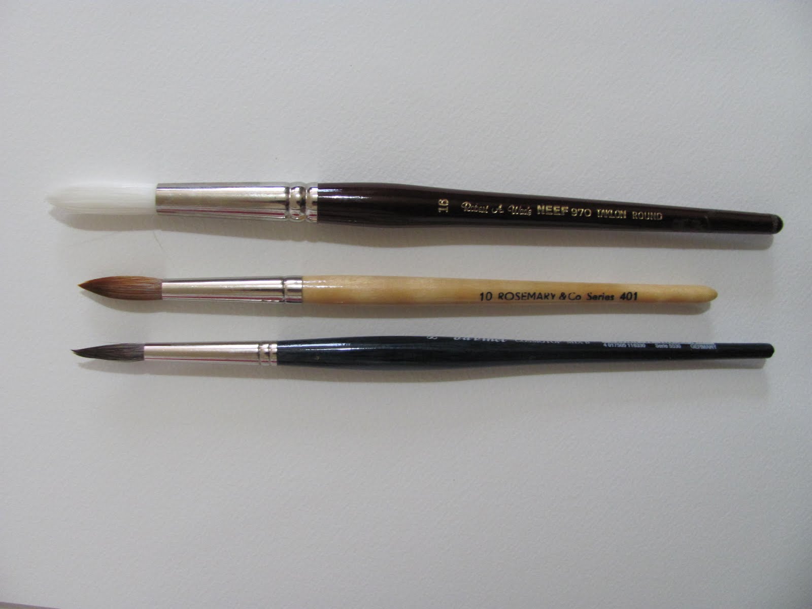
The brushes above are synthetic mixes apart from the white Neef that is pure synthetic. Neef are what Robert Wade uses.The redoubtable Zvonimir recently pointed out that sables were damaged quite easily on rough hard surfaces, papers like Arches or Khadi. He recommended synthetic brushes for those papers. I have quite a collection of sables but also the three above, not previously used. I'm also concerned at the escalating and eye watering prices of sable brushes, especially when you get past size 4. So as well as the board I tried out the Da Vinci 5530 Cosmotop B size 8 and the Rosemary 401 size 10. I used a smaller older sable brush for the smallest detail. The Da Vinci brush is a mixture of animal hairs with a small amount of synthetic. Viktoria Prischedko and Piet Lap both use these Da Vinci brushes in a range of sizes and types, not just rounds. Jacksons current price for the size 8 is £11.00. Rosemary is a mixture of red sable and synthetic, and offers two round series (plus other types) 401 and 402. The size 10 401 is £10.40p or £10.70p with a longer handle., the 402, a longer slimmer brush, £11.25p. Size 8 is only £7.95p.
To be honest I don't see much difference in the above result - if any - between these and the dearest sables I use. Possibly that's just me so don't take it as gospel. How they will last is something that only time will tell. I won't be buying any more expensive sables as I have plenty. There are now a mass of new synthetic brushes on the market and possibly they are finally living up to the claims that they 'emulate sable'. Otherwise try sable/synthetic mixes - the best of both worlds.
As said these are provisional comments based on just a little experience. I will post again when I've further to report.
Friday, 4 January 2019
First Painting of 2019
Actually I did the drawing prior to Xmas, and finished the painting on the 1st, having started it a few days before BUT it was finished on the first. I have been collecting a series of references in three main categories, Birds, Animals and Native Americans. I go through them from time to time and select ones to be painted. They all come from Pinterest.

'American Bison' 16" x 12" Cornwall 450 gsm Rough
This paper is one of the extensive Hahnemuhle range. It's a heavier weight so doesn't buckle. The surface is fairly pronounced and quite hard so the paint does not sink into the paper nor spread much. These features can be both an advantage or the reverse depending on what sort of outcome you want. The original animal is mainly a darkish brown colour although there are hints of other colours. I approached it using Charles Reids dictum of arbitrary colours. Cerulean Blue used for cools with a mix of Ultramarine Blue Light (Lukas) and Transparent Brown (Schmincke) for the darks, sometimes more blue and sometimes more brown. Also used was Raw Sienna, Quinacridone Gold (Daniel Smith or Winsor and Newton). I still have some of the original paints made with PO49 not the current multi-mixes. Also Quinacridone Burnt Orange (Daniel Smith PO48).
I was reasonably pleased with the result although not perfect by any means. As Charles says 'mistakes are part of it'.
I was reasonably pleased with the result although not perfect by any means. As Charles says 'mistakes are part of it'.
Subscribe to:
Posts (Atom)