This Amerindian image is from the Edward Curtis series and represents a hostile Apache brave circa 1880. I have done this one before but I think this is better. The likeness is not 100%, round about 70% I would say.

I'm not sure what the paper is, possibly Indian hand-made, bought from Foyles in Cabot Circus, Bristol. Foyles are a famous London bookshop - now a small chain - not an art supplier but they were selling a small range of watercolour paper.

I used a scale divider to help me get the dimensions and spacing right scaling the guide photo up one and a half times, using a mechanical Pentel 07 2B pencil.

Stage 2 - approximately.
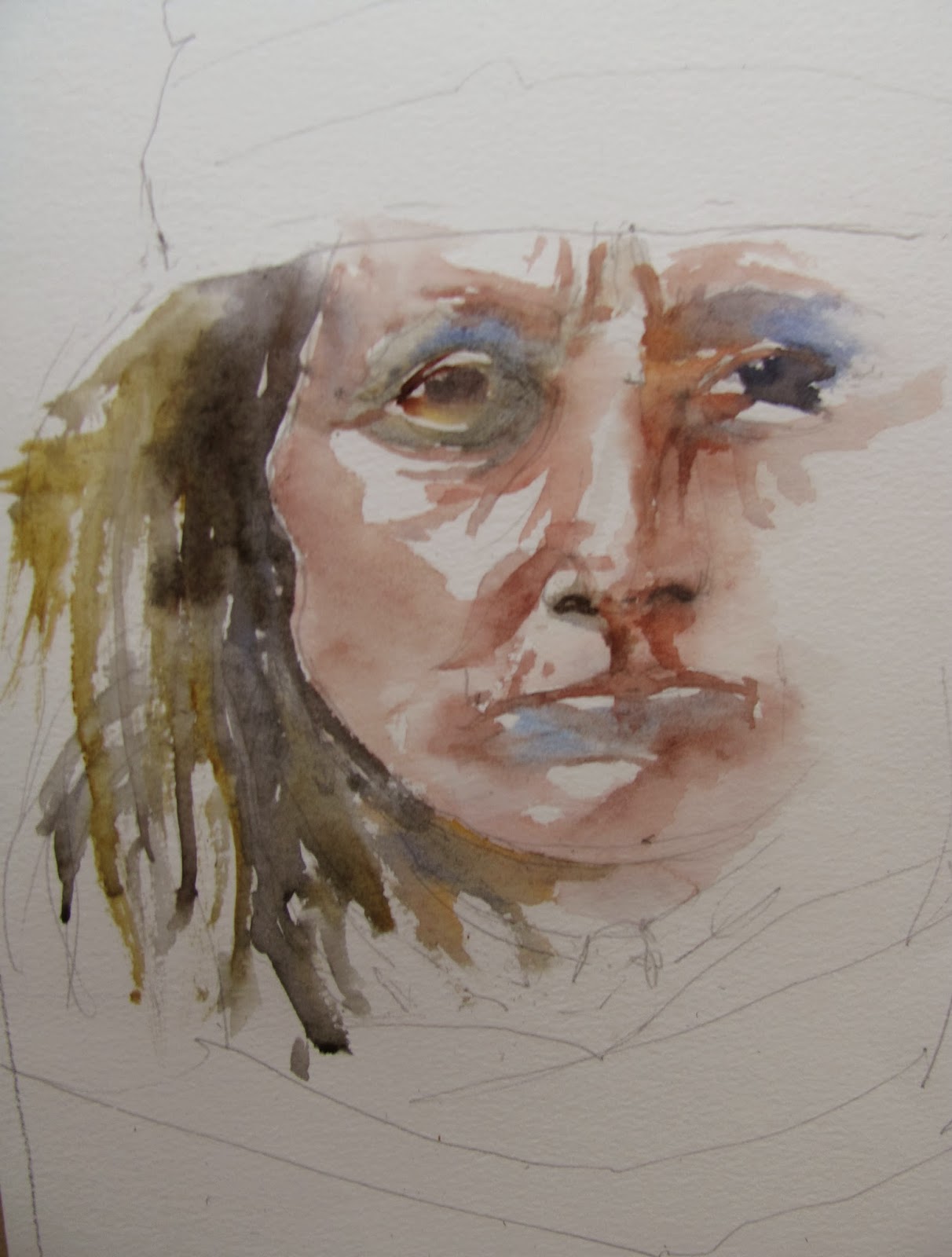
Stage 3

A Hostile Apache - 16" x 12" Not
Face colours were essentially various mixes of Cadmium Red Pale, Cadmium Yellow Light, Cerulean and Cobalt Blue. The major colour is Cadmium Red, very little yellow and small amounts of the blues to darken the mix.
The hair is basically Ultramarine Blue, Burnt Sienna, Burnt Umber and Raw Umber in various mixes. His headband is Quinacridone Rose, Quin Coral ad Perylene Maroon with some Cobalt Blue..
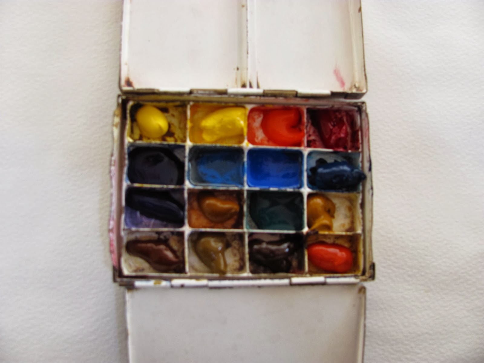
After seeing Charles Reid paint portraits using the small Craig Young Sketchers box I decided to do the same. I haven't been using this in recent months and decided to start with fresh paint. Charles checks the paint mixes consistency by holding the palette vertically and if it runs has too much water. The colours are, from left to right and top to bottom as follows:
:
Ist Row; Hansa Yellow Medium (Daniel Smith PY97), Cadmium Yellow Light (Lukas), Cadmium Red Pale (Rowney) and Permanent Carmine (Winsor & Newton)
2nd Row: Ultramarine Blue (Rowney), Cerulean (Graham), Cobalt Blue Deep (Rowney), Turquoise (Lukas),
3rd Row: Ultramarine Violet (Graham), Quinacridone Gold (Daniel Smith), Viridian (Rowney), Raw Sienna (Rowney).
4th row: Translucent Brown (Schminke), Raw Umber (Rowney), Burnt Umber (Rowney), Translucent Orange (Schminke)
You may note (some with horror?) that six different makes are involved. I have added three colours that have taken my fancy in recent months, the Schminke Translucent Orange and Brown. The orange replaces Cadmium Orange and the brown Burnt Sienna. The Schminke orange is redder than Cadmium Orange, and more transparent. The brown is a brighter Burnt Sienna. As for Turquoise (PB16) I just love that colour! I still have supplies of these other colours so no doubt they will appear again. They won't necessarily feature in portraits.
A few words about Graham paints. I do like Graham but they do tend to be over moist and remain so on the palette. When I squeezed out the Cerulean there was separation with liquid and pigment. Some tubes I have of Graham have leaked, apparently from pinholes. This is happening in a not particularly hot climate so I can understand the problems that occur in places like California. One colour, Mineral Violet, turned a muddy brown and three tubes later it still did the same thing, despite my being told the third tube was from a different pigment supplier. Will I buy more? Not sure but I do like some of their colours especially Quinacridone Rust.
15 comments:
I agree that the likeness isn't 100% but as I wasn't looking for the likeness but the final piece, I have to say this one is wonderful, particularly the work around the eyes and the highlights.
As an aside, I really like the way the drawing came out. Ever thought about trying some pen and ink?
Thanks Peter for this. I hardly ever paint portraits so seeing how you do it is really interesting. I also learnt lots from Charles Reid's books especially his colour palette and the addition of blues in portraits. Though I am not as loose as him. I can see his influence in your work though. Your apache turned out beautifully. Lots of loose passages. Wish I was as confident in loosening up within the boundaries of a portrait but I suppose that comes with practice perhaps.
A great portrait, a lovely loose style achieved. Congratulations!tcnabl sizetc
Oh! Don´t mind the last letters! Those letter accurd when I tried to send the comment! My typing ended up in the wrong place apperantly! ;)
Thanks for comments Laura. As far as Charles palette is concerned every time I've studied with him there have been variations.Usually there are two or more different colours. You may notice in his books that this occurs. One of the things he preaches in his portrait painting is not to stop at boundaries.
Thank you Catharina for kind comments.
Excellent portrait Peter. You laid the groundwork well by stage 2 then it just got better.
apologies for posting anonymously a few days ago; think it has been straightened out now. I was so worried you were potentially going to stop blogging (don't stop!)
I am a watercolorist located north of boston and have been trying to paint plein air more this year (but the weather is not cooperating now).
Today's painting of the native american has particularly lovely lost and found edges.
thank you
Thanks Ray. Your comments always welcome.
Hi HannaB and thanks for comments. I've been to Boston twice. Lovely city.
I seem to have missed replying to your comment Oscar. Apologies. Thanks for your kind remarks. I do like this one myself. I have tried pen and ink but not recently.
nice portrait!
Fabulous apache portrait Peter, wonderful expression and great colours.
Thanks kunst kopen.
Thanks Jan. I don't think Hap approves of the face colours as he hasn't commented but I'm happy with it so.....
Post a Comment