Tuesday, 29 January 2013

Snow Leopard

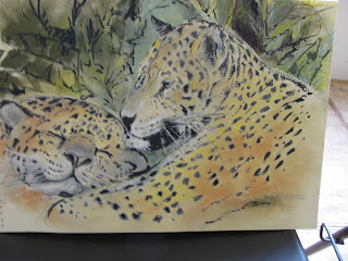
This is my latest animal portrait and is of a snow leopard. These secretive and solitary animals live high in the mountains of Central Asia and are in danger of extinction as there are less than 10000, some say even fewer, and they are hunted for their fur. There are several hundred in zoos around the World but do we want so many of these endangered species just existing in zoos?


16 " x 12" Gerstaeker No.3 200gsm 

Initially I made a `careful, drawing, avoiding `super' realistic detail, with a mechanical Pentel 05 2B pencil. I concentrated  on the face and reduced the detail outside of this to just a hint. The paper is a cheap own label Great Art product. It is basic but seems to work quite well on subjects like this. I wouldn't recommend it for large washes or where much over painting is done.

With the snow leopard being portrayed in Winter this is inevitably a  very `cool' painting although I have tried to introduce a little warmer colour for balance. Colours used were mainly Cerulean and Moonglow (Daniel Smith) with Raw Umber and (very) diluted Quinacridone Gold (Daniel Smith PO49). There is a little Ivory Black (Maimeri) about the eyes, nose and lip areas. The eyes have some Gold Green (Rowney PY129) in the lower parts. There may be slight touches with one or two other shades. Since I photographed it I have added a little red to the eyes.

I have done several of these animal paintings recently and will now be turning to other subjects, although I like painting animals and birds and will continue to do so. Judging from the lack of comments - apart from spam increasing exponentially - the Rhino painting, which I was very pleased with, seems to have  created little interest, although well received on Facebook, including a nice comment from Trevor Lingard. I am a little disappointed although that's life! I know animal subjects aren't everyone's cup of tea (or coffee). As the February challenge is of Irises I shall be working on some simpler compositions of this flower and if good enough may post the results, prior to the actual challenge subject, which is a much more complicated group of irises. 

Coming up soon are posts on Quinacridones PO48/ PO49 and I will also be featuring the artist Cao Bei-An.


Friday, 25 January 2013

Rhinos

The last meeting of Avon Valley Artists had as the subject `Animals'.  I selected a photograph of two Rhinoceros - probably mother and son (or daughter) but I can't be sure of this. The composition appealed to me, especially the head of the larger animal. 


`Rhinos' 18" x 12" Fabriano Artistico Extra White 140lb (300gsm) Not

I first made a careful drawing using a Pentel 205 2B Size 05 mechanical pencil. Although careful this was not over detailed. As can be seen in the photographs above I began by painting the head of the larger animal, starting with the horn and working across. I then painted the smaller one. There was a limited amount of over painting, particularly with respect to the darks, and I did a little more work on the rear leg of the smaller animal as Yvonne pointed out it was light by comparison with the adjacent darks. The background colours are Hansa Yellow Medium (Daniel Smith PY97) and Cobalt Teal Blue - I love this colour!

The main colours used were Quinacridone Gold (Daniel Smith PO49), Quinacridone Burnt Orange (Daniel Smith PO48), Raw Sienna, Raw Umber, Moonglow (Daniel Smith), Cobalt Teal Blue (Daniel Smith PG50) with the darks mixed from various combinations of Moonglow, Ultramarine and either Burnt Sienna or Burnt Umber. There is a little Ivory Black (Maimeri) in the eyes and a couple of other places. The Daniel Smith Burnt Orange is the same pigment (PO48) as the Graham Quinacridone Rust. I think it a little redder.

Brushes used were the Escoda and Isabey Kolinsky retractables sizes 4 to 10. Overall I am quite pleased with this one.


Avon Valley Artists - Animals

This was the subject at our meeting a week past Thursday. I decided to cover my effort in a separate post but show other members work, with some excellent paintings here.


Yvonne Harry


Cath Wilkins


Pat Walker


Jan Weeks

Gerald Pink

Since the above sadly Gerald has had a serious fall due to the current snow and icy conditions, and is in Bath RUH, where he is undergoing treatment. He is likely to take quite a while to fully recover and we send our best wishes to him and Sylvia.


Tuesday, 22 January 2013

Self-Portrait

This is another attempt at a self-portrait. My wife doesn't like it so I'm posting it with some trepidation. On the other hand I'm a believer in `warts and all' paintings. The fact that I rather look as if I've swallowed a lemon is irrelevant and the bloom of my youth is long departed. Well I don't feel that old so...!


`Self-Portrait' 16" x 12" Waterford 140lb (300gsm) not

I began with as careful a drawing as possible, although not over detailed, using a Pentel 05 mechanical pencil with a 2B lead. My skin mix was based on the Charles Reid one of Cadmium Red, in my case Rowney Cadmium Red Pale, together with smaller amounts of either Yellow Ochre (Graham PY42) or Raw Sienna. Yellow Ochre gives a slightly darker mix. They are mixed in the palette and I brush out some Cerulean and/or Cobalt Blue Deep (Rowney PB72) in a separate well'. Sometimes I add the colours together in the palette or mix on the paper. The blues are used to darken the mix for the shadow areas. I start with the features, eyes first, then down to the nose and lips. After that I extend the wash to the other areas and make sure I don't have a definite edge where the brow meets the cap under the brim. For the features I tend to use the Isabey Retractable Size 6 Series 6201 Kolinsky which is small for a size 6 but long and slim. For the remainder I use the Isabey 6228 Kolinsky sizes 4, 6 and 8 and also the Da Vinci Artissimo 44 Size 2 mop for  areas like the cap. When the initial washes are dry, and consequently much lighter, I go back in with the darker mix for the shadow areas with special emphasis around the eye sockets, making sure not to leave too many hard edges. I try not to mess around with it too much but often stray over the line. Although my system is based on the Charles Reid way I'm also impressed by several other superb artists whose portrait paintings I have come to know like Fealing Lin, Cao Bei An, Bev Jozwiak, Paul Lovering, Stan Miller and there are more. 

Saturday, 19 January 2013

Doors, Windows & Gates

 Rustic wall of building on Corfu

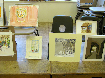
This was the subject(s) at last weeks Avon Valley Artists meeting which left considerable scope for interpretation. Members brought there own source material and off we went. Below are the results. 


Apart from my own effort, which I photographed later at home I wasn't able to take any other individual ones, other than the groups above. The reason was that a funeral was  due at 12 noon and the Hall is next to the lane that leads up to the Church. Access is poor and parking around the hall is such a problem, due to some of the locals parking their cars there more or less permanently, that we were warned we might be blocked in for an hour or so, and were obliged to finish in a rush and get out while we could. Fortunately this doesn't happen too regularly.


30 x 40cm Gerstaeker 200gsm Not `Rustic Window'

My guide photograph showed this section from a typical rustic building on Corfu. What I liked about it was the lack of conformity - no straight lines - and the variety of colours. I've exaggerated the colours in the painting.

Colours used were Permanent Rose (Graham PV19), Cadmium Orange (Maimeri PO20), Quinacridone Gold (DS PO49), Quinacridone Burnt Orange (DS PO48), Moonglow (DS PG18, PB29, PR177), Cerulean Blue, Cobalt Teal Blue (DS PG50), Viridian (Rowney PG18), this latter mainly on the wooden shutters, a little Burnt Umber and some Raw Sienna . I think that's it. The following day having decided the overall effect was too pale I added a diluted wash of Raw Umber over the whole painting. You may note the use of Moonglow, a three pigment mix. Normally I avoid multi-pigment paints but in this instance, and a few other Daniel Smith paints I break my rule. After all why be dogmatic? Moonglow is darkish grey with a purplish tinge - a lovely shade with several uses.

Brushes were my Escoda and Isabey retractables sizes 6 to 12. For the overall wash of Raw Umber I used the Rosemary - actually mine is labelled ABS - Kolinsky Mop Size 4. 


Thursday, 17 January 2013

December/January Challenge

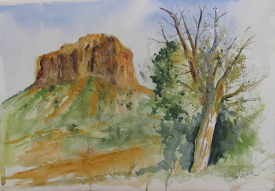
Due to the hectic Xmas/New Year period Mick Carney and I decided to extend the challenge over two months instead of one. To recap each of us selects a photograph on alternate months and we produce a painting which we subsequently post on our blogs. For this current challenge Mick selected the subject which I suspect is Monument Valley in the USA - actually he calls it Red Rock country - which he visited in 2011. Added 17/01/13: Actually it's Sedona - famous for the red rocks.


20" x14" Fabriano Artistico Extra White 140lb (300gsm) Not

I had considerable difficulty with this subject. I really wanted to produce something more creative but after pondering how to tackle it over two or three weeks, decided to adopt a fairly conventional approach. The obvious features are the mountain and the bush or tree. The rest is just window dressing and I had no intention of trying to represent all the scrub and bushes in any detail. Initially I made a simple pencil drawing with little detail. Then, against my normal practice - although I am beginning to do this on certain paintings - put a pale variegated wash over the whole paper. Even with blocks this causes some buckling but the paper mostly flattens when it dries. Colours used were mainly yellows and greens. The yellows, Raw Sienna, Gold Ochre (W & N PY43), Quinacridone Gold (DS PO49), Yellow Ochre (Graham PY43) and Raw Umber. The greens were mainly Hookers (Graham PG7/PY110), Sap Green (DS PO49/PG7)), and  Green-Gold (Rowney PY129). There is some Quinacridone Rust (Graham PO48) on the mountain and also Burnt Umber in the shadow areas. And Ultramarine Blue was added to Hookers for the dark areas around the tree trunk. The sky is diluted Cobalt Blue initially applied as part of the variegated wash..

Brushes used were the Rosemary Kolinsky mop for the variegated wash and the Isabey 6228 Kolinsky 6 & 8 together  with the Da Vinci 44 Artissimo No2.

I'm moderately satisfied with the result, as it isn't my favourite type of subject. Perhaps I've been rather heavy handed in places, something I need to address.  


Wednesday, 16 January 2013

Evie by Gerard

I have  had the painting of my grandaughter Evie, aged 8, framed by the Meltone Gallery in Bath. This was by the Dutch artist Gerard Hendriks who painted her from a photograph that appeared on my blog, He generously gave me the completed painting, not even allowing me to pay the cost of carriage. Although never having met Gerard I have come to know him a little through Facebook and as a person his statement that he `likes to make people happy' says it all. Forces are at work to try and persuade him to come to the UK for a workshop in either this year or next, and if this does materialize I'll certainly aim to be there if at all possible. 


`Evie' by Gerard Hendriks approx. 15" x 11" Hahnemuhle 600gsm

Regular readers of the blog will know I did a major feature on Gerard and his paintings in August 2012. In the same month I posted the story of how the painting came about, `Evie by Gerard Hendriks'. 

Wednesday, 9 January 2013

Translucent Orange (PO71) & Translucent Brown (PBr41).

I have already done a piece about the Schminke Translucent Orange and the paint has been a great hit with Jan and Yvonne of Avon Valley Artists and I agree with them. We owe this to Jean Haines most recent book where she lauded it as a `must have' colour and I subsequently bought some, gave `dabs' to Yvonne and Jan and off we went! They have both now purchased this colour.


The Schminke is on the left with Lukas in the centre. Translucent Brown, of which more later, is on the right.   On these two orange swatches the Lukas appears paler and more orange than the Schminke colour. This may be my faulty mixing because if you look at the swatch in the previous post on Lukas you will note it is much more like the Schminke shade. Schminke (via Great Art) is £8.24p for 15 ml while Lukas is £6.25p for 24 ml. Quite a difference. It will take a while to properly evaluate these colours  and if I find anything interesting - good or bad - I will report.

Now I come to Translucent Brown. Schminke have three colours they call `Translucent'. They are the orange above, Translucent Yellow (PY150) and Translucent Brown (PBr41). Rui reported that he had evaluated the yellow and found it excellent but had not yet came to a decision on the brown. I have PY150 as Azo Yellow made by Graham which I haven't really tried much as yet. PY150 is one of the newer pigments that is gradually appearing in all the major lines. Until recently at least Schminke are the only source of PBr41.

Sunday, 6 January 2013

Lukas

I have been thinking for a while of doing some reviews of watercolour paint manufacturers and decided upon Lukas, the comparatively little known German company, as the first. Why Lukas? Essentially because I think this is a company with a combination of quality and price that may be hard to match. I do realise this is arguable with personal preference a factor, and availability is not as widespread as many of the competing makes, but if you want a good quality product at a very keen price then read on.


The standard 24 ml tube which is the only tube size Lukas offer. Note the comparison with a Schminke 15 ml tube.They also have half and full pans. 


The four Lukas paints I have which are Turquoise, Cadmium Lemon, Cadmium Yellow and Permanent Orange. The Turquoise (PB16) and the Orange (PO71)  are two of the more interesting colours in the range. Note the greens made by mixing the Turquoise with the two yellows. I shall be posting a separate piece comparing the Permanent Orange with the Schminke Translucent Orange, both the same PO71 with this pigment only on offer (as far as I can tell) from these two.

Lukas are an established German company who have been making watercolours and other mediums, founded in 1862 by Dr.Fr.Schoenfeld, hence the name of the artists quality watercolours LUKAS Aquarelle 1862. The range was reformulated a few years ago prior to which, in 2004,  the Handprint site reviewed them.and damned them pretty thoroughly, fugitive pigments, too many brighteners and fillers etc etc. However in 2006 Bruce added a note saying  the range had been reformulated in 2005 with a slight increase in numbers to 70 and a large increase in single pigment paints. To quote him

 "All the paints I highlighted as fugitive in my 2004 paint tests and some of the dubious convenience mixtures have been discontinued. The replacement pigments...... are of excellent generic light fastness  in fact Lukas now conform to the conservative pigment choices common to other manufacturers..."

Bruce finished by saying he had not tested the new paints and signed off with a fairly negative comment as if he was disinclined to give them a second chance, although he does say past standards are not necessarily a true guide as things can and do change. 

Now to the range which comprises 70 colours of which 69% are single pigment paints. The 7.5 ml tube has been dropped and 24 ml is the standard size plus half and full pans. It is a fairly conservative one compared to the likes of Daniel Smith, Schminke, Holbein and Winsor & Newton but read on.  With the number of colours available then Daler Rowney, Graham, Maimeri, Bloxx and Rembrandt, who offer a similar number are probably fairer comparisons. We are talking here about a comparison involving a combination of quality and price. All the basic shades are well covered and as highlighted already, slightly unusual choices like Turquoise and Permanent Orange are there together with Green Yellow (PY129). There are 12 greens, half single pigment paints and a good selection of reds (11) plus purple and violet. The blues are extensive and include Manganese Blue (PB33). Note: Although Manganese Blue is still listed Rui says the true PB33 has been discontinued so the formula may be different.

The only strange choices, in my opinion, are  some of the earth shades. Burnt Umber and Raw Umber are three pigment mixes, while Neutral Tint is four. Personally I steer clear of multi-pigment paints, although there are exceptions, especially amongst Daniel Smith paints.

How do Lukas compare in price to other artists quality makes? The short answer is very favourably with cost per ml well below most others. This is partly due to the 24 ml size which is being currently sold at prices cheaper then the 15 ml, 14 ml in the case of Winsor & Newton, of other makers. It is true that Rembrandt also offer a 21 mil,and Winsor & Newton plus Da Vinci  37 ml in a limited range of paints. The complete Lukas range is on offer in 24 ml in two price series..

Where can you get Lukas paints? The only two UK sources I have found so far are Great Art www.greatart.co.uk/ and Lawrence of Hove www.lawrence.co.uk/ . Great Art  supply from Germany but have a UK telephone number and website. Current prices are £6.25p and £9.25p, Lawrence are a similar price but have an offer of a further 20% off if you buy six tubes. Lawrence charge £4.99p carriage while Great Art offer it free if the order exceeds £39. 

I now come to something of a mystery. I originally obtained most of the information above from the Lukas site www.lukas.eu/ This no longer appears to be active and the only reference which comes up is www.lukasamerica.com/ which seems to be part of Jerrys Artarama, a mail order art supplier. What does this indicate? Have Lukas changed ownership and will it affect future supplies? If anyone has any information please let me know. There is a lot of information including pigment information and colours on Jerrys site and, according to a contributor on Wetcanvas, you can download a pdf which seems identical to the one I originally downloaded from Lukas. She also gives the link. I actually clicked on it and it worked so if you Google Lukas watercolour paints the link to Wetcanvas should be there. Then scan the posts until you get the relevant one.. Those on Wetcanvas  who had used Lukas were quite complimentary. Note added 08/01/13: If you click on the link to lukasamerica (Jerrys Artarama) then follow watercolours through Acquarelle 1862 you'll discover the pdf downloadable file. Jerrys appear to have sole franchise on Lukas.


Thursday, 3 January 2013

Thin on the Ground

Avon Valley Artists resumed our weekly painting sessions today, after the Xmas and New Year break. Numbers were down with only nine present, including a new member. This is understandable as normal service doesn't really resume until next week after the New Year festive period ends.The subject was `Sweets & Cakes' obviously tied in with the festive season.


 "Sweets" 9" x 7" Gerstaeker No.3 200gm.

This was my small `sketch' which is on a larger sheet of paper 30 x 40cm. This is a cheap paper but perfectly acceptable for the way I paint (!). I took a handful of sweets from the Xmas collection and scattered them in a rough pattern on some white kitchen tissue. I first made a pencil drawing then painted them. The whole thing took a maximum of thirty minutes (including breaks). I then had to twiddle my thumbs for another hour so I washed up  the coffee cups and did sundry other small tasks, while the others got on with their paintings. It was a nice little exercise and I quite enjoyed it. Plenty of colour choices including Perylene Maroon, Quinacridone Rose, Permanent Magenta and Ivory Black for the  Cherry Liqueurs at the back, Quinacridone Gold for the Truffles in front of them, and Cerulean, Cadmium Orange, Hansa Yellow Medium, Quinacridone Rose, Burnt Umber and Ivory Black for the Allsorts. The background had some Cobalt Teal Blue and Viridian. Mostly Daniel Smith and Graham paints. Brushes were the Escoda and Isabey retractables, nothing larger than an 8, and the Escoda size 8 is not much larger than many other size 6's. 


Yvonne Harry


Myra Abbot


Brenda Parsons


Jo McKenna


Cath Wilkins

Next week the subject is `Gates, Doors, and Windows, with `Animals' the following week.  


Tuesday, 1 January 2013

Welcome to 2013

A Happy New Year to everyone who visits this blog (and everyone else). I have been thinking about what to do this year and will be posting some items in the next week or so. The blog has been going for three years and eventually will  reach its sell by date. As long as interest remains I plan to continue for a year or two. Naturally `events' might alter this  and we hope to relocate within the next twelve months, only locally, as the years are fast advancing and a smaller property beckons. If that occurs it shouldn't be a major problem but might cause some temporary dislocation. The blog has achieved 10000 page reads in both November and December, which isn't a true indication of visitors but must indicate numbers are substantial, so some things I do are of interest, although I'm sure curiosity plays a part. 


Father and Son 18" x 12" Fabriano Artistico Extra White 140lb (300gsm) Not

This is the third and final version of this subject, two water buffalo that I assumed are indeed father and son. I concentrated on the faces and the rest is just window dressing. Colours used were mainly, Quinacridone Gold (Daniel Smith PO48), Quinacridone Rust (Graham PO48), Gold Ochre (W & N PY43), Cerulean, Raw Umber and Burnt Umber. I think that's it. By final I mean I'm finished with it not that it's definitive! Apart from the faces colours mainly mixed on the paper. I also added touches of white gouache and acrylic when at the end and thoroughly dry. It was completed over several days while I pondered what to do next.

 December/January  Subject

Regular followers will know Mick Carney www.thepaintingstruggle.blogspot.com/  and I have a monthly `challenge', where on alternative months we pick a subject to paint. It was decided, because of the Xmas period to increase this to two months and Mick picked the above photograph, I suspect taken on his last trip to the USA - Monument Valley possibly?. Never mind his painting struggle, I'm struggling as to how to tackle it.  I keep looking but so far no shaft of inspiration has occurred. I don't want to do a copy but  have only managed a basic drawing, leaving lots of flexibility. I thought this might be of interest as a number of posters have expressed curiosity about the process from start to finish. 

Finally the painting by Gerard Hendriks of my grandaughter Evie is at the framers so I should have it soon. When it appears I will undoubtedly post a photograph of it, probably held by proud grandad.