Wednesday, 25 May 2016

Book Review - Keys to Drawing by Bert Dodson

I may have mentioned this book before as Charles Reid told me, when on a workshop, that he considered it the best book on drawing. This is a bold statement as there are hundreds of books on drawing and Charles can't possibly have read all of them. They vary from the classical style `Atelier' type publications to every variation on the theme. Having bought it I certainly agree with him from my point of view. I have several others, including classics, but I prefer the `looser' style of Charles and Dodsons book, while covering all types, is more to my taste. 


Keys to Drawing - Bert Dodson. North Light Books this edition paperback 1990 224 pages approx. 81/2" x 103/4"
Current Amazon prices - Hardback £16.30p, Paperback £14.88p , From Amazon partners used and new from £6.64p Also Kindle edition.

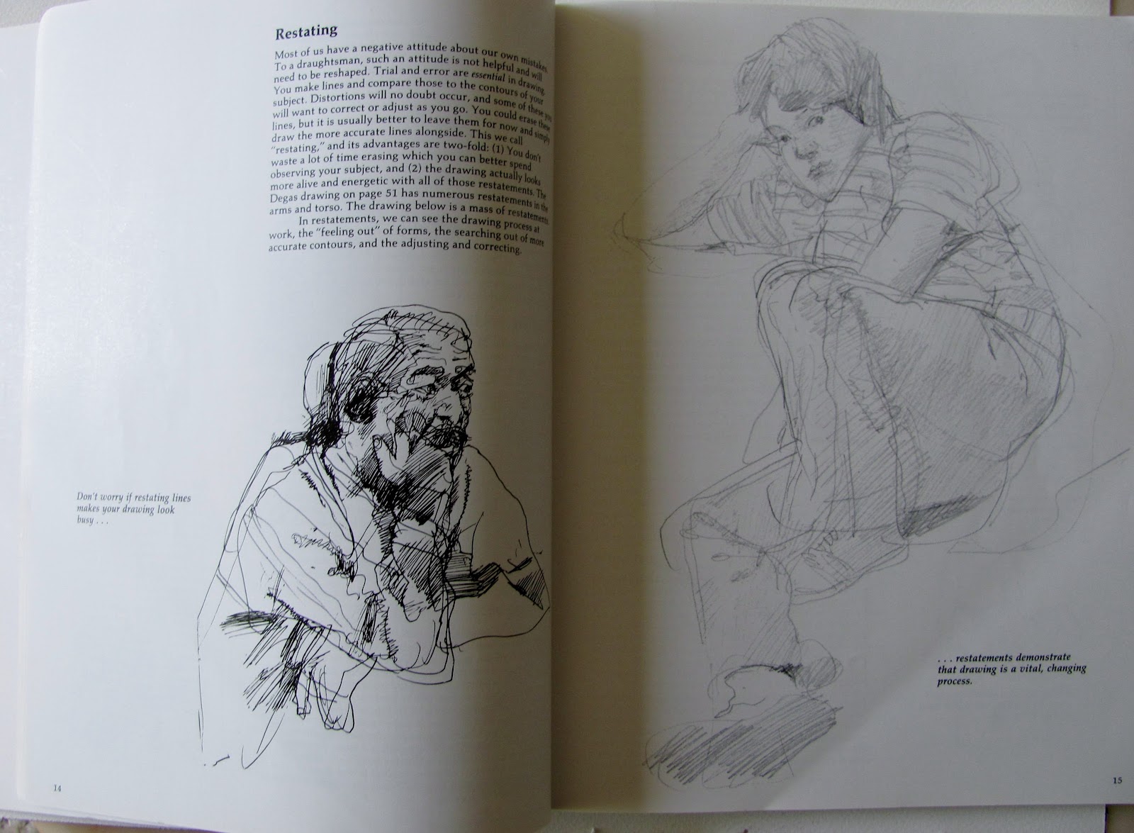
Here are some examples from the book.


I realised after doing this that I had skimped it rather and can only apologize for my befuddled state. Following a weeks holiday in Malta I returned and immediately went down with a raging cold and cough. Here are some of the things the book teaches:

55 specific keys to improving your drawing.

48 mini lessons that help you master techniques

8 self evaluation checklists to help you gauge your progress

In addition it teaches you to restate, focus, map and intensify. Free your hand action, then learn to control it.
 Convey the illusions of light, depth, and texture etc Enough said to kindle your interest?

I imagine this book won't suit everybody, who might prefer a more orthodox approach although Dodson does cover all types of drawing and we get none of the `this is the only way to do it' approach.. I think it excellent and refer to it more than any other drawing book. He did publish a second book but it didn't seem to me as interesting as this one.

Monday, 9 May 2016

The Green Man

The subject at the latest AVA session was `Greens'. This isn't beloved by many but, as is my usual method, I entered the search on Google and came up with the Jack in the Green festival at Hastings. Previously my association with Jack in the Green.was in regard to the primrose flower of the same name, due to the green ruff _ leaf like - in which sits the flower. I used to  raise them when I was hybridizing primroses. The Festival is based on an old Pagan ritual, involving Morris Dancing and is held on May Day. It was revived at Hastings a few years ago. Look it up - quite amazing what the participants get up to in terms of dress, covered with leaves and much else to give an overall green impression..


The Green Man 16" x 12" Waterford High White

I completed the drawing two days before the AVA session so was ready to start immediately and perhaps take more time over the painting. I have a tendency to rush in where others fear to tread.

What to do about the greens. Well here I simply went into my box of greens and picked out several, Sap Green and Hookers Green (Graham), Cascade Green and Apatite Green (Daniel Smith), Sap Green (Lukas) and a couple of others. They weren't all used in the actual painting but most were. I also added Cobalt Teal Blue (Daniel Smith PG50), a lovely colour with a greenish tinge that is often difficult to fit into a painting. Here it featured quite strongly. Other colours were Translucent Brown (Schminke PBr41) and Cerulean for parts of the pipe. Some Burnt Umber in the pipe as well as the Translucent Brown.The eyes were Cadmium Red Light with a little Raw Sienna and Ultramarine added for the darker areas and the iris.

I started off with the eyes then the nose followed by the mouth. I didn't do these in isolation but ventured into the areas adjacent to them. Once I'd done that I completed the green leaves around the head and painted his beard with lots of Cobalt Teal Blue as well as some green.

Brushes used were the Isabey 6201 travel brush for the main detail plus Isabel Kolinsky sables 6228 sizes 4, 6 and 8.

Overall this went well and I am happy with it as it achieved my aim of a loose interpretation which I felt caught the subject quite well.. I had a slight problem with the eyes and am still less than 100% happy even after remedial action the day after the AVA session.


Tuesday, 3 May 2016

Watercolour Paintings (18)

Here is this months batch of watercolour paintings. Again a mix of well-known  and lesser known artists with a variety of styles. Naturally I include a few of my favourites.


Robert Wade - Doyen of Australian watercolour artists


Gerard Hendriks - A master of colouir and movement - and much else


 Nirupam Konwar - another new one to me


Ewa Ludwiczak - very Charles Reid.


Trevor Waugh - I've seen him paints flowers like this.years ago


Christian Couteau -Very much a colourist


Samiran Sarkar - Simple yet effective


Milind Mulick - colourful and profilic, great use of greens


Charles Reid


Oops! Wrong artist - this is Joseph Zbukvic


Javed Chowdhury - New to me


Another from Gerard Hendriks


Valentino Veriato - |Quite amazing


Jonathan Kwegyir Aggrey - Amazing young African artist with a growing reputation

Sunday, 1 May 2016

Latest Paintings

These are my latest efforts.

16" x 12" Centenaire


16" x 12" Waterford High White - An Amerindian mother and child.


16" x 12 Waterford High White -Left Hand - Comanche


16" x 12" Waterford High White 
Peter Dinklage as Tyrion Lannister in `Game of Thrones'

Usual brushes and colours. I'm painting a bit more often and the rust is beginning to disappear. .


Tuesday, 19 April 2016

Ultramarine Blue PB29 (Pigment Blue 29)

As we have already discovered there are several variations of Ultramarine Blue, each pigment batch defined by a five figure number. I think this applies to many other colours,  PV19 Quinacridone Rose /Red/Violet being examples.

Ultramarine Blue is the modern synthetic replacement for the original natural Lapis Lazuli.  The pigment database www.artiscreation.com. describes it thus `...either the pigment extracted from Lapis Lazuli or the synthetic form Poly sulfide of sodium potassium, lithium or silver alumino-silicate' I hope I've got that all right! We then go to colour shade which is described as: `Deep blue, violet to bright bluish green shades, usually slightly duller in natural forms...' Lapis Lazuli can still be obtained from a very small number of sources and there are purists who will hunt such out but it is exceedingly expensive, while the synthetic Ultramarine is usually in the lowest price range..


Ultramarine has to be amongst the most popular and widely used paints. In general it doesn't suffer from the surfeit of  fanciful names applied to many other paints (pigments). In the majority of cases it is called Ultramarine Blue but also sometimes French Ultramarine, Ultramarine Light or Deep, with a green shade sometimes offered ( W & N).  Schmincke rather bizarrely  have an Ultramarine Blue made with PB29/ PB15 but also offer `Ultramarine Finest' which is PB29! Daler Rowney do something similar with an Ultramarine Blue but also Permanent Blue which is also PB29..Not having tried these paints I don't know what difference there is in shade between them but looking at the swatches on my col.our chart the Ultramarine Blue looks a deeper more reddish purple with the Permanent Blue `bluer'. The Sennelier  French Ultramarine Blue has PV15 as well as PB29 plus both Ultramarine Light and Deep, both PB29. Several makers, Holbein, Maimeri, offer both an Ultramarine Deep and Light. One of the more recent ranges, the reworked DaVinci call their one (PB29) Lapis Lazuli Genuine while also offering both an Ultramarine Blue and the same again `green shade'. The latest `sensation', the ultra expensive QoR are similar to Sennelier in that PV15 is added to the PB29 and called French Ultramarine Blue. I could go on but is there any point in doing so? I have no real preferences in this colour and will almost certainly give Lukas a try, with both a light and a deep as they are such great value. Currently I have a little Graham Ultramarine and a new tube of Holbein.I've used several makes in the past and have a slight feeling that the ones called French Ultramarine are brighter but I haven't done a proper comparison so may be wrong. 

It has been suggested that a possible alternative to Ultramarine Blue is Indanthrene or Indanthrone Blue which is PB60. This is one of the darkest value paints but on the dull side. I mainly use Ultramarine Blue to produce darks (or even greys) coupled with Burnt Sienna, Burnt Umber or Translucent Brown (Schmincke Pbr41)) , this latter colour resembling a brighter Burnt Sienna. There are other alternatives like some of the reds which will make very strong darks. Plenty to choose from!

Not much more to say really with personal preference playing it's usual part in determining what you buy.

Friday, 15 April 2016

Left Hand

This is my latest Indian portrait, a Comanche Indian with the name of Left Hand. I haven't been able to find anything else about him. The guide photo is from the Edward Curtis collection, freely accessible on the web. The First People site is a good place to start.


Left Hand 16" x 12 " Waterford High White 140lb (300gsm) not

I feel I've been slipping away recently so went back to basics, studying Charles Reid but also one or two other portrait artists like Aime Devine. This is the result. The original photo is black and white or more correctly more sepia-like. Colours therefore are guesswork even the facial ones. 

Colours featured included Transparent Brown (Schminke PBr41), Cerulean, Ultramarine Blue, Burnt Umber Raw Sienna and Cadmium Red Light. I think that's it. Usual brushes, Isabey 6228 and 6201 sizes 4 to 8.


Sunday, 10 April 2016

Product Review - Cornwall Watercolour Paper

I recently tried out Cornwall watercolour paper from the well-known German manufacturer Hahnehmuhle. They have quite a range and Gerard Hendriks uses their Andalucia 500gsm paper - so does Viktoria Prischedko.. The interesting thing about Cornwall is that is  a slightly heavier paper at 210lb rather than the more common 140lb.Yvonne Harry the leader of my AVA group and a very fine artist, quite the equal of many professionals, had purchased some and used it at our AVA sessions. I was quite impressed with the results so decided I would give it a try. It isn't a cotton-based paper, presumably cellulose or similar and being slightly heavier than the norm doesn't buckle quite so easily. Because the weight is heavier the cost is roughly equivalent to a 140lb cotton paper so you don't save in that respect. 


Cornwall comes in both rough and matt surfaces, the rough being quite pronounced with a distinct pattern. Both come in blocks of ten in various sizes and you can also buy sheets. I bought blocks of both surfaces in the 30 x 40cm size, my favoured size. Current Jacksons price for the 10 sheet 30 x 40cm block is £12.20p.

I recently tried the rough surface at an AVA session. The subject was landscapes, which I don't do very often these days so I was very rusty. getting my excuses in first. The surface of the paper is quite rough with  pronounced vertical lines. Brushing across them produces a broken effect. I initially tried a portrait subject and it was a disaster. It just didn't suit the subject at all. Whether the matt surface would be okay I've yet to find out.


Winter Scene - Cornwall 30 x 40cm rough 210lb/450gsm

A few years back I tried another Hahnemuhle paper Britannnia available in rough and matt surfaces. For a while I quite liked it. It has a hard surface so the paint doesn't sink into the paper and remains bright. Being 140lb it is cheaper than Cornwall and the 12 sheet 30 x 40cm is only £9.40p. A good budget option. My favourite papers these days are Fabriano Artistico Extra White and Waterford High White. I'm inclining more to the Waterford and  prefer the 16" x 12" size rather than the 18" x 12" of Fabriano. The Waterford High White took a little time to get used to as it is different from the normal off white,but is a lovely paper used by many top artists. Unfortunately being cotton it is more expensive but there are occasional special offers. I should mention I also use the Great Art Centenaire paper, another of 100% cotton and it is good but not quite as good as the Waterford (my feeling), although a little cheaper. 


Tuesday, 5 April 2016

Watercolour Paintings 17

Here are the latest watercolour paintings I've downloaded. A varied selection with many different styles and approaches. Hope you like them at least some of them!


Ali Sajid

Genevieve Buchanan


Another from N B Gurung


Charles Reid


Sergei Kurbatov


Rose Ann Hayes


Gerard Hendriks


Trevor Lingard


Another from Charles Reid


Robert Wade


Yuko Nagayama


Jem Bowden


Nirupam Kanwar


N B Gurung


Another from Yuko Nagayama


Catjherine Rey


ishfarque Ali

Another very varied selection from well-known and lesser known artists. I include some of my favourite artists as well.  Some wonderful paintings amongst this batch with hopefully something for everybody. 

Thursday, 24 March 2016

Latest Paintings

This first one was the result of the subject `Sunshine and Shadows' at my last AVA session. I know I stretch the subject but this is allowed and I like painting offbeat subjects. I've no idea what to caption this painting!.


16" x 12" Waterford 140lb Not 

The idea is that sunlight is being caught in strips across the cats face. The lines should really be straighter from the actual reference.


WOLF - Apsaroke 1908 
16" x 12" Centenaire 140lb Not

Actually not a great resemblance. I'm getting some of these subjects from a book on Edward Curtis and many photos are quite small.I did this quite quickly in the time I had left at my AVA session. Probably foolishly I posted it on my `Portraits' group on Facebook to get the comment `this is a waste of paper'! probably right. I'm now working on another which (I hope) will be much better.

Wednesday, 16 March 2016

Water

This was the latest subject at my AVA group `Water'. As I've explained before we are allowed considerable licence in our interpretation of the subject.


16" x 12" Centenaire 140lb not

I don't find `water' an inspiring subject but combined with waterfowl or ducks! I made the drawing the day prior to the meeting as this gives me more time to contemplate my approach on the day. I can concentrate just on the application of paint.

The duck colours are Raw Umber and Burnt Umber in various dilutions. A little black and some Quinacridone Gold (DS PO49). The blues are Cerulean, Turquoise (Lukas PB16) and Ultramarine Blue. At the end when dry I also added some acrylic white (Vallejo). If any masking fluid is called for I use the Pebeo Drawing gum. I once criticized this product because it is lethal if you get it on your clothes. However all masking fluid is similar and Jacksons now sell a product for cleaning it off clothes and such like.

Brushes used were the Isabey retractables and sizes 4 and 6 Kolinsky, together with the Da Vinci Mop Size 2.