Sunday, 28 September 2014

Back to Painting - Mystery Animal

After a hiatus of several weeks with no painting, due to the accident to my hand, concerns about my eyes and other family worries I finally returned to activity last Thursday.  This was at the weekly Avon Valley Artists session with the subject of `Mystery Animal'. We had no idea beforehand what this would be but it materialized as photographs of a specific cat and dog.

We were rather light this week with only ten members present, why I don't know.


Only ten members!


Kath Wilkins at 86 our oldest member (?). That white band is a fault caused by my photography


Yvonne Harry


Jan Weeks


This is mine - the early stages


The completed work - 16" x 12" waterford High White


The large painting at bottom right is pastel.

I was slightly apprehensive after doing nothing for weeks especially as I once read you needed to paint at least thrice weekly just to stand still. On that basis I expected to regress - hor far I wasn't sure.

Friday, 12 September 2014

Birds in Watercolour (2)

This is a selection of bird paintings, some from my favourite artists, others that I like but don't know much about the artist. If I've got any names wrong I do apologize. Corrections welcomed.


Gerard Hendriks


Morten E Solberg Snr


Beata Gugnacka


Bev Jozwiak 


Dean Crouser


Lars Kruse


Peter Nilsson


Susan Crouch


Gerard Hendriks


Vickie Nelson 
Kristen Borresen


Bev Jozwiak

Peter Williams

A varied selection I hope you'll agree and a wonderful demonstration showing different approaches. Even if not into birds the use of colour and movement are worth studying In the case of Bev Jozwiak they MAY be acrylic, I'm not certain as she does vary the mediums she uses.

EXTENSIVE INDEX TO BLOG POSTS - JULY 2014

Saturday, 6 September 2014

Graham Watercolour Paints

M Graham and Co, one of the three principal American manufacturers, the others are Daniel Smith and Da Vinci, are one of the favourites of Bruce McEvoy of Handprint (well they would be wouldn't they - just kidding Bruce).

The company are family run and have only been in existence since 1992 so are very much a newcomer to the world of paint makers. In that time the watercolours have gained a good reputation, certainly in America where they are well-priced and widely available, according to Bruce mainly through independent retailers. In England the only source  is Lawrence of Hove who seem to have a monopoly, incidentally also with Da Vinci. In the rest of Europe they are available from Denmark www.gefa-art.dk The only other source outside the USA is in Australia.

The initial offering was only 36 colours but a few years ago, following prodding I feel sure from Handprint, the range increased to 70 colours, 80% of them single pigment paints. I have quite a few Graham paints and a particular favourite is Quinacridone Rust (PO48). All the standard (high quality) pigments are there along with a few exotic ones like Ultramarine Pink (PR259).


This was the best I could find. Look on the Graham site.

As already said Bruce McEvoy of Handprint was effusive in his praise of Graham, probably the best review of any maker `..all in all,  these paints reflect great care and craftsmanship.....one of the most satisfactory brands of watercolour paints'... because of the high pigment load all the paints dilute out to glowing tints' and so on although he does say due to the way they are formulated several paints stain aggressively. See what he says in full on the Handprint site under `watercolour brands'.www.handprint.com/HP/WCL/pigmt2.html . Is this American bias? Try them and make your own mind up. While Bruce praises the American brands generally I think he is sufficiently professional not to let national pride influence his judgement - well not much anyway! Graham have an excellent website where you can see details of the individual colours with pigment details and good colour swatches. www.mgraham.com

We now come to a few caveats based on my own experience. Graham paints are made using a honey humectant which gives them a thick honey like consistency. I have read comments by American artists that Graham paints don't travel well, as in high temperatures they remain very liquid.  This is a problem if you are travelling with a filled paintbox. Schminke, the long-standing German paint maker are against the use of honey although the French firm Sennelier certainly add honey. In earlier posts I related the problems I had with the Mineral Violet (PV16). After a few months the paints resembled a thick brown sludge. Complaints to Lawrence brought a prompt response and Graham supplied a replacement, blaming the pigment supplier which they said had now been changed. The second tube went the same way and the third tube, supposedly problem solved, did the same thing although it took longer to do so. I then gave up and Mineral Violet is no longer on my radar. It does seem as PV16 might be a problem pigment, although I haven't heard anything about other makes so don't really know. The other problem is slightly puzzling. I noticed some tubes were sticky and it appeared that something (honey?) was leaking notably from the yellow ochre. Not all were affected so it may have been only one or two but I can only wonder if pin holes are responsible as it didn't seem to come from the cap. 

Am I knocking Graham? No I am not but nobody is perfect. Overall the paints are excellent and the only problem in the UK is having to buy them from a single source, who don't offer free postage whatever the amount you buy, although they have had an offer recently at £75. Basic prices are high but Lawrence offer a 20% discount if you buy 6. However postage adds £4.99p which on 6 tubes is an extra 83p per tube. Even with this they are cheaper than Daniel Smith. I think they are proving quite popular. www.lawrence.co.uk


Monday, 1 September 2014

More Paintings

To start off September here is another selection of paintings I've picked out covering a range of subjects. Some of the artists are well-known, others less so. At the moment, due to an accident to my right hand, I'm not painting at all, although I can still two finger type. I'm afraid I'm also suffering a lack of  inspiration, probably due to the trauma of the injury which was quite a nasty one, so have nothing immediate in the pipeline other than another brush article on specialist watercolor brushes. My friend John Softly is the lead on this and it will follow in due course once received from him. 

The following are in no particular order but illustrate the varied work of some very high profile artists, and some not so well known. As usual my penchant for impressionistic paintings influenced the selection. If I've misspelt any names I do apologize.


Keest van Aalst


Viktoria Prischedko


Ilya Ibryaev


Dianne C Benoit


Virgil Carter


Milind Mullick


Alvaro Castagnet


Edward Seago


Pol Ledent


Liu Fenglen


Gerard Hendriks


Stan Miller

I hope you agree, a varied selection of high quality watercolour paintings. More to come.


Sunday, 10 August 2014

Quinacridone Maroon PR 206 (Pigment Red 206)

Looking at the heading one might think what is this colour? The old colour was Brown Madder now replaced or replicated by this modern organic pigment. It is now known as Brown Madder, correctly a `hue', from Winsor & Newton, Transparent Red Brown from Daler Rowney, Quinacridone Burnt Scarlet from Daniel Smith and Avignon Orange from Maimeri. Some of these are favourites of several artists, probably many more, and make no mistake this is a great pigment. I have had Avignon Orange for some years but haven't used it much recently. Why I ask myself? Schinke added this pigment at the last upgrade to their range calling it Madder Brown. They recommend it for `portraits and nudes'.


Left: Avignon Orange (Maimeri), Centre: Transparent Red Brown (Daler Rowney), Right: Perylene Maroon (Daler Rowney)

Not much difference between them is there? The Maimeri paint was from an old tube and when I squeezed it out liquid first emerged then pigment. This is separation due to age, so the paintout is a little streaky. I like the Transparent Red Brown but others might prefer the Perylene Maroon which is darker valued.

Added later : I've had a comment which seems to suggest I'm misleading readers as quote ` the two paints (PR206 and PR179) are totally different'. I've now looked at the Winsor & Newton chip chart and certainly the PR179 chip looks much darker than the adjacent Brown Madder PR206. As for Schminke I only have a printed colour chart (printed charts are generally considered much less accurate) but even so the Deep Red (PR179) and Madder Brown (PR206) don't look a million miles apart in colour shade.  You decide as paints from different manufacturers, even with the same pigment, can be very different. It all depends on the additives and the way the pigment is processed. However as you can see the above paints are not so very different and the swatches were freshly painted , although on further study the Perylene Maroon looks redder.

Handprint lists it in the earth colours and describes it as lightfast, semi-transparent, mildly staining, dark valued, and moderately intense. It's main weakness is a slightly weak tinting strength, which means it might be overridden by more dominant colours. Handprint recommend it for botanicals, portraits and landscapes and say it is a versatile neutralizing complement with a wide range of blues and blue-green pigments. The pigment database describes it as  `Dark Orange to Violet Brown'. Bruce McEvoy prefers PR179 Perylene Maroon because of its greater strength.

PR206 isn't listed at all by Graham, Rembrandt, DaVinci, Sennelier or Holbein. Some obviously prefer PR179 Perylene Maroon. It does appear in a few mixed pigments though. Looking at the rare Daler Rowney chip chart I possess  the two pigments are side by side, and while very similar, PR179 does appear slightly darker valued. Permanent Alazarin Crimson from Winsor & Newton has PR206 as one of the two ingredients.

If you decide to try this colour what to buy? As readers of the blog will know I'm pragmatic and combine price and quality in any decision when I buy. All these paints are good. A check today on Jacksons shows Daniel Smith the dearest at £10.92p while Daler Rowney is only £6.80p. No contest as far as I'm concerned but hang on Winsor & Newton is currently £6.87p! Maimeri come in at £8.60p with Schminke at £7.33p. Best buys therefore Daler Rowney and Winsor & Newton. Daniel Smith, however good, worth this hefty price? Not in this instance. As for Perylene Maroon the Rowney price is the same but Winsor & Newton put it in Series 2 at (currently) £8.89p.


Thursday, 7 August 2014

Landscapes, Buildings and a Car!

I can't paint at the moment due to an accident, involving my right hand yesterday and resulting in a visit to the Bath RUH A & E. Still it could be worse I only dislocated my little finger - no break. I can just about type so here goes! This is another selection of paintings I've downloaded. Many of the artists are unknown to me but appear somewhere on Facebook.


Beata Gugnacka


The famous Hercules Brabazon, master of the minimalist approach. Many of his best watercolours were said to be painted in thirty minutes. He didn't receive recognition until he was 80.


Cemal Selimgil


Chan Chang How


Geoffrey Johnson


Gilles Durand

I had the pleasure of meeting Gilles on three Charles Reid workshops


Atnas Matsoureff


The very excellent and modest Trevor Lingard


Millind Mullick, terrific artist, very prolific


Yesim Bilge


Xian Yaping


Yuko Nagayama - the famed Japanese watercolour artist. An unusual subject for her.

This then is a varied selection showing several different styles. Some you may like others perhaps not, but in general all well worth studying. I may not have the names quite right in a few instances so apologies if that is the case. Actually a few of the above aren't actually landscapes but interesting nevertheless.

INDEX FOR THE BLOG - SEE JULY 2014

Monday, 4 August 2014

Thalo, Phalo or Phthalo Blue PB15:0 - 6 (Pigment Blue 15)

"Phthalocyanine blue PB15 in its various shades (PB15:1 and PB15:6 are middle or reddish shades; PB15:3 is the greenish shade)...." so says Handprint,  but we also have PB15:0 which is also a red shade. Confusing isn't it? Presumably there must be differences between the various numbers but apart from the green shade all the remainder are described as red shades. I've only got the one shown below but have rarely used it..


Left: Maimeri Primary Blue Cyan (PB15:3) full strength, middle heavily diluted, right Phalo Green (PG7) Michael Wilcox (Da Vinci). The diluted version tropical skies?


This is a lightfast, transparent, strongly staining, very dark valued, moderately intense blue pigment described as a `workhorse industrial blue colorant'. In watercolours virtually all manufacturers offer at least one, and sometimes more phalo paints, and it also features in student quality paints, where, with the addition of white, it is used to substitute for the dearer pigments in Cerulean and Cobalt Blue.

While many call it variations of phthalo blue it also features as Berlin Blue (Maimeri), Helio Blue (Schminke), Winsor Blue (W & N) and Primary Blue (Maimeri and Lukas). Once again don't be taken in by names - check the pigment numbers. All these shades are usually in series 1 so are the cheapest of the blue pigments. The colour itself is on the harsh side, especially if used in a strong mixture but is less `in your face' if heavily diluted. Watch the staining though on your palette as well as the painting.

Is this a worthwhile pigment? The fact that everyone offers it in one of the above numbers suggests it is and it is rated as a good mixer. Winsor & Newton, offer both Winsor Blue Red Shade (PB15:1) and Winsor Blue Green Shade (PB15:3). Lukas (now owned by Daler Rowney) have several versions and it also features in Turquoise shades, Maimeri, Rowney, Daniel Smith, where it is combined with phthalocyanine green (PG7 or PG36) .

If you decide to give it a try then proceed with caution as it is an unforgiving colour and thought needs to be given as to where and in what subject(s) it is suitable for. That's my view others may differ.

Friday, 1 August 2014

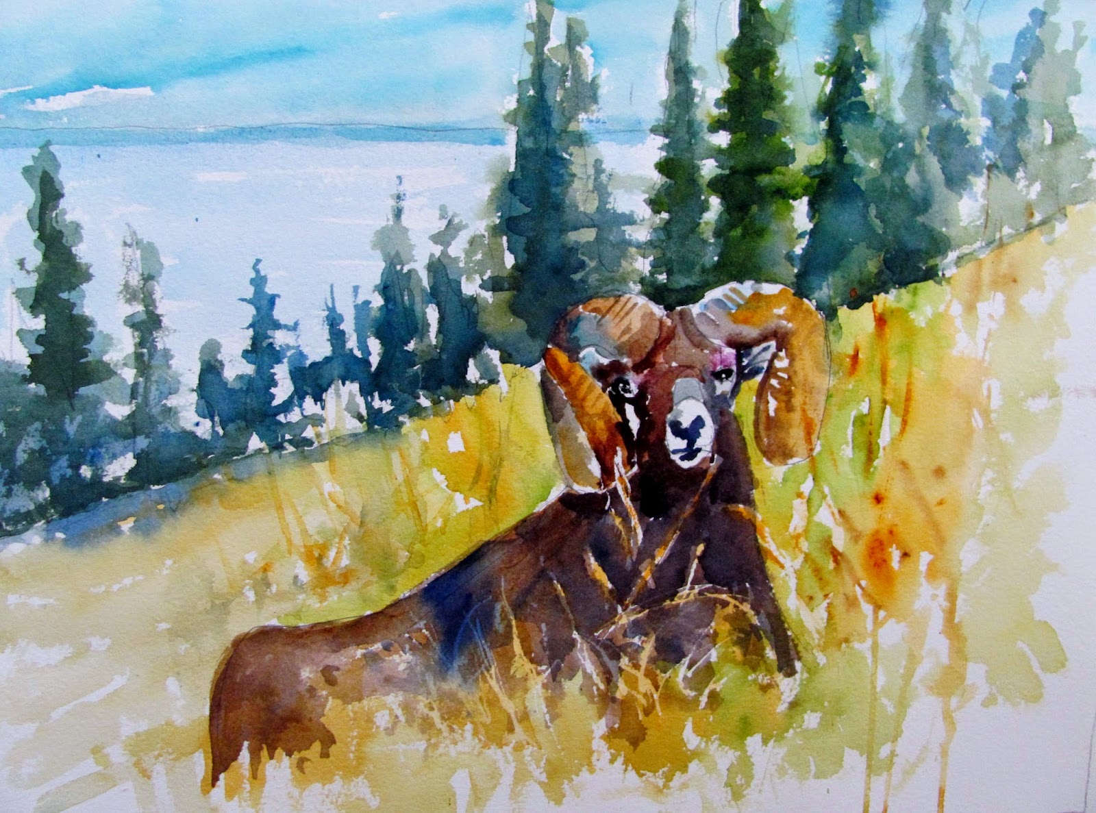
Mountain Sheep

This is a fairly quick study (11/2 hours with breaks) I painted it at the AVA `unofficial' session on Thursday. Only ten members were present and all did their own thing. I arrived there not knowing what to do so it was very much `off the cuff' so to speak.


Mountain Sheep - Waterford 16" x 12" High White

The guide photograph had another sheep to the left and further back but in the interest of simplification I left it out. I made a loose drawing, apart from the head where I was more careful. I also put some masking fluid on, the Schminke ammonia-free variety, a sort of milky white. This is the first time I've tried it so no real views as yet.

The original guide photo is of a very large panorama, which I changed by making the sheep much larger and making it the main feature. Colours included Green-Gold (PY129), Sap Green (Graham), Quinacridone Gold (Daniel Smith (PO49), Cerulean and Phalo Blue (PB15). Greens for the trees were mixtures of yellows, Hansa Yellow Medium (Daniel Smith PY97), Indian Yellow (Rowney (PY153) and blues, mainly Ultramarine (PB29).  Its a mixture of hot and cold with the `hot' colours in the forefront and the `cool' receding into the distance.

Usual brushes, only two or three Escoda and Rosemary retractables.