Palettes Pt.1 - August 2010
Palettes Pt.2 - August 2010
Palettes Pt.3 - March 2011
The Craig Young Experience - Mar 2011
To confirm interest in this subject - obsessional almost it seems with some artists - Wetcanvas have a thread still going strong under Watercolors (Palette Talk) called `Palette addicts' started in August 2012. As of 26th August 307 comments and 29713 reads! By today 24 July these figures are 475 and 54661 respectively! There is a lot of good stuff there if you are willing to wade through it. My wife says I'm obsessional with my hobbies but some of the contributors leave me in the slow lane.
Just to summarize there are numerous types of palettes. At one extreme, used by some high profile artists, are dinner plates, butchers trays and various other receptacles made of either metal, china or plastic. Ron Ranson used the Stewart plastic trays sold at kitchen shops. It is really up to the ingenuity of the user and the way they paint. If you squeeze out a few colours onto the palette then the above solutions are fine. Some artists have an array of studio palettes which they lay out on a table, but if you paint outdoors then something more portable and compact is necessary. To my mind the John Pike (two versions) is hard to beat as a studio palette. The artist Mel Stabin uses his for all types of painting.
The most common palettes are plastic ones because they tend to be cheapest and are easier to manufacture. Plastic comes in two basic sorts, the more fragile vacuformed palette like the Robert Wade and Zoltan Szabo ones, and the harder, more durable John Pike and Herring palettes. No more are the days when Winsor & Newton and others produced metal palettes like the Roberson, Binning Monroe and De Wint. We do have some custom made palettes but more on that later.
Plastic palettes exist in numerous shapes and sizes. They are generally - but not always - much cheaper than metal, although there are metal palettes of moderate price. Since I wrote the original articles I have become aware of the Mijello range and very recently the extraordinary new $100 palette. Added 11/03/13: Apparently this palette is available on E-Bay for just under $70 so it has already dropped in price.


The Mijello - from Martin Universal Design - come in a range of shapes, sizes and prices. I have seen some classified under the `toy' section. Prices vary from around £10 to just over £40. I rather like the look of the second from last which has twenty four wells. In fact I was tempted to buy one when placing a Jacksons order for the AVA group last week. It is just over £16. I've seen some smaller Mijello palettes in a local art shop but didn't handle them and have no knowledge of how well they are made. They do have a wide range and probably one to suit most needs. Plastic palettes are criticized for staining but I find the product Cif cleans them quite well. Some are less prone to staining than others. They are freely available from Amazon, several from Jacksons and if you `Google' `Mijello' watercolour (or watercolor) palettes various suppliers are listed. In the USA Dick Blick, Jerrys and others seem to carry them. It appears they are American but may be made elsewhere. What reviews I've seen are generally positive and they certainly have a range. ADDED 09/04/13. Mijello are Korean and also make Mission Gold Watercolour paints.
The latest Ken Bromley e-mail introduces two new palettes. They appear to be vacuformed so will be less sturdy than the John Pike or Herring-designed palettes.

The `Ultimate' Palette
This palette is 14" x 10" x 2" and has 12 separate internal palettes plus a separate mixing tray. It is £18.95p.

The `Premier' Palette
Also 14" x 10" but 1.7" deep , this palette has 20 wells and a separate mixing tray. It costs £14.95p. Both studio palettes I would suggest, not suitable for outdoor work If you go to Ken Bromley's website www.artsupplies.co.uk and type in `palettes' both are listed and clicking on them will bring up a video of each one which give comprehensive views.
Another from Ken Bromley.Added 12/07/13. This is the latest palette from Bromley.

The Clover Palette - See website listed above for full details. Quite expensive (very) for a plastic palette. Added 23/07/13. The cost of this palette is £38.75p.. However my friend John Softly has already purchased one and is full of praise for it saying ..."without doubt the best plastic palette on the market and extremely well made."... He has some slight criticism over the thumb rest which reduces the number of wells to 13 (otherwise 15). On the Bromley site are ample illustrations plus a short video. Bearing in mind I've not handled one I'm not yet convinced.
I now come to the latest sensation. A plastic palette at $100 (plus shipping). This is being advertised via a Youtube video www.youtube.com/user/SHYsart?feature=Guide You can stand on it as demonstrated in the video - but why would I want to be able to stand on a palette? If you want a solid plastic, smallish palette then those designed and made by the Herring Bros, including a plastic version of the Roberson, are a much cheaper option. Herring do mail order but Ken Bromley also sell them www.artsupplies.co.uk/

The $100 palette a sort of variation on the Roberson.
There is also a Korean company called Shinhanart selling a range of Heung IL aluminium paint boxes on Ebay. They offer 13, 20, 26, 30, 35. 39 and 65 paint divisions! They are various prices based on size but nothing like as expensive as the brass ones, but obviously aluminium won't be the same quality as brass or heavy duty metal like the Fome boxes. It looks as if this is tied up with the company who sell Shin Han watercolour paints. I don't like boxes where the paint wells are on both sides, as when they are closed one lot are upside down and leakage might well happen with those colours that remain moist. The only one that isn't like that is the palette at bottom right.

yUZYzBQ7NOMlgJQ~~60_3.jpg)
Prices range from around $16 to $35 with - oddly - the sterling figure quoted for all the boxes identical at £10.90p. There is also free International economy shipping If you Google `Heung il Ebay' it takes you straight to a link so it is easy to access. They claim 100% positive feedback.
I now come to the cream of palettes, those made by Craig Young in the UK. The article listed earlier gives a detailed history of Craig and his palettes and they have been bought World-Wide by famous artists and other famous people as well as lesser mortals like me. He offers several types, the most popular being the Paint Box and the Palette Box, replicas of the original Roberson and Binning Monro boxes. Craig has also made a number of `specials' to the design of some well-known artists. Craig commands a very high price and there is mostly a long waiting time so he has never seen the need to increase the number he produces, all by hand. I have often thought that a small, specialist, metal working company might have gone into production with similar products at a lower price but this hasn't happened. (so far).
Craig has had this market to himself for some years but things are changing. There has been speculation that he might retire in the not too distant future although his son Robert is helping him. This may be just an unsubstantiated rumour as I've no information one way or the other. Added 7/03. I'm told by John of Little Brass Box that Craig doesn't have a son called Robert (he has a Basset Hound) and is not planning retirement for a while yet! John says he also makes a small hand palette and a copy of the Fletcher Watson but has not been able - due to pressure of work - to update his website. John is completely inundated with orders for his Roberson type.
The first contender is a company called The Little Brass Box Company also in the UK www.littlebrassbox.com/product.html They are making a copy of the Roberson with three different models and several colour options.


Prices are up around the £200 mark and the approach appears to mirror Craig Young in that it is a small (one man?) operation hand making the boxes. This is a fairly recent development and I have no feedback on how good they are but it appears he already has a healthy order book. Added 25/07/13 See comment below from Jane Blundell who has two Little Brass Box palettes.
At least two other contenders have also sprung up, one in the UK, one American.


The Classic

The Artisan

The Petite
The above illustrates the boxes made by Classic Paint Boxes www.classicpaintboxes.com They are designed and made by David Cooper, an artist himself, in the UK. Both the little Brass Box and Classic Paintbox appear to be one man bands, which means they are expensive and waiting times will be a factor. This Classic design doesn't appeal to me and the artist producer justifies the 15 wells by saying you shouldn't use too many colours in a painting. Although a large number will agree it remains a matter of opinion. Added 03/07/13: David Cooper has contacted me to say he has added two new designs to his range, both can be viewed on his website. One the `Artisan' is a multi-fold palette, the other the `Petite' quote:
"is incredibly small yet still a fully functioning palette". Illustrations above. Full details and more photographs on the website. Added 25/07/13 See comment by Jane Blundell. David Cooper is apparently open to making customized boxes to individual requirements.

These boxes are made by IBA-CO PALETTES www.iba-copalettes.com/ The website says that `IBA-CO brushes are `coming soon' so is this a larger operation?
Also posted on Wetcanvas was the following by someone called `Effers', all said to be in brass. It seems this is the individual behind IBA-Co.

Who makes these palettes? This appears on the IBA-Co site and all the products above are listed with names for each one. They actually look different and although the poster on WC was asked who makes them has not so far replied. There appears to be some differences between some of these and those in the first photograph. Look at the shape of the wells for example. Added 8/3: If you look down to the comment section you will see that the owner of IBA-Co palettes has posted various explanations and much useful information in response to my piece. This is most helpful.
It is never a bad thing to have competition. It is interesting that these new sources of hand made palettes have sprung up and time will tell how good they are, and whether they make a success of it. Obviously being so new there is yet little feedback from purchasers. The prices are lower than Craig Young and my guess is that, providing user feedback is positive, they will eat into his sales in America.
I asked my friend John Softly his views on the new entrants into the hand-made palette market. John has tried numerous palettes and has strong views on the subject. They are entirely his and I print them without (much) comment.
"..From what I see Craig has little to worry about although the newcomers are considerably cheaper (my italics)... there will be obviously others coming..... in the not too distant future but design is everything".... the one thing Craig has above all others is that he is a watercolourist and knows about art history and traditional design"
John feels, from studying the photographs of these new palettes, that there are deficiencies in design due to lack of understanding of what is required. John's opinion is that the best are any of Craig's plus the Holbein if you are right handed. He has experienced rust problems with heavy duty Winsor & Newton boxes (made by Fome) and does not like the aluminium type at all as in his experience they flex and the joints give. A small 20 year old Holbein has lost some enamel but shows no sign of rust. John doesn't like plastic but thinks the Herring the best of the bunch.
There you have it - strong opinions from someone who has considerable experience with different types of palettes. I probably take a more relaxed view of things. In my opinion price has to be considered and good plastic palettes are perfectly acceptable for many artists. As I've said earlier some fantastic artists use all sorts of odd receptacles. In the end you pay your money and take your chances. I own three Craig Young palettes, various plastic ones including a John Pike, and some of the small metal palettes you can buy empty and fill with half or full pans, which can also be bought empty. My most used palette is the Paintbox (Roberson design), and a small cheap supplementary metal one filled with a dozen or so empty half pans, which I fill with paint. I have adapted the Paintbox by sticking some half pans into a few wells so I have 24 colours compared to the standard 16. Craig produces a `large' paintbox with additional mixing wells and 20 smaller wells for paint. I have a pristine Binning Monro, in British Racing Green from Craig, yet to be christened even though I have had it quite a while. It's No.165. When will this happen? I just enjoy handling it! As for outdoors I have a small Sketchers paintbox made by Craig. I've rather gone off it to be blunt even though I got Craig to make me a four pan clip on extension. I think it too small but Charles Reid uses it without difficulty, and Judi Whitton has a slightly larger custom-made version with twenty wells. Against these fine artists who am I to argue! Having just received the details for the Charles Reid workshop at Stow on the Wold in May I think I'll have to resurrect the Sketchers box for the outdoor sessions, assuming the weather allows us to paint outdoors. Added 14/04/2013. See the piece in `This and That' April 2013. Another Craig Young `lookalike', although a somewhat curious one(s)



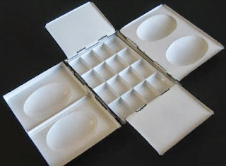


And still they come! Added 11/08/2013. My friend John Softly recently attended a workshop by the artist Malcolm Carver www.carverstudio.com/ This artist, as well as having a distinctly original (and controversial ?) way of painting also markets several products of his own design. One is this very strange looking palette which John, and most of the other participants, purchased at the workshop. John regards it as a sketching palette.

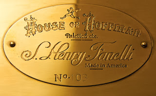
Also added 11/08/2013. And would you believe another `hand-made palette has emerged, although in this case as John says `resembling an upmarket Holbein'. Added 17/01/2016: The House of Hoffman now offer several types of these magnificent hand made palettes in various sizes. They are very expensive, starting at something like $400 but could be described as the Rolls Royce of palettes.


You really need to look at the website if interested, which stated `only one available' but goes on to say palettes can be made to order. Delivery is from Saginaw in America only within America. The price, shown in sterling, exceeded £300. www.etsy.com/listing/126094124/handmade-brass-watercolor-palette?ref=shop_home_active Alternatively search for `House of Hoffman` .
Also added 11/08/2013. The next outfit was originally listed in a post I made called this and that. However as that might be missed I've added it here. This is a strange one calling itself `The Watercolor Prototipes (!) Company.


As you can see they show two Craig Young `lookalikes' and also feature the `Piera' and Holbein palettes. This site appears to be Chinese (?) but has had very few visitors and I personally would keep well clear of it without a good deal more information about who they are - we have been making palettes for 25 years etc etc - and whether these illustrations represent actual product. www.watercolorpaintbox.wordpress.com/
Added 03/09/13. Kevin Franklin has supplied the following photograph. It shows the John Hurtely (Little Brass Box) and Craig Young small travel palettes. Craig's is the larger one. See their websites for full details.


I know I'm open to criticism by those who say you should limit your palette to many fewer colours. Each to his own as I paint several different subjects and don't normally use more than a dozen colours in a single painting, often less. With the fabulous range of colours available it seems silly to restrict oneself to 10 or fewer in total. As an amateur artist I don't have any pressures on me to conform (or make a living from painting). I like to experiment.
From the Wetcanvas experience it is obvious palettes cause much excitement and interest from users. Many other artists will wonder what all the fuss is about. You may be enlightened or even more confused by the above, and information in the previous posts. Remember when push comes to shove the important thing is getting paint on to paper.
Update on the `Spanish Palette' (see Palettes Pt.3). A good friend , who purchased one, has this to say:
`The Spanish Palette is the worst buy I have ever made, looked good initially but rust got to the wells when a year old. It is what it is. A cheap (13 Euros) Chinese-made metal palette which, basically puts it at the bottom of the metal palette types....'


Update on the `Spanish Palette' (see Palettes Pt.3). A good friend , who purchased one, has this to say:
`The Spanish Palette is the worst buy I have ever made, looked good initially but rust got to the wells when a year old. It is what it is. A cheap (13 Euros) Chinese-made metal palette which, basically puts it at the bottom of the metal palette types....'
Added 03/05/2014: John Softly has sent me details of the latest palette from the artist Malcolm Carver:]
Apparently this is credit card size(!) and is sold with Daniel |Smith paints installed but the amounts are small. If you are interested the link is: http://www.carverstudio.com/online-store/ Sorry about the blurred image but that's how it came out.
This is a better photograph but again `credit card' size!
Personally I find the Craig Young Sketchers box on the small size and it is much bigger than this. A link to an American site selling this palette is http://expeditionaryart.com/shop/product/pocket-palette/
Added 07/07/2014: My friend John Softly has recently managed to find an original De Wint palette and purchase it. Expensive but nothing like as much as some of the current hand-made palettes. Wesson used a De Wint until production ceased then switched to a Binning Munro. When that also ceased production he moved to a Holbein 1000.
Note the price - roughly £2.00 in todays money but obviously converting this to today's equivalent would be a lot more. The condition of John's example is generally good with only a slight amount of rust in one of the paint wells which can be easily dealt with.
All information and photographs courtesy John Softly.
Added 23/11/2014; The following shows the palette recently made by David Cooper of Classic Paint boxes for the fine Dutch artist, and charming man Gerard Hendriks.It certainly looks an excellent example of David Coopers workmanship
I recently received an e -mail from a company calling itself Rigger Art. They offered to send me for review a palette they are selling on Amazon. This palette is 'lightweight' yet sturdy plastic with 28 wells and 5 mixing areas. They say it is larger than similar palettes. I declined as I tend to remain completely independent and the palette appears generally similar to some other palettes on the market. I don't use plastic palettes as a rule and couldn't see the point but here is an illustration for those who might be interested.

This is a photo of my friend John Softly's palettes. It gives an interesting size comparison. The very bottom is a Craig Young and I think the Spanish palette is at the top.


