Thursday, 4 August 2011

Piet Lap

Piet Lap. Note his palette arrangements

I first became aware of Piet Lap when I bought `Realistic Abstracts' by Keest van Aalst. The initial attraction among some of the artists featured was Viktoria Prischedko, but I explored the others  and came upon Piet Lap, and some more who I may highlight in future. Piet, a Dutch artist born in 1943, isn't among the younger element but what an artist! His work featured in the abstract book is more inclined in that direction but on finding his website I discovered a range of representational paintings, in a very expressionistic style, that are absolutely stunning.  In order to find out more I contacted him with a number of questions and also asked permission to show some of his paintings. The reply was prompt, although he checked my blog out first, and answered all my queries.

St Kilda

The paintings shown are all quite large as many are full sheet and some even larger. Details and individual sizes are shown on his website. His paintings are grouped in several categories with Landscapes, Dutch, Italian, Scottish and Others together with Still Lifes and Other Works. A full biography is on the website.

 The famous fish market at Venice

Another Venice view


Piet likes painting boats: those stranded on beaches and also derelicts

An example of his Still Lifes.


What an amazing panoramic view!

As for specifics to quote Piet " I have 40 colours on my palette, far too much of course, but half of them I seldom use (just in case..) A must for me are French Ultramarine, Cobalt Blue, Caerulean Blue, Prussian Blue, Indigo, Paynes Grey, Quinacridone Rose, Cadmium Red, Purple Madder, Caput Mortuum, Burnt Sienna, Raw Sienna, Sepia, Raw Umber, Burnt Umber, Cadmium Yellow Citron, Cadmium Yellow, Hookers Green Dark, and...white gouache. All tubes Winsor & Newton, Schminke and Talens (Rembrandt)".

Regarding brushes "Some expensive Kolinsky sables, some cheap flat brushes, but mostly Da Vinci Cosmotop mix brushes in all sizes from 6 to 32".

Paper " I have tried all sorts of paper but nowadays I stick to Arches 300gsm and 640gsm Torchon (Rough)".

His approach to painting "I have no specific approach, it all depends on the subject you paint, on intuition, on your mood for an experimental approach, on the outdoor circumstances".

Other comments " I like travelling, it's half the fun in a painters life. And that's where I differ from most of the other watercolourists. I always paint my landscapes on the spot, except of course my aerial views of Dutch rivers, which I photographed from a helicopter.  ..."Making a watercolour is like chess playing: try to think about the next two or three steps you intend to make, eventually prepare a sufficient amount of some colours, but don't rigidly stick to your plan: things can change on your way, so be receptive. If you act do it with speed and determination".

 Not sure if I'm supposed to post this but his parting comment  was "A tip:in my gear is a hipflask with `water for life' it clears one's mind. Don't tell anybody"... " "Best wishes and have painters fun yours Piet Lap".

As I've already said this is one fabulous artist and obviously a great guy.. His website is www.pietlap.com/  If you like what you've seen, and I'm sure most will, have a look at all the fabulous paintings featured. Thank you Piet for being so open and helpful.

Sunday, 31 July 2011

June/July Challenge

The June/July Challenge between Mick Carney www.thepaintingstruggle.blogspot.com/ was selected by me. I chose four photographs taken at Dartmouth and Slapton Sands on a recent day trip. The ones at Dartmouth were of the inner harbour with boats marooned as the tide was out. Slapton Sands is some miles away further down the coast and is not so photogenic so I picked only two, one of the Inn there - supposedly the `best fish and chips in Devon' - and another of a beach scene.  The fish and chips were average but that's by the way. Dartmouth is an attractive small coastal town in South Devon and Slapton Sands a long stretch of coastline of no great attraction. Slapton Sands was the scene of a notorious WW2 disaster- details were suppressed until after the war - when a large pre DD landing exercise was attacked by German E boats and nearly a thousand American troops lost their lives. There is a memorial there, a Sherman tank fished out of the bay, and a large plaque giving details of those who died. I'm a WW2 amateur enthusiast, if that's the right word, so having read about Slapton Sands have long wanted to visit.


The Sherman Tank at Slapton Sands

At this stage I don't know what Mick has selected as his subject but I decided to attempt one of boats in the inner harbour.

Dartmouth Inner Harbour

For me the main problem was the background as the shapes (boats) all connected very well. How to handle the harbour wall in the background? I confess the painting I've posted is my third attempt as I was unhappy with the previous two, mainly due to my treatment of the wall, although some problems were also obvious with the boats. 


Boats marooned in the inner harbour. Fabriano Artistico 18" x 14" Not

I first made a loose but fairly accurate drawing trying not to be over fussy with detail. This was one of the problems with the first two. I then painted starting with the largest boat on the foreground and continuing across the painting connecting the shapes. I also partially painted the wall where the boats met. Finally I completed the wall and also added some detail of the mud the boats sat in. A John Yardley painting of boats on the beach was used for inspiration and simplification. 

 I actually tried some different tecniques for the wall with stippling, using a sponge dipped in paint, and also some Indian ink put on with a quill pen. Some of these marks were softened using a small bristle brush. I'm currently studying a John Blockley book (Watercolour Interpretations 1987 -William Collins & Sons) obtained from the library and he used a lot of  `marks' as he calls them. The asking prices for used copies are ridiculous. He says `marks', others might say tips and tricks, but his work illustrates the remarkable effects one can attain.

In order to avoid fussiness I used only two brushes. The main one was my Da Vinci Artissimo 44 Kolinsky mop No 2 plus a rigger. The Da Vinci is roughly equivalent to a standard Size 14 round.

Paints used were Cobalt and Cerulean Blue with some Avignon Orange (Maimeri PR206) and Permanent Carmine for the red boat, A mix of Viridian and Cerulean for the boat on the extreme left. Darks were mainly a mix of Burnt Sienna or Burnt Umber and Ultramarine, while Raw Umber and Raw Sienna were used for the mud and also wall colours. Greys on the wall were heavily diluted Burnt Sienna and Ultramarine. Touches also of Cadmium Orange (Maimeri PO20). I think that's it. Where two colours feature I mostly mix on the paper. Comments welcome.

Thursday, 28 July 2011

Plein Air

Last Saturday 23 July I painted in the garden at Pats house at Bitton.  This has been an annual event for several years, often twice during the Summer, but sadly this is the last occasion as Pat, who is quite elderly, is selling the house and moving to a much smaller property. We get coffee and biscuits on arrival and tea and cake after we have finished! I shall miss these occasions. 


Alan Coster painting last Saturday.

Alan has known Pat for many years and previously arranged similar outings at her former home which was a large converted farmhouse. It is actually arranged for members of Hanham Art Club, but I was once  a member and get invited because Alan and I also belong to the Avon Valley Artists. Alan is recovering from a serious knee operation and this was  only his second  time painting in nearly three months. 


On this occasion I decided to paint a small section around a window at the rear, having previously done mainly front views.

Window and Pots. Fabriano Artistico 18" x 12" Not

I used mainly two brushes Escoda series 1214 retractable Kolinsky-Tajmyr  sables sizes 12 and 8. Colours for the walls included Gold Ochre, Raw Sienna, Burnt Sienna and greys mixed from Cyan Blue and Cadmium Orange (both Maimeri). Although the walls look grey there are many subtle colours and representing them is a challenge. Gold Ochre for the window surrounds and various mixes to achieve a wide range of greens. Hookers Green (Maimeri) was used as a base, adulterated with other colours like Burnt Sienna and  Avignon Orange (Maimeri PR206). Faience Blue (Maimeri PB60) was used to darken the greens and Green Gold (Rowney PY129) to get a lighter yellow-green. Probably some Ultramarine in there somewhere and also touches of Ultramarine Violet (Rowney PV15). Take care with Gold Ochre (W & N PY42) as it is on the opaque side and used full strength is very powerful. A lovely rich colour nevertheless.

Monday, 25 July 2011

Pin Mill & Woodbridge

Last week my wife and I with two friends spent a few days in Suffolk. I had intended to paint at Pin Mill but the weather forecast, prior to going, was so bad with rain predicted every day that I only took a couple of sketchbooks with me.


The Tide Mill

 On the way to our B & B we stopped off at Woodbridge, a delightful small town just off the A12, a few miles North of Ipswich. This is another great painting location on the River Deben and has a famous Tide Mill. On this occasion the Tide Mill was under repair and swathed in what looked like pink plastic sheeting.  A short distance before you reach it is a building that is the home of the Woodbridge Art Club, who run regular exhibitions and indeed one was current. I spoke to one of the ladies there, explaining my interest, and she told me they had 200 members with a waiting list. This includes 25 potters and I was shown a small room with a kiln. The building is superb and on enquiring I was told it was owned by the council. It is actually quite big with one large room, a slightly smaller one and the potter's annex of two small rooms.  The standard of paintings was mixed, as is usually the case with amateur exhibitions, but there were some good works and a variety of media including watercolour. I wondered how on earth an art club, even one with 200 members could afford such a relatively palatial home. Apparently the group maintain the building, with no cost to the council, and pay a peppercorn rent as they are regarded, with continous exhibitions, as a tourist attraction. They have regular weekly painting sessions, workshops and longer courses with well-known artists tutoring. It is a hive of activity. To cap it all the annual fee is only £35! I took a number of photographs on the front here for possible future paintings.

 Woodbridge Art Club Exhibition

Another view

Taken just outside the Art Group building

Two days later we went to Pin Mill. Where is Pin Mill? It is on the River Orwell, near the village of Chelmondiston which is approximately six miles South-East of Ipswich. Pin Mill is a fabled location where many famous artists like Edward Seago painted, and in recent times John Yardley. Charles Reid made a video here for Town House Films in 2009. I believe on any decent day you will find artists at work  from the well-known professional to the humble amateur.

Pin Mill. The famous Butt & Oyster 17th Century pub in the right background


On the day we visited I indeed spotted some artists at work and wandered down to where they were.  I was careful not to interrupt but one particular man actually spoke first and said he was happy to talk. It turned out he was from a group known as `The Maritime Art Group' www.maritimeartgroup.co.uk and he was there with two others. I think he said it was his eighth visit. It appears they are a group of 17, holding regular exhibitions at various locations.


One of the Maritime members at work


Another view

And another

Unfortunately it isn't ideal to go on holiday, intending to paint, when you have friends who don't. My wife is fine as she will read a book for a couple of hours but it is different with others, even good friends. It just doesn't work well especially somewhere like this. As a result of this and the weather being very unsettled (to put it mildly) I only made a couple of rudimentary sketches but took lots of photographs and  hope to use some of this material in coming months. Plein air is great but if you want to paint regularly then photographs play a large part.

Tuesday, 12 July 2011

Wildflowers (and Fruit)

Being very discontented with my last offering I followed my normal procedure and instead of sulking pressed ahead with another painting. There are some wonderful wild flowers in a large open meadow, part of the Community wood, near my home. Last week I collected some intending to paint them, but fate intervened in that my youngest grandson was unwell so grandparenting duties intervened.  Fortunately he has recovered but by then the flowers were dead! I determined to have another shot and there were still plenty of fresh flowers so I collected a bunch yesterday. I'm not sure as to the exact legality by doing this  but I didn't dig them up and none were rarities so ........!
  
Wildflowers with added fruit

I added the fruit as I felt the area around my favourite jug looked a little lonely.


I did the intial drawing with a loose outline to start, erasing some of the marks later and then commenced the drawing proper, avoiding becoming too detailed, with the pink flowers in the centre. Once completed I started painting those same pink flowers.


Wildflowers & Fruit. Fabriano Artistico 90lb Not 15" x 11"

As you will note I painted on 90lb Fabriano and find this weight perfectly satisfactory for my sort of painting with no large washes. Colours used were Permanent Rose and Opera Rose (both W & N) for the pink flowers. As they had a violet tinge, particularly in the shadows I added Ultramarine Violet (Rowney PV15). Yellows are mainly Hansa Yellow Medium (Daniel Smith PY97) and a little Indian Yellow (Rowney PY153). Ultramarine Violet was also used for some of the flowers plus Permanent Carmine (W & N PR N/A) with a little Cadmium Orange (Maimeri PO20). The greens were mainly Hookers Green (Maimeri) adulterated with eithers Burnt Sienna or darkened with Faience Blue (Maimeri PB60), Burnt Umber also. The jug was mostly Cerulean (W & N PB35) with some Ultramarine Violet. On to the fruit with the grapes Perylene Maroon (Rowney PR179), the orange Cadmium Orange and Raw Umber and the apple mainly Permanent Carmine with touches of yellow and green. Raw Sienna in the background.


Brushes used were Rosemary series 33 No 9 and Da Vinci Maestro Size 6.

I'm much happier with this than the previous painting. I intend to do more still lifes incorporating flowers but also studies of fruit and  possibly vegetables. I like the shapes and brilliant colours of peppers. Having been studying Shirley Trevenas work recently and her treatment of fruit, together with that of my guru Charles Reid, I will be striving to improve my treatment of these subjects.

Wednesday, 6 July 2011

The Eyes Have it!

This was the caption on the photograph below which was on the cover  of the Guardian weekend magazine 26 June. I was so taken by it that I decided to try and paint the subject, who was an Indian gentleman in an article entitled `The People and Portraits of Steve McCurry'.


I initially did a loose drawing, getting it as accurate as I was able and then painted the features beginning with the eyes, nose and mouth. The eyes are a little on the small side I can see that. I then painted his hand and then began the turban just to see how it would look. At that stage I finished for the day, partly to enable me to think about how to proceed with the rest of the painting. I am very conscious that paintings can go wrong at any stage and you always reach a certain point where it either succeeds thereafter or bombs. I was also feeling that I needed an extended break rather than just a few minutes. This was session one.


An Indian gentleman -16" x 12" Fontenay Rough

Looking at the original photograph I was first of all struck by the brilliant red of his turban, followed by the deep brown/sienna colour of his face and the cream of his shirt. I don't aim for a super realistic result, as this is watercolour after all but an almost impressionistic effect, although obviously it has to resemble the subject. I finished the painting the following day in one session, taking regular little breaks to review progress. The whole thing took about two hours.

I painted the features with my Isabey Series 6201 size 6 (Jacksons) and followed up with the Rosemary series 33 size 6.. These two brushes were used for the face. The rest of the painting was completed with my Da Vinci Artissimo 44 No Kolinsky mop, approximately the size of a 14 round.

Colours used for the features were a mixture of Perylene Maroon  (Rowney or Graham PR179), my first real use of this colour, and Faience Blue (Maimeri PB60) added for the darker areas. I also used Quinacridone Rust (Graham PO48) in the lighter areas. The odd touch of Cerulean ( W & N PB35) was added. Touches of Ivory Black (Maimeri PBk9) around the moustache. This was a new approach for me in terms of skin colours.  The turban comprised Cadmium Red Pale (Rowney PR108), Quinacridone Rose & Scarlet (Daniel Smith PV19, PR206 respectively) and  Avignon Orange (Maimeri PR206). Although the Daniel Smith and Maimeri above are both PR206 the colours are quite different. Touches of Faience Blue  were used in the shadow areas, both on the turban and more heavily on the right and left sides of the face. 

The shirt was painted with diluted mixes of Raw Sienna (Maimeri PBr7), some Gold Ochre (W & N PY42), and a little Cerulean. 

I am generally pleased with the final result although I realise, as always , it could be better. Comments welcome.

Friday, 1 July 2011

Quinacridone Gold - Pigment PO49 (2)

As a follow up to my previous post this is the current position. Only one manufacturer of artists  watercolours offers the genuine article - described by the famed Australian watercolourist Robert Wade in his 2002 book, `Robert Wade's Watercolour Workshop Handbook', as "the best thing for years". The sole source of genuine Quinacridone Gold (PO49) is the American company Daniel Smith.

According to Bruce McEvoy of Handprint manufacture of the pigment, a mixed crystal form of PV19 alpha and beta (don't ask me what this means because I don't know!), ceased in 2001.The reason was that the automotive industry, the prime source of demand, dropped it. Pigment volumes for paints is a drop in the ocean compared to that from the automotive, ceramics and chemical industries so  paint makers are at the mercy of the market. They follow demand rather than drive it and get what they can.

Confusion has been caused by Maimeri continuing to put out `Golden Lake' with PO49 Quinacridone listed as the pigment ingredient. Soon after PO49 manufacture ceased Maimeri changed their formulation. Actually the information on both tubes and chip charts was wrong as they said `PV49', and still do although it also says `Quinacridone' which PV49 is not, an error never corrected. When I enquired about this from Maimeri they did not reply but Bruce McEvoy of Handprint has considerably more clout than little me and sent me a copy of an e-mail from them in Italian which nevertheless translated that PO49 had been replaced by PY42 `a similar pigment'. PY42 is a yellow oxide which is widely available from up to 30 producers Worldwide. It varies considerably in colour and tone depending on a number of factors affecting manufacture. The other main source of `true' Quinacridone Gold was Winsor & Newton who ran out of the pigment pretty quickly and have replaced it with a three pigment mix of PR206, PV19 and PY150, all excellent pigments but do not call it a `hue', which it is, and using it for mixing will give a different result.

What then of Daniel Smith? It is assumed they bought up a large consignment of PO49 and this is why they are able to continue to offer it. I shall have to ask my friend Hap, who lives not far from the Daniel Smith headquarters, to see if he can clarify this. How long will stocks last? Hap offered to take me there, should I visit Seattle again, and introduce me to the chief chemist. Much as I'd like to visit Seattle once more our days of long haul flights are more or less finished. Now if I were to win the lottery and could travel first-class things might be different.....

One problem is the price. The Daniel Smith UK price via Jacksons is £9.55 for a 15ml tube. Daniel Smith's website list the price as $10.45 or $9.40 if you buy 12 tubes overall. This is under £6 so once again we in the UK get the short straw. What are the alternatives?


The swatches above show Quinacridone Gold compared with Gold Ochre, Raw Sienna and purely for comparison, a true yellow Azo Yellow. The first three are earth colours but note Gold Ochre. This is the Winsor & Newton version made with PY42, a commonly used pigment, widely available from pigment manufacturers and (apparently) capable of a quite wide colour range. This is a favourite of Bruce McEvoy of Handprint and I think he is onto something. It is shown almost full strength but can be diluted down and is even touted as a possible alternative to Raw Sienna. Is it an alternative to Quinacridone Gold? One big advantage is that it is much cheaper, certainly in the UK and can be purchased from the online suppliers at under £7, much cheaper than the DS paint. In the USA this is reversed with W & N paints amongst the dearest so the DS Quinacridone Gold is a viable purchase but for how long?.

Friday, 17 June 2011

Watercolour Painting on a Budget

Generally speaking  the advice given by nearly all professional artists is to use the best materials. By this they mean Artist Quality paints, 100% cotton papers and Sable or possibly Squirrel brushes. There are exceptions, Ron Ranson being someone who questioned the need to spend the large sums of money necessary to fulfill these recommendations. I suppose they are aiming their advice at either other professionals or serious amateurs but don't - largely - seem to recognize that there is a large - very large - number of hobby painters for whom such materials are either unaffordable or bluntly a waste of money.

As a start what did Ron Ranson paint with before he moved to the USA? With paints he used a limited palette of Winsor & Newton Cotman student quality, Paper was Bockingford, which is made from high quality wood pulp, and brushes comprised a hake and two or three synthetic rounds.

My reading of Ron's approach was to demystify some of the  things surrounding watercolour painting,  one being that you had to spend a fortune on materials. The very finest materials may be beneficial to the talented and experienced artist, who knows how to use them to the best advantage, but is this the case with many amateurs? It is also a fact that quite a few  professional artists paint with either Cotman or a mix of student and artists quality, Bockingford paper and synthetic brushes. The famous British landscape artist Edward Wesson used 140lb Bockingford paper exclusively, then switched to 200lb, which was initially produced specifically for him. He also used, and popularized, such was his influence, what were originally called `French polisher  mops', which I take to be the Isabey range widely used today. Isabey however are not cheap. Various  manufacturers have produced Isabey `equivalents' but in general the original is still thought the best.
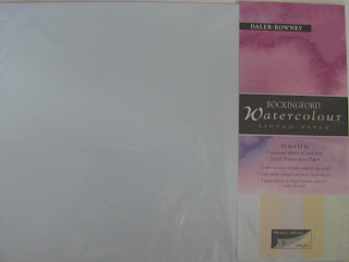
Bockingford Tinted 11" x 15" sheet pack

There are some who will tell you not to use Bockingford because it isn't 100% cotton. I also notice on the Ken Bromley website that the artist Trevor Lingard is complaining about recent variable quality, but such complaints are made from time to time about other well-known makes, with claims that quality has deteriorated. Bockingford is available in a wide range of weights and also tinted sheets.

When I first started painting I mostly used the  16" x 12" Bockingford spiral pads. There are several other budget makes, one of the best being Brittania from Hahnemuhle, made from cellulose. I have tried it and thought it fine, especially the rough surface although I wasn't so impressed with the cold pressed. It is very hard sized and so the paint doesn't sink into the paper, remaining bright. I think a lot depends on how you paint. There are others so try them and see how you get on.

I have tried a wide range of papers and have reached a provisional consensus that Saunders Waterford and Fabriano Artistico are my favourites, taking into account cost and quality. I do like Fontenay but the price has suddenly rocketed well out of reach and the Great Art website now talks about it being `handmade'. In any event this is about budget materials so I'll leave it there. According to Ian Sidaway the Daler Rowney Langton is also Bockingford. For the best buy some of the mail order specialists, specifically Jacksons and Ken Bromley, sell special offer packs of Bockingford cut into either half or quarter sheets, 50 or 100, at very keen prices equating to around 30p per sheet for the 11" x 15". Any 100% cotton paper will be more than double that and if you buy blocks even more expensive. Try Bockingford and if you are happy with it why buy anything else? Many professional artists do. I have no knowledge of other budget papers available outside Europe either in Asia or the North American Continent but I'm sure they exist.


Comparison of Cotman Tubed paints (Top three rows) and W & N Artists quality pans (bottom three).

 Can anyone looking at the above say the Cotman results appear seriously inferior? I might add since I did this, several years ago, Cotman has been upgraded and are using better quality pigments, many being exactly the same as the artists range. Another thing we are often told is that it is a false economy to use student quality as the pigment concentration is so much higher in the artist paints. The pigment concentration may well be higher but  this statement is very debatable. A comparison of costs per ml ( Jacksons prices) taking the Series 1 Artists quality price 14ml tube and the 21 ml Cotman gives figures of 48p and 15p respectively. This means that Cotman is less than a third of the cost. Has the artists range three times as much pigment? I think not. Bruce McEvoy of Handprint says actual pigment content in paints varies between 20% to 50%. The differences are variable between different pigments and are not dictated purely by cost. The balance is made up with additives and fillers. A brilliant Chinese artist who uses Cotman paints is Guan Weixing www.guanweixing.com/  Have a look at his wonderful paintings. Michael Wilcox says, in one of his books on colours and pigments, if you wish to economize on paints start with the earth colours.

Where you do tend to lose out is in expensive pigments like the Cadmiums,  Cobalts, Cerulean and Viridian. They are replaced by `Hue' equivalents. In the Cadmiums many manufacturers offer additional  `hue' versions as the toxic and opaque qualities of the true Cadmiums are anaethema to many artists. With blue one of the Phalo Blues or Ultramarine is used with added white to make `hue' equivalents of Cobalt and Cerulean Blue.  Viridian is replaced by a  `hue' version based on Phalo Green. Nothing to stop you buying a few Artist Quality as several good professionals use a mixture of the two. See my post on Paul Weaver, a very fine up and coming Bristol artist www.paulweaverart.co.uk/

I also think two other student quality paints are worth consideration. Van Gogh from Talens (Rembrandt) and Venezia from Maimeri. Maimeri is not easy to get in the UK but Van Gogh can be found with a little searching. Both are available in the USA. In each case, as with Cotman, the range is 40 paints and the same remarks apply regarding the Cadmiums and expensive blues. There may be others but these are the only ones I have experience with. St Petersburg and Shin Han paints come (in my opinion) into a different category - perhaps a halfway house, although both lines have question marks against them, particularly in the use of fugitive pigments, especially St Petersburg, while Shin Han have many multiple pigment paints, with white in quite a number. 

Keynsham Park 16" x 12" Bockingford 140lb Not

This painting was done using Van Gogh paints several years ago. My style was different then or probably more correctly still in a state of flux. Still is to some extent. I think Van Gogh paints are excellent, highly pigmented and a very good budget alternative to the eye wateringly expensive top ranges. Bockingford paper also. I don't present it as a good painting but not a great deal wrong with it. The same comments apply to Van Gogh as Cotman in that you might want to supplement them with a few tubes (or pans) of the expensive blues and/or Cadmiums only sold  in Artists Quality, although in the USA and Canada they are available in Cotman - 10 additional colours in all, slightly more expensive than the normal 40 colours but still very well-priced. Memo to Winsor & Newton. Why not in the UK? No more spurious excuses please.

We now come to brushes and the choice is plain, either animal hair or synthetic. With sable there is a choice of either Kolinsky or Red Sable, the latter generally cheaper. This is simplified because there are several different grades of sable and they vary in quality, depending on gender of the animal, time of year when harvested and also what species the hair comes from. Buy from a well-known source and beware cheap offers of `Kolinsky Sable' brushes. See my post on Rosemary and explore her catalogue online. Red Sable is the budget sable choice and then we move to synthetic/sable mixes. All the leading brushmakers offer a range and they are only slightly more expensive than pure synthetic. Rosemary, Stratford and York and  Pro Arte all make them. The SAA (Society of All Artists) now have a full range of own label brushes and have recently introduced a sable/synthetic. You need to be a member or know someone who is to buy at members prices. Jacksons are gradually increasing their own label brushes and there are some good buys amongst them. I think the Da Vinci Cosmotop Mix B is well worth a look being a mixed hair brush. Rosemary says that both Mongoose and Shiraz are suitable for watercolour. I have a Mongoose fan and it works well for tree  foliage although I don't use it much - perhaps I should. New synthetic brushes are coming onto the market all the time and are getting closer, so we are told, to emulating sable. Certainly some artists prefer the firmer feel of synthetic compared to the softness of sable. Yvonne Harry is one. The Internationally acclaimed Australian artist Robert Wade uses synthetic brushes exclusively, although they are his own signature brand made by Neef.

Paints, paper and brushes are the most expensive materials in painting although you can spend considerable amounts on other items like easels but again the range is vast, both in choice and price. I have previously posted on plein air equipment and admit that I have wasted a lot of money overall  on stuff I use only sparingly, or not at all, so be warned! Unfortunately I'm something of an impulse buyer although I have bought a lot of good stuff  at bargain prices. Art shops and mail order catalogues are full of interesting items but buy only what you really need and don't be seduced by siren voices saying you need this or that, all of which will make you a wonderful painter in a week or two. One tip is to get on the e-mail list of the mail order suppliers who regularly have special offers. When items you use appear buy! If you belong, and it is a good idea, to a local art group buy together to avoid paying carriage charges. I buy for my AVA group and  monitor  special offers.

The same general comments apply to books and dvd's which appear in ever increasing numbers. You can spend a fortune on them if not careful. From the many to choose be selective and buy only those that will be of use, although this is easier said than done. You really have to sort the wheat from the chaff.

Having said all this I will now don sackcloth and ashes and admit I buy (mostly) Kolinsky sables, 100% cotton paper and artists quality paints. I do shop around and buy at the best prices, also special offers which are frequent. For example prior to the January price increase Great Art www.greatart.co.uk/ were offering Fabriano Artistico paper at half price. I bought a shipload. Amongst artists quality paints Daler Rowney are often the best priced. Lukas via Great Art are well priced and so is Maimeri from either Jacksons (only on the website) or Turnham www.artistmaterial.co.uk who are cheaper. With Turnham you have a fixed carriage charge regardless which has to be added. In the UK Winsor & Newton are very well priced and cheaper than the American imports Graham, Daniel Smith and Da Vinci. These latter are all very good but expensive in the UK. Jacksons www.jacksonsart.co.uk offer well-priced own brand paints, made I'm told by Sennelier. And so on. Watercolour painting is an expensive hobby but you can cut corners and work within a limited budget so don't despair. Unfortunately local art shops tend to sell at full price. Some will give a 10% discount to students and members of local art groups. It is a fact that you can save considerable sums of money, at least 20-30% and sometimes up to 50%, buying from the mail order specialists, of which there are an increasing number. Jacksons, Ken Bromley www.artsupplies.co.uk/  and Great Art, all waive carriage charges over a certain amount. Some of the others now seem to be catching on to this. In the USA there are many excellent internet suppliers like Dick Blick, Cheap Joes, ASW, and Jerrys Artarama to name just four. On the continent you obviously have Great Art, who are German, but I don't as yet know of any others. The language barrier is a problem as are carriage charges. I also point out once more that countries outside the EU can order from UK suppliers and the 20% VAT is deductable. Carriage charges will be higher but they will give you a quote and you might be surprised how competitive some of the prices are.

The question of what to buy, especially that between  `best' materials and budget ones never stops. The consensus leans towards the best but as I've said this depends on circumstances. Brilliant paintings have been and are being produced by some very fine artists using cheaper materials.. I think the key thing here is the `very fine'. Their skill enables them to overcome any deficiencies which might be insurmountable to the lesser talented. 

I shall be taking a weeks holiday at Lake Garda in Italy starting tomorrow so no more posts for probably ten days. Comments (and corrections!) welcome. 

Friday, 10 June 2011

William H Macy


This is William H Macy the well-known actor pictured in his new role as `Frank' in the American TV version of the British soap Shameless. No I don't watch it. This photograph was on the cover of the Weekend Guardian colour magazine. I immediately thought he would make a great subject for a watercolour portrait.

Initial drawing.

This was my second attempt. I rejected the first painting because the resemblance to Macy was not good enough and I also realised I was beginning to tighten up, something I'm always fighting against. For the outline drawing I used a Shorty  Propelling pencil. This is a tool I first read about in Robert Wades last book  and on perusing the Great Art catalogue I saw and ordered one. It is unusual in that the pencil is short and stubby 10.5cm long 1.5cm wide, hence the name, with a quite large 7B 0.3mm lead. It is soft being a 7B so I was careful not to press too hard. It's in the latest Great Art catalogue if anyone is interested. I've not seen it anywhere else in the UK mail order specialists. Robert Wade said he bought his in an art shop in Venice and that he believed it was called a `Stumpy' in the USA. Code number is 28391/2 black or white. It costs £6.95 and comes with three leads. I presume you can get replacement leads although they aren't listed in the latest `small' GA catalogue, possibly on the website. www.greatart.co.uk Note Added 13/06/11.Yes they are available.

The `Shorty' compared


William H Macy `Frank' - Waterford High White 140lb (300gsm) 11" x 15"Not

I've just compared this with the actual painting and the painting is better, not quite so truncated (my ad hoc photography!). I also think the values are better in the actual painting.Note Added 11/6: I have rephotographed the painting, using a tripod and different settings and removed the original. Still far from perfect. Overall I'm pleased with the result. I first did a loose drawing making sure the proportions were correct by using the variscaler and just putting dots in which I then used as guides for the drawing. I used the Shorty for all the intial drawing but switched to a normal B pencil for the  eyes etc.

Paints used were a mix of Cadmium Red Light or Pale, Cadmium Yellow Light and Cerulean for the features but in order to get the darker shades, especially around the eyes, I mixed Ultramarine Blue with Burnt Sienna. The eyebrows and moustache are a mixture of mainly Gold Ochre with some Raw Sienna, Burnt Sienna and a little of the dark mix. Touches of Ivory black for the dark areas above the eye and corners and also the pupils. The hair is mainly Ultramarine Blue, Burnt Sienna and Gold Ochre partially mixed on the paper. Touches of Hookers Green in the corners of the eyes. The shirt was a mixture of Cerulean and Cobalt Blue, with the jacket mainly Raw Umber. I think that's it.

Brushes used were the Isabey No 6 retractable for the eyes, nose and mouth and Rosemary No.6 and 9 series 33 Kolinsky for the rest of the face. I used the Da Vinci 44 Kolinsky Mop No 2 and Rosemary No 9 for the hair.

This was also another trial of the Waterford High White paper and I'm beginning to change my opinion and becoming more positive about it.


Monday, 6 June 2011

Time to Experiment

I decided to chance my arm yesterday and made an experimental painting from the photograph below.


This is down Manor  lane near my home and I went through the gate this morning on my daily walk, down on the edge of the farmers field and into the Community wood. Saw a deer, a doe, she was only about twenty yards away, standing stock still until I walked off.  Since I took the above photograph, some weeks ago, the foliage growth has increased and looking at it from close up it seemed quite different. For one thing the detail in the rear was visible and the darks were not so dark.

 The Gate - 18" x 14" Not Canson Acquarelle.

I decided to experiment and move towards `realistic abstracts' a la Victoria Prischedko - well partially at least. The gate is the key feature and I have used colour in a far more vibrant way than the dullness one gets with greens. Although we are only at the beginning of June the weather here has been so warm and mild that everything is beginning to have a mid-Summer look.

I first made a loose drawing without much detail and then painted using a No.14 Sable brush labelled Simonart. This is one I bought in my early days when I was studying at Mary Shaw's studio by the River Avon. It was from a wholesale catalogue only for professionals. The head is quite large more like a 16 when compared to some other makes and it has a sharp point. The only other place I have seen them on sale was at a framing gallery in Bath.  I should have said I first applied Winsor & Newton masking fluid to the gate, parts of the trees and various other places. After this had dried I splashed paint! The paper is Canson Acquarelle, not one of my normal choices by any means but I just happened to have some. In fact this was painted on the back of another experimental painting that I did at one of my AVA sessions. When I removed the masking tape some of the paper came with it.

The darks were various combinations of Permanent Carmine (W & N PR n/a), Cyan Blue (Maimeri PB15-3), Ultramarine Blue and Burnt Sienna. There is some Viridian in there somewhere and I mixed the greens with combinations of Hansa Yellow Medium (Daniel Smith PY97)  and various blues. Gold Ochre (W & N PY43), was used on the tree trunks and parts of the wall and touches of Ultramarine Violet (Rowney PV15). Greys were mostly a mix of Cyan Blue and Cadmium Orange (Maimeri PO20). I think there are touches of Raw Umber and Raw Sienna as well. Comments welcome.