Saturday, 22 December 2012

MERRY XMAS & HAPPY NEW YEAR TO EVERYONE


 Avon Valley Artists enjoying festive cheer at our last meeting in 2011. I'm the one behind the camera. We had a slight problem as it was found the oven in the kitchen was faulty - it didn't work so much of the food couldn't be heated up. Although not all are shown in the photos 20 members were present  - a good turnout.


From left to right, Sue, Pauline and Yvonne. Sue as well as being a member of the AVA runs Timsbury Art Group. Pauline also belongs to Whitchurch Art Group.


Father & Son 18" x 12" Fabriano Artistico 140lb (300gm) Extra White Not

I painted this at home this week. This is my second attempt, I scrapped the first one. I'm still not fully satisfied by any means as I'm  not quite getting the effect I want. I wanted a lighter effect, possibly the darks are overdone especially on the left hand bull. Too dark, too pale? It can be difficult to get the right balance. 

 After the initial drawing colours used were Quinacridone Gold (Daniel Smith PO49), Quinacridone Rust (Graham PO48), Cerulean Blue, the darks various mixes of Ultramarine Blue  and Burnt Umber, others were Raw Umber and Cadmium Red. A little white gouache at the very end when all was thoroughly dry. Isabey brushes the largest a No8..


Preliminary drawing for a self-portrait 16" x 12" Waterford 140lb (300gm) Not . I drew this a week ago and have still to set about painting it. I promise to post the result (well maybe) when completed.


Tuesday, 18 December 2012

Just a Sketch

At a recent AVA meeting the subject was Xmas cards - possibly my least favourite topic. I must admit I stretched the subject as wide as possible by presenting my effort as representing a design for a card (!) It is a small sketch and I repeated the recent Robin painting, although slightly differently as the colours used were not identical, principally as I forgot to bring the Translucent Orange from Schminke, rapidly becoming a favourite colour. This was done on a small Fontenay block that I discovered amongst my paper stocks.


12" X 9" Fontenay

I first made a drawing of the robin and then painted it using Cadmium Orange and Cadmium Red Pale plus some Quinacridone Gold for the red breast. The blue is Cerulean and the other colours Raw Sienna and Raw Umber. The eyes and bill include Ivory Black.

When  all was dry I added impressions of holly leaves drawing with the brush. I mixed up the colours using Sap Green, Green Gold and Hookers for the greens, adding Cobalt Teal Blue and  Perylene Maroon, letting them mix on the paper.

Brushes were the Isabey and Escoda retractables, mostly in the 4 to 6 range of sizes. Just a sketch, nothing more which took about forty minutes excluding breaks.
 .


Saturday, 15 December 2012

Texture and More

How does one create texture in a watercolour painting or should one wish to? There are various schools of thought about watercolours, one of which is  the `purity' one, beloved by traditionalists like the much-loved Edward Wesson. Wesson was against many of the modern trends, which have accelerated in the years since his death in 1983. To quote Ron Ranson in `The Art of Edward Wesson' (1993 David & Charles).

" He viewed with undisguised disdain those artists who threw water, grit or salt at their work, distancing himself from what he termed `Americanisms' - the use of masking fluid, body colour and scraping- out techniques"

Turner used scraping and scrubbing in many of his watercolours so....?

With many of today's artists using one or more of these techniques he would probably have had apoplexy.  Wesson is held up as the archetypal Englishman with his outspoken views and much quoted remarks, a high profile artist with a huge cult following. He is still promoted, especially by Steve Hall. I was once a Wesson enthusiast but less so nowadays as I feel possibly things have moved on. I may be wronging him, if so I apologize, but he seems  to belong to the era, common among some, who resist change in the name of `tradition'. Change for it's own sake is not all good but neither is tradition. On the other hand Americans, with a much younger history have a more questioning attitude and are more prepared to take chances and try different things. Any hackles raised yet? I hope not because I don't want to upset anyone, after all painting isn't about life or death.

I do not necessarily believe anything goes, as it is easy to have too much of a good thing and I personally believe - but there are artists whose work proves the exception - that watercolour benefits from simplicity, but even so to hold a rigid view of what should and shouldn't be done is equally wrong. It is all a matter of opinion and I take the view artists can do what they wish as long as they are prepared for the consequences. I am irritated by some artists who preach in a biblical manner, as though they are Joseph descending from the mount, and demand that everyone follow their edicts. Don't use black is one example - `The Prince of Colours' according to the old masters..

With that sermonising out of the way where do we go from here. This post is mainly about texture, of increasing interest to many modern day watercolour artists. The books I feature are not solely about this, as the titles suggest, but cover `techniques' and `tips' and `tricks'. This is straying onto dangerous ground as there are those who feel that tricks, especially, can be overused and `tricksy' paintings are to be avoided. It is true that many American artists have promoted such things for years in the American open-minded manner, so three of the books are American. I should add I'm not suggesting they are the most outstanding ones but are those I own. I'm sure there are others and several books, like the very good ones in the Search Press catalogue, include the use of texture amongst other techniques. I reviewed two recently, one by Robin Berry and the other by Diana Craig and Hazel Harrison.


81/2" x 11" Softback 158 pages North Light Books 1987 

This book shows `54 ways to create imaginative effects in your paintings'. It just about covers everything needed to create texture, various tools, liquids, natural bits and pieces and then some!  The only danger is overkill. Worth buying? Yes at the right price. A query on Abebooks, my favourite source of used books brought up many copies. Those from UK booksellers ranged from £13.48p to  £24.85p. But from the American booksellers prices starting at £5 including carriage. Amazon has `new' at £71.23p - can you believe this - and used at around £10 including carriage. 

Cathy Johnson has written several other books and a later one with a similar title, which increases the number of `ways' to 75.  Is this a better bet? Not having seen it I couldn't say but two reviews on Amazon were lukewarm.  Two is insufficient really to make any sort of decision. Check it out if you are interested.


8" x 11" Softback  128 pages North Light Books 1998 Edited by Rachel Rubin Wolf

This book is specifically about textures and takes the form of excerpts from previous North Light Books by 9 well-known artists like Claudia Nice and Zoltan Szabo. There is a lot of good stuff in the introductory part which covers many tecniques for texturing. Then  follows pieces from the individual artists, as stated taken from books previously published. It is pretty good and I'd certainly recommend it. Prices range from  £22.90p (UK only one) to £18.00 - £20+ (USA) on Abebooks. Amazon have it at around £15.98p for new with used £11.58p. A bit pricey perhaps at the higher figures.


8" x 11" softback 144 pages Watson-Guptill 1983 Edited by David Lewis

This is another good book but once again is a series of excerpts from previously published books, specifically by Charles Reid, John Blockley, Christopher Schink, Zoltan Zzabo, Richard Bolton, E.John Robinson and George Shook. It covers everything from materials and equipment, brushwork and handling colour. We then have five sections ranging from painting landscapes to seascapes with one specifically on textures. All top artists. The piece from Charles Reid is from his first flower painting book which was superseded by an entirely new (and far better) later book. Prices are incredibly cheap on Abebooks ranging from £3.39p ( only one UK bookseller inc carriage) to around £6 from the USA. At these prices a steal. From Amazon prices range from £19.55p new to  used (Amazon partners) £00.1 + £2.80p carriage (!!)


9' x 10' hardback 127 pages Collins 2007 

I have already reviewed this book so won't go into great detail. Although a contemporary of Wesson, Fletcher-Smith and others of that era, John Blockley used texturing in his landscapes and mountains/buildings. His daughter is following his lead and changing her style somewhat. A little bird told me that at least one of the galleries where she had previously shown was unhappy - quite disparaging actually - with her change of style but her new paintings had sold very well at her own recent exhibition in the Cotswolds. This is an excellent book and can be obtained new from Amazon at £11.51p (rpp £17.99p).


Two examples of Ann Blockley's latest work. The use of texturing is very obvious. I rather like these paintings - striking is one word that comes to mind. Note these are landscapes rather than flower paintings - reminiscent in some ways of her fathers original style. 


A point about the prices I've quoted. Abebooks www.abebooks.co.uk is primarily a used book site and in my experience is excellent. I have had many books from the USA, some from the UK and one from Australia. UK booksellers tend in most cases to be expensive and in the worst examples a rip off. American booksellers tend to have better stocks and prices are much better in most cases BUT carriage charges can vary from acceptable to ridiculous. Stock on Abebooks is constantly changing so may differ from that quoted. Amazon's service is first class but once again they occasionally quote ridiculous figures and prices can vary week to week.They do have many excellent offers so it's a question of selection. In my experience Amazon partners are quite good and as you pay Amazon you are protected if something goes wrong.


Tuesday, 11 December 2012

Robbie

This is my latest portrait. For some time I have been collecting interesting photographs , mostly from the weekend colour magazines. This is from one such photograph. 

 Initial stages


`Robbie' 16" x 12" Waterford 140lb (300gsm) Not

I first made a careful drawing using an 07 2B mechanical pencil.  I try and get the features in the right place and the right size, often using a mechanical aid like a steel ruler or my brass variscaler. I refuse to wear a hair shirt and try and do it without aids. There was a recent article in The Artist magazine describing the growth of Atelier-type drawing schools where the emphasis is on super realism. In it the use of plumb lines to ensure accuracy was described. My understanding is that the old masters used all sorts of drawing aids. Generally I don't get it right first time and have to make some changes. When I haven't got things quite right  out comes the eraser. I stress I don't aim for a super realistic image but it is nice if the subject is recognisable.

With that completed out comes the paint. I spray the paint with water from a small spray bottle about 20 to 30 minutes prior to painting, that is if I remember to do so - not always the case. As seen in the top image I used a combination of Cadmium Red Pale, Yellow Ochre or Raw Sienna, mostly the red with only small amounts of yellow. Cerulean is used for emphasis and to darken where necessary. Colours mostly mixed on the paper. I have been trying to be less precise and going for a`cruder' approach than in some of my earlier work. With this in mind I studied the portraits in Charles Reid's last book `Watercolour Solutions' and also viewed his painting of the man in his latest `Figurative Watercolour' DVD. Attempting to follow CR's teaching I did not leave an abrupt line between the face and hairline in the initial wash, but strayed beyond as this would be covered when the hair was painted. I realise by now I should know these things off by heart but unfortunately regression can set in all too easily.

The hair was painted using various dilutions of Ultramarine Blue and Burnt Sienna - lighter/darker as required. There is some Raw Umber in there and I added white gouache when fully dry, quite thickly in places. For the white I have been trying Galeria Titanium White and also Vallejo Acrylic Titanium White Gouache as an alternative to the standard white gouache.  This is something I've seen Yvonne Harry do but so far have not reached a final conclusion which is best for me.

I re wetted areas of the face and added both Cadmium Red and Cerulean to get stronger tones. The very last thing on the face was to add small white highlights on the pupils. His jacket and shirt are mixtures of Ultramarine, Cerulean and Ivory Black.

My usual brushes, the Da Vinci 44 No2 and Isabey Nos 4, 6 and 8, the small retractables used for detailing the eyes. If you wish to paint portraits in the general manner of Charles Reid then I recommend his last book `Watercolour Solutions' and the DVD `Figurative Watercolours'. You don't have to copy him exactly - very difficult in any event - and he himself says you shouldn't try.
 .

Friday, 7 December 2012

Water

This was the subject at a recent AVA session. In my case I just happened to see a photograph in the Guardian newspaper about offshore tax avoidance which highlighted the tiny Caribbean Island of Nevis - 20000 companies supposedly based there in a single building, actually just a postbox!. The photo was of two fishermen and their boat on the beach.


The early stages


18" x 12" Fabriano Artistico Extra White 140lb (300gsm) Not

My initial approach was to make as careful a drawing of the boat and the two fishermen as I am able. The rest just involved a few pencil lines for the land on the horizon. I first painted the sky, although I returned to it later with Cobalt Blue and a diluted solution, where I added some Burnt Sienna to grey it for the lighter areas.  I also added stronger Cobalt at the top after wetting the paper. Colours were Cobalt Blue, Burnt Sienna, Raw Umber, Raw Sienna, some Phalo Blue (Cyan - Maimeri) and I think the red was Quinacridone Fuschia (Daniel Smith PR202). The skin colour of the man on the left was Cadmium Red and  Raw Sienna with some Cerulean for the shaded areas. I think that's it although I've probably missed something out. 

As this was at the AVA I used my Escoda and Isabey retractable brushes sizes 12 down to 4. I am fairly happy with the final result as I rarely do such subjects.

Tuesday, 4 December 2012

November Challenge

For November it was my choice. I chose a photograph of an owl, I'm not sure what species it is.


16" x 12" Fabriano Artistico Extra White 140lb (300gsm) Not

With such a dark subject I thought long and hard how to approach it. To attempt a very colourist approach seemed inappropriate so I essentially went for a middle way. I first made a loose but reasonably accurate drawing not getting too much into detail. I used a conventional pencil with a 2B lead. Rather than finish this in my usual two hour session - including breaks - I worked on it in short periods over several days. 

At the time an Acer snake bark maple in my garden was discarding its leaves and I collected several. I firstly painted the head as this was to be the most detailed part. When painting the background I coated the leaves with paint, reds, oranges, browns and yellows and used them as a stamp. I then tidied them up a little with the brush. I also splattered colour into the background both on dry and wet. I used granulation medium in the background. I generally paint with the board in a near vertical position so the paint runs and mixes.

The body of the owl was partially painted at the same time as the background and was finalised right at the end. The eyes look rather like two black holes and I added some small white highlights 

There are quite a lot of colours in here with several blues, reds and greens. Frankly I can't remember all of them but Lunar Blue, Green Gold, Cobalt Teal Blue, Moonglow, Quinacridone Rose, Perylene Maroon, Quinacridone Rust, Quinacridone Gold, Sap Green and Hookers are all in there somewhere. These are mainly Daniel Smith and Graham paints with the exception of Green Gold which is Rowney. There is also some white gouache on the owl and the branch it is sitting on. I don't think the result is too busy but you are welcome to disagree. To make the painting the greens and browns of the photograph would, in my opinion,  made it very dull colourwise.


Saturday, 1 December 2012

Green-Gold - Pigment Yellow 129 ( PY129)

This is an interesting pigment which is given the `Top Forty' accolade by Bruce McEvoy of Handprint. It has never been a `must have' palette colour but is beginning to appear in an increasing number of ranges, although to date neither Holbein, Rembrandt, Schminke or Maimeri  offer it.

As usual naming isn't consistent, as apart from those who call it Green Gold, Winsor & Newton, Daler Rowney, Da Vinci, variations are Green Yellow (Lukas), Brown Green (Sennelier) Azo Green (Graham), Golden Green (Old Holland), all the same pigment PY129! To complicate matters Daniel Smith's Green Gold isn't, but a mixture of three pigments PY150, PY3 and PG36,  two yellows and a green. However we then find another Daniel Smith paint, Rich Green Gold, which is PY129! The Australian company Art Spectrum have two colours with PY129 as one ingredient with PG7 as the other, Australian Green Gold and Sap Green Permanent. It does not appear in any student ranges.


With that out the way I'll once again refer to Bruce McEvoy of Handprint. 

"copper azomethine green (PY129), commonly the ingredient in "green gold" paints is a lightfast, semitransparent, staining, mid valued, moderately dull yellow pigment,".......Unrated by the ASTM, manufacturer tests rate it as having "very good" to "excellent" lightfastness". Bruce agrees. 

The thing about this colour is that in tints it shifts from a yellow green  to a beautiful light yellow. I don't actually find it dull in the latter case, perfect for the colours of early Spring. Bruce rates it excellent for all genres, but especially for landscape and botanical painting. It also mixes well with several; other colours depending on what you wish to achieve. The Handprint information while still very valuable is not as up to date as one might like but even so is still worth consulting www.handprint.com/HP/WCL/watery.html .

Bruce states that if you are an advocate of the `split primary' palette then `copper azomethine' is the perfect lightfast, transparent "cool yellow" pigment to pair with it's lightfast, transparent "warm yellow" twin, nickel azomethine yellow PY150. This is Nickel Azo Yellow from Daniel Smith and Graham, Transparent Yellow Winsor & Newton, Translucent Yellow Schminke, Yellow Lake Sennelier. This latter pigment seems destined to enter most ranges although not yet universal. One of my members  Rui rates the Schminke paint highly. Any additions or corrections to the above welcome.

I have used Green Gold, mainly Rowney, for some time and also have the Winsor & Newton version. My use has been primarily in Spring foliage but Bruce suggest mixing with Qinacridone Magenta for portraits. I'll have to give that a try.


Monday, 26 November 2012

Robin

The `dear' little Robin is one of our most loved birds but in reality they can be little monsters. Robins are very territorial and the male will only allow the female into his territory during the breeding season. Males can be very vicious and fights to the death between two are not uncommon. In my small garden Robins have nested amongst the pots in a cold frame, among the pots in my greenhouse, in ivy on the garage wall, and twice in an open fronted nest box. These are the ones I discovered because on other occasions the first sighting was young robins hopping around. The first two were well advanced before being discovered and at one stage I had young Robins clambering around the greenhouse benches. Unfortunately those in the nest box were predated, by what I don't know for certain but probably Magpies.


 `Where's my next meal coming from?' approx 30cm x 40cm Gerstaeker 200gsm 

I was prompted to do this by my friend Hap, because of an initiative by the artist Jean Haines. This is called `A Robin for Charity', the idea being that you sell the painting and give the proceeds to charity. As I'm not exhibiting at the present time I'm not sure how to do this. In case anyone thinks this is a cop  out we do have two monthly standing orders to charities, one the RSPCC, and usually give to one of the Xmas appeals. 

This is a modest little painting done quite quickly. I first completed the drawing using a mechanical  No5 2B lead. The eyes and beak and surrounding area were painted first with Ivory Black for the darks. The red breast is a combination of Transparent Orange (Schminke PO71), Cadmium Orange (Maimeri PO20) and Cadmium Red with a little Quinacridone Gold (Daniel Smith (PO49). Mostly mixed on the paper.

The lighter areas are various combinations of Cerulean Blue, Cobalt Teal Blue (Daniel Smith PG50), Raw Umber, Raw Sienna and Quinacridone Gold. The ground the Robin is standing on is a mixture of Raw Umber, Raw Sienna and Burnt Umber. I sprayed this area with W & N granulation medium. Brushes were the Isabeys sizes  6,8 and the retractables. I think that's it.


Monday, 19 November 2012

Tiger with cub.

Looking at Gerard Hendriks way with birds and animals and  his `painting a day' series, I was prompted to try something sort of similar myself. I've already had a shot at a few birds and expect to do more but in this instance came across a photograph that appealed so off I went. I aimed to produce a kind of snapshot.


Tiger with cub. Waterford 16" x 12" 140lb Not

I first made the drawing using a mechanical pencil  05 with 3B lead. I concentrated purely on the head and cub and only extended the body so far - a sort of vignette. Colours were primarily Quinacridone Gold (Daniel Smith PO49), Quinacridone Rust (Graham PO48) and also some Quinacridone Burnt Orange (Daniel Smith PO48). Although this latter is the same pigment as the Graham Q Rust it is darker and redder. There is also Cobalt Teal Blue (Daniel Smith PG50) and Ivory Black (Mamerii PBk11), There are slight touches of Raw Sienna and either Raw or Burnt Umber. Possibly some Cadmium Orange (Maimeri). The background is Cerulean.

I was rather pleased with the result but soon realised I had not quite got the head proportions right. The head is slightly too long in relation to the width. I did try and correct  but it only worked so far. My wife spotted it straight away but I felt that some aspects of the painting worked  well so what the heck!

 I  used the Da Vinci Artissimo 44 Size 2 Kolinsky for most of the painting and a smaller Isabey 6228 for the detail bits like the eyes. Afterwards I added some white gouache in a few places.


Friday, 16 November 2012

Mystery Animal

This was the subject title at Avon Valley Artists Thursday session yesterday. Subject matter would be provided and turned out to be a wide variety of tropical fish, many colours, shapes and sizes.  From the numerous photographs we were asked to select  one or more and produce a painting 


There was a good attendance with 19 members present and everyone was soon hard at work. In my case I selected three photographs of  individual fish and first made a rough drawing on cartridge paper to see how they should be arranged. It should be emphasized that it was a case of getting on with it as we didn't know beforehand - which we usually do - what we were being asked to paint so had to jump straight into the water!


This was my effort and you can see the three photographs on the left of the painting which  is about two thirds of the way through. I should add this has all to be completed in a two hour period which includes a refreshment break, although this is taken  individually, rather than as a group. After the initial rough drawing I began in earnest and made an accurate drawing of the three fish placing them in a roughly triangular arrangement. I then began painting starting with the red fish near the centre, then the one on the right and finally the one on the top left, simultaneously painting the background to try and avoid them looking pasted on.

 Three Friends 16" x 12" Waterford 140lb (300gsm) Not.

The subject lent itself to a very colourist approach with the range of colours in the fish. I used quite a few colours, five blues, Cerulean, Cyan Blue (Maimeri PB15:3), Prussian (Graham PB27), Cobalt Teal Blue (DS PG50) plus a touch of Cobalt. Reds were Cadmium Red Pale, Quinacridone Rose (Graham PV19), Quinacridone Coral (DS PR209), Quinacridone Fuschia (Daniel Smith PR202) and Perylene Maroon (Graham PR179). I also used Moonglow (Daniel Smith PG18, PB29, PR177) for the fish on the right. I usually avoid three mix pigments but in this instance made an exception. Colours in the background were mainly Viridian, Prussian and Cyan Blue, Sap Green and Green-Gold. The brushes used were the DaVinci 44 Artissimo No2, Isabey 6228 No6 and a sable No4. I mostly used the Da Vinci Artissimo. This is a subject I've never done before and I enjoyed the challenge. Too many colours?


Robert Heal


Myra Abbot


Jo McKenna


Kath Wilkins


Yvonne Harry


Pat Walker


I have omitted some names as I'm not sure of the provenance of all the paintings. but you can see they were a very colourful array.Next week the subject is `shiny metal objects' (!)


Tuesday, 13 November 2012

Left Hand

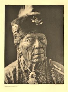
The Comanches - Lords of the South Plains - were one of the most feared of all Indian tribes. In the late 18th Century it was estimated there were around 45,000, one of the most numerous tribes, but numbers declined so that by 1870 only 8000 were left. The low point came in 1920 with census figures of only 1500. Present day numbers are around 15000.

Comanches were renowned as magnificent horsemen, more at home on a horse than on foot, and  had a reputation - in addition to that of ferocity and cruelty - as excellent horse breeders. Before the coming of the whites they waged war against the Spanish and later the Mexicans and took many captives, some treated as slaves others eventually adopted into the tribe.

At the high point they roamed an enormous area  which covered present New Mexico, Southern Colorado, North-Eastern Arizona, Southern Kansas, Oklahoma and most of North-West Texas. Their home territory was known as Comancheria and they resisted white encroachment - often described as the Comanche barrier to settlement - for many years. The Comanches and Texans especially hated each other and  dreadful hostilities continued between them until the final surrender of Quanah Parker in 1877. For a good history try Wikpedia. I have several books of which `Comanches' The Destruction of a People by T.R.Fehrenbach is excellent,and `The Comanches' Lords of the South Plains by Ernest Wallace and E.Adamson Hoebel another. Quanah Parker, son of a Comanche chief and a white captive woman is one of the most famous individuals, see `Empire of the Summer Moon' by S.C.Gwynne. He later became a wealthy cattleman and  celebrity.


Left Hand - Comanche Warrior circa 1900
www.firstpeople.us/

Edward Curtis the famous photographer and author of the monumental `The North American Indian', took most of his photographs beginning around 1895. By this time the Indian wars were over but memories were still raw. Much resentment remains to this day, especially on the present day reservations. This photograph may have been taken around 1900 or a little later. I know nothing of this individual other than he was a tribal elder.


Left Hand -Waterford 16" x 12" 140lb (300gsm) Not

I first made a careful pencil drawing using a mechanical pencil  07 with a 3B lead. Beginning with the eyes I painted the features first. Skin colours were various mixes of Cadmium Red Pale (Rowney), Quinacridone Rust (Graham PO48), Raw Sienna, Cobalt Blue and a little Burnt Umber all (mainly) mixed on the paper.. The fur hat is mixtures of Quinacridone Gold (Daniel Smith PO49), Raw Umber and Raw Sienna. The shirt is Cerulean Blue and Gold Ochre (W & N PY43). I wonder of Hap will approve of the skin colour?

Friday, 9 November 2012

Paul Weaver at Avon Valley Artists

On Thursday  8th November Paul Weaver the award winning Bristol artist gave a demonstration to Avon Valley Artists, 21 members present. Paul, who was  very successful at the prestigious Bath Prize last year, has a growing reputation, which is beginning to extend beyond Bristol, Bath and the surrounding area.

Paul paints in the traditional English style and specializes in landscapes and other outdoor scenes with buildings. On this occasion he was asked to do a demonstration painting of the Bristol dock area. 

Paul began as a landscape artist and studied initially - like so many others -with Ron Ranson. The artists mentioned  he particularly admired were David Curtis, John Yardley and Ken Howard. I believe Trevor Chamberlain is another favourite.

Paul trained as a graphic and design illustrator, and told me that drawing was not something stressed in this profession, although most graphic artists do draw well. He still does some graphic work, although now working as a full-time professional..


Preparing for the Demo


 Paul getting ready


A selection of photographs on which the painting was to be based.


 Using a viewfinder to crop the photograph. As you can see he  uses a home made viewfinder in two pieces, which allows greater flexibility in framing the subject. Paul normally uses a viewfinder when painting or sketching outdoors.


Paul started off by making a value drawing on cartridge paper with charcoal. 


The value drawing. The advantage of using charcoal is that you can easily correct mistakes or make alterations.


Paul began by taping the paper to the board with masking tape, a roughly half inch overlap. He then made a quite loose and faint drawing. Then using slightly darker pencil marks highlighted the key areas. Paul uses a 4B pencil which is quite soft. He holds the pencil  some way from the tip. With such a soft pencil he is careful not to press too hard, and stressed the danger of the harder leads is that the pencil can mark the paper which can cause problems when you apply paint.

He then commenced painting, using primarily neutral colours, Initially he put faint washes over the sky and other areas. He began with darker paint on the area furthest away, then towards the right hand closer buildings. Paul uses wet into wet a lot. Detail is painted with stronger colour when the paper is dry or just damp. He considers value more important than colour. 
.


He then painted the wall next to the boat and the dark reflections. We had a recess for tea/coffee and biscuits. The large boat was completed next and then the small one. Finally the reflections and the masts. He lifted out some paint using the dry tip of his brush. The whole painting, took about 11/2 hours, and he was explaining what he was doing pretty much continually - very clear and easy to understand.


Dock Scene 16" x 12" Bockingford 140lb 


As there were 30 minutes remaining Paul did a very rapid second study based on a photograph of  more boats. He cropped the photograph with his viewfinder and off he went.


You may notice  that Paul is left handed and paints using a single brush, which is his own `Paul Weaver' signature brush made for him by Rosemary & Co. I have seen several demos from him going back some years and originally he used the SAA `Whopper', a synthetic brush, an approximately size 30 round. His signature brush has a longer slimmer head which tapers sharply at three quarters of the length. This enables him to use the broad part as a  wash brush and the slim tip for detail. It is a size 30 and made from a synthetic fibre slightly firmer than the SAA brush. He sells them for £28.00p


16" x 12" Bocking ford.

The demonstrations were made on Bockingford paper.He uses this for outdoors, where quick working is required, and for  demonstrations. His main paper choices are Saunders Waterford which he considers has now been enhanced with the introduction of the `High White' version. He also likes Arches. While he uses Bockingford he said the main fault  is that the paint dries faster than on cotton papers. Bockingford is made from high quality treated wood pulp whereas Waterford and Arches are cotton.

Pauls palette comprises approximately 19 colours of Winsor & Newton paints, including a few Cotman colours. It is composed primarily of reds, blues and yellows with warm and cool versions of each. He uses a much smaller number in individual paintings. Colours in his palette include Raw and Burnt Umber, Raw Sienna, Permanent Magenta,Viridian, Blues Ultramarine, Cobalt and Cerulean, Permanent Rose (Cotman), Alazarin Crimson, Light Red, Cadmium Orange, Red, Lemon and Yellow, and Lemon Yellow.

These demonstrations were interesting and informative, enjoyed by all  present, regardless of individual styles or medium.. Paul is an excellent demonstrator and clearly explains what he is doing and why. He also told us that he has been making a DVD over the past year with the help of a friend and it was almost finished. His website is www.paulweaverart.co.uk/  Paul has recently had an article published in the `The Artist' and more will follow.


Tuesday, 6 November 2012

Book Review - Transparent Watercolor by William Condit.

I have something like 90 art books, primarily on watercolour. My friend John Softly has even more and suggested to me that amongst them this book by the late William Condit, who I'd never previously heard of, was worth considering. Enquiries at Amazon brought the information it was available at a very cheap price, just over £6, so I wasn't making a large commitment buying it.  


Hardback 11 1/2" x 8 3/4" 124 Pages Sand Dollar Publishing

This book is not a `how to' watercolour book, although he does go on about `transparent watercolour' quite a lot and also discusses his materials, which he calls `his ammunition'. Condit relates how 32 publishers turned the book down before he eventually decided to self publish. It is essentially about him and his journey as an artist. He sold his own company in 1979, described as a `design and exhibit' firm, and launched on a career as a `transparent' watercolour artist. Note the transparent bit as he was totally against opaque pigments and thought they shouldn't be allowed into a `true' watercolour artists palette. He also talks about the history of pigments and here he thanks Winsor & Newton for their assistance.

The most interesting part of the book - a significant part - details his experiences learning under several well-known artists, including amongst others, Tony Couch, Frank Webb, Claude Croney, Tony Van Hasselt and Charles Reid. All top artists. I was particularly interested in the Charles Reid part for obvious reasons. Following this he turned professional and was soon hosting his own workshops. He later opened a gallery, the Sand Dollar Gallery, now run by his daughter who is an abstract artist, and as noted self-published his book. The book is well illustrated with his and other artists paintings, primarily his workshop tutors. Rather chameleon-like he instantly seemed to take on the style of the artists he studied with and you can see remaining elements of them in his own paintings. Condit  was a competent artist without being very exciting. His style is recognizably North American and as noted you can see traces of his tutors. Nothing against that, we are all influenced by others. Is it worth buying? Hard to say. Undoubtedly there is quite a lot to interest one in this book.At the price it isn't much of a decision and certainly it is different. Probably of most interest to American artists. Thanks to John for bringing him to my attention.