Sunday 31 March 2019

Watercolour Paintings 53

Here are this months batch. Varied as usual showing a wide range of styles and subjects. Hopefully there is something for everyone although this is always a tall order to fulfil. Some of the artists are no longer with us, some are already famous and World renowned, some well known and some lesser known or not at all, at least to me. Of course many may  have reputations in their own countries or local reputations where they are based.


Robin Berry - This is very recent from this fine American artist


Leilie Abadie - A study in delicacy from this French lady


Sarah Yeoman


Vladislav Yeliseyev


Tim Wilmott


Yuko Nakayama


Alvaro Castagnet - The Workshop King, Great Artist.


Herbert Brocklebank  1892 - 1932 A fine Australian artist


Correction - Stephen Zhang - Still Stunning!


Andy Evansen


Michiko Taylor


Ross Paterson - one of the leading Ausrtralians


Harold Herbert - Very Charles Reid like.


Lorna Muir 1920 - 1990 - Another  Australian


Jinnie May


Erkut Sevin


Rae Andrews


John Salminen - Amazing!


My Mistake! It is Charles Reid- Thanks Ray


Keiko Tanabe

Any name corrections or more information on the lesser known artists above welcomed

Tuesday 26 March 2019

Winsor & Newton 'Cadmium Free' Watercolours

Winsor & Newton have introduced seven new paints which they say act exactly like the Cadmium versions but without the toxicity. They call them 'Cadmium Free' after the names, Cadmium Lemon, Cadmium Red etc. In addition three other paints have been introduced Smalt (Dupont's Blue),  Transparent Orange and Quinacridone Violet (PV55).  All these paints are in Series 4 - the most expensive. I have e-mailed W & N to ask for the pigment details and will post their answer (if I get one).


Smalt was available as part of a special 5ml edition in 2016. Presumably due to demand it is now part of the full range. Here there is a problem, if you like to call it that. The paint is based on PV15 which in my book is Ultramarine Violet so should be called a 'hue'. The true Smalt had a different composition.

Transparent Orange is shown on the website as Pigment 'DPP' but on the colour chart comes up as PO107. I've never heard of this one and neither has the Pigment Database which ends at PO86. Interesting must be a new one. Quinacridone Violet is PV55, first introduced by Daniel Smith. The pigment database calls it 'Quinacridone Purple' and says 'it is claimed superior to Quinacridone Violet PV19 and close to PV23'. I bought the DS version and eventually discarded it as the paint went solid in the tube.

Looking at the 'Professional' range in total the number offered is 109, 100 plus in 5ml, 96 in 14ml and 24 in 37ml. There are also 95 in half pans and 72 in full pans. Current W & N prices at Jacksons are (14ml) Series 1 £9.80, Series 2 £11.30, Series 3 £13.10 and Series 4 £15.40! These are stiff and have escalated over the last year, as have many others.

At the moment my recommendations using my markers of price and quality together  are first choice LUKAS in 24ml which may be too much for some unless you use a lot of paint. An alternative is Sennelier who offer both 10ml and 21ml tubes, while I'm considering giving Shin Han another try. I might also try Turner. The other option is the new Van Gogh range, increased to 72. My main reservation with the Van Gogh is the smallish number of single pigment paints but nevertheless there are some interesting newcomers amongst the range. I realise of course that personal preference plays a large part in choosing what to buy. I think however one should have an open mind as prices  of top ranges are reaching stupid levels for keen amateurs or just hobby painters. Ron Ranson used Cotman and thought the whole thing was a con, while my friend Zvonimir regards it is as ripoff since the pigments in watercolours are the same as in oils and acrylics, which are not as expensive volume for volume. In addition to the above suggestions have a look at house brands like Jacksons, the SAA and Bromleys. In the US all the big dealers offer them and some are very well-regarded.

I have received the following reply to my queries from Debbie at Winsor & Newton:

'Since we have developed Cadmium Free colours we cannot give the pigments away for other companies to use. We have spent years perfecting these colours to mimic as close as possible the original Cads and we are protecting our own interests.
Transparent Orange contains pigments that are not registered with the ASTM this means that the ASTM (the America Society for Testing and Materials) has not given it a C.I. number. D.P.P stands for Diketo-Pyrrolo-Pyrrol. Additional Note: On Jacksons website PO107 is shown on the details for the new Transparent Orange.

I have to say this concerns me. Since Handprint stopped updating pigment details and testing them I know for a fact some companies are changing pigments without altering the packaging. Others seem less inclined to give details. Most of the makers websites do still give details but it is getting harder to find them.


Friday 15 March 2019

Trevor Chamberlain - A Watercolour Master

Trevor Chamberlain is a contemporary of John Yardley.  I think it fair to say they have been at the pinnacle of British watercolour artists for many years, both now in their mid-eighties. John Yardley is a shy and reserved character although, according to his many friends much less so when you get to know him. Trevor is even more reserved in that he has never made a video nor held workshops or given demonstrations. I imagine over the years he has received many requests to do so. When Steve Hall wrote his book on Trevor he told me he was initially rather reserved and perhaps suspicious, but once Steve gained his confidence was fine. Trevor is a prominent member of the famous Wapping group of artists founded in 1946- www.thewappinggroupofartists.co.uk/ - so has many painting friends. They paint outdoors weekly April to September, much along the River Thames. Numbers are restricted to 25 although their splendid website currently has 26, 25 men and 1 woman.


The two paintings above are my favourites. The one on the oil tanker, I believe painted at Falmouth is quite small which makes it all the more amazing. I could be wrong on the size.


There have been a number of books on Trevor. He is shown as author of two, one on oils in Ron Ransons Painting School series, and (my favourite) 'Trevor Chamberlain - A Personal View'  in the superb David & Charles Atelier Series, sadly discontinued after only a small number of titles.  Angela Gair is credited as assisting on the Atelier book. The other books are a section in Ron Ransons splendid 'Watercolour Impressionists' and the latest by Steve Hall and Barry Miles 'Trevor Chamberlain England and beyond.


What is Trevors approach? As Ron Ranson says in 'Watercolour Impressionists'... 'The effect of light is everything to him and it is the constant theme that runs through his work whether it be oils or watercolour'. As noted Trevor also paints in oils and when he decided to do watercolour  he states in the Atelier book that it took him a year to master the medium. Lucky him as some of us still struggle after many years - at least I do. As Ron also says he is something of a  slave to the weather as he paints  exclusively outdoors, but he's by no means a 'fair weather' painter. This limits him to about two paintings per week.


What is Trevors approach to painting? He paints 'loose and fluid' using what is called the 'controlled wash' method , Jack Merriot, who promoted this,  being one of his early influences. To quote him from the Atelier book 'Much of the picture is completed in a single wash, with the addition of one or two additional washes to define forms'. This gives in most of his paintings a very soft look. This does not appeal to everyone. My friend John Softly isn't a great fan of this 'soft' approach. Each to his own as we say.  His methods are detailed in the Atelier book so I won't go into detail just say if you are interested seek out the Atelier book and Ron Ransons 'Watercolour Impressionists' I don't have the latest available book by Hall.& Miles. The others are out of print but searching may find copies in the second- hand market.


What materials does he use? He likes many of the old papers and built up a stock of several makes. which are probably exhausted by now. Of current papers he likes Arches, Bockingford, Waterford, Fabriano and Two Rivers, usually 140lb stretched to avoid cockling . He will paint very large in the studio- full imperial - in which case he has 300lb paper -from a small outdoor sketch. Brushes are Kolinsky round  sables in sizes 8, 12 and 14. On larger paintings he may use a 'french polishers mop' - presumably Isabey for the initial wash. He also sometimes uses a shaving mop and has an 18mm flat brush for lifting out. A No 4 rigger for fine detail completes the number, although he also uses an old brush to apply masking fluid, used  very sparingly.

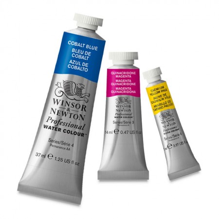
Artists quality paints are his choice, both tubes and pan colours,  Raw Sienna a favourite and also mentions Olive Green, Burnt Sienna, French Ultramarine, Viridian, Burnt Umber, Venetian Red. Permanent Magenta - a softer colour - has replaced Alazarin Crimson. After trying many different Viridians  he'd found the one by Talens (Rembrandt) 'really good'. I bought the Rembrandt Viridian on this recommendation but couldn't see it was much different to others. Still I'm not Trevor Chamberlain.


Trevor is a close friend of the artist David Curtis who told him about Craig Young and his hand-made palettes  based on old designs. He purchased the one similar to  the Binning Munro without the flap. I've one of those with the flap and it is still pristine and unused. I can hardly bear to spoil it but as my other two Craig Young palettes are showing the worse for wear will have to bite the bullet shortly.

I think that's pretty much it. As said enquiries on the internet will bring more information and lots of paintings, and searches amongst  second-hand booksellers may result in copies of the books mentioned. Without a doubt a wonderful artist.


Wednesday 13 March 2019

Nearly But Not Quite.

This is an odd title but denotes what I feel about many of my paintings. A sense of not quite getting there. The one below, done this week, is an example.


What I was interested in here was the heads of the animals, a rare Scottish breed, I reached this point and didn't quite know what to do next. Perhaps I should have stopped. Charles Reid says when you look at a painting and wonder what to do next the best thing it to stop. After reflection I carried on, feeling it was a bit too unfinished but was I right?  I don't know. Certainly overpainting is one of the worst faults artists painting in watercolour do. They just keep on when stopping - even if the painting is slightly unfinished - is the best option. Judi Whitton taught something similar.


Stonehenge Aqua not 16" x 12" 'Highland Cattle 'or 'Mother & Son'.

One of Charles other pearls of wisdom is that you reach a certain point in a painting where - if you make the wrong decision - it goes downhill or alternatively the right one and a decent painting emerges.

The other day I decided to take Robert Wades advice, illustrated in one of his videos, of going through that pile of paintings and discarding the ones that don't come up to scratch. In his case most of us would be delighted with the ones he tore up but.... I have a huge pile built up over some years so started on the first batch, about half the total. I segregated them into three piles. Those to be discarded, those where I could paint on the back - at over £1.50p a sheet now per block of Waterford this is an  option, and you can do it whatever might be said to the contrary. The late Ron Ranson told me he had a painting hung at the Royal Academy that was on the reverse of a 'failure'. The third pile were those I considered decent, although a few are borderline. Remember this is a hobby painter talking not a high profile artist. The discarded ones were torn up and put in the recycle bin. Do I feel better after doing this. Robert said he did and so am I. Actually it tidied things up somewhat.


Friday 1 March 2019

Watercolour Paintings 52

Here are the latest batch, a very varied collection, which hopefully has something for everybody. It once again displays the wide range of styles and subjects that watercolour now encompasses. I know some of these artists but not all. Further enquiries on Facebook or Pinterest should bring more information.
Rachel McNaughton


Another from Rachel McNaughton

This one is very similar to the paintings John Blockley produced at the earlier stage of his career. His paintings were quite bleak with sombre colours however. He later introduced more colour and even became President of the Pastel Society. Interestingly his daughter Ann, an accomplished flower painter, has also changed direction with  a far more abstract approach and very strong colour.


Edward Seago


Steven Scott Young


Corneliu Dragan-Targoviste


Jake Winkle
This British artists wife runs the Luxartis brush company,  although the brushes have  'Germany' on the handles presumably where they are made.


Charles Reid


Olivia Quinton


Ann Christian Moberg


Koo Cheang Jin


Roberto Zangarelli


David Taylor

One of the leading Australian artists.


J W M Turner
Turner has an International reputation although not everyone likes his work. Charles Reid amongst them.


Lars Eje Larsson


Yvonne Joiner


Thomas W Schaller


Maria Stezhko


Jasmine Huang


Annemiek Groenhout


Tim Willmot

This was painted in Saltford nr Bath, where I lived until fairly recently. I'm still close by at Keynsham. Seago painted  at least one oil at Saltford, down by the river Avon.


Elke Memmler


Bev Jozwiak

A top American Bev loves painting Jackdaws.


Edward Wesson

The simplicity of most of Wessons paintings is typified by the above. Don't think though that such works are easy to produce.