Tuesday, 30 October 2012

And Another `Newsflash'.

Just received an e-mail from Great Art www.greatart.co.uk/ with a number of offers on watercolour paints. Pebeo, a budget make with 28 colours, has been reduced to 96p a tube! I've never tried this newish one so cannot speak for it.

Rui alerted me today to the very cheap prices on offer for Winsor & Newton from Great Art. I have received an e-mail from them but this wasn't highlighted, so you may need to go into watercolour paints and find W & N. On all pans, and tubes, whatever the size, discounts range from 51% - 55%. This is incredibly cheap but there is no indication as to how long this offer will last. It may I suspect be only very temporary before a price hike, witness Jacksons new catalogue just received, where Series 1 14ml are £7.70p. These sort of prices were introduced at the beginning of 2012 but (presumably) customer resistance or hot competition meant that lower prices than these have been on offer from one source or another all year. I think they'll have a similar difficulty in 2013. In any event before you buy check the website prices and compare.


Jacksons latest 2012/2013 catalogue www.jacksonsart.co.uk/

I haven't studied this in detail yet to see what price movements have taken place. On first glance the things that probably interest the watercolour artist the most, paints and papers, don`t appear to have moved much if at all. This after only a cursory glance so don't hold me to it! The Jacksons catalogue is distributed far and wide so copies will be arriving with Leisure Painter and The Artist as well as those to existing buyers. Note added : I have checked Jacksons prices and and all the leading artists quality makes remain unchanged as do the watercolour papers, both sheets and blocks, from Waterford, Arches, Fabriano et al. After the price hikes at the beginning of the year this is welcome BUT still look for special offers.


Friday, 26 October 2012

Avon Valley Artists Thursday 25 October

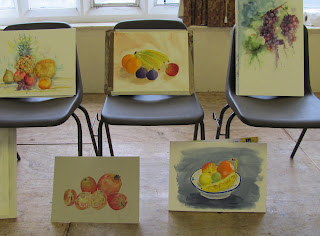
This week the subject was `Fruit' just that. Although attendance has not been great this session we had the unusually low figure of only eight members present. 


Thin on the ground!

Those present painted either from photographs or fruit they had brought to the hall.


Robert


Eileen


Helen


Pauline


John
 
 
Yvonne

 See www.watercolourflorals.blogspot.co.uk/ as Yvonne has already done a comprehensive post with photographs, description of paints used and other information. Well worth a look.


Pat

Where is mine?


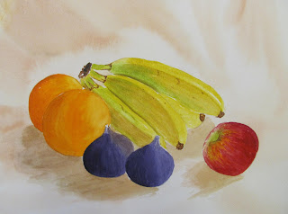
This is my setup, the drawing completed the previous day and starting with the pineapple.


Fruit. 16" x 12" Centenaire 140lb (300gsm) not

The colours in the pineapple are mainly Quinacridone Gold (DS PO49), Quinacridone Rust (Graham PO48). There is also a little Cerulean and Burnt Umber. The top is a mix of Cerulean, Viridian, Hansa Yellow Medium (DS PY97) and Cobalt Teal Blue DS PG50). The apples are (left) Quinacridone Coral (DS PR209), Sap Green (Graham), and a touch of yellow. The right hand apple is Quinacridone Rose (Graham PV19), Quinacridone Purple (DS) and Sap Green. The orange is Cadmium Orange (Maimeri PO20), Transparent Orange (Schminke PO71) and some yellow. The grapes are Moonglow (DS) and some Quinacridone Rose. The (difficult) melon is a mix of Quinacridone Gold, Raw Sienna and Raw Umber.  The pear is Raw Umber and ? (can't remember!). It isn't perfect - mine never are - but I am reasonably happy with the result.
 
 I used the Escoda 1214 retractable Kolinsky sable Size 12 for 90% of the painting. This is the equivalent size to several other size 10s or even 8 in some cases. Escoda's are smaller in general size for size but are good and well priced.


A final view of all the paintings.
 

Another Newsflash!

Great Art www.greatart.co.uk are offering free delivery until the 28th October, providing purchases exceed £29.95p (normally £39.95p). They specify on the website any exceptions to this. The website is complicated but can be navigated with care.

Great Art offer a huge range of items for the watercolour artist. For the budget conscious, aren't we all, I suggest Centenaire paper is worth consideration. Centenaire is 100% cotton, whereas amongst the other budget papers sold, for example Bocklingford, Veneto and Brittannia,  are made from cellulose. Bockingford,  is usually described as made from `high quality wood pulp'. They also offer two `own label' budget papers in blocks. I have tried both but wasn't overly impressed - too hard a surface my main criticism.

 Great Art are German and deliver from Germany, but have a UK ordering telephone service and an English website. I have found their service excellent and have had no problems. It was suggested to me (by a competitor)) that they were a bit `rigid' if a problem occurs or items are out of stock.

Other products worth looking at are various watercolour paints, First Van Gogh, made by Talens whose premier line is the well-respected Rembrandt. I have used Van Gogh in my early days and it is good. The range of colours, 40 in all', is adequate unless you desire a really exotic palette. Downsides? No Cobalts or Cadmiums,with `hue' equivalents for the expensive blues, usually based on Phalo Blue (PB15) and white. They have other `student' makes, a misnomer if ever there was one, and have recently introduced the Pebeo range of 28 shades. Amongst artists quality Lukas is a great buy.

They also offer a massive range of brushes including synthetics and mixed hair brushes like the Da Vinci Cosmotop Mix B (used by Viktoria Prischedko and Piet Lap) much cheaper than sables.

My advice is always to shop around and compare prices before buying.

Tuesday, 23 October 2012

Newsflash - Good Bromley offers on Winsor & Newton or are they?

Just received a `newsflash' e-mail  from Ken Bromley www.artsupplies.co.uk  who are offering Winsor & Newton watercolours (and Gouache) at 30% off. This makes 14ml Series 1 £7.21p (5ml £3.85p) to series 4 £11.41p (5ml 5.74p). 37 ml are similarly discounted as are half and full pans. Watercolour mediums are on offer at 35% off. This is about 5% more than Bromley's normal discounted prices. You have to buy 6 tubes or pans to get this offer and doing so also triggers a  free half pan of Quinacridone Magenta. If this free pan offer attracts you then the overall price package would work out better but there is not a lot in it.

A look at current Jacksons www.jacksonsart.co.uk and Great Art prices www.greatart.co.uk  indicate they are cheaper at basic prices! Series 1 14ml from Jacksons are £6.93p and Series 4 £10.89p!!! Great Art are very close to these prices. I suggest ALWAYS compare prices before thinking you have a bargain. With the price of art materials, particularly those for watercolour, my advice is shop around and compare prices as the situation is very volatile. It's tough out there for art suppliers but even tougher for many artists. I have also checked the 5ml sizes and a similar situation appears to exist.

 There are other art suppliers. I have not checked any very recently as the ones above are usually at the forefront and all offer free carriage if purchases exceed £40. Some others appear to be becoming more competitive and I'll be having a look at one or two shortly.

Monday, 22 October 2012

Matters of Interest?

Did you know that the (once) great British company Winsor & Newton, previously owned by a Swedish educational company called Colart, are now owned by a German paint company called AB Wilhelm Becker? I didn't until I read the excellent blog  http://channeling-winslow-homer.com/   . I wonder  what Mr Winsor and Mr Newton would make of all this - probably turning in their graves. If you think this nationalistic - and I'm opposed to extreme nationalism - look at who owns Holbein, Sennelier, Schminke, Lukas, Maimeri,  Graham and Daniel Smith. Not one has been sold  to a foreign company.

 As an aside there continue to be rumours circulating that W & N watercolours are not as good as they once were. Is this true? Any views?

 I don't know who owns Daler Rowney, the other famous British paint maker, but it certainly isn't the descendants of Mr Daler and Mr Rowney. I believe it is also owned beyond the shores of the UK. 

********

Turning to watercolour paper I see that Saunders Waterford have now introduced their `High White' paper in blocks. Initially I wasn't overly impressed when I tried some sheets shortly after it was introduced. Yvonne Harry didn't like it either but as I made more paintings I became more positive. The well-known artist Ann Blockley is very happy with this paper. The blocks are now available from both  Ken Bromley and Jacksons. I've just ordered a 16" x 12" Not block, my favoured size, from Jacksons at £24.30p. I do like Fabriano Artistico Extra White, but  they do have this odd size of 18" x 12" and I've taken to reducing it to 16" x 12", which is a waste of paper, especially at close to £30 for a block of  20. Incidentally for those who liked the famous Whatman hand made (and very expensive) paper, which has been discontinued, it is being said that the replacement  is Milford. Why replace it and what is the difference between the two?

Actually I live quite near the Waterford Mill and have been mulling over contacting them and asking if I could visit for a blog feature.

Continuing with paper Great Art are offering their Centenaire 100% cotton watercolour paper at the very keen price of £16.10p for a 16" x 12" 20 sheet block. Other sizes relatively priced. This is current as of today. Centenaire is sold in both rough and not surfaces, several different sizes plus sheets. The `normal' price is £18.95p which is still good compared to other cotton papers. This was launched last year at very keen prices but in 2012 it became more expensive. However the competition has moved up in price - and the special offer seems ongoing, at least up to date - so  for anyone looking for something that is keenly priced but not made of cellulose then worth looking at.


How good is Centenaire? I have used it  for a while and find it satisfactory but  think both Waterford and Fabriano still have the edge. The gap isn't obvious though, at least as far as I can tell. Some other artists at Avon Valley Artists are using it and I've just ordered some for several.
*******
Finally I have been entranced by Gerard Hendriks `little' watercolours on his blog http://gerardhendriks.blogspot.co.uk/  , which he describes as a `ten minute' painting a day. I decided to try something similar, although I`m frequently driven off course by amongst other things grandparenting duties and emergencies, like tomorrow with Evie having `suspected' - it may well not be - hooping cough. Anyway the other day I took three remaining Rudbekia blooms and attempted a very loose and simple painting. It was quite large at 15" x 11" on 90lb Fabriano and took about 40 minutes.


I first made a loose drawing, very simple, and then painted using a No 8 Isabey 6228 Kolinsky sable. The idea was to use compliments so I put several blues in the background, Cyan Blue (PB15:3), Prussian (PB27), Ultramarine and Cerulean. there is also some Sap Green and a little Hookers. The flowers are a mixture of Indian Yellow (Rowney PY153), Cadmium Orange (Maimeri PO20) and Hansa Yellow Medium (DS PY97). There may also be minor touches of Raw Sienna and Raw Umber. The flower centres are Burnt Umber and Ivory Black. 

Once again comments seem to be drying up. I don't look for praise just feedback really otherwise it is difficult to know what is interesting to readers. That's it folks!

Sunday, 21 October 2012

Problem colours or pigments?

A while ago I related my problems  with the Graham Mineral Violet (PV16). The first 15 ml tube was half empty and a complaint to Lawrence, the sole UK source, was promptly dealt with and a new tube despatched. I didn't attempt to paint with the colour for several months and when I did found the tube had solidified into a horrible muddy brown. Again I contacted Lawrence www.lawrence.co.uk who were very good, explaining that Graham said this was  due to a faulty batch of pigment, and  had subsequently changed their supplier. A third tube arrived which I was assured was the real thing. Although I don't use this colour much I have a secondary palette and  sqeezed colour into one of the wells. After a while I noticed it was changing colour - the muddy brown again! By skimming quite a lot of paint off the top I returned to the `true' colour - at least I think it is. The only way round this seems to be to  squeeze out a small amount of paint prior to using it. However my conclusion from all this is AVOID.  I stress this is my experience with only one make and others may be fine, but this isn't a popular pigment and rarely features in artist palettes. I have many other Graham paints and am generally very pleased with them so this isn't a condemnation of Graham. Charles Reid uses Holbein Mineral Violet BUT this is PV15 not 16, in other words Ultramarine Violet.


The Cobalt Violet is 4th bottom left but look at the paint 3rd bottom left!

What does Handprint  www.handprint.com/HP/WCL/waterfs.html the indispensable reference say? The initial surprise is that it is rated a `Top Forty' pigment by  Bruce McEvoy. He continues:

 `Manganese Violet PV16 is a very lightfast, semitransparent, lightly staining, dark valued, moderately dull red-violet pigment, available from 4 pigment manufacturers worldwide'.

 He also says the PV16 pigment is very consistent across paint manufacturers. Six versions  are listed variously called Manganese Violet, Permanent Mauve (W & N) and Mineral Violet. Old Holland call it Manganese Violet-Blue and this discoloured to a brownish cast in his sample. Shades of my experience with Graham.

The second problem colour/pigment is the Rowney PV14 Cobalt Magenta. Like all cobalts it is very expensive, although the Rowney version considerably less so than others. It may be that I'm exaggerating the problem but certainly over a period the same sort of horrible muddy discolouring took place and I had to discard quite a lump of paint because of it. What to do? I sqeezed out a small amount  as I did with Mineral Violet and so far - about a week to ten days - the colour remains the same. I quite like the colour and it granulates beautifully if a little weak.

What does Handprint say? Another Top Forty pigment! He goes on to say:

 `Cobalt Violet PV14 (often labelled "cobalt violet deep") is a very lightfast,semi-transparent, nonstaining, moderately dark valued, moderately dull violet to red-violet pigment, available from 4 pigment manufacturers worldwide'. 

Again this is not the most popular of pigments although a number of manufacturers list it. The paints on offer show a noticeable variation (Handprint) and colour varies from light to dark valued. Some disparage it as `weak and gummy' but , again according to Handprint, the `genuine, high quality,cobalt violet is a spectacular paint on broad wash applications'.

Interestingly I spotted a pan of Cobalt Violet in Charles Reid's palette at my last Crantock course in 2011. Charles has taken to using some pans although he prefers tube colours. This is due to the problems associated with moist watercolours when travelling. He never mentioned this colour when discussing his palette but I notice that on his latest DVD, `Figurative Watercolours', the figure of the man has some on his clothing. Almost certainly this is the Winsor & Newton version.

What to do? If you like this colour, and I do, what make to buy. I have just this minute looked at my palette again, and while the Mineral Violet has already turned grey, the Cobalt Magenta hasn't changed colour.

What does it cost? Taking Jacksons www.jacksonsart.co.uk as the guide The Rowney Cobalt Magenta is £8.80p for a 15ml tube (5ml £4.50p). Winsor & Newton 14ml is £12.10p (5ml £6.10p). Daniel Smith is actually cheaper at £11.70p, Holbein is an amazing (Cobalt Violet Light) £18.70p with Old Holland £15.95p. All 15ml including Bloxx. Some eye watering prices here. Jacksons only offer Rembrandt in 5ml tubes - a reasonable £2.90p. You can get 21ml Rembrandt from others like Great Art www.greatart.co.uk but is such a large tube in this colour necessary? Bloxx costs £14.85p, Graham £10.36p (inc.20% off offer for 6 same size tubes), DaVinci £11.96p (includes 20% offer). Both these only in the UK from Lawrence who do charge for carriage. Maimeri don't list this pigment. My suggestion would be, unless you have a definite preference for a specific make, to consider either the Rowney or Rembrandt versions and also the 5ml size if it is only used  occasionally. I do have a final suggestion. The underrated German make of Lukas offer a 24ml tube costing £9.25p then you also have the -20% offer on top. This is the Lawrence deal but Lukas is also available from Great Art and possibly some others but that 24ml tube!!!

Thursday, 18 October 2012

Avon Valley Artists Thursday 18 October.

The subject today was `Pots, vases and flowers'. Members brought in a variety of flowers and objects and off we went. There were 14 of us today, which was better than last week. Numbers are still depressed by holidays and illness.


Gerald Pink


Clive Brotherton


Pauline Vowles


 Robert Heal


Pat Walker


Sue Macy


P Ward


Yvonne Harry (unfinished) on Whatman paper.


That's it then. This is a selection of the paintings. Yvonnes  is looking good. She had drawn it the previous day after finding some Whatman paper she had overlooked. This is or was an expensive hand-made paper  no longer produced. The replacement for it is Milford. I don't think overall this was one of our better days and I was less than enthused by my own effort.

Saturday, 13 October 2012

Edward S. Curtis

Edward Curtis is an iconic figure in American history, although somewhat controversial. He was a famous photographer and also wrote the `The North American Indian', an enormous work in 20 limited edition volumes, published between 1907 and 1930. There are over 1500 illustrations of black and white photographs, taken by Curtis over a period of many years commencing about 1895. The Firstpeople site www.firstpeople.us/ has many if not all and they are free to download and use, but not for profit. If you Google his name a vast amount of links appear.


16" x 12" Centenaire 140lb (300gm) not.

 I started off with a pencil drawing using a 2B pencil. I kept this fairly simple and made no attempt to put in `missing detail'. By this I mean that which isn't visible in the photograph. For the features I used various mixes of Ultramarine Violet (Rowney PV15), Quinacridone Rust (Graham PO48), Cadmium Red Pale and Cobalt and Ultramarine Blue, with a touch of Raw Sienna. The underside of the hat is mainly the same colours in heavier mixes. His beard is combinations of Raw Umber, Raw Sienna plus diluted mixes of Ultramarine Blue and Burnt Sienna. I allowed the painting to dry thoroughly then made some small changes and additions the following day. The head is silhouetted with the same dark colours. I tried to paint him following Charles Reid's  advice `cruder' rather than fussy and in a more adventurous manner. 

His hat colours are combinations of Ultramarine Violet, Raw Umber and Raw Sienna.The coat is a mixture of Quinacridone Rust and Raw Umber. 

Brushes used were the Da Vinci Artissimo 44 Size 2 Kolinsky and the Isabey 6228 Size 4. 


Wednesday, 10 October 2012

Failures, Experiments and Unfinished paintings

I get many failures. The reject pile grows ever higher, so high that if I fell off the top I'd probably break a leg!  It does comprise different categories. Older paintings that I was  happy with at the time but  have been replaced by better ones. Others are experimental where I was trying different things, swatches, figures, trees, and so on. Some are just abject but I'll draw a veil over them.  All is not entirely lost as many can be painted on the reverse, which is what I do, given the cost of cotton-based papers. Ron Ranson once told me some of his best paintings were on the back of failures, including one that was hung at the RWA.

 11" x 15" Leonardo 300lb (600gm) 

This was an experiment using Hahnemuhle Leonardo paper, which is used by both Viktoria Prischedko and Gerard Hendricks. Yvonne bought a quantity on special offer and offered me a couple of sheets.
I have yet to try the second but first impressions were not very positive. I warned Yvonne that such heavy papers soak up the paint and, as a recent convert to Daniel Smith. this could prove very expensive. She was unimpressed at first, although results improved with subsequent paintings. I don't think she plans to change however and remains wedded to Fabriano Artistico Extra White 140lb (300gm). If you see the earlier features on both Viktoria and Gerard you will see they paint in an entirely different way.  


This is a failed and unfinished painting in my Amerindian series. I was quite pleased with the drawing but my failure to interpret the original monochrome photograph, one of the Edward Curtis series, made me decide to abandon it. 


Can you see my dilemma? Is his hair grey or is it just reflecting the light? Has he possibly died his hair? Has that above the face black roots? The change to very light  is extreme and I've concluded that I became too fixated on the photograph details and should not have made certain assumptions but been creative. Interpreting these old monochrome photos is not easy due to the extreme contrast and loss of detail but I found this one particularly difficult. 

16" x 12" Centenaire 140lb not.

 This is another experimental attempt at the same subject using a slightly different approach - a little more abstract. I experimented with colour using diluted pink and green overall with the right facing side of the image in a darker green shade. This was put on after the original colour was dry. Colours here were Viridian and Quinacridone Rose. I think it gives me some ideas for future works.


Fabriano Artistico Extra White 18" x 12" Not

This is an unfinished still life. I drew and painted the first section then left it for a few days. It was originally done on the spur of the moment and I didn't have a proper plan. I was quite pleased initially and intended to add some strawberries and grapes. When I came to do so the strawberries had been eaten and the grapes much reduced in number. Apart from drawing a few grapes from memory I've done nothing else and am inclined to abandon it and paint on the reverse.


Indian Pony 16" x 12" Centenaire 140lb Not

I'm don't think this is a total failure and am in two minds about it. It was painted from a monochrome photograph and depicts an Indian pony in full flow. I'd be interested in any views.

There we have it. Painting can be exhilarating and depressing, I get periods when nothing seems to go right and you wonder if it's all worth it. Usually I recover quite quickly and produce something better - at least I think it is - so the gloom lifts. The advice from the artist Trevor Waugh is that everyone suffers these bouts of uncertainty and the one thing you don't do is stop painting.  

Thursday, 4 October 2012

Bev Jozwiak

Amongst the many fine artists I have discovered over the last year or two is Bev Jozwiak. I can't recall exactly how I found out about her, but discovery soon led to an admiration of her colourful and impressionistic work, together with interesting subject matter. As well as being a wonderful artist she is also a very nice person as I discovered when asking assistance in producing this feature.


Born in Vancouver, Washington, Bev is a Signature member of the American Watercolor Society and many others too numerous to list. She is an International award winning artist and her website - well worth a visit  www.bevjozwiak.com/  gives much detail of her career along with a large gallery of her paintings.


The following are examples of her `crow' paintings, highly original to say the least.


This statement from her website epitomizes her philosophy:

"Painting very directly, I place my watercolors on the paper with very little mixing on the palette. I use lots of varied colour in my blacks to keep them from going flat, in my whites to keep them glowing, and even in my skin tones to keep them interesting.

Emotion plays an important part in every successful painting, so I choose only subjects that call to me and that gives my work energy and excitement."

Bev is represented by several galleries and one of them had this to say at a recent exhibition of her paintings:.

"the Cole Gallery in Edmonton represents forty artists and hosts a rotating feature exhibition of each artist. The current artist featured is Bev Jozwiak. Jozwiak is a signature member of the Norwest Watercolor Society. Curator, Dennis Cole, claims that of the workshops offered to artists, Jozwiak's are the most popular.

Jozwiak's featured watercolor paintings depict figurative and avian subjects. her figurative work in this exhibition is split between young women and children. One of her avian subjects is a rooster; the rest are crows. Whether she is painting birds, a bride's maid or women waiting for the No.9 bus, Jozwiak's approach is both energetic and memorable.

Her colors are intense and her contrasts lively, but the source of her `Wow' factor, and she does have the `Wow' factor, is her expressive and deliberate brush strokes. Jozwiak's painting style is intensely personal. Her work appears to be driven by a kinetic relationship with her world. 

The edge of a shape is a critical transition in artwork. Edges are said to come in three flavors: hard, soft and rough. Jozwiak's edges move beyond the standard. Her edges can be jagged, gestural, bleeding, spattered and at times the pigment simply fades out into a solitary pencil contour line defining the shape.

Jozwiak paints with bold brushstrokes. Paint is often thick and opaque. She characteristically mixes pigment on the paper rather than the palette, which results in surprising color juxtapositions.

Her compositions are engaging. Most of her children are active. In Budding Artist a child is painting. In Life's little Treasures children are curiously searching the ground for that perfect little object to take home and put in a jar on the shelf. The young women in Jozwiak's show are waiting.  In  Bus Stop Conversation and Waiting on No.9, they are waiting for the bus. In `All Dressed Up...' the subject appears to be waiting for a date to show up. All of Jozwiak's figures appear to be embedded in their own reality. The gaze of the figures is always behind the frame, rather than out of the frame toward the viewer. Directing the gaze of the figures is always behind the frame rather than the out of the frame toward the viewer. Directing the gaze of the subject behind the frame, the artist contains the energy in the image she has created. We are allowed to peer in, but the subjects do not notice us. The effect enlarges the virtual world of the subject.

Jozwiak is playful as well as expressive. When she paints crows, she represents a bird that is familiar with the human world. In Traffic Cop II a crow is shown perched on a traffic signal light. In Crow Bar II a crow has found its way into a traditional still life of grapes, wine glasses and bottles. The crow has a grape in its beak. These scenes may sound cute, and while Jozwiak works with humour, her images go beyond cute. Even in these tame situations, her crows have a mischievous wildness about them."

This accompanied an exhibition in June 2012 and a selection of her work is on permanent display. The Cole Gallery is at http://www.colegallery.net


Below are some of Bevs latest work - not yet on her website - which she kindly sent me. I do see a change in emphasis with colour. One thing that attracted me to her work was her use of brilliant colour, especially red, and this has been toned down in these paintings. You can see many subtle colours and the use of complements.

The Diploma II

 Man of the Hour

World Beat

Big Dreams


Three Dancers

Bev has also supplied the following `mission' statement, if that is the right expression. 

"The style I am currently working in seems to be the direct result of my own personal journey. I can paint thick, dark and dramatic. to light loose and washy, all in one piece. Who says you can't have it all.

From an oil like look to dripping puddles, I love the spontaneity and freshness of watercolor. It has the capabilities to be hard edged in one stroke and washed out in the next. Watercolor is the perfect medium for creating edge variety, soft, hard,blurred or focussed. Lost and found edges help to create movement throughout the painting. I try not to get bogged down with finishing every detail. When you do your edges become hard, thus stopping the eye from travelling through your piece."

I have always been under the assumption that paintings should look like paintings, and not photographs. With that in mind, try to create movement in your work by showing brushwork, adding water, creating runs, drips and splatter. Experiment with the uniqueness of watercolor. Be bold, fear tends to make you tighten up. Don't just be a recorder of facts; keep in mind that you do not need to reproduce everything that you see. being freed up from exact rendering helps you concentrate on what the medium can do, rather than worrying about the small details.

This medium can be so versatile so don't fight it. Don't work against it; let it be in all its glory"

So there you have it!

More examples of Bevs work.


Now down to the nitty gritty of materials. Her palette is a John Pike, this is a very large, flat, hard plastic palette with 24 wells. It has a lid that you can also use for mixing. An illustration appears in one of my earlier posts on palettes. Paper is 140lb Fabriano Hotpress and the following Winsor & Newton tube paints, but note exception. Yellow Ochre, Quinacridone Gold (opt), Burnt Sienna, Sap Green (Holbein), French Ultramarine Blue, Cobalt Blue (opt), Manganese Blue Hue, Alazarin Crimson, Rose Madder Genuine, Cadmium Red, Cadmium Orange (opt), Winsor Blue (Red Shade (opt), Winsor Blue (Green Shade) (opt), Cadmium Yellow,

Brushes are Cheap Joes Golden Fleece (a large American mail order supplier) , Bev says she has expensive brushes but `I always seem to paint with these inexpensive brushes from Cheap Joes, almost exclusively a number 10'.

This is a long piece but I felt there is so much interesting and useful information that I have printed it in full. Almost a mini Masterclass in itself. Thank you so much Bev and I look forward to seeing more of your work in future.