Showing posts with label winsor and Newton. Show all posts

Saturday, 1 December 2012

Green-Gold - Pigment Yellow 129 ( PY129)

This is an interesting pigment which is given the `Top Forty' accolade by Bruce McEvoy of Handprint. It has never been a `must have' palette colour but is beginning to appear in an increasing number of ranges, although to date neither Holbein, Rembrandt, Schminke or Maimeri  offer it.

As usual naming isn't consistent, as apart from those who call it Green Gold, Winsor & Newton, Daler Rowney, Da Vinci, variations are Green Yellow (Lukas), Brown Green (Sennelier) Azo Green (Graham), Golden Green (Old Holland), all the same pigment PY129! To complicate matters Daniel Smith's Green Gold isn't, but a mixture of three pigments PY150, PY3 and PG36,  two yellows and a green. However we then find another Daniel Smith paint, Rich Green Gold, which is PY129! The Australian company Art Spectrum have two colours with PY129 as one ingredient with PG7 as the other, Australian Green Gold and Sap Green Permanent. It does not appear in any student ranges.


With that out the way I'll once again refer to Bruce McEvoy of Handprint. 

"copper azomethine green (PY129), commonly the ingredient in "green gold" paints is a lightfast, semitransparent, staining, mid valued, moderately dull yellow pigment,".......Unrated by the ASTM, manufacturer tests rate it as having "very good" to "excellent" lightfastness". Bruce agrees. 

The thing about this colour is that in tints it shifts from a yellow green  to a beautiful light yellow. I don't actually find it dull in the latter case, perfect for the colours of early Spring. Bruce rates it excellent for all genres, but especially for landscape and botanical painting. It also mixes well with several; other colours depending on what you wish to achieve. The Handprint information while still very valuable is not as up to date as one might like but even so is still worth consulting www.handprint.com/HP/WCL/watery.html .

Bruce states that if you are an advocate of the `split primary' palette then `copper azomethine' is the perfect lightfast, transparent "cool yellow" pigment to pair with it's lightfast, transparent "warm yellow" twin, nickel azomethine yellow PY150. This is Nickel Azo Yellow from Daniel Smith and Graham, Transparent Yellow Winsor & Newton, Translucent Yellow Schminke, Yellow Lake Sennelier. This latter pigment seems destined to enter most ranges although not yet universal. One of my members  Rui rates the Schminke paint highly. Any additions or corrections to the above welcome.

I have used Green Gold, mainly Rowney, for some time and also have the Winsor & Newton version. My use has been primarily in Spring foliage but Bruce suggest mixing with Qinacridone Magenta for portraits. I'll have to give that a try.


Sunday, 4 November 2012

More Incredible Deals from Great Art

Just received the Great Art magazine - actually a large pull out leaflet - with some incredible paper deals for watercolour artists. The Winsor and Newton artist quality paint offers, previously highlighted, are included and  prices for Fabriano, Waterford and Arches are the best I have seen for a long time. There are great deals for other media artists.

To give some examples the Fabriano Artistico 18" x 12" 20 sheet block (all surfaces including Extra White) is only £14.75p which is half price! Waterford 16" x 12" 20 sheet blocks are £17.95p and Arches of the same size £27.50p. These are just examples. www.greatart.co.uk/

Monday, 22 October 2012

Matters of Interest?

Did you know that the (once) great British company Winsor & Newton, previously owned by a Swedish educational company called Colart, are now owned by a German paint company called AB Wilhelm Becker? I didn't until I read the excellent blog  http://channeling-winslow-homer.com/   . I wonder  what Mr Winsor and Mr Newton would make of all this - probably turning in their graves. If you think this nationalistic - and I'm opposed to extreme nationalism - look at who owns Holbein, Sennelier, Schminke, Lukas, Maimeri,  Graham and Daniel Smith. Not one has been sold  to a foreign company.

 As an aside there continue to be rumours circulating that W & N watercolours are not as good as they once were. Is this true? Any views?

 I don't know who owns Daler Rowney, the other famous British paint maker, but it certainly isn't the descendants of Mr Daler and Mr Rowney. I believe it is also owned beyond the shores of the UK. 

********

Turning to watercolour paper I see that Saunders Waterford have now introduced their `High White' paper in blocks. Initially I wasn't overly impressed when I tried some sheets shortly after it was introduced. Yvonne Harry didn't like it either but as I made more paintings I became more positive. The well-known artist Ann Blockley is very happy with this paper. The blocks are now available from both  Ken Bromley and Jacksons. I've just ordered a 16" x 12" Not block, my favoured size, from Jacksons at £24.30p. I do like Fabriano Artistico Extra White, but  they do have this odd size of 18" x 12" and I've taken to reducing it to 16" x 12", which is a waste of paper, especially at close to £30 for a block of  20. Incidentally for those who liked the famous Whatman hand made (and very expensive) paper, which has been discontinued, it is being said that the replacement  is Milford. Why replace it and what is the difference between the two?

Actually I live quite near the Waterford Mill and have been mulling over contacting them and asking if I could visit for a blog feature.

Continuing with paper Great Art are offering their Centenaire 100% cotton watercolour paper at the very keen price of £16.10p for a 16" x 12" 20 sheet block. Other sizes relatively priced. This is current as of today. Centenaire is sold in both rough and not surfaces, several different sizes plus sheets. The `normal' price is £18.95p which is still good compared to other cotton papers. This was launched last year at very keen prices but in 2012 it became more expensive. However the competition has moved up in price - and the special offer seems ongoing, at least up to date - so  for anyone looking for something that is keenly priced but not made of cellulose then worth looking at.


How good is Centenaire? I have used it  for a while and find it satisfactory but  think both Waterford and Fabriano still have the edge. The gap isn't obvious though, at least as far as I can tell. Some other artists at Avon Valley Artists are using it and I've just ordered some for several.
*******
Finally I have been entranced by Gerard Hendriks `little' watercolours on his blog http://gerardhendriks.blogspot.co.uk/  , which he describes as a `ten minute' painting a day. I decided to try something similar, although I`m frequently driven off course by amongst other things grandparenting duties and emergencies, like tomorrow with Evie having `suspected' - it may well not be - hooping cough. Anyway the other day I took three remaining Rudbekia blooms and attempted a very loose and simple painting. It was quite large at 15" x 11" on 90lb Fabriano and took about 40 minutes.


I first made a loose drawing, very simple, and then painted using a No 8 Isabey 6228 Kolinsky sable. The idea was to use compliments so I put several blues in the background, Cyan Blue (PB15:3), Prussian (PB27), Ultramarine and Cerulean. there is also some Sap Green and a little Hookers. The flowers are a mixture of Indian Yellow (Rowney PY153), Cadmium Orange (Maimeri PO20) and Hansa Yellow Medium (DS PY97). There may also be minor touches of Raw Sienna and Raw Umber. The flower centres are Burnt Umber and Ivory Black. 

Once again comments seem to be drying up. I don't look for praise just feedback really otherwise it is difficult to know what is interesting to readers. That's it folks!

Thursday, 4 October 2012

Bev Jozwiak

Amongst the many fine artists I have discovered over the last year or two is Bev Jozwiak. I can't recall exactly how I found out about her, but discovery soon led to an admiration of her colourful and impressionistic work, together with interesting subject matter. As well as being a wonderful artist she is also a very nice person as I discovered when asking assistance in producing this feature.


Born in Vancouver, Washington, Bev is a Signature member of the American Watercolor Society and many others too numerous to list. She is an International award winning artist and her website - well worth a visit  www.bevjozwiak.com/  gives much detail of her career along with a large gallery of her paintings.


The following are examples of her `crow' paintings, highly original to say the least.


This statement from her website epitomizes her philosophy:

"Painting very directly, I place my watercolors on the paper with very little mixing on the palette. I use lots of varied colour in my blacks to keep them from going flat, in my whites to keep them glowing, and even in my skin tones to keep them interesting.

Emotion plays an important part in every successful painting, so I choose only subjects that call to me and that gives my work energy and excitement."

Bev is represented by several galleries and one of them had this to say at a recent exhibition of her paintings:.

"the Cole Gallery in Edmonton represents forty artists and hosts a rotating feature exhibition of each artist. The current artist featured is Bev Jozwiak. Jozwiak is a signature member of the Norwest Watercolor Society. Curator, Dennis Cole, claims that of the workshops offered to artists, Jozwiak's are the most popular.

Jozwiak's featured watercolor paintings depict figurative and avian subjects. her figurative work in this exhibition is split between young women and children. One of her avian subjects is a rooster; the rest are crows. Whether she is painting birds, a bride's maid or women waiting for the No.9 bus, Jozwiak's approach is both energetic and memorable.

Her colors are intense and her contrasts lively, but the source of her `Wow' factor, and she does have the `Wow' factor, is her expressive and deliberate brush strokes. Jozwiak's painting style is intensely personal. Her work appears to be driven by a kinetic relationship with her world. 

The edge of a shape is a critical transition in artwork. Edges are said to come in three flavors: hard, soft and rough. Jozwiak's edges move beyond the standard. Her edges can be jagged, gestural, bleeding, spattered and at times the pigment simply fades out into a solitary pencil contour line defining the shape.

Jozwiak paints with bold brushstrokes. Paint is often thick and opaque. She characteristically mixes pigment on the paper rather than the palette, which results in surprising color juxtapositions.

Her compositions are engaging. Most of her children are active. In Budding Artist a child is painting. In Life's little Treasures children are curiously searching the ground for that perfect little object to take home and put in a jar on the shelf. The young women in Jozwiak's show are waiting.  In  Bus Stop Conversation and Waiting on No.9, they are waiting for the bus. In `All Dressed Up...' the subject appears to be waiting for a date to show up. All of Jozwiak's figures appear to be embedded in their own reality. The gaze of the figures is always behind the frame, rather than out of the frame toward the viewer. Directing the gaze of the figures is always behind the frame rather than the out of the frame toward the viewer. Directing the gaze of the subject behind the frame, the artist contains the energy in the image she has created. We are allowed to peer in, but the subjects do not notice us. The effect enlarges the virtual world of the subject.

Jozwiak is playful as well as expressive. When she paints crows, she represents a bird that is familiar with the human world. In Traffic Cop II a crow is shown perched on a traffic signal light. In Crow Bar II a crow has found its way into a traditional still life of grapes, wine glasses and bottles. The crow has a grape in its beak. These scenes may sound cute, and while Jozwiak works with humour, her images go beyond cute. Even in these tame situations, her crows have a mischievous wildness about them."

This accompanied an exhibition in June 2012 and a selection of her work is on permanent display. The Cole Gallery is at http://www.colegallery.net


Below are some of Bevs latest work - not yet on her website - which she kindly sent me. I do see a change in emphasis with colour. One thing that attracted me to her work was her use of brilliant colour, especially red, and this has been toned down in these paintings. You can see many subtle colours and the use of complements.

The Diploma II

 Man of the Hour

World Beat

Big Dreams


Three Dancers

Bev has also supplied the following `mission' statement, if that is the right expression. 

"The style I am currently working in seems to be the direct result of my own personal journey. I can paint thick, dark and dramatic. to light loose and washy, all in one piece. Who says you can't have it all.

From an oil like look to dripping puddles, I love the spontaneity and freshness of watercolor. It has the capabilities to be hard edged in one stroke and washed out in the next. Watercolor is the perfect medium for creating edge variety, soft, hard,blurred or focussed. Lost and found edges help to create movement throughout the painting. I try not to get bogged down with finishing every detail. When you do your edges become hard, thus stopping the eye from travelling through your piece."

I have always been under the assumption that paintings should look like paintings, and not photographs. With that in mind, try to create movement in your work by showing brushwork, adding water, creating runs, drips and splatter. Experiment with the uniqueness of watercolor. Be bold, fear tends to make you tighten up. Don't just be a recorder of facts; keep in mind that you do not need to reproduce everything that you see. being freed up from exact rendering helps you concentrate on what the medium can do, rather than worrying about the small details.

This medium can be so versatile so don't fight it. Don't work against it; let it be in all its glory"

So there you have it!

More examples of Bevs work.


Now down to the nitty gritty of materials. Her palette is a John Pike, this is a very large, flat, hard plastic palette with 24 wells. It has a lid that you can also use for mixing. An illustration appears in one of my earlier posts on palettes. Paper is 140lb Fabriano Hotpress and the following Winsor & Newton tube paints, but note exception. Yellow Ochre, Quinacridone Gold (opt), Burnt Sienna, Sap Green (Holbein), French Ultramarine Blue, Cobalt Blue (opt), Manganese Blue Hue, Alazarin Crimson, Rose Madder Genuine, Cadmium Red, Cadmium Orange (opt), Winsor Blue (Red Shade (opt), Winsor Blue (Green Shade) (opt), Cadmium Yellow,

Brushes are Cheap Joes Golden Fleece (a large American mail order supplier) , Bev says she has expensive brushes but `I always seem to paint with these inexpensive brushes from Cheap Joes, almost exclusively a number 10'.

This is a long piece but I felt there is so much interesting and useful information that I have printed it in full. Almost a mini Masterclass in itself. Thank you so much Bev and I look forward to seeing more of your work in future.

Monday, 2 January 2012

A Hopi Man

To start 2012 here is my latest subject, once more with thanks, from the photo archives of www.firstpeople.us/ of a Hopi man.

A Hopi Man Circa 1900 (?)

The Hopi are a group of pueblo or village indians who have remained in the same territory occupied when first visited by Coronado's troops in 1540. They speak a Shoshonean dialect and mostly live on high mesas in the arid northeastern  area of Arizona. They are said to have adapted better to modern civilization than many other groups of Amerindians. A very good reference is `American Indians of the Southwest'  by` Bertha P.Dutton (University of New Mexico Press 1903 Revised Ed.1975). There is also plentiful information on the web - just Google `Hopi Indians'.


Hopi Man - Centrenaire 140lb 16" x 12" Not

For this painting I changed my colour combinations  as I wanted a slightly different, more expressive, result. As I've constantly stated my approach is based on Charles Reid's style so super realism is out! For the skin colour I used a combination of Quinacridone Rust (Graham PO48) with touches of Burnt Umber and Cerulean Blue. This was to avoid the `pinkish' colour that so annoys Hap! For the first time I changed my usual Ultramarine/ Burnt Sienna/Burnt Umber combinations for darks and introduced Daniel Smith's Indigo (PB60/PBk6) in the hair. I used this straight, just varying the dilution, but sometimes added small amounts of Burnt Sienna. This can be the darkest dark imaginable but also dilutes down very well. I like this particular colour a lot and it may become a staple on my palette. Note PB60 as usually other makes of Indigo are based on either Prussian Blue (PB27) or Ultramarine (PB29). It is a convenience colour but WOW!! I also like the straight Indanthrone or Indanthrene Blue (PB60), without the black added, but it would be pointless to have both. There is also some Quinacridone Gold (Daniel Smith PO49) in the hair. The shirt has Yellow Ochre and  Raw Umber with touches of Quinacridone Gold, Permanent Carmine (W & N PR N/A),  and Cerulean (W & N PB36). I also mixed small amounts of Prussian Blue (Graham PB27) in the hair.

Brushes were limited to my Isabey Series 6201 Size 6 retractable for the features, with Da Vinci Series 10 Maestro Size 6 and the Isabey Series  6228 Size 8, all Kolinsky sables. Finally I used a Pro Arte Series 3 Sable Size 00 for the tiny dots of white Gouache for the eyes. As I've pointed out before the Isabey retractable is much smaller than a normal Size 6, more like a longer and slimmer 4, but is a lovely brush for detail. Jacksons sell it  www.jacksonsart.co.uk/  and there is also a smaller Size 4. Currently they are out of stock as I've recently ordered another 6 for a member of my AVA art group.

I'm pretty pleased with this one as a start to 2012. As usual I concentrated on the face and head, starting with the eyes, then the nose followed by the lips. The clothing was painted  in a minimal way just to suggest but not stress. In previous portraits I've had some problems wondering how to handle the clothing, especially not knowing the original colours, and in several cases overworked.

Friday, 14 October 2011

Charles Reid at Crantock, Cornwall

My wife (as non-painting partner) and I have just returned from a delightful week with Charles Reid at the Crantock Bay Hotel, West Pentire, North Cornwall. We had previously been to this venue, with its spectacular sea views, on three other occasions. We were with the artist Judi Whitton who in fact had just finished her final Crantock week the previous day. The hotel has always had a lovely ambience and this occasion was no different.

What made this week so poignant was that the hotel is to close at the end of October after more than sixty years. When we originally booked we were unaware of the plans for closure so this final visit was very special.

We travelled down with the irrepressible Mick Carney who had stayed with us the previous night to break his long journey from the North East.

Once settled in the seventeen students, together with several non-painting partners, were invited to a welcome drink with Charles, Judy and Jane Duke, who is the organizer. Some of us - several in fact - had been on previous courses so it was a much anticipated reunion, and there were also many newcomers.

The course comprised five daily sessions, using a large room at the front of the hotel with  superb panoramic views of the sea and Crantock Bay itself. There is also a smaller attached second room  which was used part of the time.

My report will comprise five separate pieces Day 1 to 5, followed by an overview and finally an interview with Charles Reid.

DAY 1.

The day began at 9.30am and the subject was painting from a photograph. In recent years Charles has become more interested in this, primarily using old black and white studies. I gathered this first came about by chance at one of his home workshops. The procedure was that Charles commenced painting sometime after 9.30am, usually after an initial discussion which varied in length each day, finishing the painting by around 12 noon. This included a coffee break as well as the breaks he takes during  painting. Lunch was taken between approximately 12 and 1pm. After this the students commenced painting and Charles wandered around, responding to requests for assistance and also commenting on progress individually. A critique took place at 6pm. I will cover this in the overview.

The hotel has a collection of very old photographs dating back to around 1900. We were allowed to use them and the staff removed the selected ones from the frames and printed photocopies. The one Charles selected was of David Grubb, coxswain of the local lifeboat who was lost  at sea. He also happens to be the great, great, grandfather of one of the owners. This was the only photograph with attached text. 

Ready to Start

Charles rolls up his sleeves!

Charles feels that painting from this type of photograph is more interesting and safe! Colours are from the imagination and there is less inclination to copy. 


The initial drawing begins on Schut Noblesse 40 x 50cm Not. This is from a block with the sheet removed and attached to the board. He likes this paper, 100% cotton, especially for its size but also rates it comparable with Fabriano..

The plan was to do a modified contour drawing, where the pencil is (mostly) kept on the paper with a continuous line. A simple silhouette is produced, very, very light. Charles made the interesting comment that measuring doesn't always work and the final question is does it look right? For these type of drawings he uses a mechanical pencil,  07 HB or 2B, because the point remains sharp. The figure was superimposed over a landscape background of sea and cliffs, the view from the window. 

The drawing begins to take shape

Now extended down into the shirt and lifebelt. Notice how loose the drawing is.

  Completed drawing with background added last.

Before commencing the painting sequence here is a view of Charles palette, a Craig Young paintbox.


The inevitable questions were asked about colours and Charles ran through those in his box. They are a mixture of Holbein tube colours and Winsor & Newton half pans. He has introduced the pans due to the problems associated with travelling. Some tube colours remain moist and can leak into adjacent areas creating an awful mess. This is a pragmatic decision as he still prefers tube paints and is comfortable with Holbein. He is used to them, they don't crack and are easily rewetted. He isn't dogmatic about paints as you will see later when I interview him. The paints mentioned in the palette were Cadmium Yellow, Yellow Pale, Alazarin Crimson, Cadmium Orange, Raw Sienna, Yellow Ochre, Raw Umber, Burnt Umber, Burnt Sienna, Viridian, Chrome Oxide, Ivory Black, Cerulean, Cobalt Blue, Ultramarine Blue, Ultramarine Violet. That numbers sixteen but later examination of his box made me think there were in fact 22 colours with several paint wells having two half pans side by side! Another colour definitely identified was Cobalt Violet. Others possibly included Mineral Violet and Carmine, both Holbein. Maybe also Paynes Gray. He also sometimes uses Permanent Rose for flowers, probably the Winsor & Newton paint. Sorry I can't be more precise but ....... !! One point always emphasized is that paints must be moist and a small spray water bottle used, ideally 30 minutes before commencing painting. Charles is adamant paint must be moist so you can dig your brush into it not skirt the surface. Brushes used are Da Vinci Maestro series 35 or the USA equivalent, various sizes up to a 12. 


Skin colours are Raw Sienna and Cadmium Red mixed on the paper -  the less mixing the better. Blues are chosen depending on what tone is required. He starts with the eyes, then the nose followed by the mouth. The shadow shape of the eye socket is most important as is a very accurate eye. together with the overall structure of the head. Absolute realism isn't something he aims for. With Charles every painting is an adventure and he does some things as the mood takes him. He commented that he was self taught in watercolour so a lot of what he says is probably wrong! This provoked some amusement and was said tongue in cheek (I think!). What he then said was that water is the bane of watercolours as what is needed is pigment. You shouldn't worry too much about colour with tonal value most important. By now Raw Umber had also entered the mix.

With shadow shapes always start from the light side. He continued down into the beard and then the shirt using the same colours so avoiding separation.  Charles takes regular breaks lasting 5 to 10 minutes. He suddenly decides it's time for a break and off he goes.


Look at those colours.

Finished painting.

For his greens he mixes mostly yellows with various blues. He mentioned Cobalt Blue as a favourite, here he also used Raw Umber and the green Chrome Oxide. He may try several yellows as he improvises as the mood takes him. For darks Ultramarine Blue and Burnt Umber. Colour variation and tone are constantly emphasized. Only repaint small areas to avoid  losing freshness. For the breakers he applied quite thick white gouache, something which one of his regulars said he hadn't seen before. Nor had I. He thinks many students use too much dry brush. He took one last look at the painting and just stopped. I've tried to convey how it all went, a very interesting and exciting process because  you never know when and how it will end.

I've tried to convey a sense of the mood because each painting is an adventure and a certain amount of improvisation takes place. Everyone is really on the edge of their seats but it is a thoroughly enjoyable experience.

Tuesday, 20 September 2011

Mineral Violet - Pigment Violet 16 (PV16)

This wasn't a planned post but has arisen as a result of my experiences with two tubes of Graham Mineral Violet purchased from T.N.Lawrence  & Son of Hove.

I actually bought these paints in the first half of last year and somewhat later  decided to make a swatch of the Mineral Violet, only to find initially only liquid emerged and that the tube was less than half full. When contacted Lawrence were most apologetic and replaced the tube very promptly.

As I am a paint junkie I have far too many paints and the Graham paints, apart from two colours, were not brought into immediate use. Very recently I decided I must do something with them and prepared an alternative palette which included paints from Daniel Smith. The paints were sqeezed out into the wells with no problems until I came to the Mineral Violet. I noticed immediately that it seemed somewhat congealed and what emerged from the tube was a thick mud-like brown substance. Not a trace of violet anywhere!

I decided to contact Lawrence once more as these paints are not cheap. The response was immediate. I received an e-mail from Martin Lawrence which said  "...it does appear to be a problem with this particular colour that we have experienced with a number of other paint manufacturers" He also said this had been communicated to Graham and a reply was awaited. Once again the response was immediate. Graham replied:

  "Yes, a couple of years ago we (and other manufacturers) bought a pigment that reacted to the medium.It only happened with the Mineral Violet. We apologize and will replace any tubes that you or your customers have with this problem".

Martin Lawrence replied as follows "I have asked for clarification as to whether this batch is identifiable. As we haven't had any other problems reported for some time, I hope that our current stock is ok. It looks as if we must have replaced the first tube with another tube of the same batch. We will send out a replacement tube tomorrow".

Assuming the tube arrives and is ok then the response from Lawrence (and Graham) could hardly be bettered. I find Jacksons equally good in handling any rare problems and Lawrence are in the same league.

As for Mineral Violet PV16 it isn't a particularly popular pigment, correctly called Manganese Violet. Handprint rate it a `top forty' pigment and make no comment about possible problems so it appears this is an isolated instance.

Lawrence www.lawrence.co.uk sell a wide range of art supplies and have a very good selection of watercolour paints. They are the sole UK source of both the highly regarded American makes of Graham and DaVinci. The German Lukas brand is also stocked as is Old Holland. Art Spectrum and others.

Graham and DaVinci, both ranges containing some excellent and unique colours, are rather expensive but Lawrence do offer an additional 20% off  when six tubes are purchased. This makes them more competitive. Both companies have excellent websites with very good colour charts and information on pigments etc. Graham are www.mgraham.com/  and DaVinci www.davincipaints.com/ . Graham paints are easily rewetted, a major plus unless you paint every day. My only experience with Da Vinci is through the Michael Wilcox paints, which they make, but they have since reformulated the paints introducing many new colours made with top pigments. Both are worth serious consideration. I shall almost certainly buy more Graham in the future.

I have only one issue with Lawrence and that is they don't have a similar free postage offer, providing the order exceeds a certain amount, to Bromley, Jacksons and Great Art. Some other suppliers are starting to introduce something similar. The minimum postage charge is £4.99 which adds 83p per tube when six are purchased.  Obviously the more you purchase the lower this figure becomes. Thus the final price can be more expensive compared with Winsor & Newton (and other makes) from the three aforementioned suppliers. In these straightened times, with art materials increasingly expensive, price is becoming a major factor.

Saturday, 10 September 2011

Quinacridone Rose - Pigment Violet 19 (PV19)

PV19 is one of the most important pigments for the watercolour artist and seems to feature in an increasing number of manufacturers paints, mostly as single pigments, but also in quite a few mixtures. This is an interesting pigment which is available in two major versions, Rose and Violet, but things become complicated in that there is also a `red' form not far removed from the Rose, all covered by the same PV19 designation. However a study of the palette choices of several well-known professional artists indicated it has certainly not replaced (for example) the fugitive  Alazarin Crimson (PR83) which is still widely used and only partially replaced by the `Permanent' version. Probably the best known PV19 paint is Winsor & Newton's Permanent Rose, a favourite of many flower painters. Winsor & Newton recommend Permanent Rose as the red  in a  three colour primary palette, although some other manufacturers tend to favour a magenta shade.

 Above are nine different versions of PV19 which include both the Rose and Red shades and Violet. The only violet shade is the Rowney Permanent Magenta which is obviously different to the rest. Permanent Rose from W & N is the Rose shade, Primary Magenta from Maimeri is also the same shade, while Maimeri's Rose Lake is the Red shade. Schminke say, when describing their Ruby Red version that `different colour layers have a strong influence on character'.

In this instance I'll cover the Rose and Red versions, which are very similar and the Violet in another post. Quinacridone Violet (Gamma Quinacridone 1958) comes in deep red to violet-red shades depending on manufacturer. There are at least 20 pigment suppliers Worldwide and small variations may exist in the raw pigments they sell, while differences in the various manufacturing processes  also affect the final product. The red shade is warmer and darker than the Rose but I doubt most of us can tell the difference, more likely those between different makers. Although considered lightfast and semi-transparent Bruce McEvoy detected some fading after 800 hours exposure and suggests that variations may exist between the different makes on offer. He always says it is safer to carry out ones own lightfastness tests but I suggest only a few are prepared to go to such lengths. However it is rated, even by Bruce `Excellent to Very Good'.

To see what is on offer I looked at 14 leading manufacturers. The Australian company Art Spectrum and the American Da Vinci have the most paints with  five single pigment PV19's. Art Spectrums names vary from Spectrum Crimson to Rose Madder with four (or is it three?) Rose or Red versions. Da Vinci, possibly the most recent company to reformulate their paints have Alazarin Crimson (!), Carmine, Red Rose Deep, Permanent Rose and Quinacridone Violet as well as several mixtures including PV19. Of the 35 paints I identified only seven were called either Quinacridone Rose or Violet (mostly violet) with some pure marketing hype, `Genuine Rose', `Rose Pale Lake', `Thio Violet', ` Ruby red' etc.  The only company that calls it like it is  Daniel Smith with respectively Quinacridone Rose, Red and Violet. Surprisingly Holbein only market one colour Primary Magenta and so do Sennelier. I also note that Van Gogh offer Quinacridone Rose and Permanent Red Violet, Cotman Permanent Rose while Maimeri have Venezia versions of both Primary Magenta and Rose Lake. All this seems to confirm Bruce McEvoys assertion that paints should be selected by pigments not colours. There are two sources of pigment information, the manufacturer's website (usually) and that printed on the tubes. The latter is usually so small you almost need a magnifying glass.

If you wish to go deeper I always suggest the Handprint website www.handprint.com/HP/WCL/water.html Look under paints where very extensive information is available. If that is not enough try www.artiscreation.com. I would imagine these two sources are enough for most artists. I once again pay tribute to Bruce McEvoy of Handprint for his wonderful resource for the watercolour artist which I have leaned heavily on..

Wednesday, 31 August 2011

The Butt & Oyster

I posted a feature on my visit to Pin Mill in July. After reviewing the photographs  I took, some of which are featured in that article, I decided the two main subjects of interest were the famous Butt & Oyster and the Thames barges. There are other ways of looking at it as there are some glorious panoramic views but unfortunately not my strong point. In the end I decided to concentrate on the Butt & Oyster and cropped one photograph to maximise the pub.This is the result and here it is warts and all as finished. Should I have ignored the fence?


The Butt & Oyster Waterford 18" x 14" not

Greens were mixed from various combinations of yellow and blue except where Hookers Green was utilised, adulterated with touches of Burnt Sienna, Burnt Umber to try and make it more natural looking. Only two brushes Rosemary Series 33 Kolinsky Nos 6 and 9. The roof of the pub was a combination of Cadmium Red Pale (Rowney), Cerulean Blue (W & N ), Avignon Orange (Maimeri PR206) and Burnt Umber. The walls are a mixture of Raw Sienna and Gold Ochre (W & N PY42). All colours mixed on the paper. Small touches of other colours like Viridian on the canopy to the right. Darks are usually Ultramarine and Burnt Sienna or Burnt Umber.

Thursday, 4 August 2011

Piet Lap

Piet Lap. Note his palette arrangements

I first became aware of Piet Lap when I bought `Realistic Abstracts' by Keest van Aalst. The initial attraction among some of the artists featured was Viktoria Prischedko, but I explored the others  and came upon Piet Lap, and some more who I may highlight in future. Piet, a Dutch artist born in 1943, isn't among the younger element but what an artist! His work featured in the abstract book is more inclined in that direction but on finding his website I discovered a range of representational paintings, in a very expressionistic style, that are absolutely stunning.  In order to find out more I contacted him with a number of questions and also asked permission to show some of his paintings. The reply was prompt, although he checked my blog out first, and answered all my queries.

St Kilda

The paintings shown are all quite large as many are full sheet and some even larger. Details and individual sizes are shown on his website. His paintings are grouped in several categories with Landscapes, Dutch, Italian, Scottish and Others together with Still Lifes and Other Works. A full biography is on the website.

 The famous fish market at Venice

Another Venice view


Piet likes painting boats: those stranded on beaches and also derelicts

An example of his Still Lifes.


What an amazing panoramic view!

As for specifics to quote Piet " I have 40 colours on my palette, far too much of course, but half of them I seldom use (just in case..) A must for me are French Ultramarine, Cobalt Blue, Caerulean Blue, Prussian Blue, Indigo, Paynes Grey, Quinacridone Rose, Cadmium Red, Purple Madder, Caput Mortuum, Burnt Sienna, Raw Sienna, Sepia, Raw Umber, Burnt Umber, Cadmium Yellow Citron, Cadmium Yellow, Hookers Green Dark, and...white gouache. All tubes Winsor & Newton, Schminke and Talens (Rembrandt)".

Regarding brushes "Some expensive Kolinsky sables, some cheap flat brushes, but mostly Da Vinci Cosmotop mix brushes in all sizes from 6 to 32".

Paper " I have tried all sorts of paper but nowadays I stick to Arches 300gsm and 640gsm Torchon (Rough)".

His approach to painting "I have no specific approach, it all depends on the subject you paint, on intuition, on your mood for an experimental approach, on the outdoor circumstances".

Other comments " I like travelling, it's half the fun in a painters life. And that's where I differ from most of the other watercolourists. I always paint my landscapes on the spot, except of course my aerial views of Dutch rivers, which I photographed from a helicopter.  ..."Making a watercolour is like chess playing: try to think about the next two or three steps you intend to make, eventually prepare a sufficient amount of some colours, but don't rigidly stick to your plan: things can change on your way, so be receptive. If you act do it with speed and determination".

 Not sure if I'm supposed to post this but his parting comment  was "A tip:in my gear is a hipflask with `water for life' it clears one's mind. Don't tell anybody"... " "Best wishes and have painters fun yours Piet Lap".

As I've already said this is one fabulous artist and obviously a great guy.. His website is www.pietlap.com/  If you like what you've seen, and I'm sure most will, have a look at all the fabulous paintings featured. Thank you Piet for being so open and helpful.

Tuesday, 12 July 2011

Wildflowers (and Fruit)

Being very discontented with my last offering I followed my normal procedure and instead of sulking pressed ahead with another painting. There are some wonderful wild flowers in a large open meadow, part of the Community wood, near my home. Last week I collected some intending to paint them, but fate intervened in that my youngest grandson was unwell so grandparenting duties intervened.  Fortunately he has recovered but by then the flowers were dead! I determined to have another shot and there were still plenty of fresh flowers so I collected a bunch yesterday. I'm not sure as to the exact legality by doing this  but I didn't dig them up and none were rarities so ........!
  
Wildflowers with added fruit

I added the fruit as I felt the area around my favourite jug looked a little lonely.


I did the intial drawing with a loose outline to start, erasing some of the marks later and then commenced the drawing proper, avoiding becoming too detailed, with the pink flowers in the centre. Once completed I started painting those same pink flowers.


Wildflowers & Fruit. Fabriano Artistico 90lb Not 15" x 11"

As you will note I painted on 90lb Fabriano and find this weight perfectly satisfactory for my sort of painting with no large washes. Colours used were Permanent Rose and Opera Rose (both W & N) for the pink flowers. As they had a violet tinge, particularly in the shadows I added Ultramarine Violet (Rowney PV15). Yellows are mainly Hansa Yellow Medium (Daniel Smith PY97) and a little Indian Yellow (Rowney PY153). Ultramarine Violet was also used for some of the flowers plus Permanent Carmine (W & N PR N/A) with a little Cadmium Orange (Maimeri PO20). The greens were mainly Hookers Green (Maimeri) adulterated with eithers Burnt Sienna or darkened with Faience Blue (Maimeri PB60), Burnt Umber also. The jug was mostly Cerulean (W & N PB35) with some Ultramarine Violet. On to the fruit with the grapes Perylene Maroon (Rowney PR179), the orange Cadmium Orange and Raw Umber and the apple mainly Permanent Carmine with touches of yellow and green. Raw Sienna in the background.


Brushes used were Rosemary series 33 No 9 and Da Vinci Maestro Size 6.

I'm much happier with this than the previous painting. I intend to do more still lifes incorporating flowers but also studies of fruit and  possibly vegetables. I like the shapes and brilliant colours of peppers. Having been studying Shirley Trevenas work recently and her treatment of fruit, together with that of my guru Charles Reid, I will be striving to improve my treatment of these subjects.

Friday, 1 July 2011

Quinacridone Gold - Pigment PO49 (2)

As a follow up to my previous post this is the current position. Only one manufacturer of artists  watercolours offers the genuine article - described by the famed Australian watercolourist Robert Wade in his 2002 book, `Robert Wade's Watercolour Workshop Handbook', as "the best thing for years". The sole source of genuine Quinacridone Gold (PO49) is the American company Daniel Smith.

According to Bruce McEvoy of Handprint manufacture of the pigment, a mixed crystal form of PV19 alpha and beta (don't ask me what this means because I don't know!), ceased in 2001.The reason was that the automotive industry, the prime source of demand, dropped it. Pigment volumes for paints is a drop in the ocean compared to that from the automotive, ceramics and chemical industries so  paint makers are at the mercy of the market. They follow demand rather than drive it and get what they can.

Confusion has been caused by Maimeri continuing to put out `Golden Lake' with PO49 Quinacridone listed as the pigment ingredient. Soon after PO49 manufacture ceased Maimeri changed their formulation. Actually the information on both tubes and chip charts was wrong as they said `PV49', and still do although it also says `Quinacridone' which PV49 is not, an error never corrected. When I enquired about this from Maimeri they did not reply but Bruce McEvoy of Handprint has considerably more clout than little me and sent me a copy of an e-mail from them in Italian which nevertheless translated that PO49 had been replaced by PY42 `a similar pigment'. PY42 is a yellow oxide which is widely available from up to 30 producers Worldwide. It varies considerably in colour and tone depending on a number of factors affecting manufacture. The other main source of `true' Quinacridone Gold was Winsor & Newton who ran out of the pigment pretty quickly and have replaced it with a three pigment mix of PR206, PV19 and PY150, all excellent pigments but do not call it a `hue', which it is, and using it for mixing will give a different result.

What then of Daniel Smith? It is assumed they bought up a large consignment of PO49 and this is why they are able to continue to offer it. I shall have to ask my friend Hap, who lives not far from the Daniel Smith headquarters, to see if he can clarify this. How long will stocks last? Hap offered to take me there, should I visit Seattle again, and introduce me to the chief chemist. Much as I'd like to visit Seattle once more our days of long haul flights are more or less finished. Now if I were to win the lottery and could travel first-class things might be different.....

One problem is the price. The Daniel Smith UK price via Jacksons is £9.55 for a 15ml tube. Daniel Smith's website list the price as $10.45 or $9.40 if you buy 12 tubes overall. This is under £6 so once again we in the UK get the short straw. What are the alternatives?


The swatches above show Quinacridone Gold compared with Gold Ochre, Raw Sienna and purely for comparison, a true yellow Azo Yellow. The first three are earth colours but note Gold Ochre. This is the Winsor & Newton version made with PY42, a commonly used pigment, widely available from pigment manufacturers and (apparently) capable of a quite wide colour range. This is a favourite of Bruce McEvoy of Handprint and I think he is onto something. It is shown almost full strength but can be diluted down and is even touted as a possible alternative to Raw Sienna. Is it an alternative to Quinacridone Gold? One big advantage is that it is much cheaper, certainly in the UK and can be purchased from the online suppliers at under £7, much cheaper than the DS paint. In the USA this is reversed with W & N paints amongst the dearest so the DS Quinacridone Gold is a viable purchase but for how long?.

Friday, 17 June 2011

Watercolour Painting on a Budget

Generally speaking  the advice given by nearly all professional artists is to use the best materials. By this they mean Artist Quality paints, 100% cotton papers and Sable or possibly Squirrel brushes. There are exceptions, Ron Ranson being someone who questioned the need to spend the large sums of money necessary to fulfill these recommendations. I suppose they are aiming their advice at either other professionals or serious amateurs but don't - largely - seem to recognize that there is a large - very large - number of hobby painters for whom such materials are either unaffordable or bluntly a waste of money.

As a start what did Ron Ranson paint with before he moved to the USA? With paints he used a limited palette of Winsor & Newton Cotman student quality, Paper was Bockingford, which is made from high quality wood pulp, and brushes comprised a hake and two or three synthetic rounds.

My reading of Ron's approach was to demystify some of the  things surrounding watercolour painting,  one being that you had to spend a fortune on materials. The very finest materials may be beneficial to the talented and experienced artist, who knows how to use them to the best advantage, but is this the case with many amateurs? It is also a fact that quite a few  professional artists paint with either Cotman or a mix of student and artists quality, Bockingford paper and synthetic brushes. The famous British landscape artist Edward Wesson used 140lb Bockingford paper exclusively, then switched to 200lb, which was initially produced specifically for him. He also used, and popularized, such was his influence, what were originally called `French polisher  mops', which I take to be the Isabey range widely used today. Isabey however are not cheap. Various  manufacturers have produced Isabey `equivalents' but in general the original is still thought the best.
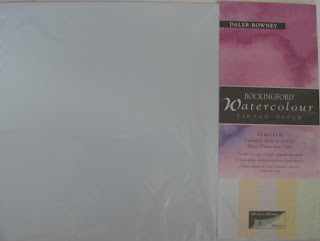
Bockingford Tinted 11" x 15" sheet pack

There are some who will tell you not to use Bockingford because it isn't 100% cotton. I also notice on the Ken Bromley website that the artist Trevor Lingard is complaining about recent variable quality, but such complaints are made from time to time about other well-known makes, with claims that quality has deteriorated. Bockingford is available in a wide range of weights and also tinted sheets.

When I first started painting I mostly used the  16" x 12" Bockingford spiral pads. There are several other budget makes, one of the best being Brittania from Hahnemuhle, made from cellulose. I have tried it and thought it fine, especially the rough surface although I wasn't so impressed with the cold pressed. It is very hard sized and so the paint doesn't sink into the paper, remaining bright. I think a lot depends on how you paint. There are others so try them and see how you get on.

I have tried a wide range of papers and have reached a provisional consensus that Saunders Waterford and Fabriano Artistico are my favourites, taking into account cost and quality. I do like Fontenay but the price has suddenly rocketed well out of reach and the Great Art website now talks about it being `handmade'. In any event this is about budget materials so I'll leave it there. According to Ian Sidaway the Daler Rowney Langton is also Bockingford. For the best buy some of the mail order specialists, specifically Jacksons and Ken Bromley, sell special offer packs of Bockingford cut into either half or quarter sheets, 50 or 100, at very keen prices equating to around 30p per sheet for the 11" x 15". Any 100% cotton paper will be more than double that and if you buy blocks even more expensive. Try Bockingford and if you are happy with it why buy anything else? Many professional artists do. I have no knowledge of other budget papers available outside Europe either in Asia or the North American Continent but I'm sure they exist.


Comparison of Cotman Tubed paints (Top three rows) and W & N Artists quality pans (bottom three).

 Can anyone looking at the above say the Cotman results appear seriously inferior? I might add since I did this, several years ago, Cotman has been upgraded and are using better quality pigments, many being exactly the same as the artists range. Another thing we are often told is that it is a false economy to use student quality as the pigment concentration is so much higher in the artist paints. The pigment concentration may well be higher but  this statement is very debatable. A comparison of costs per ml ( Jacksons prices) taking the Series 1 Artists quality price 14ml tube and the 21 ml Cotman gives figures of 48p and 15p respectively. This means that Cotman is less than a third of the cost. Has the artists range three times as much pigment? I think not. Bruce McEvoy of Handprint says actual pigment content in paints varies between 20% to 50%. The differences are variable between different pigments and are not dictated purely by cost. The balance is made up with additives and fillers. A brilliant Chinese artist who uses Cotman paints is Guan Weixing www.guanweixing.com/  Have a look at his wonderful paintings. Michael Wilcox says, in one of his books on colours and pigments, if you wish to economize on paints start with the earth colours.

Where you do tend to lose out is in expensive pigments like the Cadmiums,  Cobalts, Cerulean and Viridian. They are replaced by `Hue' equivalents. In the Cadmiums many manufacturers offer additional  `hue' versions as the toxic and opaque qualities of the true Cadmiums are anaethema to many artists. With blue one of the Phalo Blues or Ultramarine is used with added white to make `hue' equivalents of Cobalt and Cerulean Blue.  Viridian is replaced by a  `hue' version based on Phalo Green. Nothing to stop you buying a few Artist Quality as several good professionals use a mixture of the two. See my post on Paul Weaver, a very fine up and coming Bristol artist www.paulweaverart.co.uk/

I also think two other student quality paints are worth consideration. Van Gogh from Talens (Rembrandt) and Venezia from Maimeri. Maimeri is not easy to get in the UK but Van Gogh can be found with a little searching. Both are available in the USA. In each case, as with Cotman, the range is 40 paints and the same remarks apply regarding the Cadmiums and expensive blues. There may be others but these are the only ones I have experience with. St Petersburg and Shin Han paints come (in my opinion) into a different category - perhaps a halfway house, although both lines have question marks against them, particularly in the use of fugitive pigments, especially St Petersburg, while Shin Han have many multiple pigment paints, with white in quite a number. 

Keynsham Park 16" x 12" Bockingford 140lb Not

This painting was done using Van Gogh paints several years ago. My style was different then or probably more correctly still in a state of flux. Still is to some extent. I think Van Gogh paints are excellent, highly pigmented and a very good budget alternative to the eye wateringly expensive top ranges. Bockingford paper also. I don't present it as a good painting but not a great deal wrong with it. The same comments apply to Van Gogh as Cotman in that you might want to supplement them with a few tubes (or pans) of the expensive blues and/or Cadmiums only sold  in Artists Quality, although in the USA and Canada they are available in Cotman - 10 additional colours in all, slightly more expensive than the normal 40 colours but still very well-priced. Memo to Winsor & Newton. Why not in the UK? No more spurious excuses please.

We now come to brushes and the choice is plain, either animal hair or synthetic. With sable there is a choice of either Kolinsky or Red Sable, the latter generally cheaper. This is simplified because there are several different grades of sable and they vary in quality, depending on gender of the animal, time of year when harvested and also what species the hair comes from. Buy from a well-known source and beware cheap offers of `Kolinsky Sable' brushes. See my post on Rosemary and explore her catalogue online. Red Sable is the budget sable choice and then we move to synthetic/sable mixes. All the leading brushmakers offer a range and they are only slightly more expensive than pure synthetic. Rosemary, Stratford and York and  Pro Arte all make them. The SAA (Society of All Artists) now have a full range of own label brushes and have recently introduced a sable/synthetic. You need to be a member or know someone who is to buy at members prices. Jacksons are gradually increasing their own label brushes and there are some good buys amongst them. I think the Da Vinci Cosmotop Mix B is well worth a look being a mixed hair brush. Rosemary says that both Mongoose and Shiraz are suitable for watercolour. I have a Mongoose fan and it works well for tree  foliage although I don't use it much - perhaps I should. New synthetic brushes are coming onto the market all the time and are getting closer, so we are told, to emulating sable. Certainly some artists prefer the firmer feel of synthetic compared to the softness of sable. Yvonne Harry is one. The Internationally acclaimed Australian artist Robert Wade uses synthetic brushes exclusively, although they are his own signature brand made by Neef.

Paints, paper and brushes are the most expensive materials in painting although you can spend considerable amounts on other items like easels but again the range is vast, both in choice and price. I have previously posted on plein air equipment and admit that I have wasted a lot of money overall  on stuff I use only sparingly, or not at all, so be warned! Unfortunately I'm something of an impulse buyer although I have bought a lot of good stuff  at bargain prices. Art shops and mail order catalogues are full of interesting items but buy only what you really need and don't be seduced by siren voices saying you need this or that, all of which will make you a wonderful painter in a week or two. One tip is to get on the e-mail list of the mail order suppliers who regularly have special offers. When items you use appear buy! If you belong, and it is a good idea, to a local art group buy together to avoid paying carriage charges. I buy for my AVA group and  monitor  special offers.

The same general comments apply to books and dvd's which appear in ever increasing numbers. You can spend a fortune on them if not careful. From the many to choose be selective and buy only those that will be of use, although this is easier said than done. You really have to sort the wheat from the chaff.

Having said all this I will now don sackcloth and ashes and admit I buy (mostly) Kolinsky sables, 100% cotton paper and artists quality paints. I do shop around and buy at the best prices, also special offers which are frequent. For example prior to the January price increase Great Art www.greatart.co.uk/ were offering Fabriano Artistico paper at half price. I bought a shipload. Amongst artists quality paints Daler Rowney are often the best priced. Lukas via Great Art are well priced and so is Maimeri from either Jacksons (only on the website) or Turnham www.artistmaterial.co.uk who are cheaper. With Turnham you have a fixed carriage charge regardless which has to be added. In the UK Winsor & Newton are very well priced and cheaper than the American imports Graham, Daniel Smith and Da Vinci. These latter are all very good but expensive in the UK. Jacksons www.jacksonsart.co.uk offer well-priced own brand paints, made I'm told by Sennelier. And so on. Watercolour painting is an expensive hobby but you can cut corners and work within a limited budget so don't despair. Unfortunately local art shops tend to sell at full price. Some will give a 10% discount to students and members of local art groups. It is a fact that you can save considerable sums of money, at least 20-30% and sometimes up to 50%, buying from the mail order specialists, of which there are an increasing number. Jacksons, Ken Bromley www.artsupplies.co.uk/  and Great Art, all waive carriage charges over a certain amount. Some of the others now seem to be catching on to this. In the USA there are many excellent internet suppliers like Dick Blick, Cheap Joes, ASW, and Jerrys Artarama to name just four. On the continent you obviously have Great Art, who are German, but I don't as yet know of any others. The language barrier is a problem as are carriage charges. I also point out once more that countries outside the EU can order from UK suppliers and the 20% VAT is deductable. Carriage charges will be higher but they will give you a quote and you might be surprised how competitive some of the prices are.

The question of what to buy, especially that between  `best' materials and budget ones never stops. The consensus leans towards the best but as I've said this depends on circumstances. Brilliant paintings have been and are being produced by some very fine artists using cheaper materials.. I think the key thing here is the `very fine'. Their skill enables them to overcome any deficiencies which might be insurmountable to the lesser talented. 

I shall be taking a weeks holiday at Lake Garda in Italy starting tomorrow so no more posts for probably ten days. Comments (and corrections!) welcome.