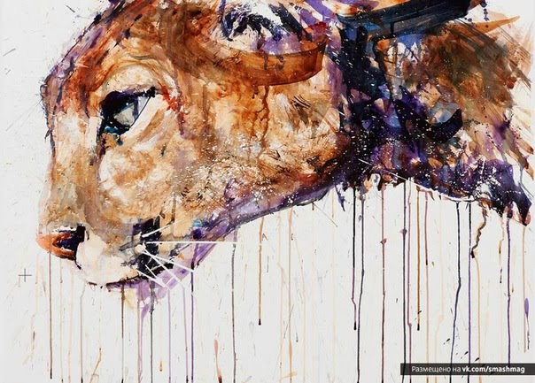
Showing posts with label Gerard Hendriks. Show all posts

Sunday, 13 November 2016

Rembrant (Royal Talens) Watercolours

Rembrandt ( Royal Talens) the Dutch company, now owned by Sakura Color Products of Japan, was started in 1899 by Martin Talens as the 'Dutch Factory for Paints, Lacquers and inks', located in the  city of Apeldoon. In 1949 the 'Royal' designation was awarded, In 1963 Van Gogh (40 paints in pans and 10ml tubes) were introduced and Amsterdam in 1976.

 Just to explain Rembrandt are the artists quality range, Van Gogh a middle range and Amsterdam the student quality. Van Gogh is therefore in between and an excellent choice for those who don't want or cannot afford the dearest artist quality.   From amongst the 40 colours a very acceptable palette can be put together which would suit many people.

In 1963 the Sikkem Group NV took over and a further change occurred in 1991 when the Sakura Color Products Corporation became the new owners


The Rembrandt range comprises 80 paints of which 53% are single pigment.  All the colours are there and good pigments feature.   Apart from two fugitive paints using PR83, Madder Lake Deep and Alazarin Crimson, which are identified as fugitive, all others are said to be excellent in this respect. PY184 -Permanent  Lemon Yellow - however is rated by Handprint as fugitive, but then he has questioned the ratings of several paints in other leading makes. What does Handprint say about them?

"Rembrandt paints are relatively inexpensive and of very good consistent quality". His criticisms are.... 5 pigments are involved in 37 different colours... too many mixed hues... an economy brand`'.

Other reviews I've seen have been favourable giving them top marks and they are certainly superior overall to student quality ranges - so too is Van Gogh. I have said before however that there are many decent paints to be selected from amongst Cotman, Venezia as well as Van Gogh and the own brand makes are also worth investigation. The artist Trevor Chamberlain commented in his book, 'Trevor Chamberlain - A Personal View',  that he had found a really good Viridian, after trying many others, made by Talens. I actually bought some after reading this but wasn't especially enthused, but who am I to disagree with such an accomplished artist. 80 is a goodly number and nothing is really missing. See for yourself in the colour chart above.

Whatever Handprint says they are used by many artists in Europe and available from most USA online companies.  Gerard Hendriks, the Dutch master, uses them and look how colourful his paintings are. Indeed they are marketed as 'Professional Quality', which has to be taken with a grain of salt in regard to some makes, but I am sure is reasonable in this instance.


The Van Gogh range - 40 colours in half pans and 10ml tubes. 

Rembrandt are available in both pans and tubes plus box sets. Tubes are 5ml with 40 colours  in 20ml. Not everyone stocks the 20ml and indeed Jacksons are selling them off 'while stocks last'. The only one that seems to sell the full range of sizes is the SAA  (Society of All Artists ) and you have to be a member to get the best prices. Jacksons seem to be dropping the 20ml size which is a shame. In the 5ml size the Cadmiums, which Handprint praises, only cost around £3.20 so are excellent buys if you only use them sparingly.  In fact this applies to many colours apart from the staples. The 5ml prices are very good. I certainly regard them, in terms of quality and price - which are the criteria I use - in the larger 20ml size as a 'best buy'.

In conclusion I think Rembrandt are well worth consideration apart from the tube sizes which are out of line with most others. It would be better if they offered  either a 15ml tube size or a larger range of 20ml. Based on the current 20ml prices from the SAA, ranging from  £6.55 to £9.75, they are a top buy. My main gripe is the poor availability in the UK of the 20ml size. Even Great Art  only do the 5 ml size. This doesn't appear to be a problem in the USA.

SEE UPDATED INDEX - JULY 2014

Tuesday, 17 December 2013

A Surprise in the Mail!

Two days ago I received a most pleasant surprise in the mail. A lovely watercolour sketch of an `Orange-breasted Sunbird' signed Gerard Hendriks.


Since I first got to know Gerard, albeit at long distance, I've come more and more to realise what a nice and generous man he is.  Not many would do what he has done, first with my grandaughter Evie's portrait and now this. When I thanked him for Evie's portrait, when he wouldn't even allow me to pay the carriage charges, his response was he likes to make people happy. Gerard is planning a UK workshop visit in 2015 and I hope to be there.


Friday, 22 November 2013

Animals in Watercolour

Continuing the series of photographic  selections of  paintings I  either like or have found interesting are the following on animals. I believe all are watercolour but I may be mistaken in one or two instances. In several cases I know little or nothing about the specific artist but searching the web may bring more information if you are particularly taken by them. Bear in mind this is just not about animals but illustrates different ways to approach the subject - which may well be applicable to other things - and I would point to the use of colour, which I think is not sufficiently exploited by many artists. Naturally they are only my opinion(s) and you may disagree. I would love to be able to paint like some of those below.


I'll start with this sensational painting from the superb American artist Bev Jozwiak.


Dave White


Frank Ebers


Lars Kruse - a disciple of Gerard Hendriks


Nigel Short - wonderful colours


Nora McPhail - again wonderful colours but in a more delicate manner.


Peng Zigiang - very bold and dynamic


Solveig Rimstad - actually I'm not fond of cats- they kill too many birds.


The delightful Stephie Butler a master of the delicate use of colour.


Peter Williams - amazing but is this watercolour I rather doubt it.?


Both the above are by the wonderful  American artist Morten E Solberg Snr who paints animals in the landscape.


Finally two from the Dutch artist and really delightful person Gerard Hendriks. I think they are both demos. Gerard's reputation continues to rise and he told me he is coming to the UK in 2015. Although this is some way ahead I'll strive to attend his workshop. I regard him in many ways as a European Charles Reid, although there are differences..


Sunday, 24 March 2013

Mandarin Duck

Having joined the small group on Facebook headed by Gerard Hendriks and Robin Berry, the latest subject is a Mandarin Duck.  This is a really colourful bird and makes for a very colour conscious painting. I would have liked it to be a little looser!


12" x 9" Fontenay 140lb (300gsm) Not

The Mandarin Duck is such a striking bird that my colourist instincts were given full reign. The orange colours are mainly Schminke Translucent Orange (PO71). The blues are Cerulean, Ultramarine and Cobalt. There is both Raw and Burnt Umber, some Raw Sienna and Ivory Black (Maimeri).. I first masked parts of the bird where it appeared white - mostly just narrow lines - using Pebeo Drawing Gum applied with an SAA ruling pen.


The initial drawing with masking fluid applied.

The next subject - one a week - is the Caribbean Flamingo. This will be a test as they are mostly pink and white.

The great thing is that we are painting - about eight at the moment - the same subject, although not with the same reference. One of the things that constantly vexes me  is to wonder how artists like Charles Reid and Gerard Hendriks would tackle the painting I happen to be working on? In the case of Gerard and Robin I can now see. This is great.

Sunday, 17 March 2013

Fishers Lovebirds

On Facebook the well-known artists Gerard Hendriks and Robin Berry have instituted a modest painting competition where each posts paintings of the same subject - various small birds. There have been several so far and anyone who was interested was invited to join in. I don't know if they were serious but I've had a shot at one. The most recent  was of `Fishers Lovebirds' and here is my take on it, although my reference is a different one. Gerard calls this series something like `splashes, sploshes and scribbles'. It's a fun thing and mine was completed in about 30 - 40 minutes.


`Fishers Lovebirds' 10" x 9" Fontenay 140lb (300gsm) Not

I used two brushes, both Isabey. The No.8 Kolinsky and the No 6 retractable. Colours are Transparent Orange (Schminke PO71), Cadmium Orange (Maimeri PO20), Indian Yellow (Rowney PY153), Sap Green (Graham), Quinacridone Rose (Graham PV19), some Raw Umber, Ivory Black for the eyes,. The background is Cobalt Teal Blue (Daniel Smith PG50). There may have been slight touches of  Cerulean and Burnt Umber. 

Friday, 8 March 2013

Another Bird

I recently did two small paintings of Robins. I rather enjoyed it and inspired by Gerard Hendriks quick, colourful, and impressionistic current series of bird sketches off I went. Mine aren't as loose as Gerards, not deliberately just how they work out. They don't take that long, an hour at most including the drawing (and breaks). I'm not sure what the bird is. It looks like some sort of Finch but not a UK species.


`Pensive' - 24 x 32cm Cold Press Fontenay 140lb.

I first made a careful drawing, paying particular attention to the head. I then started to paint from the bill with Ivory Black (Maimeri). I then moved to the yellow on his head using Indian Yellow (Rowney PY153) and then to the red areas with Quinacridone Deep Gold (Daniel Smith PO48). The green/yellows were Green-Gold (Rowney PY129) and Sap Green (Graham). There is some Cerulean in the shadow area under his breast and a little Burnt Umber. The branches are also Deep Gold, sometimes with a little Burnt Umber.  

Brushes used were all Isabey. The retractable Nos 4 & 6, which are quite small and slim for their respective sizes and the No 6 Kolinsky.which is more like a normal size 6.


Wednesday, 16 January 2013

Evie by Gerard

I have  had the painting of my grandaughter Evie, aged 8, framed by the Meltone Gallery in Bath. This was by the Dutch artist Gerard Hendriks who painted her from a photograph that appeared on my blog, He generously gave me the completed painting, not even allowing me to pay the cost of carriage. Although never having met Gerard I have come to know him a little through Facebook and as a person his statement that he `likes to make people happy' says it all. Forces are at work to try and persuade him to come to the UK for a workshop in either this year or next, and if this does materialize I'll certainly aim to be there if at all possible. 


`Evie' by Gerard Hendriks approx. 15" x 11" Hahnemuhle 600gsm

Regular readers of the blog will know I did a major feature on Gerard and his paintings in August 2012. In the same month I posted the story of how the painting came about, `Evie by Gerard Hendriks'. 

Tuesday, 1 January 2013

Welcome to 2013

A Happy New Year to everyone who visits this blog (and everyone else). I have been thinking about what to do this year and will be posting some items in the next week or so. The blog has been going for three years and eventually will  reach its sell by date. As long as interest remains I plan to continue for a year or two. Naturally `events' might alter this  and we hope to relocate within the next twelve months, only locally, as the years are fast advancing and a smaller property beckons. If that occurs it shouldn't be a major problem but might cause some temporary dislocation. The blog has achieved 10000 page reads in both November and December, which isn't a true indication of visitors but must indicate numbers are substantial, so some things I do are of interest, although I'm sure curiosity plays a part. 


Father and Son 18" x 12" Fabriano Artistico Extra White 140lb (300gsm) Not

This is the third and final version of this subject, two water buffalo that I assumed are indeed father and son. I concentrated on the faces and the rest is just window dressing. Colours used were mainly, Quinacridone Gold (Daniel Smith PO48), Quinacridone Rust (Graham PO48), Gold Ochre (W & N PY43), Cerulean, Raw Umber and Burnt Umber. I think that's it. By final I mean I'm finished with it not that it's definitive! Apart from the faces colours mainly mixed on the paper. I also added touches of white gouache and acrylic when at the end and thoroughly dry. It was completed over several days while I pondered what to do next.

 December/January  Subject

Regular followers will know Mick Carney www.thepaintingstruggle.blogspot.com/  and I have a monthly `challenge', where on alternative months we pick a subject to paint. It was decided, because of the Xmas period to increase this to two months and Mick picked the above photograph, I suspect taken on his last trip to the USA - Monument Valley possibly?. Never mind his painting struggle, I'm struggling as to how to tackle it.  I keep looking but so far no shaft of inspiration has occurred. I don't want to do a copy but  have only managed a basic drawing, leaving lots of flexibility. I thought this might be of interest as a number of posters have expressed curiosity about the process from start to finish. 

Finally the painting by Gerard Hendriks of my grandaughter Evie is at the framers so I should have it soon. When it appears I will undoubtedly post a photograph of it, probably held by proud grandad.


Monday, 19 November 2012

Tiger with cub.

Looking at Gerard Hendriks way with birds and animals and  his `painting a day' series, I was prompted to try something sort of similar myself. I've already had a shot at a few birds and expect to do more but in this instance came across a photograph that appealed so off I went. I aimed to produce a kind of snapshot.


Tiger with cub. Waterford 16" x 12" 140lb Not

I first made the drawing using a mechanical pencil  05 with 3B lead. I concentrated purely on the head and cub and only extended the body so far - a sort of vignette. Colours were primarily Quinacridone Gold (Daniel Smith PO49), Quinacridone Rust (Graham PO48) and also some Quinacridone Burnt Orange (Daniel Smith PO48). Although this latter is the same pigment as the Graham Q Rust it is darker and redder. There is also Cobalt Teal Blue (Daniel Smith PG50) and Ivory Black (Mamerii PBk11), There are slight touches of Raw Sienna and either Raw or Burnt Umber. Possibly some Cadmium Orange (Maimeri). The background is Cerulean.

I was rather pleased with the result but soon realised I had not quite got the head proportions right. The head is slightly too long in relation to the width. I did try and correct  but it only worked so far. My wife spotted it straight away but I felt that some aspects of the painting worked  well so what the heck!

 I  used the Da Vinci Artissimo 44 Size 2 Kolinsky for most of the painting and a smaller Isabey 6228 for the detail bits like the eyes. Afterwards I added some white gouache in a few places.


Monday, 22 October 2012

Matters of Interest?

Did you know that the (once) great British company Winsor & Newton, previously owned by a Swedish educational company called Colart, are now owned by a German paint company called AB Wilhelm Becker? I didn't until I read the excellent blog  http://channeling-winslow-homer.com/   . I wonder  what Mr Winsor and Mr Newton would make of all this - probably turning in their graves. If you think this nationalistic - and I'm opposed to extreme nationalism - look at who owns Holbein, Sennelier, Schminke, Lukas, Maimeri,  Graham and Daniel Smith. Not one has been sold  to a foreign company.

 As an aside there continue to be rumours circulating that W & N watercolours are not as good as they once were. Is this true? Any views?

 I don't know who owns Daler Rowney, the other famous British paint maker, but it certainly isn't the descendants of Mr Daler and Mr Rowney. I believe it is also owned beyond the shores of the UK. 

********

Turning to watercolour paper I see that Saunders Waterford have now introduced their `High White' paper in blocks. Initially I wasn't overly impressed when I tried some sheets shortly after it was introduced. Yvonne Harry didn't like it either but as I made more paintings I became more positive. The well-known artist Ann Blockley is very happy with this paper. The blocks are now available from both  Ken Bromley and Jacksons. I've just ordered a 16" x 12" Not block, my favoured size, from Jacksons at £24.30p. I do like Fabriano Artistico Extra White, but  they do have this odd size of 18" x 12" and I've taken to reducing it to 16" x 12", which is a waste of paper, especially at close to £30 for a block of  20. Incidentally for those who liked the famous Whatman hand made (and very expensive) paper, which has been discontinued, it is being said that the replacement  is Milford. Why replace it and what is the difference between the two?

Actually I live quite near the Waterford Mill and have been mulling over contacting them and asking if I could visit for a blog feature.

Continuing with paper Great Art are offering their Centenaire 100% cotton watercolour paper at the very keen price of £16.10p for a 16" x 12" 20 sheet block. Other sizes relatively priced. This is current as of today. Centenaire is sold in both rough and not surfaces, several different sizes plus sheets. The `normal' price is £18.95p which is still good compared to other cotton papers. This was launched last year at very keen prices but in 2012 it became more expensive. However the competition has moved up in price - and the special offer seems ongoing, at least up to date - so  for anyone looking for something that is keenly priced but not made of cellulose then worth looking at.


How good is Centenaire? I have used it  for a while and find it satisfactory but  think both Waterford and Fabriano still have the edge. The gap isn't obvious though, at least as far as I can tell. Some other artists at Avon Valley Artists are using it and I've just ordered some for several.
*******
Finally I have been entranced by Gerard Hendriks `little' watercolours on his blog http://gerardhendriks.blogspot.co.uk/  , which he describes as a `ten minute' painting a day. I decided to try something similar, although I`m frequently driven off course by amongst other things grandparenting duties and emergencies, like tomorrow with Evie having `suspected' - it may well not be - hooping cough. Anyway the other day I took three remaining Rudbekia blooms and attempted a very loose and simple painting. It was quite large at 15" x 11" on 90lb Fabriano and took about 40 minutes.


I first made a loose drawing, very simple, and then painted using a No 8 Isabey 6228 Kolinsky sable. The idea was to use compliments so I put several blues in the background, Cyan Blue (PB15:3), Prussian (PB27), Ultramarine and Cerulean. there is also some Sap Green and a little Hookers. The flowers are a mixture of Indian Yellow (Rowney PY153), Cadmium Orange (Maimeri PO20) and Hansa Yellow Medium (DS PY97). There may also be minor touches of Raw Sienna and Raw Umber. The flower centres are Burnt Umber and Ivory Black. 

Once again comments seem to be drying up. I don't look for praise just feedback really otherwise it is difficult to know what is interesting to readers. That's it folks!

Saturday, 25 August 2012

Latest Attempt at Evie

Even prior to the wonderful portrait of Evie painted by Gerard Hendriks, I had started another due to some fair criticism and my own dissatisfaction with my previous study. I had basically only completed the drawing and when I saw Gerards version, it gave considerable food for thought, although I never contemplated attempting to rigidly copy his approach. For one thing I couldn't and another that the Charles Reid way has been my template for developing portraiture. Even here Charles says you shouldn't just try and copy the way he paints. I've learned a lot from Charles and there is a lot to be learned from Gerard . A little bird has told me that there is a possibility Gerard may come to the UK for a workshop(s) in either 2013 or 2014 but this is still at a very early stage. I've expressed an interest and been promised I'll be kept informed. At my age I hope this isn't too long delayed!


 The initial drawing.

I did make some changes as I went along, especially on the left facing side. Often I look at the drawing (and painting) after a few hours and realise some things are not quite right so try and correct.

 Evie - 15" x 11" Fabriano Artistico 90lb Not

I'm not unhappy with this. I realise the `rose' is a little too large compared to the actual photograph. I can see another possible criticism but I'm not going to labour it. Overall I like it. As Charles says faults are part of it.

The features and skin colours were combinations of Cadmium Red Pale, Raw Sienna and Cerulean. Some Cobalt or Ultramarine added to get the darker areas around the eyes.The hair mainly various mixes of Ultramarine and Burnt Sienna with some Cyan Blue (Maimeri PB15:3). 

My usual brushes, the Isabeys and Da Vinci's.

Monday, 13 August 2012

Evie by Gerard Hendriks.

My last post but one was a feature on Gerard Hendriks the  Dutch  master watercolourist. In the course of preparing it I contacted Gerard, who was most helpful in answering requests for information.  A few days after publishing the feature I received an e-mail with attached image from Gerard. To my amazement it read " I also tried to paint Evie. I do not know Evie. It is more difficult painting from a photo if I do not know the girl". The photograph used was the recent one on which I based my own poor effort. I immediately replied saying how delighted and astonished - indeed honoured - he had taken the trouble to do this.  Gerard replied that as I liked it he would send it to me but would do some further work first. Another e-mail arrived with the definitive image.


Evie - 57cm x 38cm Hannemuhle Leonardo 300lb (600gsm)

Arriving home this afternoon, after a trip out with Evie, who is with us today and tomorrow, what should have arrived but the parcel, left by the delivery van in the care of a neighbour.


I still find myself somewhat bemused by what has happened and I can't imagine many other artists doing something similar. He has refused any recompense, even for the carriage costs, saying he "likes to make people happy". I was a fan before, an even bigger one now and can only repeat my thanks. What a generous man! The painting will go to a quality framer in Bath and remain a treasured family possession. Thank you once again Gerard. 

Sunday, 5 August 2012

Gerard Hendriks - A Master of Watercolour

I continue to discover fabulous new artists - to me -  by the score.  One I have been made aware of in recent months is the Dutch watercolour painter Gerard Hendriks. Gerard is very well-known in Europe and has an enormous following. Although I subscribe to magazines like The Artist, and previously Leisure Painter and International Artist, I've never seen him mentioned, or many of the others, let alone featured. Why is this? Is it a language barrier or does it have deeper implications? Fortunately some changes are taking place and Gerard is highlighted in two of Robin Berrys  2011 books, including the `Compedium of Watercolour Tecniques' which I reviewed recently. Originally he painted in a very `photorealistic' manner in other mediums but gradually moved towards watercolour and his present  highly impressionistic and vivid colourist style.


Gerard Hendriks

I came across Gerard on Facebook, an incredible source of fabulous artists and their paintings. He is truly prolific with a wide range of subject matter that includes Sports, Flowers, Still Lifes, Birds, Wildlife and Landscapes. I have seen many examples of his work and his use of colour, together with a loose and adventurous approach appeals to me very much. We are friends on Facebook and when I contacted him with the idea for this post he was most helpful.


Poppies - Gerards most recent painting 57cm x 76cm although I'm sure this has now been superceded

Gerard at work.

 His Studio

He also paints in a more conventional position

What many artists are interested in are the materials that top artists use. In Gerards case he favours Hahnemuhle Leonardo 600gsm (300lb) rough. The only immediate UK source I knew for this paper was Ken Bromley but then found after some digging that Great Art, Jacksons, the SAA, Heaton Cooper and Artdiscount, all sell it although it isn't exactly prominent on their websites, nor does it appear in either the Great Art or Jacksons catalogues, despite them featuring several other Hahnemuhle papers. Viktoria Prischedko also favours Leonardo. The only reason I can think for this is that, being 300lb, it is expensive and not really a sensible buy for most amateurs so sales are in a niche market. Jacksons are apparently discontinuing this paper and are offering it at a cut price while stocks last.

Gerard only uses tube paints, a mixture of Rembrandt and Old Holland both well-known Dutch makes.


Rembrandt appears to be the main one with some specific colours from Old Holland. His palette is : Alazarin Crimson, Karmijn (Carmine), Perm Kraplak (Permanent Alazarin), Cadmium Red Dark, Cadmium Red Light, Cobalt Violet (Old Holland), Quinacridone Rose, Permanent Red Violet, Cadmium Yellow Dark, Cadmium Yellow Light,  Lemon Yellow, Gamboge (Old Holland), Yellow Ochre, Burnt Sienna, Burnt Umber, Blue/Green, Turquoise Blue, Cerulean Blue, Cobalt Blue, Ultramarine Deep, Prussian Blue, Neutral Tint, Ivory Black, Chinese White. That makes 23 colours but he only uses a limited number in each painting, depending upon subject. His basic palette is Permanent Kraplak (Alazarin), Cadmium Red, Cadmium Yellow Dark, Yellow Ochre, Cerulean Blue, Cobalt Blue and Prussian Blue.

As for brushes they are long handled Chinese brushes, which he imports from China, together with cheap flat varnish brushes 2cm and 5cm, several others of which he doesn't know the English name however here we are. 


Gerard does most of his watercolours in the studio but also paints plein air. He says he has no big stack of sketchbooks but draws directly on the board with pencil b4 and "lets all the lines, also the wrong lines, stand on the board". He then begins the painting process, the dry paper sometimes upright, sometimes flat, using lots of water and pigment, splashing paint on and letting it drip off and always retaining the beautiful parts (happy accidents?) that occur. If necessary he uses nails, credit card, the back of a paintbrush or a pencil to draw or scratch in the wet paint, everything to obtain a good result. He admits he does all sorts of things that are supposedly `not allowed'  but doesn't worry about that as he considers only two things matter, painting in a way you enjoy and obtaining a good artistic result. His ethos is that painting is an exciting adventure, a kind of safari behind the easel. 
.
Now for some of his paintings.


This  painting of the cheetah is actually acrylic all others watercolour


The above selection gives a good coverage of most of the subjects that Gerard paints. I have read that he `specializes' in wildlife, but flowers, still lifes and landscapes appear almost as frequently. I think them stunning.

If you are as taken by the above as I am then you can follow this up by visiting his website www.gerardhendriks.net/ where many more paintings are displayed, and also Youtube to view three demonstration videos. Just search on there for `Gerard Hendriks' videos. If you Google `Gerard Hendriks' lots more comes up.