Showing posts with label Graham. Show all posts

Tuesday, 4 December 2012

November Challenge

For November it was my choice. I chose a photograph of an owl, I'm not sure what species it is.


16" x 12" Fabriano Artistico Extra White 140lb (300gsm) Not

With such a dark subject I thought long and hard how to approach it. To attempt a very colourist approach seemed inappropriate so I essentially went for a middle way. I first made a loose but reasonably accurate drawing not getting too much into detail. I used a conventional pencil with a 2B lead. Rather than finish this in my usual two hour session - including breaks - I worked on it in short periods over several days. 

At the time an Acer snake bark maple in my garden was discarding its leaves and I collected several. I firstly painted the head as this was to be the most detailed part. When painting the background I coated the leaves with paint, reds, oranges, browns and yellows and used them as a stamp. I then tidied them up a little with the brush. I also splattered colour into the background both on dry and wet. I used granulation medium in the background. I generally paint with the board in a near vertical position so the paint runs and mixes.

The body of the owl was partially painted at the same time as the background and was finalised right at the end. The eyes look rather like two black holes and I added some small white highlights 

There are quite a lot of colours in here with several blues, reds and greens. Frankly I can't remember all of them but Lunar Blue, Green Gold, Cobalt Teal Blue, Moonglow, Quinacridone Rose, Perylene Maroon, Quinacridone Rust, Quinacridone Gold, Sap Green and Hookers are all in there somewhere. These are mainly Daniel Smith and Graham paints with the exception of Green Gold which is Rowney. There is also some white gouache on the owl and the branch it is sitting on. I don't think the result is too busy but you are welcome to disagree. To make the painting the greens and browns of the photograph would, in my opinion,  made it very dull colourwise.


Saturday, 1 December 2012

Green-Gold - Pigment Yellow 129 ( PY129)

This is an interesting pigment which is given the `Top Forty' accolade by Bruce McEvoy of Handprint. It has never been a `must have' palette colour but is beginning to appear in an increasing number of ranges, although to date neither Holbein, Rembrandt, Schminke or Maimeri  offer it.

As usual naming isn't consistent, as apart from those who call it Green Gold, Winsor & Newton, Daler Rowney, Da Vinci, variations are Green Yellow (Lukas), Brown Green (Sennelier) Azo Green (Graham), Golden Green (Old Holland), all the same pigment PY129! To complicate matters Daniel Smith's Green Gold isn't, but a mixture of three pigments PY150, PY3 and PG36,  two yellows and a green. However we then find another Daniel Smith paint, Rich Green Gold, which is PY129! The Australian company Art Spectrum have two colours with PY129 as one ingredient with PG7 as the other, Australian Green Gold and Sap Green Permanent. It does not appear in any student ranges.


With that out the way I'll once again refer to Bruce McEvoy of Handprint. 

"copper azomethine green (PY129), commonly the ingredient in "green gold" paints is a lightfast, semitransparent, staining, mid valued, moderately dull yellow pigment,".......Unrated by the ASTM, manufacturer tests rate it as having "very good" to "excellent" lightfastness". Bruce agrees. 

The thing about this colour is that in tints it shifts from a yellow green  to a beautiful light yellow. I don't actually find it dull in the latter case, perfect for the colours of early Spring. Bruce rates it excellent for all genres, but especially for landscape and botanical painting. It also mixes well with several; other colours depending on what you wish to achieve. The Handprint information while still very valuable is not as up to date as one might like but even so is still worth consulting www.handprint.com/HP/WCL/watery.html .

Bruce states that if you are an advocate of the `split primary' palette then `copper azomethine' is the perfect lightfast, transparent "cool yellow" pigment to pair with it's lightfast, transparent "warm yellow" twin, nickel azomethine yellow PY150. This is Nickel Azo Yellow from Daniel Smith and Graham, Transparent Yellow Winsor & Newton, Translucent Yellow Schminke, Yellow Lake Sennelier. This latter pigment seems destined to enter most ranges although not yet universal. One of my members  Rui rates the Schminke paint highly. Any additions or corrections to the above welcome.

I have used Green Gold, mainly Rowney, for some time and also have the Winsor & Newton version. My use has been primarily in Spring foliage but Bruce suggest mixing with Qinacridone Magenta for portraits. I'll have to give that a try.


Monday, 19 November 2012

Tiger with cub.

Looking at Gerard Hendriks way with birds and animals and  his `painting a day' series, I was prompted to try something sort of similar myself. I've already had a shot at a few birds and expect to do more but in this instance came across a photograph that appealed so off I went. I aimed to produce a kind of snapshot.


Tiger with cub. Waterford 16" x 12" 140lb Not

I first made the drawing using a mechanical pencil  05 with 3B lead. I concentrated purely on the head and cub and only extended the body so far - a sort of vignette. Colours were primarily Quinacridone Gold (Daniel Smith PO49), Quinacridone Rust (Graham PO48) and also some Quinacridone Burnt Orange (Daniel Smith PO48). Although this latter is the same pigment as the Graham Q Rust it is darker and redder. There is also Cobalt Teal Blue (Daniel Smith PG50) and Ivory Black (Mamerii PBk11), There are slight touches of Raw Sienna and either Raw or Burnt Umber. Possibly some Cadmium Orange (Maimeri). The background is Cerulean.

I was rather pleased with the result but soon realised I had not quite got the head proportions right. The head is slightly too long in relation to the width. I did try and correct  but it only worked so far. My wife spotted it straight away but I felt that some aspects of the painting worked  well so what the heck!

 I  used the Da Vinci Artissimo 44 Size 2 Kolinsky for most of the painting and a smaller Isabey 6228 for the detail bits like the eyes. Afterwards I added some white gouache in a few places.


Friday, 26 October 2012

Avon Valley Artists Thursday 25 October

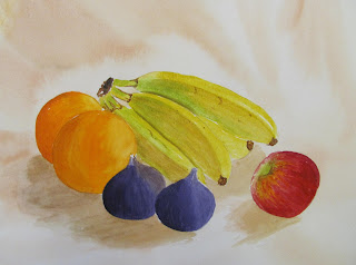
This week the subject was `Fruit' just that. Although attendance has not been great this session we had the unusually low figure of only eight members present. 


Thin on the ground!

Those present painted either from photographs or fruit they had brought to the hall.


Robert


Eileen


Helen


Pauline


John
 
 
Yvonne

 See www.watercolourflorals.blogspot.co.uk/ as Yvonne has already done a comprehensive post with photographs, description of paints used and other information. Well worth a look.


Pat

Where is mine?


This is my setup, the drawing completed the previous day and starting with the pineapple.


Fruit. 16" x 12" Centenaire 140lb (300gsm) not

The colours in the pineapple are mainly Quinacridone Gold (DS PO49), Quinacridone Rust (Graham PO48). There is also a little Cerulean and Burnt Umber. The top is a mix of Cerulean, Viridian, Hansa Yellow Medium (DS PY97) and Cobalt Teal Blue DS PG50). The apples are (left) Quinacridone Coral (DS PR209), Sap Green (Graham), and a touch of yellow. The right hand apple is Quinacridone Rose (Graham PV19), Quinacridone Purple (DS) and Sap Green. The orange is Cadmium Orange (Maimeri PO20), Transparent Orange (Schminke PO71) and some yellow. The grapes are Moonglow (DS) and some Quinacridone Rose. The (difficult) melon is a mix of Quinacridone Gold, Raw Sienna and Raw Umber.  The pear is Raw Umber and ? (can't remember!). It isn't perfect - mine never are - but I am reasonably happy with the result.
 
 I used the Escoda 1214 retractable Kolinsky sable Size 12 for 90% of the painting. This is the equivalent size to several other size 10s or even 8 in some cases. Escoda's are smaller in general size for size but are good and well priced.


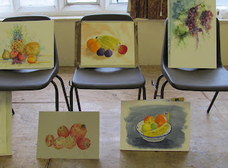
A final view of all the paintings.
 

Saturday, 11 August 2012

More Plein Air

With the weather somewhat better I was able to do some outdoor painting this week. This was at the Thursday morning session of my Avon Valley Artists group. Although the weather was good, of the nine members present I was the only one to opt for painting outside. I was situated just outside the hall - literally feet away - and attempted a subject I've tried before, never very successfully. One of the reasons was that due to later in the day grand parenting duties I didn't want to travel too far. Yvonne Harry, who is second from left has her annual weeks solo exhibition at Wells, starting on Saturday in the Chapter room at the Cathedral. I shall be there next Monday with the wife and grandaughter, another budding artist.


I had no intention of attempting the whole scenario and opted to concentrate on part of the cottage and the tree on the right. The wall at front was to be left well alone!  


I initially made a fairly loose and uncomplicated drawing then began to paint, first splashing water onto the paper. My object was to paint with freedom and avoid any `tightness' by trying to be too close to the actual scene. This is risky. Initially I painted the tree using plenty of water and pigment letting the wet areas blend and using a couple of riggers to draw in the branches. Green used were mainly Sap Green (Daniel Smith (PO49/PG7)) and Hookers Green (Graham PG7/PY110)) with a little Green Gold (Rowney PY129). There is also some Cobalt Teal Blue (DS PG50) at the top of the tree. The trunks and branches are various combination of Raw Umber, Cerulean, Burnt Sienna and Ultramarine Blue. A little Gold Ochre was added later. I splashed both Hookers and Sap Green onto the tree at various stages. 

 20" x 14" Fabriano Artistico Extra White Not

I experimented on the building using granulating colours, Daniel Smith Lunar Violet, Earth, Red and  Blue. I wet some of the area with W & N granulating medium prior to putting the paint on. Other colours on the cottage included Burnt Sienna, Quinacridone Rust (Graham PO48), Raw Sienna and Gold Ochre. (W & N PY43). There is some Mineral Violet (Graham PV16) at the lower part of the cottage. Diluted Cerulean and Cobalt Blue in the sky with a little Burnt Sienna to grey them.

Brushes used were the Rosemary Kolinsky Mop Size 1, Escoda Tajmir Kolinsky retractable size 10 and a couple of riggers. I think that's it.

On reflection I overworked the tree and when I've subsequently  looked at this painting  my dissatisfaction grew, so it now resides on the reject pile waiting for an opportunity to paint on the reverse side. I'm also beginning to think that my love affair with Grahams Hookers Green is a mistake. It is rather a dull colour and can have a deadening effect. It needs to have another colour added to counteract this. You also have to be careful with the DS Lunar colours. They are on the dull side and can also deaden a painting if not used properly - which I fear is what has happened here. With these colours you need to  think carefully about what other colours to mix with them. I intend to do some serious trial and error work on landscape subjects, especially trees. I've previously noted the way in which the Belgian artist Gerda Mertens draws and paints trees.  I was in two minds whether to post this or not but as I adopt - well almost - a warts and all approach to showing my work it might help others to avoid such frustrating failures. However I've already moved on and have completed a flower painting for the August challenge which - so far - I haven't downgraded!  Today I'm planning two drawings for future works, one of Evie and the other another Indian. As far as Evie is concerned there has been an amazing development. My painting of her has come in for some criticism - rightly - and it has sparked something off. Believe me you couldn't make it up and all will be revealed soon.

Saturday, 4 August 2012

Purple & Green

Once again due to the weather it wasn't possible to paint outdoors so the AVA group were again in St. Marys Church hall this last Thursday morning. As the forecast had been pretty poor I had already prepared two drawings of flower subjects the previous day. They were based on photographs I've taken recently and I decided to paint the oriental poppy I  photographed in Pats garden the previous Saturday. Its a simple composition but there is a lot to be said for simplicity.


15" x 11" Saunders Waterford Extra White 140lb not

I determined that I would adopt a very loose approach other than for the flower itself. I initially splashed clear water onto the paper in a random fashion, which was near vertical so that dribbles ran down to the bottom. For the flower, which I painted first I used Permanent Magenta (Rowney PV19), the violet shade of PV19. I previously masked out the anthers in the centre using Pebeo Drawing Gum and part of the centre itself. I then began to put in the green leaves that surrounded the flower in a loose manner which was helped by the wet paper. Hookers Green (Graham PG7/PY110), which is quite dark at full strength, was used for the darks but I softened the edges in places to get a balanced mixture of hard and soft edges. The other greens used were Sap Green (Daniel Smith PO49/PG7), a brighter green, and Green-Gold (Rowney PY129), a so-called two tone paint, which varies from light green to yellow when heavily diluted. 

Once the flower was dry I darkened certain areas as per the photograph with a stronger mix of Permanent Magenta, again softening the edges to avoid a `hard' look.  After this the rest of the green foliage was painted. I should say I `splashed' colour on at various times, some of which finished up on my face, spectacles and  right arm! I still have trouble getting splashes exactly where wanted. This caused some amusement and generally my fellow painters keep well clear when I'm in action. Finally I dropped some Primary Blue Cyan (Maimeri PB15-3 Green Shade) into the dark areas of the flower when still wet and let them blend.

At the very end I removed the masking fluid and finished off the stamens and centre with light use of white gouache.. Apart from the centre of the flower I only used one brush the Da Vinci Artissimo Series 44 Size 2 Kolinsky Mop, roughly equivalent to a size 14 round. The small brush for the centre was the Isabey Size 6 retractable which is small for a number 6, closer to a 4.

The colours of green and magenta are near compliments, not exactly so but I thought they work quite well together and was not displeased with the final result. The whole exercise, including the drawing took about 1 1/2 hours. I have another flower painting drawn up and Mick has set a flower painting, a hollyhock, as the August Challenge.


Tuesday, 17 July 2012

Back to Painting

Having had a barren last week as far as painting is concerned I needed to get the paint brushes flowing again, so after some little thought decided to attempt a flower painting. This was prompted by two nice plants of Phlox Maculata in the garden that had come into full bloom just as we returned from Devon. I cut two stems, stuck them in a jam jar and off I went.


For the initial drawing I had to restrain myself from making it too detailed as the flower heads are a mass of small blooms. I think I did slightly. I used a mechanical  07 Pentel 120 A3 DX with a 2B lead. I have a mass of drawing instruments but use this one quite frequently. Pentel do a very good range including the 120 series and the Sharplet.


Phlox Maculata - Centenaire 16" x 12" 140lb (300 gm) not

As far as colour was concerned this was fairly restricted, although I admit the shade in the painting is not quite right compared to the actual plant which is more of a lavender pink colour. Colours used were mainly Quinacridone Rose (Graham PV19), Ultramarine Violet (Rowney PV15) plus a little Cobalt Magenta (Rowney PV14) and Certulean Blue. The Greens were various dilutions of Hookers Green (Graham).

Brushes used were the Isabey 6228 Kolinsky Sizes 8 and 6. The whole painting took about 1 1/2 hours with breaks.

Tuesday, 24 April 2012

Latest Painting

This is a study of Moorhens, one of my favourite birds or should I say wildfowl. The little chicks are far more savy than Mallard ducklings and more seem to survive, although Moorhens don't have such large clutches, six or seven eggs being average. In addition, although the chicks can mainly feed themselves, any older siblings from earlier  nests will assist in looking after them. I have been very impressed with the way several artists, noted in earlier posts, handle animals and birds. I intend to spread my wings and try some more.

"Moorhens" 15" x 11" Not 140lb.

For the birds I used Daniel Smith Indigo (PB60/Pbk6) and Graham Prussian Blue (PB27). On the adult bird in addition Cobalt Teal Blue (DS PG50), Cobalt Magenta (Rowney PV14) plus Mineral Violet (Graham PV16). Various greens for the lily pads Graham Hookers Green (PG7/PY110), Sap Green (DS PO49/PG7), Hansa Yellow Medium (DS PY97). There are touches of other colours including Cerulean, Gold Ochre (W & N PY43) and  Green Gold (Rowney PY129). The reds are a mixture of Quinacridone Rose (Graham PV19), Quinacridone Coral (DS PR209) and ???. Oh yes some Raw Umber for the edges of the lily pads.

My usual brushes with the Isabey 6201 retractables sizes 6 & 4 for the small detail, Rosemary Series 33 Kolinsky Size 6 plus the Isabey Kolinsky 6228 Size 8. As this was done on the reverse side of a discarded painting, I have lots of those, I'm not certain what make the paper is. I quite like the result and have another Moorhen study in prospect. 

Sunday, 22 April 2012

Daniel Smith Pt.3

Following up the previous posts on Daniel Smith the question arises are they worth the extra premium UK  and European buyers have to pay? I say this because prices in the USA are lower and in addition DS, through their retail shops and internet site, have regular special offers - lots of them in fact. If we had  similar offers then I'd not hesitate to say yes, although I like Graham and have not tried DaVinci, both highly rated by American artists. What we shouldn't lose sight of is that we have several very good manufacturers in Europe who have been making watercolour paints for a very long time, much longer in fact, and comparing quality and price there is a very good case for sticking to them, certainly on many of the standard colours.  Winsor & Newton, still and for  many years the top rated watercolours by many professional artists, are much more competitive in price here than in North America, where I sense they are losing out to the American makes. At the beginning of this year the new much higher prices for W & N made Daniel Smith  more competitive but almost immediately discounted offers appeared. Perhaps W & N realised the threat these new paints posed which they certainly do.

Previously I have noted that the DS range is split into three or four groups. The standard colours, those that follow most other makes, comprise the biggest number - 100 plus. Standard but still including some unique colours not duplicated elsewhere. The remainder include the Primateks, Duochrome and Iridescent paints. These two latter are for specialist purposes and most watercolourists would stick to the standard colours. What about the Primateks? Here I urge you to carefully  read what Bruce McEvoy of Handprint writes in a very comprehensive review  www.handprint.com/HP/WCL/primatek.html  Essentially Daniel Smith has been gathering mineral pigments from mines all over the World. They don't have pigment numbers and are expensive. 

Here is a further selection of colour swatches. I have added pigment details and will add them to the previous posts. You will note that in many instances the pigments are those in common use by the other makers.

Cobalt Blue Violet  (PV19/PB28)


Duochrome Autumn Mystery

Cobalt Teal Blue (PG50)


Garnet Genuine 

German Greenish Raw Umber (Pbr7)

Green Apatite Genuine

Lunar Blue (PBk11/PB15)

Serpentine Genuine

Undersea Green (PB29/PO49)

Hansa Yellow Medium (PY97)


Quinacridone Sienna (PO49/PR209)


Quinacridone Rose (PV19)

I could go on forever - well almost - but with the other illustrations in Pt. 1 & 2 you should have a good idea of what is available. I am personally intrigued by the number of granulating paints offered. Rui who comments on here is fulsome in his praise of the Lunar colours for their granulation properties and I intend to try some other than black which I already have.  Jan Weeks love Serpentine Green, Moonglow and Cascade Green. Rui likes them  but says you need to be careful what you mix Cascade Green with.  German Greenish Raw Umber is another favourite.

A good source of individual pigment details is; www.premiumartbrands.com/products/watercolour-tubes-15m/  For the complete range try www.danielsmith.com/item--i-G-284-600 If you print this off it runs to 19 pages! The Daniel Smith website, which is a selling site with various other brands and products is: www.danielsmith.com/ There is a mass of information including `peeks' at some DVD instructional videos they sell. In addition if you go onto Youtube `videos',and type in `Daniel Smith Watercolors' you'll get a mass of promotional videos with lots of information. In the USA the wonderful Dick Blick site has very good pigment details, although each colour has to be looked at individually.

Finally quality versus price? Are Daniel Smith watercolours worth the extra premium we are charged in the UK and Europe? As things stand Daniel Smith are the most expensive watercolours in the UK. Winsor & Newton are cheaper, certainly while the special offers continue. It isn't straightforward to compare them as the number of price categories vary manufacturer by manufacturer. Daniel Smith, Holbein and Old Holland have six, Sennelier five, Maimeri, Winsor & Newton, Bloxx, Schminke four while Daler Rowney and Rembrandt only three, although in reality Daler Rowney have only two prices as has Lukas.  Graham and DaVinci are only available from one source, Lawrence of Hove who have a fixed carriage charge on top of the prices but they do offer 20% off for 6 or more tubes. This is further complicated in that manufacturers don't all sing from the same song sheet. Apart from basic colours like the earths, usually in the cheapest category, other colour ratings vary from one make to another. In order to get an accurate picture you must compare them not just by colour, which can confuse, but more accurately by pigment numbers. Some manufacturers Winsor & Newton, Lukas, Sennelier, DaVinci and Rembrandt offer larger tube sizes that are cheaper per ml. This is another factor although personally I think W & N would have been far better with a 21ml or 24ml large size rather than 37ml. The further I get into this the more complicated it becomes so I'll leave it at that and may return to the subject at a later date. 

So are Daniel Smith paints worth the cost? Are they better than the paints from say Winsor & Newton or some of the others listed? They are good but so are most of the other artists quality makes and in the end it comes down to the depth of your pocket and personal preferences. For the average watercolour painter probably not, but they do have a whole range of wonderful, often unique, colours  so I shall continue to buy them, although selectively. For impulse buyers like me they are very seductive. As for the other makes Daler Rowney, Lukas, Rembrandt and Maimeri are very well priced and offer good quality with a choice of around 70 colours. 


Friday, 2 March 2012

Avon Valley Artists Thursday 1 March 2012

This week the subject was `In the Garden'. to be interpreted as you will although keeping to the basic theme.


My source Photo


 In the Garden - Fabriano Artistico Extra White 14" x 20" Not

Although only small my garden swarms with birds. I have four feeding stations plus a bird bath and a small pond, a four star hotel for the birds! The most numerous visitors are goldfinches. In the painting I've added greenfinches, also regulars, and a long tailed tit, an occasional visitor usually in numbers. I could have put in many other species.

My basic painting was built around two bird feeders with the two goldfinches at the front left the  main focal points. I painted them and the bird feeder together with an impression of the surrounding foliage in one passage. I then moved to the right completing the second feeder and another goldfinch linking them together with the  greenfinches at the top right. The branches at the top of the painting were put in last as was the long tailed tit. I tried to link everything to avoid any one part looking isolated.

Colours used for the goldfinches were Indigo (Daniel Smith PB60/Pbk6) for the blacks , Hansa Yellow Medium (Daniel Smith PY97) and Indian Yellow (Rowney PY153) plus diluted Raw Umber. The Red is Quinacridone Rose (Graham PV19). Raw Sienna was used to simulate the seeds in the feeders. I used a lot of Hookers Green (Graham) in various dilutions and sometimes altered with yellow. Some Gold Ochre is in there somewhere (Winsor & Newton PY43). Burnt Sienna was added in various places to add warmth. The Greenfinches are a mixture of green and yellow in various dilutions. The greys are mainly Indigo with some Burnt Sienna.

Brushes were my Da Vinci Artissimo 44 Size 2 Kolinsky mop, a size 6 Da Vinci Maestro 10 and the Isabey retractable size 6. Comments welcome.

Monday, 20 February 2012

February Challenge

This months challenge was chosen by Mick www.thepaintingstruggle.blogspot.com/ and is a scene in Venice showing The Bridge of Sighs.


When Mick sent this photograph I was unable to save it and various e-mails went back and forth without a resolution, Finally I searched the web and came up with a free utility called Pixillion Image Converter. I downloaded and it worked first time! I was able to convert the photo file enabling me to save, crop, print etc.

Venice is one of the most painted cities in the World - actually many think over painted. I remember reading of a judge at an exhibition saying if any more Venice paintings appeared he would...!!! On my last visit - a cruise in the Venice lagoons - we explored beyond the normal tourist limits. I knew that the population has fallen dramatically in the last decade or more and this was evident in the empty buildings and semi-derelict shops as soon as you got beyond the centre and main tourist areas. A dying city?

The first two paintings attempts were unsatisfactory. Yesterday I had a final shot and first of all cropped the photograph.


The right hand (facing) side has been cropped. This is the view I decided upon. I completed the drawing trying not to be over fussy but getting everything in their right place. 


Bridge of Sighs- Fabriano Artistico Extra White 18" x 10" Not


Modified by lightening the small rear bridge using a damp sponge.

I used quite a few colours in this painting. Blues were Cerulean, Cobalt (Rowney PB72) and Cyan (Maimeri Green shade PB15-3). The Cerulean mainly on the bridge, Heavily diluted Cobalt for the water and sky, with Cyan for the darker areas of the water. Also some Ultramarine for the darks in the boats. The walls were  Raw Umber, Raw Sienna, Quinacridone Gold (Daniel Smith PO49) and Yellow Ochre (Graham) with Burnt Sienna , Ultramarine Violet Deep (Graham PV15) and Permanent Magenta (Rowney PV19). Some Viridian on the poles sticking out of the water and Burnt Umber and Indigo Daniel Smith) for the darks. I think that's it. Oh yes a touch of Permanent Carmine (W & N PR N/A) on the small boat.

Brushes by contrast were the Isabey Size 8 series 6228 and Da Vinci Maestro 10 Size 6, both Kolinsky sable plus a size 4 . 

One thing I'm frustrated with. I photographed the original using two cameras, a Nikon DSLR with 55mm lens and a Canon Powershot, different settings and under different light. Despite producing over 20 photographs not one conveys the actual painting in a satisfactory way. It is better than the reproduction on here - by a margin - but unfortunately you'll have to take my word for it. I'll have to consult Mick the camera expert. Comments welcome.


Monday, 2 January 2012

A Hopi Man

To start 2012 here is my latest subject, once more with thanks, from the photo archives of www.firstpeople.us/ of a Hopi man.

A Hopi Man Circa 1900 (?)

The Hopi are a group of pueblo or village indians who have remained in the same territory occupied when first visited by Coronado's troops in 1540. They speak a Shoshonean dialect and mostly live on high mesas in the arid northeastern  area of Arizona. They are said to have adapted better to modern civilization than many other groups of Amerindians. A very good reference is `American Indians of the Southwest'  by` Bertha P.Dutton (University of New Mexico Press 1903 Revised Ed.1975). There is also plentiful information on the web - just Google `Hopi Indians'.


Hopi Man - Centrenaire 140lb 16" x 12" Not

For this painting I changed my colour combinations  as I wanted a slightly different, more expressive, result. As I've constantly stated my approach is based on Charles Reid's style so super realism is out! For the skin colour I used a combination of Quinacridone Rust (Graham PO48) with touches of Burnt Umber and Cerulean Blue. This was to avoid the `pinkish' colour that so annoys Hap! For the first time I changed my usual Ultramarine/ Burnt Sienna/Burnt Umber combinations for darks and introduced Daniel Smith's Indigo (PB60/PBk6) in the hair. I used this straight, just varying the dilution, but sometimes added small amounts of Burnt Sienna. This can be the darkest dark imaginable but also dilutes down very well. I like this particular colour a lot and it may become a staple on my palette. Note PB60 as usually other makes of Indigo are based on either Prussian Blue (PB27) or Ultramarine (PB29). It is a convenience colour but WOW!! I also like the straight Indanthrone or Indanthrene Blue (PB60), without the black added, but it would be pointless to have both. There is also some Quinacridone Gold (Daniel Smith PO49) in the hair. The shirt has Yellow Ochre and  Raw Umber with touches of Quinacridone Gold, Permanent Carmine (W & N PR N/A),  and Cerulean (W & N PB36). I also mixed small amounts of Prussian Blue (Graham PB27) in the hair.

Brushes were limited to my Isabey Series 6201 Size 6 retractable for the features, with Da Vinci Series 10 Maestro Size 6 and the Isabey Series  6228 Size 8, all Kolinsky sables. Finally I used a Pro Arte Series 3 Sable Size 00 for the tiny dots of white Gouache for the eyes. As I've pointed out before the Isabey retractable is much smaller than a normal Size 6, more like a longer and slimmer 4, but is a lovely brush for detail. Jacksons sell it  www.jacksonsart.co.uk/  and there is also a smaller Size 4. Currently they are out of stock as I've recently ordered another 6 for a member of my AVA art group.

I'm pretty pleased with this one as a start to 2012. As usual I concentrated on the face and head, starting with the eyes, then the nose followed by the lips. The clothing was painted  in a minimal way just to suggest but not stress. In previous portraits I've had some problems wondering how to handle the clothing, especially not knowing the original colours, and in several cases overworked.

Tuesday, 13 December 2011

Cadmium Orange - Pigment Orange 20 (PO20)

Cadmium Orange (Cadmium Sulfoselenide) is an interesting pigment, although not a staple of many artists palettes, especially those restricted to 12 colours or less. Nevertheless Handprint rate it a `Top Forty' pigment.

 A few years ago I was on one of Judi Whittons courses in Cornwall and Judi was demonstrating. In the demo one of the colours she used was Cadmium Orange and she made the comment her preference was Maimeri because  the Winsor & Newton version behaved differently in mixtures.   As it happened I was able to explain that the Maimeri version was `true' Cadmium Orange Pigment PO20 which leans towards red, whereas the W & N Cadmium Orange was actually a `hue' comprising a mixture of Cadmium Red and Cadmium Yellow, consequently with a yellow bias. Winsor &  Newton also have Winsor Orange (PO62). Since then I have explored what is on offer from other makers.


 Here we have four oranges,. Maimeri is the only true PO20 version and notice how it is quite dark, very opaque and shows a red tinge.  The Daler Rowney Cadmium Orange  is strongly influenced by the addition of PY35 and shows a strong yellow bias. Use these for mixing and you get a totally different result. There are several other mostly newer oranges, two of which are shown. Apart from being transparent they are a different shade. The main drawback of Cadmium Orange as offered by Maimeri is that, being a Cadmium, it is toxic and quite opaque. I rather like it but some think it dull.  The main alternatives seem to be Perinone Orange (PO43) and Pyrrole orange (PO73). We also have PO36, PO71, and PO62. None are identical in hue or colour to PO20 but are transparent or semi-transparent.

What is the situation with leading makes?  Daniel Smith do not offer a `true' Cadmium Orange at all having discontinued this one in 2006. Why I wonder? Not having received replies to two previous e-mails to DS I doubt I'll bother to ask them. Smith list a Cadmium Orange Hue, a mixture of three pigments comprising two yellows and an orange, Permanent Orange (PO62), Pyrrole Orange (PO73), Transparent Pyrrole Orange (PO71), Perinone Orange (PO43) and finally Mayan Orange (PR N/A), mostly transparent or semi-transparent. Spoiled for choice! Which to choose is the dilemma? 

Looking at other leading makers Rembrandt follow Rowneys path with an identical PO20/PY35 mixture as do Sennelier (Cadmium Yellow Orange). Graham have Cadmium Orange PO20 as have Da Vinci who also list `Orange' and `Orange Deep', PO73 and PO36 respectively and finally Benzimida Orange (PO62).

This gets heavier when we look at Scminke the leading German firm. Scminke have  four paints listed as PO20, Cadmium Orange Light, Cadmium Orange Deep, Cadmium Red Orange and , would you believe Cadmium Red Light! Their Cadmium Yellow Deep is the same pigment mix as the Rowney and Rembrandt Cadmium Oranges! They also offer Translucent Orange (PO71) and Chrome Orange (PO62). The PO20 mixtures range from a light orange to a deeper reddish version.

I'll confine the rest of my summary to those companies that offer true PO20 - Cadmium Orange paints. Art Spectrum have one but they call it Cadmium Yellow Deep. Lukas and Old Holland Cadmium Orange while Bloxx list Cadmium Yellow Orange and Cadmium Red Orange.

 Finally Holbein. They miss out completely except for including PO20 in several mixtures notably the two Jaune Brilliant paints. Charles Reid likes the Holbein Cadmium Yellow Orange but this is PR108 - Cadmium Red.

What to make of all this? Despite Orange being a secondary colour, easily mixed from red and yellow (which red and yellow?), as you can see paint manufacturers list a whole range of alternatives with the newer pigments appearing in an increasing number of paints. 

The mixing compliments of Cadmium Orange (PO20) as listed by Bruce McEvoy of Handprint www.handprint.com/HP/WCL/mixtable.html are Phalo Blue (PB15), Prussian (PB27) and Cerulean (PB35/36). I have mixed very good neutral greys using Phalo Blue (PB15-3) Green Shade but with some trial and error first.


Wednesday, 9 November 2011

Latest Paintings

Since returning from the Charles Reid workshop I've been pouring on the gas! I'm not suggesting what follows is good  - just my modest efforts. I've been trying to put into practice certain things I picked up in Cornwall. None of it is really new as I've been on three previous workshops with him. My feeling this time is that I was better equipped to benefit from the lessons learned and - maybe, just maybe - I can move my painting up a notch or two over the next six months. We'll see.

Chief Joseph - Nez Perce 15" x 11" Fabriano Artistico Not 90lb (200gsm).

I'm none too happy with the resemblance to the real Joseph as it isn't quite right, so will be doing this one again and will post a fuller biography if I manage to achieve success.

 Autmn fruits 16" x 12" Centenaire 140lb (300gsm) Not.

This was the subject at a recent AVA Thursday morning workshop. I took along the apples with leaves and added the gourds that another member of the group had brought. As you can see I've gone for a colourful representation and used some of the Daniel Smith and Graham colours. 

Quinacridone Gold (PO49) from DS and Hookers Green (PG7/PY110) from Graham feature but there are others. I like these colours very much although how much longer Daniel Smith will be able to offer Quinacridone Gold remains to be seen with no manufacture of the pigment since 2001 ( according to Handprint). The Graham Hookers is the most natural version I have come across, very dark at full strength.  Many Hookers tend to look artificial. Daniel Smith watercolours, if somewhat expensive, are available from Jacksons www.jacksonsart.co.uk/ and  Ken Bromley www.artsupplies.co.uk/  One or two other retailers like Pegasus Art www.pegasusart.co.uk/ are also stocking at least part of this huge range.

 In their last but one catalogue Bromley made a big thing introducing both Daniel Smith and Schminke watercolours but the latest catalogue has no mention of either! Previously Bromley majored on Winsor & Newton with Rowney as a second string. Do I sense industry politics here or is there another explanation? I think I'll e-mail Bromley and ask them what is happening. Graham are only available in the UK from Lawrence of Hove www.lawrence.co.uk

Harvey 15" x 11" Fabriano Artistico 90lb (200gsm) Not.

Harvey is my eldest grandson aged 7. This is quite a good resemblance but I've overworked , especially around the eyes. I will  have another shot at him soon.

Mackenzie aged 5 - 11.75" x 15.75" Vivace Not. 140lb (300gsm)

Mac, Harveys brother, is my youngest grandchild and this has caught his likeness quite well. I'm not 100% satisfied ( I never am with good cause!) and will be doing further studies. The third grandchild Evie will be attempted very soon. About two weeks ago I took a series of photographs of all three with the object of turning them into portraits.  After Cornwall I feel more confident about attempting such studies. A friend who has painted many portraits tells me children are particularly difficult.

One departure with the latter paintings is the use of  an Isabey Kolinsky sable Size 8 series 6228, the one with the black handle with green tip. I've had it a while and in size by size  comparisons with Raphael and Da Vinci it was seen to be smaller - less hair in other words. Jacksons  offer this brush at £25.90 while the comparable Raphael and Da Vinci are £31.90p and £28.15p respectively. I have quoted the Series 35 Da Vinci but the excellent Series 10 is only £24.15p. I was already a big fan of the Isabey retractable Series 6201 Size 6, very slim but quite small compared to others in this size, and this 6228 is superb. It is long and slim, holds a good charge of paint and releases beautifully, very controlled. It is early days yet but my first impressions are very positive.