Thursday, 26 January 2012

Bath Portrait Course - 3rd Session Tuesday 24 January

Tuesday was my third portrait session at Bath College, drawing using white cartridge paper and willow charcoal. The only other tool needed, or allowed, was a putty rubber which is used to lighten areas and/or take the paper back to as near white as possible.  At least I didn't have to carry much on the bus and bought the cartridge paper (very cheap) at the college shop plus a new putty rubber. On this occasion we had a different model.

 
John

Our starting point was to cover the paper with charcoal.


Not very promising is it! I did have a much better position this week. The model sits just to the back and  right of the easel

The instructions were to draw the model with the charcoal stick or - as some of the more experienced did - form the shape just using the putty robber. We were specifically told the previous week that it had to be willow charcoal not compressed. As I have never done anything approaching this the latter was a step too far, so I used a piece of willow charcoal for the general shape and the features, using my measuring stick to try and get the overall dimensions and the distances between the features accurate. This stick is a green garden stake, slightly less than half the diameter of a pencil, around 10" long and with notches cut into it every 1/2 inch. I held this at arms length - arm very stiff and straight - while measuring.  Prior to beginning Jackie laid out a series of reproductions of charcoal drawings, roughly A4 or smaller, both by famous past masters and some of her own. This was helpful to the newcomers, Pat and I, in establishing exactly what we were to try and emulate.  
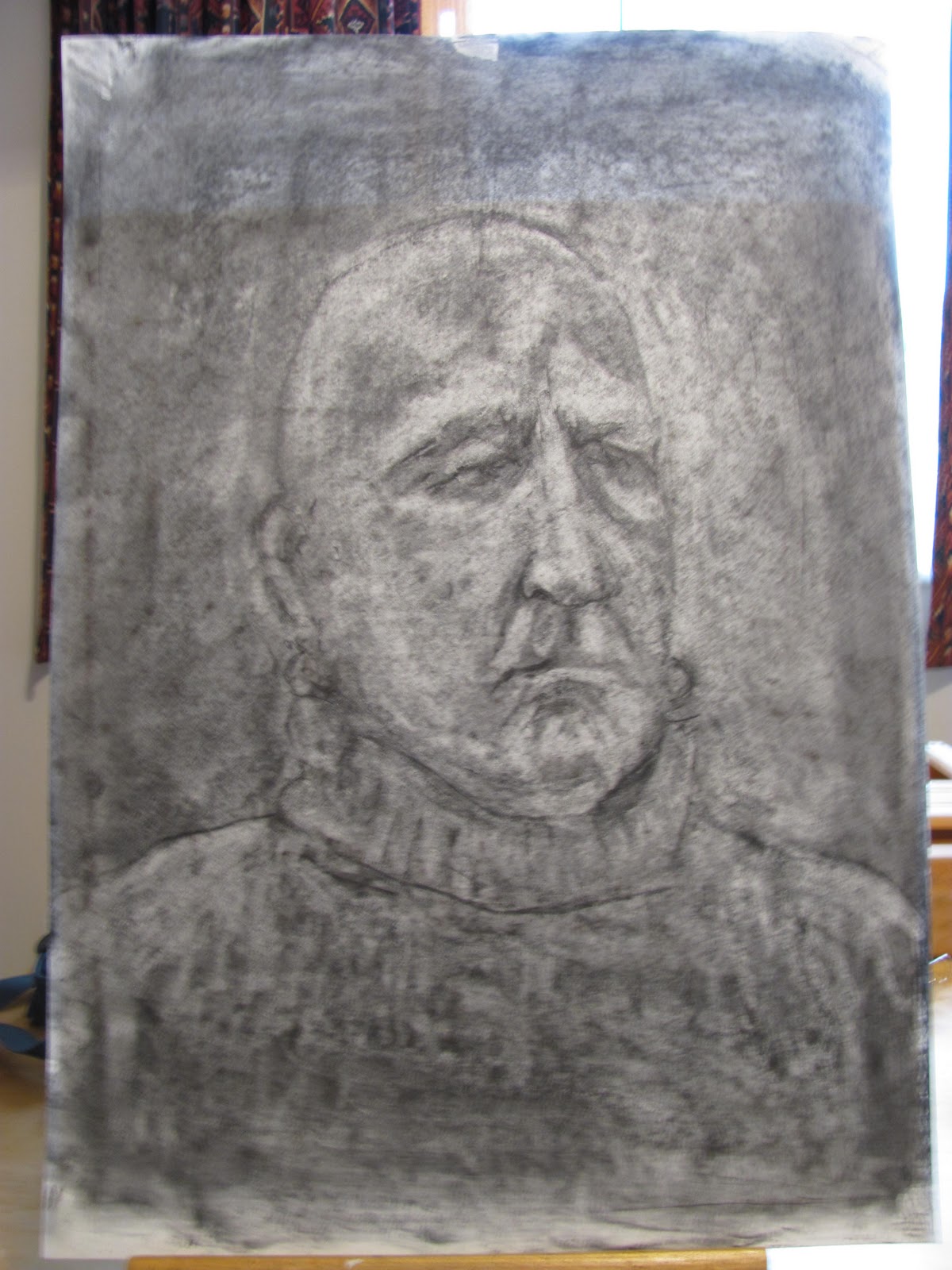


Two views - A2 Cartridge paper Charcoal

I've shown two views because I've struggled to get a good photographic representation. The original looks better in the flesh but I think the above are reasonable. Even my wife thinks it good. Actually she said excellent!

This was a fascinating session because it is all about shadow and light shapes and all you have to define them is a putty rubber and a piece of charcoal. As you know I am a `pure' (well not that pure!) watercolourist and how will this help my watercolour painting? I'm sure it will help portraiture. Downsides? Charcoal is dirty (very!) but fortunately Pat bought an aerosol of fixative at the shop and allowed me to `fix' my  drawing so it arrived back home in more or less pristine condition.  

Next week and the following it is back to painting with Sarah, the same model from the first two weeks. Having had one shot at painting her in watercolour I am determined to do better this time. I hope to be in a similar position - facing her more or less frontally or slightly to her right, and have been thinking hard how to improve my approach and get a better result. 

Once again I found this a very stimulating session with Jackie quietly appearing at regular intervals to point out where things were not quite right or could be improved. Not a word of praise whatever. She is very unobtrusive but a hard taskmaster. When I was contemplating my original piece of putty rubber, black as the Ace of Spades, Jackie appeared and explained she had used the same one for years and showed how to knead it to a point to pick out whites.


Friday, 20 January 2012

Bath Portrait Course - Week Two - Tuesday 17January

I attended my second session this week and this is a short description. The model, who I discovered is called Sarah, was the same one and once again displayed extreme professionalism. 

Sarah
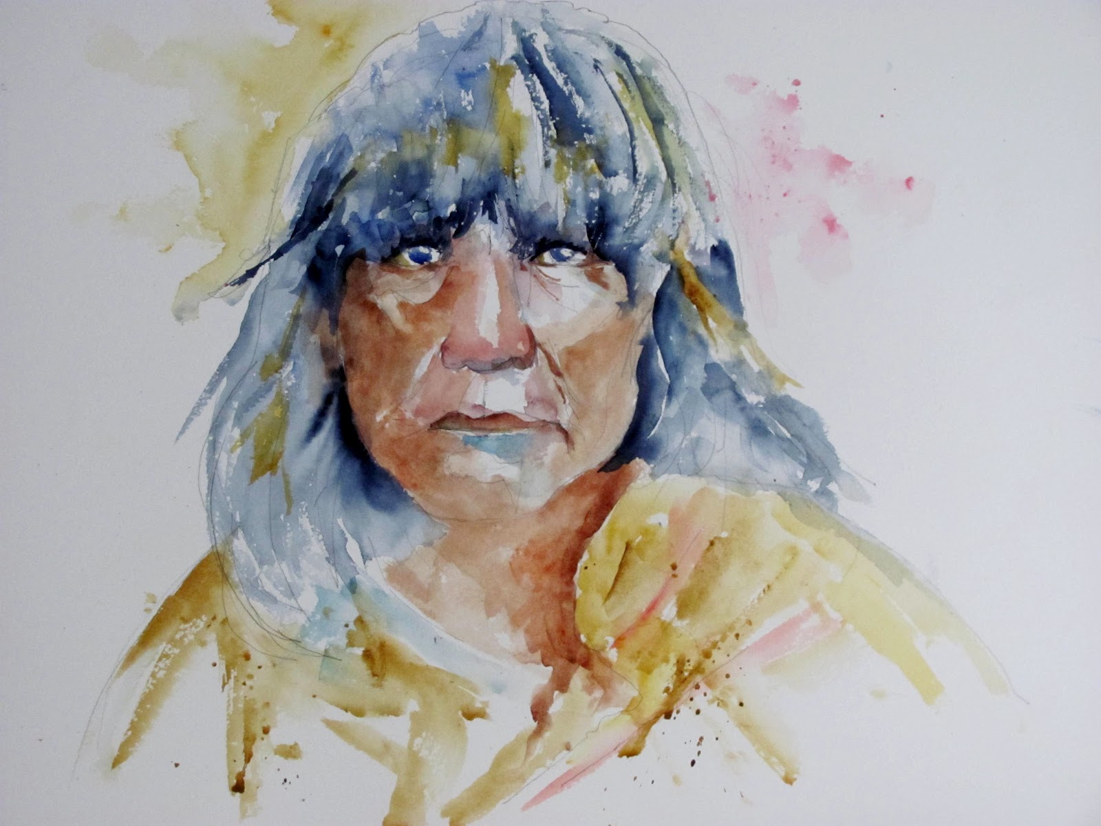
On this occasion we were allowed to draw or paint, whichever we decided, and in whatever media. I chose watercolour and this is the result.

Sarah 16" x 12" Centenaire 140lb Not.

Sarah's face was mainly in shadow, due to where I was seated- far from ideal, so next week I'm aiming to move and had a word with the tutor about this. I used pan paints with Cadmium Red and Yellow Light plus Cerulean for the skin colours and features. The Scarf was a mixture of Viridian and Hookers Green, and the cardigan a mix of Orange and Red. Brushes were Escoda 1214 retractables, Sizes 8 and 10 plus my small Isabey 6201.

 Next week we have a male model and are to do drawing using cartridge paper and willow charcoal. We were also told to bring a putty rubber. Another enjoyable session.

Wednesday, 18 January 2012

Ann Blockley

Ann Blockley is a well-known and highly rated British artist, daughter of the late John Blockley who was one of the top watercolourists of his day. Like her father she painted initially in watercolour, but following in his footsteps has moved into experimentation with other media. She is known for her flower paintings but in this latest phase of her career is creating more abstract works, involving flowers and other subjects.

Currently she has two books in print, `Watercolour Textures' in the Collins artists's studio range (2007) and `Experimental Flowers in Watercolor' (Batsford 2011).

23x 26mm- 127 pages - UK £18.99 US $27.95 (Batsford 2011)

I currently have this book on loan from the library. It is profusely illustrated with her paintings, including many that are experimental. I quote one short section that illustrates the direction she is taking.

."I used PVA glue to stick on collage that included torn and cut pieces of watercolour paper, tissue, and brown sand covered and sealed with gesso. I rubbed oil pastel over the raised lines created by the crumpled tissue paper"...

We also have sand ,twigs, splodges, doodles, granulation material, bubble wrap, cling film you name it! The book is divided into five sections. An introduction that includes paint experiments, watercolour and mixed media and surface textures. We then have sections on Spring, Summer, Autumn and Winter and finally Flowers in the landscape. There is a lot of interesting stuff for flower painters if you like a loose to very loose approach. I like some of the paintings but there are many, where she veers very much into abstraction, that I don't find particularly attractive. I'm certainly not against an abstract approach but one can see Ann is feeling her way with this new direction, albeit boldly. Would I personally buy it?  No, as  I already have the texture book, which came as a requested Xmas present and I feel is broader based.

23 x 26mm 127 pages UK £17.99  (Collins 2007)

I much prefer this book which has a wider remit covering  flowers, animals, still life, buildings and landscapes. As it was published four years earlier she doesn't quite go to the same lengths in terms of experimentation, but the use of mixed media and other materials  is well covered. There are also guest artists, including her late father to whom the book is dedicated. I don't think he was ever a conventional watercolourist, in the vein of Wesson for example, but changed and developed his work throughout his life until his late stuff appears totally changed, different mediums and a more abstract approach prevalent. He wrote a number of well-regarded books that are now difficult to find and command very high prices as collectors items. Like father like daughter it seems.  

Shirley Trevena  is another guest artist, much admired, who has pushed the boundaries even further than Ann is currently doing. She has a new book (her third) out soon called `Breaking the Rules of Watercolour'. You can pre-order it on Amazon. What rules I say?

Two of my fellow Avon Valley Artists are studying with Ann this Spring. One is on a painting trip to Morocco and the other a day workshop at her studio or village hall at Todenham near Moreton - in - Marsh in the Cotswolds.I may do a piece on their experiences (if they allow me to do so!). www.annblockley.com/

Sunday, 15 January 2012

Indanthrone Blue - Pigment Blue 60 (PB60)

Indanthrone Blue PB60, one of the least known or popular blues is the darkest valued pigment available next to Black Pbk6. There have been suggestions it is gaining more supporters and certainly all the main manufacturers include it in their ranges. The main criticism is that it is dull. It can also dry much lighter, up to 50% according to Handprint.

Click to Enlarge

With these swatches for comparison purposes I have mixed in two versions of Indigo and for further contrast French Ultramarine and Ivory Black. Originally I planned to do a piece purely on Indigo brought on by my recent purchase of the Daniel Smith version, which I like very much. Indigo isn't a staple of many artists's palettes - the late John Lidzey apart www.johnlidzey.co.uk  - and can be mixed quite easily by adding black to one of several blues. I decided to major on Indanthrone Blue instead but include Indigo as the colours can be very similar.

The first swatch is DS Indigo followed by the Maimeri Faience Blue which is PB60. Once again we have manufacturers identifying their paints by a different selection of names. All the more important to have a basic understanding of pigments and select paints by this means rather than colours. Some mixed convenience colours are very popular but that's another story. Next is the Maimeri Indigo, a mixture of PB27 Prussian Blue and Pbk7 Black. This is a very nice paint that leans towards green in undertone. The Schminke PB60 Delft Blue is very dark and I don't like it  at all with last of this group the Rowney PB60 Indanthrene Blue. The Rowney version is quite bluish in tone, noticeably more so than Maimeri. For comparison purposes at lower right are swatches of Rowney French Ultramarine PB29 and Maimeri Ivory Black Pbk9. I'll get to those at the extreme right later. Pbk9 Ivory Black is considered by Handprint a `Top Forty' pigment but there are several other blacks ranging from Pbk6 up to Pbk31 Perylene Black. Look at the Handprint Guide to Pigments if you are interested in digging deeper. http://www.handprint.com/HP/WCL/waterfs.html
What mixtures do we have in the various versions of Indigo? Phalo Blue PB15 (which version?) seems to feature quite often, in the case of Rowney a PB15/Pbk7/PV19 mix, blue, black and red. Winsor & Newton is a similar mix while Schminke is PB15:1/PB66, Sennelier PB15/Pbk7 and Rembrandt PB15/Pbk6. I would say, just a suggestion, that if you like Indigo either mix it yourself by adding black to a dark blue OR stick to either Daniel Smith or Maimeri. Others may disagree having tried some of the other manufacturers paints. This assumes you have black in your palette which most artists don't, having been told (incorrectly) that black much like Paynes Grey, is a colour to avoid. Did you know that black was once regarded as `The Prince of Colours' by the old masters?  It may be better to stick to Indanthrone Blue or in a limited palette leave it out altogether in favour of Ultramarine.

The best compliments to Indanthrone Blue are deep yellows like Raw Umber, Raw Sienna (both PBr7), Gold Ochre (W & N PY42), Quinacridone Orange (PO48) and Gold (PO49). There are several others. For more suggestions see http://handprint.com/HP/WCL/mixtable.html .

I mentioned the three swatches on the far right. They are nothing to do with this topic but for the interested I'll explain what they are. Daniel Smith do a very nice paint called Rose of Ultramarine. Yvonne Harry has bought it and likes the colour very much. It has been mentioned by contributors on Wetcanvas. Curious I looked it up and found it was a mixture of PB29 Ultramarine and PV19 Quinacridone Rose. The first two swatches from the left are  attempts at matching it and the middle colour is very similar, a sort of mulberry shade. Forget the one on the extreme right I think I mixed in Perylene Maroon (PR179) by mistake OR it may have been the violet shade of PV19 from Rowney.  Comments (or corrections) welcome.

Wednesday, 11 January 2012

Portrait Painting at City of Bath College

Yesterday 10th January my long awaited portrait course commenced. This was from 10.00am to 12.30am and I travelled to Bath on the local X39 bus complete with backpack and assorted art materials. On arriving at the College, not far from the centre of Bath and conveniently close to the bus stop, I went into the Macauley building as previously instructed only to discover the reception desk was missing replaced with four chairs and a coffee table! There was no indication of what to do so after a bit of head scratching I asked an official looking lady, who happened to be passing - the place is  heaving - what had happened. She quickly explained that, as part of major restructuring and improvements currently taking place, the reception was now located in the Roker building and took me there. The Roker building is new and very impressive as was the new reception area complete with coffee bar. On enquiring and quoting my course number I was given a studio number and instructions how to get there. The place is like a maze and finding your way about is far from simple. By this time my fellow AVA artist Pat had arrived and we set off to find the room.  After travelling down various corridors we entered only to discover it was empty apart from a young man who was stacking easels. We were (as instructed) early but time progressed and when 10 o' clock arrived still nothing. To cut this short the young man went off to check, returned saying we were in the wrong place and took us there because it was another trek to find the studio. The staff at the college are all very pleasant and helpful but I'd been told it was pretty chaotic and so it proved.

After this unpromising start things took a turn for the better. The class were already at work, all present having done previous courses, and the tutor introduced herself. She is a mature lady and artist called Jackie Harding and couldn't have been more helpful. Already the previous bad vibes had been banished! She explained to Pat and I how things were done and we were provided with cartridge paper and various other bits and pieces to get us started. After selecting an easel and stool off we went.

There were eight on the course, as I've explained, the model was already in place (apologies to her I've forgotten her name already), and Jackie gave us a sheet of paper with a number of key points to consider when drawing portraits. I'll probably publish these in a future post.

The scene when we arrived.

 Another view, Pat in the striped top

 Ist Pose

My easel to the right of and slightly below the model

 My Drawing. Graphite on Cartridge Paper.

During the first hour, until just after 11am, we completed our drawing. The model took no breaks  and never moved, obviously very professional. At 11am Jackie called a halt for a break and most took off to the coffee bar near the reception, us newcomers noting the return route to the studio!  After about twenty minutes we returned to find the model assuming another pose at a  different angle.

 The Second Pose


My effort on the right. This is full length, as was the other, approximately 23" x 16", cartridge paper, graphite and willow charcoal. For the drawing I used a Koh-i-noor mechanical pencil with a 5.6mm lead.

My second effort

The Completed Studies - Remember they are just that! Graphite and Willow Charcoal on Cartridge Paper each approximately 23" x 16"

We finished at around 12.20 and I must say I thoroughly enjoyed the experience. I was pleased with my first efforts especially as it was all very new to me. As for me being the oldest student on the Campus, or in this class, I'm glad to say this was not so! I'm looking forward to future sessions which will vary with both drawing  and/or painting sessions. 

 A word about the tutor. I had never heard of Jackie Harding but  found her website www.jackieharding.com/Site/home.html  I thought she was excellent. She was quiet and unobtrusive but managed the class effortlessly and is obviously an experienced teacher as her CV indicates. After an initial  briefing for the two newcomers (Pat and I) we went straight into the drawing and she quietly moved around, occasionally suggesting improvements or corrections to individuals work. In this particular class 6 of the 8 members had been with her previously, some several times. There is a structured plan for the course and I'll return to it in future weeks.

Monday, 2 January 2012

A Hopi Man

To start 2012 here is my latest subject, once more with thanks, from the photo archives of www.firstpeople.us/ of a Hopi man.

A Hopi Man Circa 1900 (?)

The Hopi are a group of pueblo or village indians who have remained in the same territory occupied when first visited by Coronado's troops in 1540. They speak a Shoshonean dialect and mostly live on high mesas in the arid northeastern  area of Arizona. They are said to have adapted better to modern civilization than many other groups of Amerindians. A very good reference is `American Indians of the Southwest'  by` Bertha P.Dutton (University of New Mexico Press 1903 Revised Ed.1975). There is also plentiful information on the web - just Google `Hopi Indians'.


Hopi Man - Centrenaire 140lb 16" x 12" Not

For this painting I changed my colour combinations  as I wanted a slightly different, more expressive, result. As I've constantly stated my approach is based on Charles Reid's style so super realism is out! For the skin colour I used a combination of Quinacridone Rust (Graham PO48) with touches of Burnt Umber and Cerulean Blue. This was to avoid the `pinkish' colour that so annoys Hap! For the first time I changed my usual Ultramarine/ Burnt Sienna/Burnt Umber combinations for darks and introduced Daniel Smith's Indigo (PB60/PBk6) in the hair. I used this straight, just varying the dilution, but sometimes added small amounts of Burnt Sienna. This can be the darkest dark imaginable but also dilutes down very well. I like this particular colour a lot and it may become a staple on my palette. Note PB60 as usually other makes of Indigo are based on either Prussian Blue (PB27) or Ultramarine (PB29). It is a convenience colour but WOW!! I also like the straight Indanthrone or Indanthrene Blue (PB60), without the black added, but it would be pointless to have both. There is also some Quinacridone Gold (Daniel Smith PO49) in the hair. The shirt has Yellow Ochre and  Raw Umber with touches of Quinacridone Gold, Permanent Carmine (W & N PR N/A),  and Cerulean (W & N PB36). I also mixed small amounts of Prussian Blue (Graham PB27) in the hair.

Brushes were limited to my Isabey Series 6201 Size 6 retractable for the features, with Da Vinci Series 10 Maestro Size 6 and the Isabey Series  6228 Size 8, all Kolinsky sables. Finally I used a Pro Arte Series 3 Sable Size 00 for the tiny dots of white Gouache for the eyes. As I've pointed out before the Isabey retractable is much smaller than a normal Size 6, more like a longer and slimmer 4, but is a lovely brush for detail. Jacksons sell it  www.jacksonsart.co.uk/  and there is also a smaller Size 4. Currently they are out of stock as I've recently ordered another 6 for a member of my AVA art group.

I'm pretty pleased with this one as a start to 2012. As usual I concentrated on the face and head, starting with the eyes, then the nose followed by the lips. The clothing was painted  in a minimal way just to suggest but not stress. In previous portraits I've had some problems wondering how to handle the clothing, especially not knowing the original colours, and in several cases overworked.

Monday, 26 December 2011

Landscapes

As readers might have noted I have suffered something of a relapse in my landscape paintings, not helped by a very limited number of plein air outings this year. This has resulted in a reliance on photographs. Concentration on portraiture and still lifes has brought about improvement in those areas but one step (or more) backwards with landscapes. What actually defines a definitive landscape? Is it just a rural scene depicting trees and fields, perhaps dotted with animals like sheep, cows or horses? How do you define a scene with buildings the main shapes? Does it all depend on the variety  or which are the major players?

A few weeks ago I showed the painting below of a scene in Keynsham park, somewhere I know well and have painted several times in the past. I've lost count of the number of times I've walked around this relatively small area bisected by the River Chew.

 
Keynsham Park looking along the River Chew.

Painting No.1 Gerstaeker Acquarell 16" x 12" Not

This is the original painting which failed to get  single vote at Bathampton and generally went down like a lead baloon with most others. I rather liked it (!)

When at first..... I then thought hard about this subject and consulted both Gerda Mertens (`A way with Trees' ) www.gerdaaquarel.be/  and John Palmer to see if their approach might help.

Keynsham Park Version No.2 Waterford (?) Not 16" x 12"

I rather liked this initially but the more I study it the more I can see it is overworked,and much too busy with too many trees crowded in, and a more simplified approach would have been better. Still progress of a sort or not? I frequently do more than one version until I arrive at a better result.

 Keynsham Park Version Number 3. 16" x 12" Centenaire Not

This is my `definitive' version and I am quietly pleased with it. This has been simplified and the large tree stump at the front eliminated. Although essentially a `cool' painting I have added some warm colours. Brushes for all three paintings  Isabey 6228 No.8, Da Vinci Artissimo 44 No.2 mop, Da Vinci Maestro Size 6 and Isabey 6201 retractable Size 6, together with a Pro-Arte Series 103 Size 4 rigger. The rigger is a synthetic, all the rest Kolinsky sable.

My usual palette featured with much reliance on  the earth colours, Burnt Sienna, Raw Umber, Raw Sienna, Burnt Umber and Gold Ochre (W & N). I mixed the greens mainly with various blues and yellows, the yellow the Daniel Smith Hansa Yellow Medium (PY97). The blues primarily Cerulean (W & N) and Ultramarine with some Cobalt Bue (+ Phalo Blue?). I do like Grahams Prussian Blue and it is in there somewhere. I also incorporated some Graham Hookers Green, a colour I like a lot as it is, in my opinion, more natural looking than other Hooker Greens. For darks I seem to frequently use Ultramarine with Burnt Sienna, or less often Burnt Umber, not overmixed but the Charles Reid way in which you can still see the original colours and let them intermix on the paper. There are many other combinations that make good darks and I will probably do a post on this in the future. Not an expert view just mine as a hobby painter.

I'm not absolutely certain what the paper is on number two (or is it three?), as it was painted on the back of a failure. I've gone off the Gerstaeker Acquarelle paper completely. I don't know if this latest block is somehow different but it doesn't take the paint terribly well. In future I'll just use it for  drawings with perhaps a small amount of paint.  I like Centenaire and both Yvonne and Jan from my AVA group have given it  qualified approval, especially at the current price. This is exclusive to Great Art www.greatart.co.uk

What do you think? Comments welcome.


Sunday, 18 December 2011

John Palmer

In my highlighting of  artists I now want to introduce a local one, whom I've met several times and seen demonstrate. I first heard of John Palmer via Judi Whitton who was using Papermate disposable pencils.  She explained that she'd originally seen John using them. John has this amazing and unique drawing tecnique. He doesn't have a website nor has he made a video. He did tutor courses at one time for EPC in Catalonia but doesn't feature in their current schedule. John is a member of the prestigious Bristol Savages and a full biography is  on the website. www.bristol-savages.org/current-artists/96-palmer-john-frederick-rwa-.html   Some of his paintings are also shown. Essentially his paintings are primarily drawings with a wash or two added, usually fairly nondescript. The drawing is the thing. His paintings have appeared in several books by other artists including  Judi's `Loosen up your Watercolours' (Collins 2005).

 A friend of mine knows him well and suggested John should really be better known. He usually exhibits at the RWA (Royal West of England Academy) at their annual exhibition at Clifton, Bristol and also features in at least one gallery in Bath.


Fortunately there are two books, in the `Ron Ranson Painting School series' (Anaya Press 1993/4), that showcase John's talent. In my view by far the better book is `Drawing and Sketching' which is attributed only to John, whereas the `Watercolour Landscape' book is shown as joint authorship with Ron Ranson. The drawing book showcases his skills in amazing detail and I haven't come across another comparable artist. John is different! The Watercolour book, while interesting, isn't in the same class. When I originally tried to obtain these books, several years ago, they were hard to find but I eventually managed to buy the drawing book. Recently I felt I needed to revitalise my landscape painting and also look at other artists, even if very different to my `guru' Charles Reid. This is something he recommends. No tunnel vision here! I wouldn't try to emulate his style even if I could but there are things to be learned, as from many other artists, and who knows maybe a slight touch of the magic will rub off!

Both the copies I have of the above books are in excellent condition. I obtained the Watercolour book only recently with a slight hiccup, as the first bookseller could not find it, despite advertising on the Abebooks website. Fortunately a second did have a copy although at a slightly higher price. Prices vary enormously between booksellers and I've just checked Abebooks www.abebooks.co.uk , a brilliant website, and the Drawing book is available at 0.64p plus carriage from one or two UK booksellers rising to over £20 from American sources, while the inferior ( in my opinion) Watercolour book starts at £24 - £25 from the UK to over £65 including carriage from Canada. Note added 19/12: I've had another close look at the watercolour book and perhaps I should have been more positive about it. I stand by my view that his drawing book is superior but the second book has much to commend it. 

To sum up I can understand some will look at John Palmer and think him quite tight and realistic - verging on super realistic at times. Actually this is a simplistic view as he is very versatile with often a loose impressionistic approach. 


Tuesday, 13 December 2011

Cadmium Orange - Pigment Orange 20 (PO20)

Cadmium Orange (Cadmium Sulfoselenide) is an interesting pigment, although not a staple of many artists palettes, especially those restricted to 12 colours or less. Nevertheless Handprint rate it a `Top Forty' pigment.

 A few years ago I was on one of Judi Whittons courses in Cornwall and Judi was demonstrating. In the demo one of the colours she used was Cadmium Orange and she made the comment her preference was Maimeri because  the Winsor & Newton version behaved differently in mixtures.   As it happened I was able to explain that the Maimeri version was `true' Cadmium Orange Pigment PO20 which leans towards red, whereas the W & N Cadmium Orange was actually a `hue' comprising a mixture of Cadmium Red and Cadmium Yellow, consequently with a yellow bias. Winsor &  Newton also have Winsor Orange (PO62). Since then I have explored what is on offer from other makers.


 Here we have four oranges,. Maimeri is the only true PO20 version and notice how it is quite dark, very opaque and shows a red tinge.  The Daler Rowney Cadmium Orange  is strongly influenced by the addition of PY35 and shows a strong yellow bias. Use these for mixing and you get a totally different result. There are several other mostly newer oranges, two of which are shown. Apart from being transparent they are a different shade. The main drawback of Cadmium Orange as offered by Maimeri is that, being a Cadmium, it is toxic and quite opaque. I rather like it but some think it dull.  The main alternatives seem to be Perinone Orange (PO43) and Pyrrole orange (PO73). We also have PO36, PO71, and PO62. None are identical in hue or colour to PO20 but are transparent or semi-transparent.

What is the situation with leading makes?  Daniel Smith do not offer a `true' Cadmium Orange at all having discontinued this one in 2006. Why I wonder? Not having received replies to two previous e-mails to DS I doubt I'll bother to ask them. Smith list a Cadmium Orange Hue, a mixture of three pigments comprising two yellows and an orange, Permanent Orange (PO62), Pyrrole Orange (PO73), Transparent Pyrrole Orange (PO71), Perinone Orange (PO43) and finally Mayan Orange (PR N/A), mostly transparent or semi-transparent. Spoiled for choice! Which to choose is the dilemma? 

Looking at other leading makers Rembrandt follow Rowneys path with an identical PO20/PY35 mixture as do Sennelier (Cadmium Yellow Orange). Graham have Cadmium Orange PO20 as have Da Vinci who also list `Orange' and `Orange Deep', PO73 and PO36 respectively and finally Benzimida Orange (PO62).

This gets heavier when we look at Scminke the leading German firm. Scminke have  four paints listed as PO20, Cadmium Orange Light, Cadmium Orange Deep, Cadmium Red Orange and , would you believe Cadmium Red Light! Their Cadmium Yellow Deep is the same pigment mix as the Rowney and Rembrandt Cadmium Oranges! They also offer Translucent Orange (PO71) and Chrome Orange (PO62). The PO20 mixtures range from a light orange to a deeper reddish version.

I'll confine the rest of my summary to those companies that offer true PO20 - Cadmium Orange paints. Art Spectrum have one but they call it Cadmium Yellow Deep. Lukas and Old Holland Cadmium Orange while Bloxx list Cadmium Yellow Orange and Cadmium Red Orange.

 Finally Holbein. They miss out completely except for including PO20 in several mixtures notably the two Jaune Brilliant paints. Charles Reid likes the Holbein Cadmium Yellow Orange but this is PR108 - Cadmium Red.

What to make of all this? Despite Orange being a secondary colour, easily mixed from red and yellow (which red and yellow?), as you can see paint manufacturers list a whole range of alternatives with the newer pigments appearing in an increasing number of paints. 

The mixing compliments of Cadmium Orange (PO20) as listed by Bruce McEvoy of Handprint www.handprint.com/HP/WCL/mixtable.html are Phalo Blue (PB15), Prussian (PB27) and Cerulean (PB35/36). I have mixed very good neutral greys using Phalo Blue (PB15-3) Green Shade but with some trial and error first.


Friday, 11 November 2011

Fugitive Paints?

A few months ago I published  a swatch of various red/magenta colours. Bruce McEvoy of Handprint remains sceptical of the  lightfastness claims for  a number of reds and always suggest you do your own tests. Following his advice this is the result. 

The swatches as originally painted


The same swatches after four months exposure in a south facing window. I put masking tape over the bottom half of the swatches so any deterioration should be in the top half. Personally I can detect either very little or no difference. You have to allow for the fact that reproduction may not be of the very best, but I have the original and looking at it reached a similar conclusion. I don't know what the optimum time scale is for doing such tests and I suppose they might well fade over a much longer period, but then again watercolours are not normally hung in south facing windows so make of it what you will.