Monday, 20 September 2010

More Amerindians

Geronimo. Chiricahua Apache 1898 http://www.firstpeople.us/

Geronimo is one of the most famous indian leaders. He is famous, infamous at the time, as his band of 36, including 20 women and children were the last hostile indians to surrender on September 4th 1886. This in effect brought an end to the Indian wars, although the Ghost Dance problems  with the Crows in 1887 and the Sioux in 1890 post dated his surrender. Geronimo, who led the band with Naiche Cochise's son,  was hunted by 5000 soldiers and Apache scouts under General Miles. Without the assistance of fellow Apaches  hostile to Geronimo they would probably still be free. As it is very small numbers of Apaches remained thereafter in the wild mountains of Northern Mexico and reports of them raiding continued into the 1920's. Their descendants  may still be there. The above photograph was taken at the Trans Mississippi Exposition in Omaha, 1898 when Geronimo would be nearly 70.

This is Geronimo, on the right, at around the time of his final surrender. He would be about 57. Contrast this with his later more civilized appearance when he appeared in circuses and generally capitalized on his fame, including selling pictures of himself..

Geronimo. Waterford 16" x 12" Not  Second Version

Geronimo. Fabriano Artistico 15" x 11" Not First Version

The reason for two versions is that I first did the version above in a sort of rosy sepia colour. There is a story why I did  but I won't bore you with it. Initially I was pleased  but gradually realised the colour did not reflect the dark side of Geronimo, the hard eyes and slash of a mouth. I then did the second version with slightly different dimensions. Comparing the two I thought I might be able to improve the intial painting and put some additional washes on it to darken both the face and the hat, with slight touches on the clothing. Colours used were Cadmium Red Pale, Raw Sienna, Cerulean Blue and Ultramarine Blue. Touches of Hookers Green around the eyes with Viridian and Permanent Carmine for the tie. Raw Sienna, Raw Umber, Quinacridone Gold also featured in the clothing with Ultramarine and either Burnt Umber or Burnt Sienna for the darks. I an fairly pleased with both these portraits.  

Sunday, 19 September 2010

Charles Reid's Checklist

Having attended three CR courses, own most of his books and videos, I have compiled a list of bullet points that Charles constantly emphasizes. Here they are in no particular order.

1. First Squint - less is more -is image dark against light - light against dark?

2. Vary finish. Adjust value and colour intensity throughout painting.

3. When short of time begin with darks.

4. Shadow and cast shadow shapes are painting foundation, close in tonal value, but colours varied and mixed on paper.

5. Accurate shapes.

6. Patience and timing! Don't hurry!

7. Basics. Shapes, good tonal value, first try and lose boundaries when two similar tonal values meet.

8. Magic Triangle (1). Three dominant colours or local value shapes form a triangle within painting, two near two of the boundaries and third nearer third boundary or closer to edge.

9. Mix on paper. Less mixing cleaner and clearer colours.

10. Magic Triangle (2). Find two or three elements that you really want to paint. Paint as carefully as possible then omit or simplify rest.

11. Design your page. using areas of explicit detail.

12. Place People first.

13. Edge Control. Soften edges when painting. Squint if easy to see make it hard, if difficult  soften.

14. Paint what's offbeat.

15. Background should support subject but not dominate! Is something in background essential or potentially dangerous? If so leave out!

16. Buildings. Darker tones and detailed towards top. Simplify and lighten middle section, darker tones and more detail at base.

17. Creating success. A. Shapes, local value and edges. B. Colour.

18. When outdoors always paint from dark to light.

19. Buildings. NEVER paint your minds conception of a building. Paint a collection of beautiful colour and shapes, that suggest a building.

20. Loosening up is a state of the mind!

21. Clean palette regularly when painting.

I've just added  points 20 and 21 (20 -09 -10). I should have said earlier that while I would like to say I follow all the above religiously that isn't always the case. One gets carried away - at least I do - and sometimes (often?) plunge in where others fear to tread. There is a dilemma with watercolour that centres around the spontaneous nature of it. Charles and others talk about `happy' accidents (and unhappy ones) and to adopt an over deliberate approach can mitigate against the wonderful possibilities of this medium. Many will disagree, especially those who go in for super realism. Each to his own I say. One of the points above says don't hurry but take your time. In the two artists I mostly lean to, Charles Reid and Judi Whitton, they both take regular breaks when painting.   

I should emphasize that the above is the Charles Reid way. Other artists may well differ and offer completely opposite `rules'. When I read my first CR book, the 2001 flower painting one, I found it difficult to assimilate the quite different approach he advocated. I put it to one side but found myself returning  and gradually becoming interested and then a convert. I should say I am not a sycophantic follower, some of whom you meet on his courses. I don't  rave about everything Charles does, being especially interested in his portrait, figure, and still life work, the latter combining flowers and other objects. There is good stuff in the other subjects he paints but those are my priorities.

I mentioned different approaches. This is something the would-be artist should beware. Different artists say different things and some of it is very contradictory. It is easy to become confused and this - to me - is the problem. Don't take what anyone says as gospel - they aren't always right. This is particularly so regarding things like paint choices. I may post something more on these lines at a future date with examples to prove my point. Regarding the above though I feel much of what Charles says can be usefully applied, regardless of whatever style you choose.

Sunday, 5 September 2010

Latest Amerindian


Bull Tongue - Absaroke or Crow Indian Chief 

I have no other details about this individual or the date at which the photograph was taken. The Crow were a numerous tribe of horse indians who traversed large areas of what is now the United States. www.firstpeople.us/


Moldau A3 Not 280gsm
I finally received the consignment of Moldau watercolour paper from the Czech Republic that I have been seeking since late last year. The paper has one surface which is Not like and the weight is 280gsm (130lb) rather than the normal 300gsm. There is also a 200gsm weight (90lb) and a much heavier one. The paper is composed of 60% cotton 40% linen and  hand made.

 The Velke Losiny Mill http://handmadepaper.tripod.com/13en.htm that produce it has been in business since 1492! It is expensive finally costing over £2 a sheet. I say finally because it was difficult to find out exactly what it was going to cost based on an initial price list from the mill giving prices in euros with no carriage charges, which were guessed at. This all resulted in my having to pay a supplement as there was also 20% Czech Vat to be added. They initially sent the wrong weight (200gsm) and quantity so be aware. Why did I go through this tortuous process and was it worth it?  At my last Charles Reid course in 2009 he was using this paper and spoke highly of it, although he said it was not quite as soft as Fabriano. A little later Bruce McEvoy of the Handprint site http://www.handprint.com/HP/WCL/paper2k.html gave it a very enthusiastic review.

As a result of my initial enquiries to the mill, which I posted about way back - e.mails replied to in Czech etc etc I virtually gave up when a little later received a communication from John Vydra, who said he had been appointed UK agent for the mill. His address is : Bohemia Company, Mr.John Vydra, 3 Medesenge Way, London, N13 6DZ e.mail Kvydra@aol.com.
I don't blame John for the sloppy way the Mill does business as he did his best so if you want some of this high grade paper then don't expect it to be as easy or clear as if ordering from Jacksons! In the USA
 it is much better as you can order the full range from Italian Art http://italianartstore.com/store/VelkeLosinyMoldau.html . A 25 pack of 280gsm A3 is $89.95 presumably plus carriage. This works out at over £2 a sheet given current exchange rates. Italian Art say it is "their best selling hand made paper"

I have only used one sheet so far so will defer judgement. It will have to be good to pay roughly twice as much as Fabriano Artistico.

Sunday, 22 August 2010

Shot-in-the-Eye


Shot-in-the-Eye Oglala Sioux 1898 courtesy  www.firstpeople.us/

Shot-in-the-Eye was an Oglala Sioux who fought in the Battle of the Little Bighorn in 1876, where he was wounded and lost an eye. What he was called prior to this battle is unknown. This was the famous battle in which General George Armstrong Custer, a very controversial figure in American history, was killed together with nearly 300 troopers of the 7th Cavalry. The Sioux, with some Cheyennes and possibly Arapahoes,, amassed a huge force of several thousand warriors and overwhelmed the numerically inferior cavalry. Custer had earlier split his force for which he has been heavily criticized. This was the last desperate attempt by the plains indians to maintain their traditional ways and within less than two years they were confined for ever more to reservation life. The above photograph, which has been edited, was taken at the US Indian Congress Trans-Missisipi and International Exposition in 1898. He died about 1910.


My initial drawing together with  work on the features and skin tones.


Shot-in-the Eye. Waterford Not 16" x 11"

I used Cadmium Red Light and Yellow Light together with Ultramarine Blue plus Cerulean for the features and skin tones. The red colour is Windsor and Newton Permanent Carmine, otherwise, Raw Sienna, Quinacridone Gold (Maimeri), Raw Umber and touches of Burnt Umber and Burnt Sienna plus some Viridian (Rowney), Brushes used were nos 2, 4, 6 Kolinsky sable plus my Da Vinci Artissimo 44 Kolinsky mop.

Sunday, 15 August 2010

Palettes Pt 2

Part one discussed the many plastic palettes on offer, indeed many were omitted, but suffice to say a huge range costs from as little as 50p upwards to near £30 ($42), the majority under £20 ($28). They are freely available from art shops and the large mail order specialists. I also covered the cheaper empty metal palettes, again freely available via mail order, with the largest and dearest upwards of £30 ($42). What you pick is a matter of personal choice depending upon cost and how you paint. Obviously large flat or round brushes and large washes call for a large pallette, or deep enamel pans of various sorts.Plein air painting needs a smaller  more convenient palette, although Mel Stabin uses his John Pike palette for all his painting, including plein air. See his setup in his Watson Guptill book `Watercolor, Simple, Fast and Focussed'.  

Of these sorts my preference is the John Pike for studio work, although I use my Craig Young Paintbox and even the Sketcher's box, for virtually all my paintings, studio or plein air. I also like the Zoltan Szabo palette, albeit it is flimsy being vacuum formed. Other than that I would opt for a large empty metal box and fill it with half and full pans.

My Craig Young Palettes. Two in British Racing Green the other brass.


The same palettes open. The Palette Box is yet to be christened.

Craig Young palettes are very expensive. That is a given so either many artists cannot afford to pay so much or prefer to have a cheaper option. I don't disagree with that as buying them is something of an indulgence, although many top professional artists have one or other and many serious amateurs. Charles Reid, who previously used a Holbein now has at least four from Craig Young and personally requested he make the Sketcher's box. Judi Whitton has a Sketcher's Box with 20 wells instead of sixteen and I have a small four well extension to clip onto mine. Craig is open to special requests.

The discussion about Craig's boxes on Wetcanvas tilted towards buying one or other of the better quality `heavy duty' boxes, used by Winsor and Newton, complete with either half or full pans of paint.  These  boxes come at a high price, especially if you already have most of the colours. They are a great Xmas or birthday present! The question was asked were they available empty and soon information was flowing from posters giving the options. Some `professional' boxes are listed by the suppliers highlighted in Part one but tend to be isolated examples. What are the alternatives? There are two main ones, either from Holbein or made by the Italian metal working specialists  Fome www.fome.it/.

In the UK Heaton Cooper  http://www.heatoncooper.co.uk/ list 12 empty metal palettes, four from Holbein (250/350/500/1000) and four from an unidentified manufacturer (possibly Fome) that are `hand enamelled'. The remaining four are logo'd Scminke and are the lightweight sort. They are all very well illustrated on the website with plenty of information. Prices of the hand-enamelled models range from £18.45  (approx. $26) to £54.95 (approx.$75)  with three having 12 half pan wells and one full pans. Heaton Cooper tend to be expensive and charge carriage extra. The other source is Jacksons http://www.jacksonsart.co.uk/  who have just added Holbein to their range, so new that they are not in the most recent catalogue. Search the website for `holbein palettes'. Prices are cheaper than Heaton Cooper and no carriage charges are applied if your total order exceeds £39 UK or £100 Europe. Other destinations ring for a quote. There may well be other sources but these are the only ones I know about as things stand. If further information comes to hand I'll post it.

In the USA one source of a heavy duty palette has been identified as Natural Pigments www.naturalpigments.com/detail.asp?PRODUCT_id=624-2096. This is a heavy duty box with 12 wells that sells at $57. According to Robert Armas, who has ordered one and is waiting delivery (delayed), the name Rublev, which appears on many of the products on the site, is involved and he suspects it could be Russian in origin rather then the Italian Fome. Actually it is listed as a Fome. I have not looked at any of the other major USA mail order specialists yet but I'd be surprised if names like Dick Blick, Jerry's, Cheap Joe's and Art Express had nothing similar to offer.

A final word. Look at this website http://www.greenandstone.com/. This old company are in Chelsea, London and sell, amongst other things, antique palettes. I'm not suggesting you buy one but have a look if you are interested . Not a Binning Munro nor a Roberson in sight however!  

Monday, 9 August 2010

More Plein Air Paintings & Our Latest Project

A week last Thursday I painted at Newton St Loe. It should have been at Victoria Park in Bath but that is another story. Here is the result.

The Church at Newton St Loe.18" x 14" 152lb Veneto Not

I wasn't going to post this one but after looking at it a few times decided to take the plunge. Drawing wise everything is pretty much in the right place  and I simplified the scene. I was positioned just in front of the monument on the left and started the drawing at the front of the entrance in the centre. As usual I attempted to do this by modified contour drawing, drawing then stopping, leaving the pencil on the paper while comparing each section to get the proportions right. This doesn't always work for me - I'm not Charles Reid - but is not bad in this instance. Newton St Loe is a delightful village on the western outskirts of Bath. Apart from one residence all the others belong to the Duchy of Cornwall - in other words Prince Charles - and there is a waiting list to rent the various cottages, including some lovely thatched buildings. It isn't tiny and has a village shop with an annual fete on May day. My AVAS group usually put on an exhibition in the church during the fete. Prince Charles occasionally flies in by helicopter as the Duchy have a regional office.

Regarding the painting I used Raw Sienna, Raw Umber, Gold Ochre, Ultramarine Violet, some blues and other yellows plus Burnt Sienna. I am almost out of the true Quinacridone Gold and am trying Gold Ochre instead. Ah yes some Permanent Carmine in the roofs.

Thomas a Becket Church Pensford 18" x 14" 152lb Veneto Not


Last Thursday my Avon Valley Artists Group, seven of us, painted at a small village called Pensford several miles south of Bristol. All those present decided to paint this ancient building formerly a church but now, would you believe, being converted into a private residence. The church dates back to the 14th century but was badly damaged in the 1968 floods when the River Chew burst its banks and reached unheard of levels. It was then abandoned and has been rotting ever since but in 2008 was bought for repair (it is a listed building) to be turned into a home. Apparently the couple who bought it have four children.  When we were painting a lady invited us to look inside and see how the conversion was going and several did but I continued painting. I'm just amazed that anyone would want to live in it. The church itself is not enormous and is surrounded by a modest amount of ground but, as you will see from the painting, filled with gravestones, some of which appeared recently tended!  According to the lady it is to be the subject of a television programme. I cannot imagine how much all this will cost. The owner must be a banker or financier.

I'm not really into painting churches but decided to have a try and took the porch in the centre rear as the focal point. That porch is in need of repair looking at the state of the roof and the background was a sea of green from the surrounding trees. Other than that there were gravestones everywhere. Perhaps I should have left them out, or at least most of them. I painted almost exclusively with a number 14 round Escoda Kolinsky-Tajmyr Series 1214 retractable (Jacksons) to try and avoid being too tight. Colours used, lots of blues and yellows to get varied greens, Ultramarine and Burnt Umber or Burnt Sienna for the darks, Raw Sienna, Raw Umber and Gold Ochre (Windsor & Newton) for the buildings and I used Cyan Blue (Maimeri) mixed with Cadmium Orange (Maimeri) for various shades of grey. Possibly a few other touches such as Green-Gold (PY129) Rowney.

Our next project

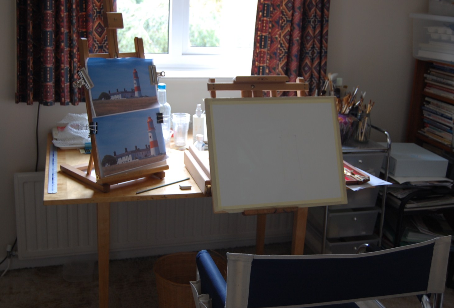
This is me working on our next project. The subject and photos were supplied by Mick. This is my `studio' a converted bedroom. My wife keeps wanting to sort it out as I have stuff everywhere. You can see why I wear a cap most of the time when outside.


This is where I draw and paint when not outdoors. The drawing is partially completed.


Sunday, 8 August 2010

Palettes Part One

I joined the wetcanvas forum a few weeks ago www.wetcanvas.co./forums/  and an interesting discussion has taken place about palettes, driven by some of the posters discovering the Craig Young hand-made versions. Several appear to have ordered them and according to one poster the waiting time is now a year and the prices he quoted (in dollars) indicated they had risen steeply compared to when I purchased mine.  Some of the contributors appeared a little confused with what to buy when balancing cost against functionality. As a result, and due partly to new information about what is available and where I decided to do this piece.

First of all watercolour palettes come in various shapes and sizes from small to (very) large. If you are painting on say half sheets or larger and use big brushes size 16 and above and large flats, 1" or more, then it is obvious you need a big palette. Not everyone uses conventional palettes and various sorts of flat trays are used by artists, including some top professionals. Butcher's metal trays of different sizes and/or the flat plastic ones sold in some kitchen shops can be perfectly adequate. With such trays you squeeze out paint from tubes. This method is normally associated with limited palettes of 6 to 9 colours.  You can mix large quantities of paint but it can be wasteful with what remains and is then washed off.


The above selection of palettes includes two of the largest, the John Pike (A) which is on the left hand side complete with lid, which can also be used as another mixing area. The Robert Wade Palette (B) is at middle bottom with the lid, also used for mixing, touching to the left. Top centre is a muffin tray (E) (as used by the artist Trevor Waugh) and to the left (D) is a plastic palette of a type commonly available. Centre is the Zoltan Szabo palette (C). The three remaining palettes in the top left hand position are top a cheap aluminium version (F) commonly available and underneath the smallest palette, a Windsor and Newton plastic one (G) with an empty metal palette (H) of the sort commonly available but in this instance filled with empty full pans. I have labelled each palette with a letter A to H, but you may need to click on the photo and enlarge it to see the letters clearly.

What you need and what you should obtain depends on how you paint and whether you use tubes or half/full pans. The other criteria is how large you paint because in my experience most amateurs paint fairly small. These are only a selection of palettes that come in four basic materials, plastic, metal, ceramic and porcelain. There are other sorts but not usually used for watercolours. The John Pike palette is American  and all the information you need is here http://www.johnpikeartproducts.com/. The Robert Wade palette is obtainable in the UK from www.apvfilms.com/ . The JP palette is very popular with professionals like Mel Stabin www.melstabin.com/ and in his book `Watercolor, Simple, Fast and Focussed'  is illustrated more than once as he uses it for everything including his plein air painting! I'm not sure about the Zoltan Szabo palette as he is deceased (as is John Pike) but it is probably still available if you Google it. Added Note: Yes it is. Try www.ZoltanSzabo.com/ Wade and Szabo palettes are vacuum formed whereas the Pike palette, those from Herrings and several others are made from much stronger materials.

What is readily available? In the UK we have Ken Bromley, Jacksons, Lawrence, Herrings and several others possible suppliers. Great Art are German but have a UK telephone ordering number. Great Art have palettes from 85p up to a `professional' box with 48 large wells (!) costing £133.40p. Try Great Art http://www.greatart.co.uk/ . The enormous catalogue stretches to nearly 400 pages. Jacksons, who tend to be the most popular supplier amongst my artists group http://www.jacksonsart.co.uk/  list a large number and have recently added the superior and more expensive Holbein metal palettes. They are not yet in the catalogue but are on the website. Bromley http://www.artsupplies.co.uk/ also list a good number including the plastic Maxwell palette `designed by artists'. Herrings are interesting because the Herring brothers (and family) are enthusiastic artists and have introduced a range of artists products `designed by artists for artists'. These include several palettes plus other items like easels. Herrings also sell two `professional' metal empty boxes. Herrings have a website http://www.frankherringandsons.com/ but it is still under construction and art materials are not yet on it. Most of the above also sell various empty, lightweight, metal boxes, cheaper and not to be compared with the more expensive heavy duty `professional' sorts.   


Here are three typical metal boxes, purchased empty and filled with a mixture of half and full pans. I suggest half pans for the least popular colours and full pans for the colours you use most often. You can purchase empty full and half pans at both Jacksons and Bromley and some of the others and fill them from tubes or  half and full pans from manufacturers like Windsor and Newton. Not every paint manufacturer offers both half and full pans.  One of my local art shops in Bath (Minerva) also sells them in packets of ten. You may note two of the boxes above have the Scminke Logo. Some of these boxes, very similar whatever the source, have logos like Scminke, Rembrandt and Lukas. others nothing. They are basically cheap enamelled metal so don't compare them with the more expensive heavy duty palettes I shall cover in Part Two. They do the job if price is an issue but won't last more than two or three years with heavy usage.


Thursday, 29 July 2010

Latest Plein Air

Actually it isn't but the one I did today is far too light, the Church at Newton St Loe,  and I've already put it on the ever growing reject pile. I would probably have been pleased with it a year or three ago but no longer.


Pat's back garden 16" x 12" waterford Not

This was painted last Saturday on our second 2010 visit to Pat's house at a village on the outskirts of Bristol.  Weather was fine, a little cloudy but warm and I painted a scene looking through a gap between bushes. The main feature is the urn but following Charles Reid's dictum of not having a particular centre of interest decided to modify it and added several flowers. Actually they were  growing in a border behind and to the side of where I sat so it's my own composition. I think it works quite well. Colours used included , Permanent Rose (W & N),Carmine (W & N), Quinacridone Gold (Maimeri), Ultramarine Violet (Rowney), Hookers Green (Maimeri), combinations of various blues and yellows, Raw Sienna, Burnt Sienna and Burnt Umber. Oh yes and Raw Umber.


Latest Indian Portraits

I'm still beavering away and here are the latest:

Big Bear Cree Chief 1895
Waterford 16" x 12" Rough

Big Bear was involved in the Riel rebellion of 1895 in Canada. He actually tried to prevent his followers from taking part but to no avail. He was captured and imprisoned for two years, dying one year after release. The painting depicts him after capture, actually in chains in the original full length photograph.

 
Wanduta Lakota Sioux. Waterford 16" x 12" Rough

This was my second attempt at Wanduta and I think it much better than the previous one on the blog.

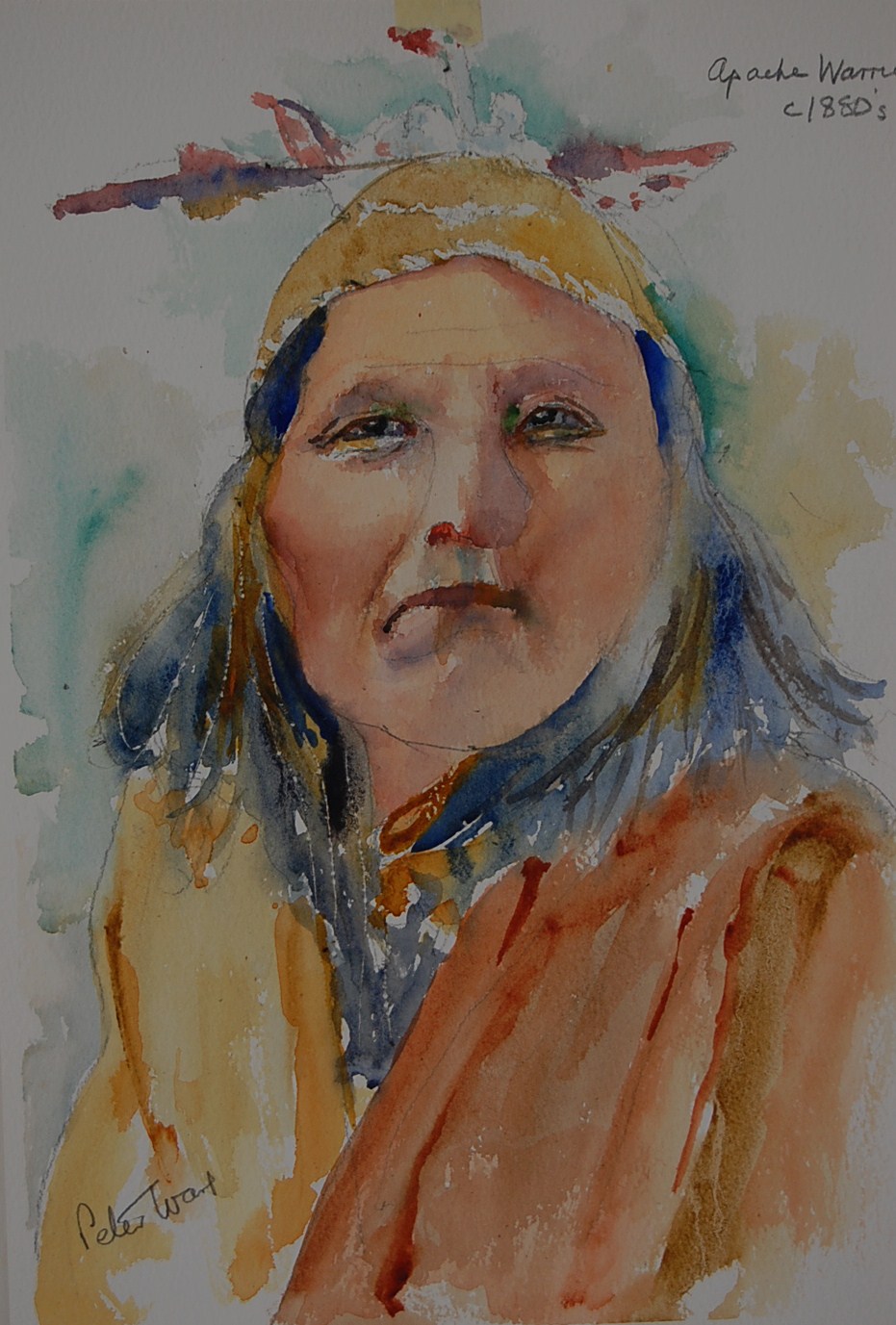
Apache Warrior 1880's 16" x 12" Waterford Rough

This is better than  the previous one shown on the blog but I am still not entirely satisfied - not that I ever reach 100% satisfaction far from it - and may try again.

I painted the features with my usual mix of Cadmium Red  Light and Cadmium Yellow Light but actually used a colour new to me, Windsor and Newton's Gold Ochre (PY42). This was used quite a lot instead of Cad Yellow and Raw Sienna. I rather like it. It is a rich golden yellow and was introduced in W and N's most recent changes to their colour range. Blues used were Cobalt, quite a lot of Ultramarine and a little Cerulean. I used the Ultramarine to get a darker face mix. Notice `Waterford Rough'. I normally use NOT papers but these Indian portraits do seem to suit it. On the Apache portrait I introduced Quinacridone Rust from Graham (PO48) in the clothing on the right hand side. It is rather brighter than Burnt Sienna - a lovely colour. Other colours used, other than in the features, include Ultramarine Violet (PV15 Rowney), Burnt Umber (Maimeri), Quinacridone Gold (PO49 Maimeri) and Permanent Alazarin (W and N). I forget to mention a touch of Hookers Green in the eye sockets and Black for the pupils.

As for brushes for the features I used two long handled Windsor and Newton Cirrus, Nos 2 and 4, Either Da Vinci or Rosemary Kolinsky No.6, and for the rest my Da Vinci Artissimo 44 No 2 Kolinsky Mop. This latter is a lovely brush roughly equivalent in size to a normal number 14. I also paint fairly upright.

Friday, 23 July 2010

Latest Indian Portrait

L Amatruda Amalfi Hand Made Paper 15" x 11"
Wanduta Lakota Sioux c. 1880's

This is the latest, done on Wednesday. I'm moderately pleased with it considering that the photograph was  very, very dark in large areas, virtually blanked out. Usual Cadmium Red LIght and Yellow Light for the flesh colour darkened with either Cerulean, Cobalt or Ultramarine Blue. Touch of Hookers Green round the eye sockets. Other colors Ultramarine and Burnt Umber together with Viridian plus Quinacridone Gold for the hair plus Raw Sienna, Ultramarine Violet and Viridian for the clothes with a little Permanent Carmine. It could be better but then that's par for the course. I'm still at an early stage in doing these subjects and portraits in general. I realise I still have a way to go.

The paper you will note is unusual. I mentioned it on an earlier post when I acquired several sheets at a shop in Amalfi, Italy. The paper is handmade and quite light, about 90 lbs I think but has a beautiful surface and is very nice to work with. As It's doubtful I'll go again I'll have to husband these sheets, although I do have an e-mail address so it's possible more could be obtained - at a price! Co-incidentally there should be 40 sheets of Moldau paper somewhere in transit from the Czech republic., A3 size 280gsm. I should have received them by now but the initial shipment sent to the UK agent was incorrect, 30 sheets of 200 gsm. However providing the correct lot arrive safely I may end up with those as well since 200gsm (90lbs) is perfectly okay with my (attempted) style of ` try first time for a finish'.  

NB: Several days later on reflection I have gone off this painting and label it a failure. It looks a little better in reality than the photo on here but is still not good enough. I am thinking of another try with a slightly different approach