Friday, 13 March 2020

Stages of a Work in Progress

I generally do my portraits of Amerindians from old black and white photographs, many originally taken by the famous photographer Edward Curtis. This is not easy as most have large shadow areas with all detail lost, and very large contrasts between black and white. On the plus side this is something which prevents you being too realistic, providing you follow  Charles Reids teaching of only painting what you can actually see.


Stage 2

I say Stage Two as I always draw the image first as Stage One, using a size 7 2B propelling pencil, although I sometimes use 'proper ' pencils, again 2B well sharpened. In this case I have already started painting the face. The eyes come first followed by the nose and then the mouth. This is the basic approach I follow which is the one Charles Reid taught. Colours are Cadmium Red Light  (PR108), Cerulean Blue (PB36). RawSienna or Yellow Ochre also featured in Charles skin tones but here there is no RawSienna.


Stage Three

Here the face has progressed further and I have started on his headdress. This is the most difficult part and I am pondering how to proceed further. I have a tendency normally to rush things and while this sometimes comes off often it doesn't. I prefer a minimalistic approach as I think overworking it one of the most common mistakes in watercolour. There are artists who do the most super realistic paintings in watercolour and I marvel at their skill but wonder if acrylics are better with this sort of approach.


Amerindian Chief 16" x 12"

This is the finished painting (unfinished as I want to avoid 'over-finishing") This approach doesn't appeal to everyone as I well know. I actually scrapped the one above and re did it from scratch, still keeping to the same approach. The reason I scrapped the previous effort is that I was following the photograph - which was very complicated - rather than just using it as a guide. It simply wasn't working out. I like parts of this painting but I can see faults, the mouth, right cheek, and the nose could be better. In some respects it is getting closer  but nowhere near perfect - if such a thing is achievable. The struggles of a would be watercolour artist! And this after 20 years.

Friday, 6 March 2020

My Favourite Watercolour Papers

What is the most important item in watercolours? Is it the paints, paper or brushes? Personally I agree with the artist and teacher Charles Webster Hawthorne in his small book 'Hawthorn on Painting" ` in fact a collected edition of his students notes, published after  his death in 1930. He said "buy good paper- fifty percent of and more of your watercolors depends on the paper you use". Actually it's the hand that guides the brush but good paper makes it easier.

Most starting off in watercolour use a cheaper paper with the British Bockingford being the most popular, at least in the UK. You also have a number of cheaper papers in the German Hannemuhle range, while in the USA Strathmore have cheaper papers. And there are others. The thing about these budget papers is that they are not made of cotton, but high quality wood pulp in the case of Bockingford and I think cellulose or alternatives are used in others. I have tried some that Great Art sell but wasn't impressed although the 100% cotton Centenaire  is a good paper.

I stress the following is just my opinion and others may well differ. Also I haven't tried every available paper although I have sampled a good number.


This is my current favourite paper in the 'High White" version, also in a block although blocks are more expensive than sheets.


Fabriano Artistico "Extra White' was one of Charles Reids favourites and also mine. He said it suited his style of painting, and didn't like Arches as he said it was too 'hard -sized"

 I've gone off it for three reasons. Firstly the price has escalated, something that has affected all papers in line with the increasing overall costs for watercolour artists. The others are the block size "18 x 12", my preference being "16" x 12", and the way the blocks fall apart when you get down towards the last few sheets. Waterford hold together very well.


This paper was introduced to me by Judi Whitton and Charles, who knew Judi who attended at least two of his workshops, one of which I was on, probably heard of it from her. He considered it equal to Fabriano but particularly liked the block size - 40 x 50cm. Unfortunately getting hold of Schut papers, including the favoured Noblesse, was difficult. I first read about it in a book by the late Zoltan Szabo. I actually obtained some from an art shop in Stow, then from a small wholesaler, actually a private house with a small warehouse, in Banbury. This then dried up.


I recently decided to see, with rising prices in papers, if Schut was still available and at what sort of price. Enquiries discovered the Schut paper mill had changed hands and was now part of the Fontaine group. Further enquiries finally brought the information that ALL 100% cotton papers under the Fontaine label were actually the paper previously marketed as Schut Noblesse. There are four surfaces and a good range of blocks and sheets. A new surface called 'Cloud Effect' is also available. 

Both Great Art and the SAA are selling them, not yet Jacksons though. There is some slight confusion in that there is conflicting information regarding the number of sheets in a block, some saying 15 and others 25. This has an effect on the price per sheet, which seems to be approximately the same as Waterford or slightly higher. I haven't bought any as I have a large supply of paper, possibly enough to last except if I reach 100. Actually I'm exaggerating here slightly. I'm currently painting on the reverse side of failed paintings. Ron Ransom told me he did this and it is perfectly possible on decent papers like Fabriano and Waterford. I have many!

What other papers have I tried.? Quite a few actually. I have a small stock of Moldau, the Czech hand-made paper, obtained with great difficulty, the saga of which is related somewhere on this blog. A lovely paper but getting hold of it oh dear! I also found, quite by chance a small shop selling quite small sheets of loose watercolour paper in Amalfi on the Sorrento coast of Italy. The largest was 11" x 15", quite light at about 90lbs. A lovely paper I have to say but I I've not been back since that second visit. The lady owner, when asked where she got it, waved her arm saying 'at my factory over there'. I doubt I'll go to Sorrento again but would certainly buy more if she was still there. 

Another paper creating waves, especially in the USA from where it emanates. is Stonehenge Aqua. Rave reviews have appeared  from American artists. Jacksons sell it and I've purchased and painted on a block of the 16" x 12" size with a not surface and rate it equal to the Waterford. Certainly not superior (in my opinion). The American Strathmore group have a good name but I have no experience with any of their papers. 

Other than that what can I say? There are lots of other papers including some very expensive hand-made ones. The ones I've listed are mainly 100% cotton, which to me is a benchmark.  Cotton and linen is mentioned in some of the high end papers.

If price is a factor, and when isn't it these days, for us struggling amateurs, Great Art do an own brand called Centenaire which is 100% cotton and cheaper than the above. The Hannemuhle group have several cheaper papers and there are a few others.  Frankly the long established Bockingford, made from high grade wood pulp (they say) is as good as anything if you want an inexpensive, decent paper. Some will say cotton papers are better, and they probably are, but  do many  amateurs need to spend big bucks?  Based on my experience with several local art groups I suggest no is the answer.

Added 10.15pm. I omitted to mention Khadi, a Nepalese hand-made paper, available in a wide range of sizes and weights. Some of my fellow artists have tried it with mixed responses but it is 100% cotton and  very reasonably priced. It isn't a favourite but I do have some and occasionally use it. The surface is on the rough side whereas my choice of surface is not.


Monday, 2 March 2020

Watercolour Paintings 64

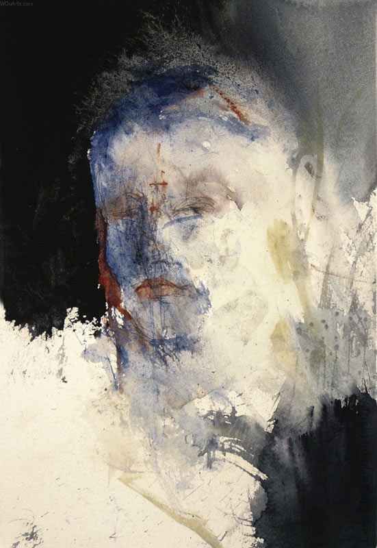
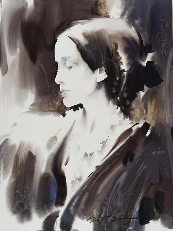
This month I am posting watercolour portraits, although many are partial figures.It is possible some may not be watercolour so any corrections are welcome. This also applies to the artists names. I make no apologies in leaning towards an impressionistic approach, although there are examples of more detailed works here. Some I like a lot more than others but as usual I'm trying to show the wide range that is possible with watercolour. This is just a sample of what is out there.


Liu Yi

Another of these amazing Chinese artists


Jack London (?)

Not sure if this is correct. Maybe the subject is JL Apparently this is Robert Wade . That surprises me as it isn't typical RW. Thanks to Greg.


Annette Smith 


Another from Annette Smith

I can see Charles Reid in this and the one above.


Lars eje Larsson

This is very abstract . which seems to be the case with his figure and portrait work. His other stuff is very different with bold colours. I love his work but the above may not appeal to many.


This is lovely but I cannot find the artists name Might be Atsushi Matsubayashi


Slawa Prischedko. One half of the Prischedkos. A wonderful artist. They have been doing workshops at East Devon Arts at Sidmouth on the South Coast of England for the last two years.


The superb Stephie Butler. This is another example of her use of the new liquid charcoal allied with one or two watercolours. I've now bought a tube but haven't yet tried it. This is very different to her normal style (which is excellent) and I like both very much.


Ted Nuttall

One of the premier USA artists in watercolour portraits 


Aine Devine

This Scottish lady is a wonderful artist


Chien Chung-Wei

"Robert Wade' by Chien Chung -Wei

This is a great painting by the fabulous CCW


David Lobenberg

A very bold and colourful work typical of this artist


The late Charles Reid A typical demo of which I saw about thirty in my several workshops with him although this wasn't one.


Fealing Lin

Another marvellous American/Asian artist


Gerard Hendriks

I have been friends with Gerard for a few years now. His work has expanded greatly and here (I think) he was having  fun


Marcos Beccari


Chien Chung -Wei

I love this for its minimalist approach


Atanur Dogan

Not familiar with the artist.


Vijay Achrekar

This Bangalore artist is brilliant


Rick Huang-Huang hua Zhao


Another from Slawa Prischedko

Janet Rogers

The fine American artist


Stan Miller

Stan produces fabulous work including a lot of portraits


kubra Turkegul

A new artist to me


Thursday, 27 February 2020

Latest Paintings

Here are my latest efforts warts and all. I stress I don't put them up as good paintings. Some are experimental. After 20 years I'm still experimenting! Says a lot about my painting. All 16" x 12"


Nubian Woman.


Nubian Woman. Corrected version.

I made the nose too long on the original so had a go at changing it. It can be done in watercolour as long as the colours used are not too staining. as are many of the modern synthetic pigments like the Quinacridones.  I also softened the too prominent outline. I hope readers can benefit from my mistakes, which is the reason for posting these corrections.


The eponymous Chef/Businessman Gordon Ramsey

Moderately Happy with this one, although only moderately. It is flawed.


Kiowa Brave

Hair not right too blue


Raptor

Got the shape wrong. The body is too long. This has already bitten the dust.


Nubian Girl

Although happy with certain parts of the painting I have made the top of her head the wrong shape. It should be slightly lower and more rounded. I may have another shot at this.


Corrected version. Here I reduced the head height and made it more rounded.


Amerindian Warrior

Facial colour not quite right - a bit too red,  although the camera seems to make them worse. I'm reverting to Charles Reids combination of colours (after straying from the path) but haven't quite got them right. To articulate he used basic combinations for facial colours of Cadmium Red, Raw Sienna and Cerulean Blue. He also used Ultramarine Blue, Alizarin crimson and even Green at times, and a few others. 


Metal Objects - This weeks AVA subject. Pretty awful I know but this is a warts- and all blog.


'Herbert" A work in progress.

I am at the point where it could go on to be a decent painting or go completely wrong. I'm baring my soul with these comments.


Another Amerindian - a work in progress.


Monday, 17 February 2020

Latest Paintings.

Here are my latest works. Mostly done for Avon Valley Artists weekly subjects. I do the drawings in my small home studio and  most of the painting at the AVA sessions, though some of the detail - eyes, noses etc - at home. I'm still  trying to follow Charles Reads teaching of 'small details, large generalities'. You'd think I'd  have it cracked after painting in watercolour for twenty years! This latest batch are closer to what I would like to achieve, although when I post stuff on Facebook in some of the watercolour groups I contribute too my 'likes' remain - mostly - very much on the low side.  All  16" x 12" unless otherwise stated.


What a Beak.!


Dad with son 10" x 12"


"Peeking out"!


"What am I missing?"


"Eagle No 2"


"Eagle No 3"

The above two were done in my small home studio.

Tuesday, 11 February 2020

Roman Szmal Aquarius Watercolours

There have been quite a few new brands of watercolours in the last few years, mostly somewhat exotic or specialised ones at even higher prices than the majors. As readers will know I am opposed to the eye watering prices artists or just hobby painters (like me) are having to pay, with stiff price increases over the last two years. We also have these campaigns with well-known artists promoting the most expensive brands, particularly Daniel Smith, which are aimed at the vast mass of artists.
Is it just possible we are seeing a trend away from this? First of all we have the extended Van Gogh range, from 40 to 72,  which is perfectly adequate for amateurs. The St Petersburg range has increased and seems to have overall improved the brand, despite still using a few fugitive pigments. See what Jane Blundell says. 


I now come to what looks  an exciting new development in this sphere. This is the introduction of Roman Szmal's Aquarius watercolours emanating from Poland. I first heard of them in a recent e mail from Jacksons so they are readily available in the UK and with American artists reviewing them on You Tube presumably also in the USA.

The range comprises 140 colours of which 117 are single pigment paints. All the well-known pigments are there plus new ones like PY61, PY168, PBr23 and  PBk8. There is no suggestion obsolete or fugitive pigments are included. Gun arabic, glycerine, Linden honey and distilled water are used in the production  process. Colour charts giving full pigment details are available. The highly respected Australian artist Jane Blundell has already tested them and gives them an excellent rating. See her blog. There is much more on You Tube. Just 'google' his name and see the  response including demos. The colours appear intense and not at all wishy washy. At the moment only full pans are available  but that might change ?

Finally we get to price. Jacksons are selling the single pans at from around £2.30 to £3.70. There are a variety of sets, including trial ones. A set of 5 is £10.20 ( (RRP £12.00). A set of 12 is £34.00 (RPP £44.00). And there are others.

The questions I have include how long do the pans last? Do they wet easily? etc etc. I tend to think pans are not kind to my Kolinsky sable brushes so tend to use synthetics when I use them - which I do occasionally. Possibly these questions have already been answered in all the information about them already posted but there is a mass to absorb believe me.

To sum up on the basis of what I know so far - and this is early days - this seems to me an exciting new development of great benefit for the great mass of artists who paint in watercolour. I have plenty of paints at the moment but will definitely be buying some when I need to replenish my supplies.


Monday, 3 February 2020

Watercolour Paintings 63

This month the subject is more specific with all the paintings featuring boats in one form or another. Boats are a popular theme, whether on the beach or in harbours etc. Hope you like them. Any mistakes on my part please feel free to correct me.


John Yardley (?) Certainly his style


Guan Weixing - The Chinese Master


David Howell


Artist ?


Peter Cronin


Artist ?


Tim Wilmott


Miguel Linares Rios


Vladislav Yeliseyev


Robert Zangarelli


Tony Belobrajdic


Fabrizio Esposito


Myint Naing


Corneliu dragan Targoviste