Monday, 1 October 2012

September Challenge

This month it was my choice of subject and this is it. A mother Cheetah and her two cubs, probably on the Serengeti.


The initial drawing


Stage 2


20" x 14" Fabriano Artistico Extra White 140lb (300gm) Not

The concentration here was on the three heads with the rest supporting them. Colours used were various shades of yellow, including Raw Sienna and Gold Ochre (W & N PY43). Cerulean and Cobalt Teal Blue (DS PG50) for the blues with Burnt Umber, which was also mixed with Ultramarine Blue for the darks. There is some diluted Viridian in the background. I also introduced Translucent Orange (Schminke PO71) to warm the animals up. The Serengeti is a very hot place.

Brushes used were the Da Vnci Artissimo 44 No 2 plus some Isabey 6228's (4,6,8) and a couple of riggers for the grassy/foliage bits.

Next month Mick chooses the subject which I await with trepidation! Just joking Mick. 


Thursday, 27 September 2012

Avon Valley Artists Thursday 27 September

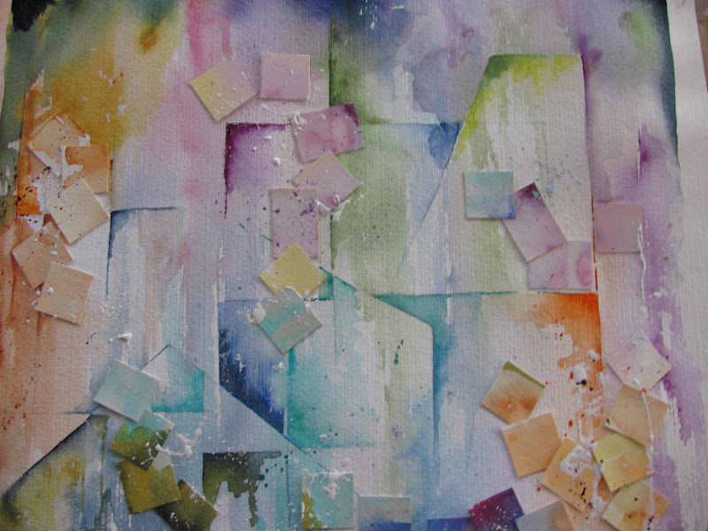
Today the subject was `Abstracts' . Yvonne brought a number of boxes and set them up in two places.


The idea was that you produce an abstract painting, or drawing, based on this arrangement. This was kept secret until the actual morning so we were all in the dark, apart from Yvonne! I must admit I was not looking forward to it. The previous evening I pulled out my copy of the Kees van Aalst book `Realistic Abstracts' but found little inspiration. Not to say it isn't a good book because it is, but considerable study and practice is required to understand what abstraction is all about. I've looked at it several times, found it very interesting, especially in regard to some of the featured artists, but not really delved into it in any great detail. This book though mixes abstraction with realism so isn't entirely suitable for pure abstraction. Search Press produce two other books, by the same artist Rolina van Vliet, called `The Art of Abstract Painting' and `Painting Abstracts', which for those seeking to understand the subject are probably better. There are books by other publishers but I have an increasing regard for Search Press, who are producing very good, economically priced, practical art books, amongst a range of other subjects.

In the event faced with these boxes my creative abilities shrivelled, such as they are, and I made a very poor fist of it, one of the problems being I don't like lots of straight lines. However my fellow members, thirteen on this occasion, made much better attempts.

Yvonne Harry

Yvonne was not overly happy with this and said she would be making changes/additions. No doubt the finished work will appear on her blog in the next few days. Specifically she felt it a little weak on colour and needed some curved lines. Some thought she was being over critical.

Pauline Vowles

 Pat Walker (Acrylic)

Helen Newman

Sue Macy

 Jo McKenna

Robert Heal

 My dreadful effort is at bottom right


I think some of the above are pretty good given the subject and the fact there was no real time to plan prior to the meeting. It is certainly not my bag at all but some of the others take a different view. I took my copy of the Kees book to the meeting and Pat Walker  after perusng it was planning to buy a copy from Amazon (£9.09p). The subject next week is `Autumn'.

Saturday, 22 September 2012

Harvey & Mackenzie

I recently achieved, after several tries, a reasonable painting of my grandaughter Evie - well I like it and so does she! Unfortunately (actually I LOVE IT) I have Gerard Hendriks study which is a tough comparison. I also have two grandsons and want to paint decent portraits of them. Earlier efforts weren't too bad although silence from the parents makes me think they weren't impressed. These are the latest and I stress I am not trying for an exact likeness, although I do want them to be recognizable!


Harvey 8, but we often say 8 going on 18! This was the guide photo I used. I have others and will be making other studies but little steps....


 Harvey. 16" x 12" Fabriano Artistico 140lb (300gm) Extra White Not

My procedure remained as normal. First I made an as accurate drawing as possible using a 2B pencil. Then I commenced the painting with the eyes first followed by the nose and mouth. Skin colours were Cadmium Red Pale, Cadmium Yellow Light and Cerulean Blue, the Cerulean being added for the darker areas. The eyes are Cobalt Blue with Ivory Black for the pupils. The hair is mainly Raw Sienna and Raw Umber with a little darker colour made from diluted Ultramarine Blue and Burnt Sienna. The blue of of the tee shirt is Cobalt Teal Blue (Daniel Smith PG50). The eyes are far too blue but I can alter them. Next came Mac, although they were painted several days apart.


Mackenzie Aged 6


Mackenzie. 16" x 12" Centenaire 140lb (300gm) Not

The procedure here was the same as for Harvey and the colours are identical apart from the blue of his top which is Cerulean. For both paintings I used mainly the Da VInci Artissimo 44 No 2 Kolinsky, and the Isabey  6228 and 6201 Kolinsky sables, sizes 4, 6 and 8. I am reasonably pleased with both although Harvey's could be better. I probably will start from scratch with another try. I think Macs hits the spot more.They are on an improving curve and more studies will follow until I get a really good result - will I ever I ask myself? I showed both to the boys and got a muffled `good', they then carried on with their computer games! 


Friday, 21 September 2012

Avon Valley Artists - Thursday 20 September

The subject this week was `Leaves and Berries etc', one of the more interesting subjects given the variety and colour usually available at this time of year. 


Once again attendance was low, with only ten members present, several still missing for various reasons. Later during the session Jan Weeks and Jean King called in, although neither painted today.


When Jan arrived she brought a painting she had been working on, using the blob of Quinacridone Purple I'd given her the previous week, and wanted to show me the result. Although her initial reaction had been that she wouldn't be adding it to her palette, she has had a change of heart after realising that it was more useful that first thought. Like Yvonne she had run out of the colour before finishing the painting. I offered her some more but Yvonne, who had received her tube from the SAA this week, had already done so. As they both ran out of the sample I gave them It's making me look mean! Still at £9.90 for a 15ml tube you can't afford to be overgenerous!  


Jan Weeks

Yvonne also brought in another painting incorporating some of the Daniel Smith colours and it is already on her blog with much useful information. www.watercolourflorals.blogspot.com/


Yvonne Harry. This illustration doesn't do it full justice - a lovely painting which is now on her blog. Neither illustration does full justice to the actual paintings.

 Yvonne Harry - utilising several Daniel Smith colours - unfinished

Other paintings from yesterday.

Robert Heal

Pat Walker

Gerald Pink

Myra Abbot (?)

Not sure?

My effort follows. The material came partially from my garden and the blackberries from just outside the hall.

My setup


The initial drawing. The dark spots are masking fluid. They are Pyracantha berries and I also put masking fluid on the blackberries. After the fluid was dry I wet large areas of the paper, which was fairly upright,  and put in diluted colour, which I allowed to mix and run. 

 Stage 2


Leaves & Berries - 16" x 12" Fabriano Artistico Extra White 140lb (300gm) Not 

Colours used were Cadmium Orange for the Pyracantha berries, Moonglow (Daniel Smith PG18/PB29/PR177) and Ivory Black for the Blackberries. Sap Green (PO49/PG7), Green Gold (Rowney PY129) and Hookers Green (Graham PG7/PY110)) for the leaves with a little Cobalt Teal Blue (DS PG50) in places. The coloured leaves at the bottom were a mixture of (mainly) Quinacridone Coral (DS PR209), Translucent Orange (Schminke PO71), Quinacridone Magenta (Rowney PV19 ) and Quinacridone Rose (Graham PV19). A word about Moonglow. I don't normally favour multi-pigment mixes and this colour has three. It is rather good though, so I've made an exception and I would add both Yvonne and Jan are fans of it.

A word about the use of masking fluid. I used the Pebeo Drawing Gum applied with a  ruling pen. I used it, primarily, on some - not all  - of the orange berries and also the blackberries. It takes a while to dry and  you need to be careful not to foul brushes with it, especially expensive sables. Really it should be left for an hour or two to dry thoroughly. It is easy to pick some up when you commence painting, particularly as noted if not fully dry.

Brushes used were the Escoda retractables, sizes 6, 8 and 10 plus the Rosemary retractable rigger.

Monday, 17 September 2012

Quinacridone Purple - Pigment Violet 55 ( PV55)

This is a new colour introduced by Daniel Smith in early 2011, who claim exclusivity, at least for the present.  It is a transparent non-granulating, medium staining, pigment described by the pigment website www.artiscreation.com/violet.html as a `Bluish Violet to Violet Blue'. Note there is no such thing as a `true' purple pigment which would be `PP' so we are in fact seeing a variation of violet. As a Quinacridone there won't be any of the possible lightfastness (fading) problems with dark violets like PV23 and PV37.

Up to now most purple shades listed by manufacturers have been convenience formulations composed of  a red and a blue. There are a few single pigment mixes, one being Dioxazine Purple (PV37 Graham) - but see previous comment. The usual method of creating a purple is to mix a red and a blue. But which red and which blue?  The Daniel Smith Purple is a mix of Ultramarine Blue (PB29) and Quinacridone Rose (PV19 - Violet Shade?) .For those who follow the single pigment argument - and not everyone does - the idea of such a purple holds attraction. Recently the colour has become available in the UK, initially it seems only via the SAA (Society of All Artists)  www.saa.co.uk/ I have just bought a tube and made the following swatches as well as giving small amounts to Yvonne Harry and Jan Weeks, fellow friends in Avon Valley Artists, to test. North American artists can obtain it from the Daniel Smith website and also their retail shops plus other designated stockists.


The swatches on the left are pure Quinacridone Purple with the strongest at the bottom. The orange is Schminke Translucent Orange, a sort of compliment although not exactly so. I haven't explored the possibilities for mixing with other colours. 

Yvonne Harry  `Fuschias' using Quinacridone Purple
www.yvonneharryfloralwatercolours.com
www.watercolourflorals.blogspot.co.uk


Yvonne's comments are:

".......I have used it on the attached painting as promised. There was enough for the top two blooms, mainly, and then I had to mix my equivalent for the bottom flower. You can see that it is much duller than the upper two. .........I expected it to be closer to a blue than a magenta, but why I should think that I have no idea. I mixed it occasionally with Opera Pink and where I needed darks I dropped a little Ultramarine into the wet paint. This seemed to do the job.

Like all Daniel Smith paints I have tried, it flowed well, remoistened easily and was a pleasure to use. I am converted to the Daniel Smith and Graham paints for the future.I think it makes lovely shades of purple/magenta and the fact it is a single pigment does give it more freshness.and transparency.. All in all I was delighted to use it and am having some of that. I have ordered a tube from the SAA as Jacksons had none in stock".

Jan Weeks has this to say:

" I have tried out the Quinacridone Purple, a lovely clear colour, and I would imagine it would be very useful for painting flowers, but would have limited use in landscapes and figurative work. I don't think I will be adding this one to my palette but enjoyed testing it".

Yvonne is mainly a flower painter with Jan more of a landscape artist so you have two viewpoints starting from different directions. I do think it will be very useful for flowers and possibly some still lifes.

ADDED 17/10/2019. After several months this paint went hard and could not be squeezed out. I discarded it but when it now happens, and it does with several other paints, especially those with added white, I cut the tubes open and use as pan paint. This works with the first tried the Daniel Smith Lunar Black. PV55 has now been introduced in other ranges including the budget one Van Gogh and also White Knights.


Friday, 14 September 2012

The Last Hostile Apaches

On 4 September 1886 Geronimo and his band of Chiricahua  Apaches finally surrendered to the US Army - mainly infantry - commanded by  Brigadier General Nelson  Miles. This is generally considered the end of the Indian wars, although further localised trouble took place with the Crows in 1887 and Sioux in 1890. A few recalcitrant Apaches never surrendered hiding away in the wild Sierra Madre mountains of Mexico. There were occasional reports, up to the early 1920s, of minor depredations, such as cattle stealing. Some may still be there. 

The Historic photograph of the hostile Apaches.

Geronimo left, mounted on the horse with Naiche (son of Cochise) mounted next to him. Geronimo's son is holding a baby. This was taken in March 1886 when Geronimo was in negotiation with General Crook before surrendering. Subsequently the US government, as frequently happened in it's dealing with the Indians, reneged on the deal and the Apaches fled. Crook was so disgusted he tendered his resignation, which was accepted, replaced by General Miles, a more ruthless and ambitious individual. Miles using 5000 troops and numerous `friendly' Apache scouts  finally cornered Geronimo and his band of less than thirty the following September.


 Geronimo (centre bottom), and the remnants of his band on the way to prison in Florida. a single woman is part of the group shown here. On the way to Florida one warrior somehow escaped and made his way back to Arizona or New Mexico, hundreds of miles, without being seen let alone captured. This episode was made into a film with Burt Lancaster as the warrior, but in usual Hollywood fashion bore  little relation to the facts.

The top photograph was my entry into the AVA subject of `Transport'. We are allowed considerable flexibility (!) and as the horse was the principal Indian mode of transport I  selected the first photograph. The second could well have been considered as it depicts the captives train but too complicated by far for me to attempt.


I began by making as accurate a drawing as possible given the difficulty of interpreting the photograph, then started painting Naiche, beginning at his hat and working downwards.


Further progression with three of the four figures and horses completed except for final touches.


Geronimo - "16" x 12" Centenaire 140lb (300gsm) Not

I had to use my imagination for the colours plus my knowledge of the Apaches dress sense. A useful reference was a small booklet in the Osprey Men-At-Arms Series `The Apaches' Paperback 48 pages 1989.

Although this painting is 16" x 12" the actual figures are quite small with a lot of detail, much of it impossible to see clearly if at all. I used only two brushes the Isabey 6201 retractable Kolinsky sables sizes 4 and 6. This is against the trend recently where I have been resisting small brushes, but using larger brushes would have stretched my capabilities too far. Despite using small brushes - and these Isabeys are small compared to most other makes - I resisted fussy detail and tried very hard to create an impressionistic result that did justice to the subject.

Colours were varied but Ultramarine Blue, Burnt Umber, Quinacridone Rust (Graham PO48) and Raw Sienna were the principle ones. The darks were mainly various mixes of Ultramarine Blue, Burnt Umber and Quinacridone Rust. I also used small amounts of Gold Ochre (W & N PY43) and Raw Umber. The headbands were Viridian and Quinacridone Rose. There is also some Cerulean and Cobalt Blue. I think that's it. The pencil drawing was completed using a Pentel mechanical pencil 07 2B. 

I finished rather pleased with the result because it brings together two of my main interests, watercolour painting and the history of the Indian wars.

Thursday, 13 September 2012

Avon Valley Artists - Thursday 13 September

This was the second session of the Autumn programme and had the very low attendance of 9 members. The feeling seemed to be that many were taking the opportunity to have a holiday, after grand parenting duties during the long Summer holidays. As I usually arrive early and arrange the tables and chairs it was a bit of a wasted effort!

The subject this week was `Transport', which allowed a wide interpretation. I chose to paint from a black and white photograph of the last hostile Apaches, the band of Geronimo and Naiche, taken in 1886. The `transport' connection of course are the horses. I shall cover this in a separate post as it is an interesting story.


You can see how empty the hall is!


Paintings set up for the viewing - we don't actually have a critique.


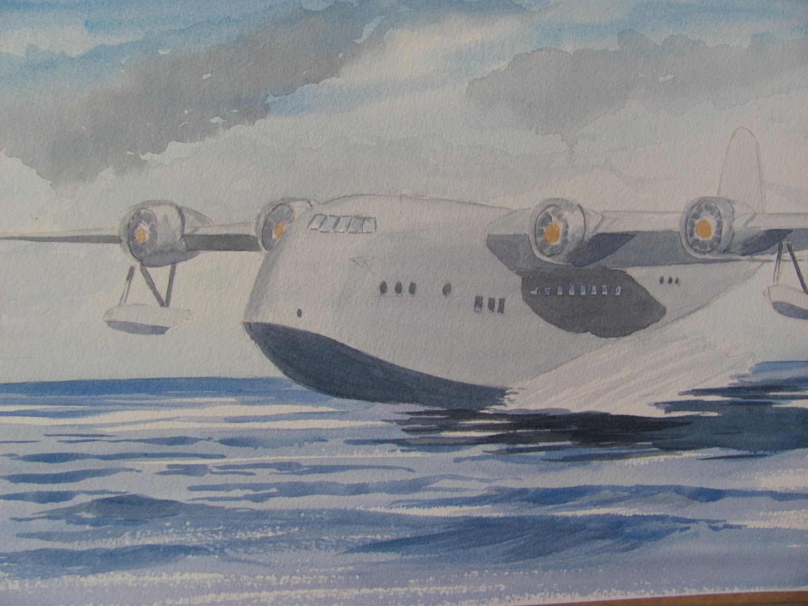
Empire Flying Boat by Robert Heal. Watercolour & Gouache


Cyclist by Jan Weeks.


Balloons by Jo McKenna


Minis by Sylvia Pink.

Gerald Pink

Watercolour & Acrylic by Clive Brotherton

San Franciso Tram by Yvonne Harry

Really we are just getting warmed up and hopefully will get fully  into our stride next week when the subject is `Leaves and Berries'. Plenty of those about at the moment. The following weeks subject is `Abstract' so that will tax many of us. The annoying thing is that the weather over the last two weeks has been better than previously and it would have been perfectly possible, although somewhat windy, to paint outside.

Finally my tube of Quinacridone Purple had arrived via Robert and I gave a splodge to both Jan and Yvonne. I will be doing a post on this colour and hope to have Jan and Yvonne's input.